
The internet triggered a revolution in most fields, and marketing is no exception. The ability to track people’s online behavior gave marketers critical new data and insights into consumer behavior.
Capturing information via online forms added additional value—for example, email addresses. Unlike traditional mail, email was relatively free. While free can be great for a business, it also lowers the barrier to entry. Users’ email accounts soon became swamped with spam.
Eventually, the FTC regulated email standards, but people today still face crowded inboxes and are more concerned with privacy than in the past. Many are wary of filling out forms and sharing their information on websites.
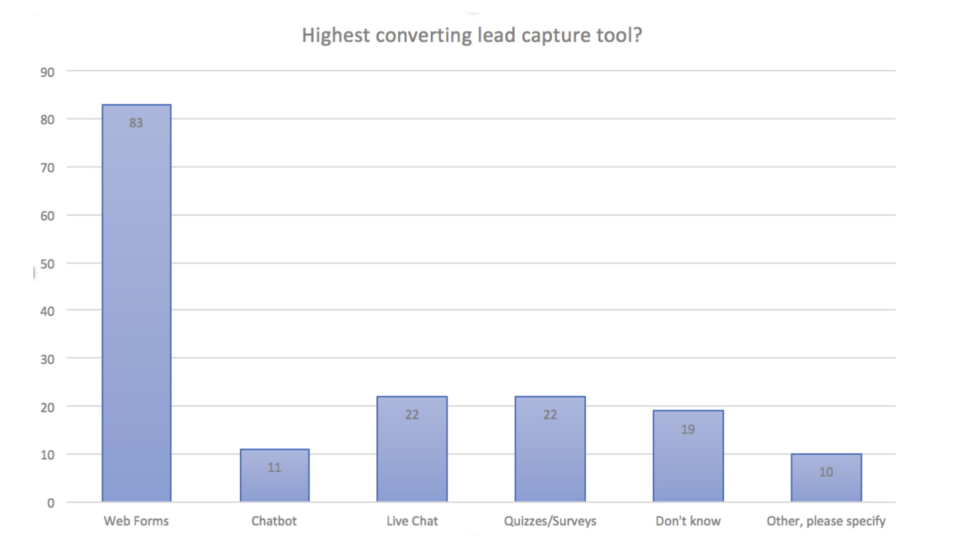
The challenge for marketers is that forms are still essential to lead generation and sales. From landing pages to websites, Hubspot reported in 2020 that 83 (48%) of 173 study respondents say forms are their highest converting tool.
Whether it’s a sign-up form for a newsletter or a contact form for inquiries, how you frame these forms can significantly impact conversion rates. In an era where people are increasingly cautious about sharing their personal information online, the art of “softening the ask” becomes crucial.
Let’s look at a few steps marketers can take to encourage web visitors to complete an online form.
Create a Form Audit
Before you dive into tweaking your forms, it can be helpful to know where to start. “Create a form” audit for your forms is a valuable tool. Here are some characteristics of high-performing forms to get you started.
- Is the form context distraction-free?
- Is there a compelling benefit to filling out the form?
- Is the first step effortless?
- Do the instructions offer clear guidance?
- Do error messages do more than just point out errors? Do they help the user fix the error?
- Does the password input field give an option to see the password?
- Are you using drop-down menus for lengthy lists? (Hint – you want to avoid drop downs because they can introduce decision fatigue)
- Does the form leverage microcopy to guide users?
- Does the form validate responses in the field?
- Do you have relevant social proof?
- Do longer forms have multiple steps and progress indicators?
- Is the submit/CTA button optimized?
- If there are any next steps after filling out the form, are they clear?
You can also incorporate some of the following ideas into your audit to improve your opt-in form conversion rate.
Build Trust
“Softening the ask” boils down to building trust. Asking users to provide their information is a matter of timing. People are protective of their personal data, and their experience on the website needs to inspire trust.
Walk In Their Shoes – The Buyer’s Journey
Understand where your visitors are in their buyer’s journey. When they feel they are in the right place, they are more likely to see filling out a form as the natural next step.
Are they in the early research phase or signaling intent to purchase? Tailor your content and benefits accordingly. For those in the early stages, offer educational resources. Quizzes are a way to gamify forms and work well for some audiences. Prospects closer to a decision may appreciate a free trial or a personalized demo.
Gartner reports that B2B prospects’ behavior is changing. They prefer a digital-first approach and spend up to half their discovery phase in DIY research. 33% would rather not talk to a salesperson to complete a sale. That means forms leading to a direct sales contact or call back aren’t likely to convert as many as forms offering deeper dive information, like webinars or research studies.
Points for Professionalism
Make sure the form looks professional. You want to serve up something other than an equivalent of a used car salesman cliche experience. A poorly designed form doesn’t inspire trust. A visually noisy popup that keeps interrupting them feels intrusive and can cause prospects to click away.
Visual Cues – Logos and Badges
Visual cues such as trust badges, security logos, and affiliations with respected organizations can convey a sense of trustworthiness. Users who see these symbols on your website are likelier to believe you’ll handle their information responsibly.
Testimonials
Sharing testimonials from satisfied customers can have a profound impact on form conversion. Testimonials are the equivalent of online word-of-mouth recommendations. Real-life success stories and endorsements help potential leads see your value and encourage them to take the next step.
Be strategic about testimonials. Generalized kudos pack a weak punch. Tailor testimonials to highlight your USP and answer your buyers’ conscious and subconscious objections.
Privacy Transparency
Be transparent about how you intend to use the information collected. A clear privacy policy is a legal requirement and can also be a selling point. Your statement should outline how you use, store, and protect their data. Make sure users know that you respect their privacy and are committed to safeguarding their data. You can also reinforce this point in the confirmation email with a link to your privacy statement.
User Experience – Keep It Simple
Various studies have shown that the more fields there are to fill out, the higher the abandonment rate. So, one of the easiest ways to increase conversions is to decrease the number of required fields on the form to no more than three.
Some B2B companies get around this by offering a valuable lead magnet for free, like original research or detailed templates. They use multistep opt-in forms to segment and gain more information about leads, such as company size and occupation.
Placement and Pacing Matters
Try to position opt-in forms toward the top of the page, above the fold. Even for mobile phones and tablets, devices that don’t have a “fold” per se, presenting the form sooner rather than later is a best practice. The idea is to capture their attention so you don’t have to rely on them scrolling down to encounter the form.
That only gives you a little time to make a compelling case for why they should convert, so be clear about your unique value proposition (UVP), what benefit they will receive, and what will happen next.
Consider breaking the form into multiple steps for longer forms, like payment forms or intake questionnaires. Venture Harbour reported that breaking the form into multiple steps improved conversions by 300%. If it works for your audience, try quizzes, which are multiple-step forms in disguise.
Variety and Personalization
Bombarding users with the exact offers repeatedly feels like an annoying buzzing fly. If they’ve already received a whitepaper download offer, don’t present it to them again on the same page, especially if they opted in. Instead, track their progress and personalize the experience by showing them responsive content or offers that align with their behavior signals.
Moving Ahead
Fine-tuning website form performance can be challenging. Create forms that build trust and encourage user engagement by addressing emotional considerations, displaying trust signals, considering context, and tailoring content.
The good news is that form performance is easy to test. The more challenging part is the tech behind the analytics for form optimization. At Funnel Envy, we have the expertise and tools to help you dial in your website form performance and increase conversions. Give us a call today.