6 Highly Optimized Product Pages & What You Can Learn From Them
Your product page is your elevator pitch.
Since visitors spend an average of 54 seconds on a page, you have less than a minute to convert them.
So we asked CRO experts to nominate their favorite product pages to dissect them and find the common thread that ties all high-growth companies together—the secret that helps them convert attention into revenue in spite of changing customer behavior and an increasingly competitive industry.
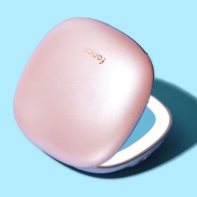
Product Page Example 1: Fancii
Nominated by: Andra Baragan, Founder ONTRACK Digital
Overall Branding & Value Proposition
Fancii offers high-tech beauty tools like vanity mirrors, nail care, and skin care tools. Unlike other beauty brands that focus on age-defying and pore-vanishing creams, Fancii’s self-proclaimed motto is to take a light-hearted approach to beauty. The brand wants to empower customers to deliver their “most authentic self to the world.”
For this deep dive, we’ve chosen to take look at one of their bestsellers, MILA, a compact mirror.
Offer & Pricing
Banner offer: Seasonal discount coupon

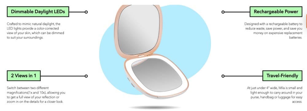
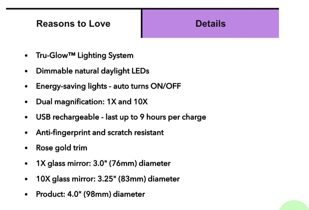
MILA, a dimmable LED compact mirror, costs $49. The batteries last long and are rechargeable. Plus, this mirror offers dual magnification – 1x and 10x.
A quick Google search shows that you can buy a cheap LED compact mirror for less than $10 so this is definitely a premium product.
Fancii has deployed an exit-intent pop-up on this product page (see below) that offers a great deal if you buy more than one MILA mirror.
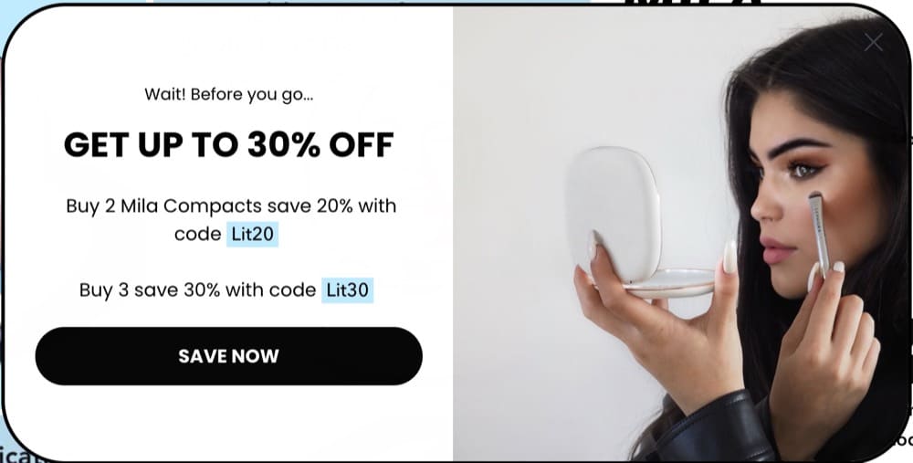
The brand offers free shipping when you spend over $75, 90-day free returns, and a 24-month warranty. You can also use Sezzle to turn your purchase into interest-free payments.
Nav bar: Uncluttered
CTA: A straightforward “Add to cart” button in the buy section
Once you leave the first fold, there’s a sticky “Add to Cart” button that follows you around.
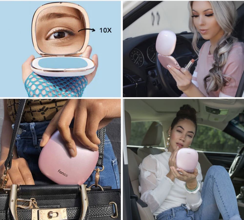
The visuals used align with the brand’s image and appeal to younger millennials and Gen Z.
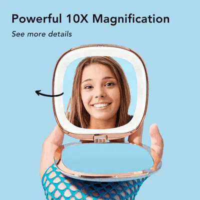
The product page starts with an image grid that lets you soak in the product. What’s interesting is the use of a GIF in the grid to show how the magnification works.
After the first fold, Fancii has a quick video to show how MILA works. The video highlights the features of MILA and ends with positive reviews from customers and coverage in beauty publications.
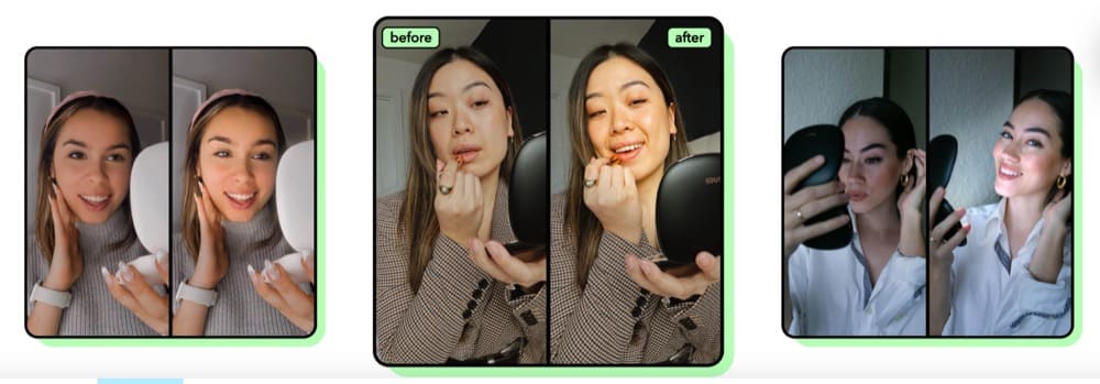
The “Before/After” section also uses high-quality visuals to illustrate the difference between using a normal compact vs. MILA.
Another section on this page re-iterates why you should choose MILA with a compelling visual and text combination.
Narrative & Story
Fancii’s motive to empower customers to put their “best face forward” is crystal clear with this product page.
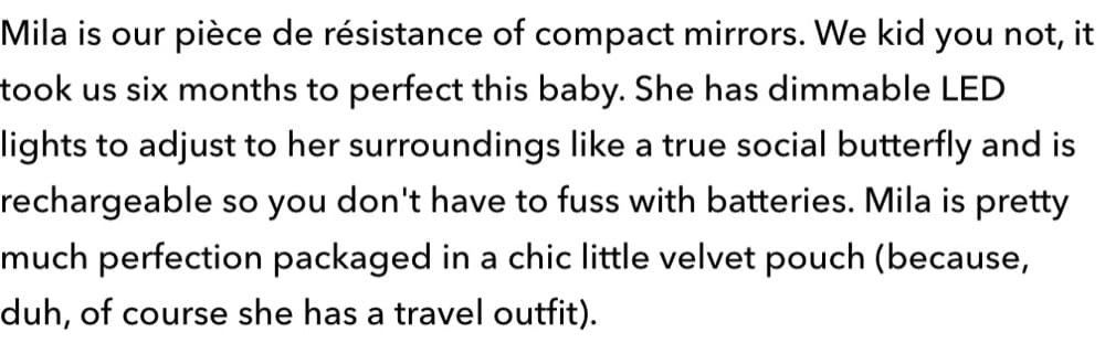
Their product description is a breath of fresh air. While it focuses on what MILA is, it also tells you the story behind the product’s invention.
The first fold also hosts a quick positive review highlighting how sleek it is and its fantastic light and magnification capabilities.
This section also showcases 3 top reasons why MILA is perfect and product details that make the product worth it.
The copy used in the page is aimed at the target audience:
- “Meet MILA, your new bestie”
- “Trust us, nothing ruins a vacay more than having a blotchy face”
- “Never miss that rogue eyebrow or chin hair again”
The page constantly tells you why MILA is the perfect choice for you and seems to follow the concept of LISH (Length Implies Strength Heuristic) aka longer copy is more likely to persuade visitors.
Upsells & Cross-sells
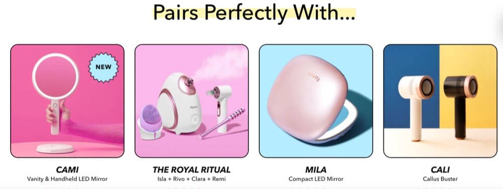
Fancii doesn’t try to upsell on this product page. It’s likely that since this is the premium version, they’re only nudging shoppers to buy more mirrors to get a discount on the bundle. The page, however, does show you other products that pair well with MILA at the end.
Performance
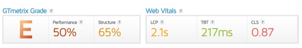
When we ran the page through Page Speed Insights, it didn’t pass the Core Web Vitals assessment on both mobile and desktop. It didn’t fare well on GTmetrix either. The site gave this page an “E” grade.
However, site speed and performance isn’t the only important factor. We’re also going to evaluate this page against best practices uncovered by Baymard’s research.
Product Images: (2/2)
- Do they offer an in-scale image? – YES
- Do they show a human model? – YES
- Do the visuals show the “included accessories”? – NA
The “Buy” section: (~1/3)
- Do they allow users to purchase out-of-stock items by increasing the delivery time? – UNSURE (none of the products on the site are sold out)
- Is it easy to access and “save” products for later? – NO
- Is the price per unit displayed if the product is sold in varying amounts or quantities – YES
Shipping, Returns & Gifting: (2/3)
- Do they offer an estimate of the total order cost? – NO
- Do they show or link to their return policy? – YES
- Do they place “free shipping” in and around the buy section? – YES
Specification Sheets: (2/2)
- Is the spec sheet highly scannable? – YES
- Are most terms explained or defined? – YES
User Reviews: (3/3)
- Do they only ask for relevant reviewer information in forms? – YES
- Do they respond to negative reviews? – YES
- Do they offer a rating distribution chart at the top of the review section? – YES
Star Elements
The use of the GIF in the image grid adds a lot of value to the customer who wants to know how the magnification works.
Fancii’s review section is stellar.
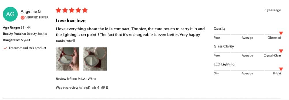
You can see:
- The variant (color) that was reviewed
- Beauty persona of the reviewer
- Who they bought it for – themselves or as a gift
- What they think about the quality, clarity, and lighting
- User generated visuals of the product
- How many people found the review helpful
- When the review was submitted
The FAQ section is also a brilliant touch. It answers commonly asked questions reducing the need to get in touch with customer support.
Areas of Improvement
- In the “Before/After” section, they only have 3 images that keep cycling back and forth.
- When they’re trying to cross-sell other products, the link could just let shoppers add the product to the cart instead of taking them away from the current product page.
- The cross-selling suggestion could also use some work. On the product page, shoppers are recommended to pair the product with MILA again.
- Show shipping fees upfront.
- Show delivery times in the buy section
Product Page Example 2: OLIPOP
Nominated by: Luka Milekic, Founder of Clever Choice
Overall Branding & Value Proposition
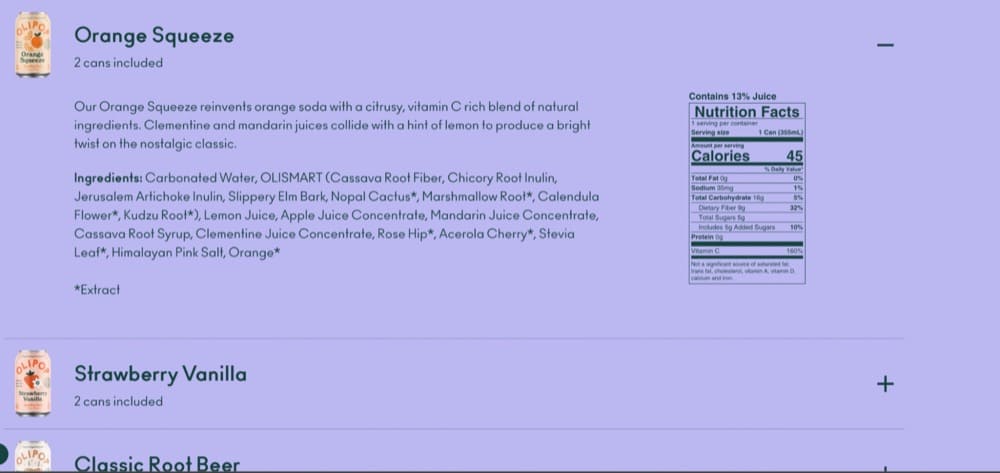
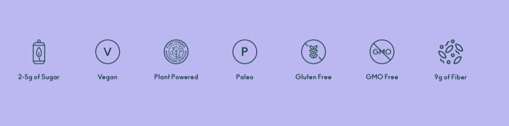
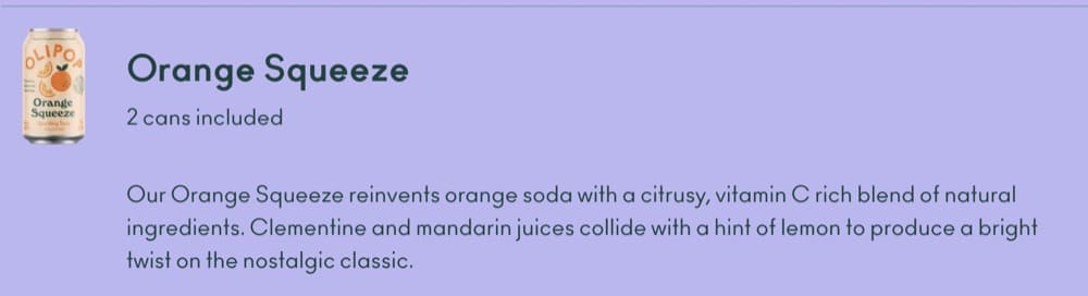
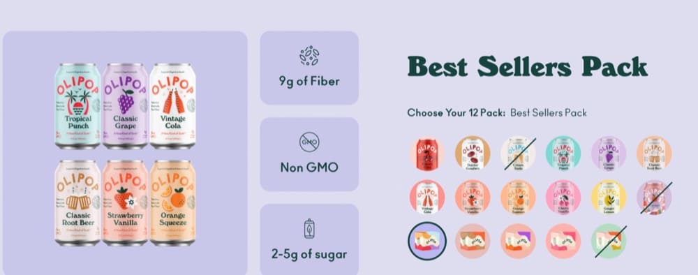
OLIPOP is a low-sugar soda alternative. For people who love soda but are conscious about the usual 11 g of added sugar found in sodas, OLIPOP’s sodas that only contain 2-5 g of sugar and 9 g of fiber are a wonderful alternative.
OLIPOP’s youthful branding suggests it’s marketed to young millennials and Gen Z who want to become healthier.
For this deep dive, we’re going to take a look at their best sellers pack.
Offer & Pricing
Banner offer: 15% off if you subscribe to their mailing list + free shipping, flat rate shipping for the US.

The BestSellers pack costs $35.99 for a one-time purchase and $30.59 (15% off) if you subscribe. When compared to regular soda, this is a steep increase in pricing but it is in line with other healthy soda brands.
You can pay in 4 interest-free installments with ShopPay.
Nav Bar: Simple. You can Shop, Learn, Subscribe, or Try Best Sellers.
The buy section has all the value propositions laid out—Non-GMO, 9 g of fiber, and 2-5 g of sugar. You have the run-of-the-mill “Add to Cart” CTA.
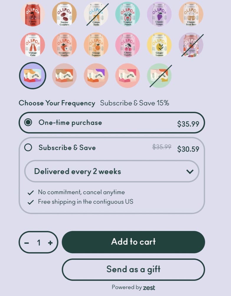
But, the “Send as a Gift” is the real surprise. Shoppers can choose a digital card to go along with the order.
The page doesn’t have an “Add to Cart” sticky banner.
Visuals
The buy section has only one image of all the 6 flavors you get in the best sellers pack. When you scroll down, you can see each flavor and its nutritional breakdown. Plus, each soda’s taste is described in great detail so you know what you’re in for.
But, single flavor soda packs have far more immersive and strong visuals. The stills and videos draw you in and it’s up front and center in the buy section.
Narrative & Story
OLIPOP’s mission is clear—become the soda you reach for. The product page isn’t heavy on copy. It uses strong visuals coupled with benefits to help you make a purchase decision. The section that does rely on emotive copywriting is when they describe each flavor.
One of the drawbacks of buying soda online is you can’t taste it. But OLIPOP takes great pain to detail each flavor profile.
Upsells & Cross-sells
Interestingly, the cross-selling all takes place in the buy section. You can choose a pack of 12 old school classics, a fruity variety pack, Pink Pops, or buy a 12-pack of a single flavor.
Performance
The page passed the Core Web Vitals on both mobile and desktop. GTmetrix gave the page an “F” grade.
Let’s see how the page fared against the best practices recommended by Baymard:
Product Images: (0/2)
- Do they offer an in-scale image? – NO (they do for other products)
- Do they show a human model? – NO (they do for other products
- Do the visuals show the “included accessories”? – NA
The “Buy” section: (1/3)
- Do they allow users to purchase out of stock items by increasing the delivery time? – NO
- Is it easy to access and “save” products for later? – NO
- Is the price per unit displayed if the product is sold in varying amounts or quantities – YES
Shipping, Returns & Gifting: (1/3)
- Do they offer an estimate of the total order cost? – NO
- Do they show or link to their return policy? – YES
- Do they place “free shipping” in and around the buy section? – NO
Specification Sheets: (2/2)
- Is the spec sheet highly scannable? – YES
- Are most terms explained or defined? – YES
User Reviews: (2/3)
- Do they only ask for relevant reviewer information in forms? – YES
- Do they respond to negative reviews? – NO
- Do they offer a ratings distribution chart at the top of the review section? – YES
Star Elements
This product page stands out for two reasons—stunning visuals and flavor descriptions. The “send as a gift” idea is definitely worth stealing on your combo products.
Watch Rishi Rawat and Lorenzo Carreri’s breakdown on OLIPOP:Ep #17: Olipop.com Conversion Optimization Ideas
Areas of Improvement
- The buy section should have an image carousel. Expecting people to scroll down to see what’s included in the pack is unnecessary friction.
- Use a sticky banner with “Add to Cart” CTA
- More videos — video to show the drink pours, video reviews that describe the taste
- Feature customer reviews that describe the taste
- OLIPOP also has been featured in the press but it’s missing from the product page
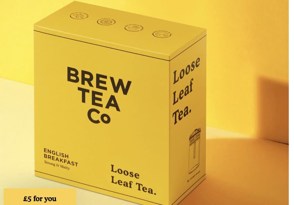
Product Page Example 3: Brew Tea Company
Nominated by: Luka Milekic, Founder of Clever Choice
Overall Branding & Value Proposition
Brew Tea Company is for tea savants who love the taste of 100% whole-rolled tea leaves.
The brand’s value prop is two-fold: taste authentic tea and a flexible subscription model (although how they’re able to accurately project revenue with that model is a head scratcher).
We’re scrutinizing their Loose Leaf English Breakfast Tea for this deep dive.
Offer & Pricing
Banner offers: same-day dispatch, free shipping, and ‘become a stockist’.

The 113 g sells for £6 while the 500 g pack goes for £20. Compared to other brands, the pricing is competitive.
Like with other subscription bands on the list, you save more when you subscribe and Brew Tea nudges visitors to opt for a subscription.
Nav bar: Uncluttered.
You can use the nav bar to check out other products, and their gifting range, or set up a subscription.
The buy section has several options to choose from. You can opt for tea bags, choose the quantity of tea you want and make a one-time purchase or subscribe.
Instead of the standard “Add to cart” button, you see an “Add to Trolley” button. You can also shop for other blends available under the buy section.
Visuals
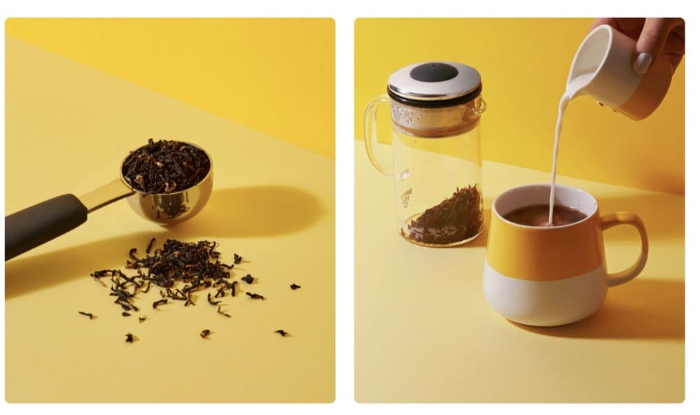
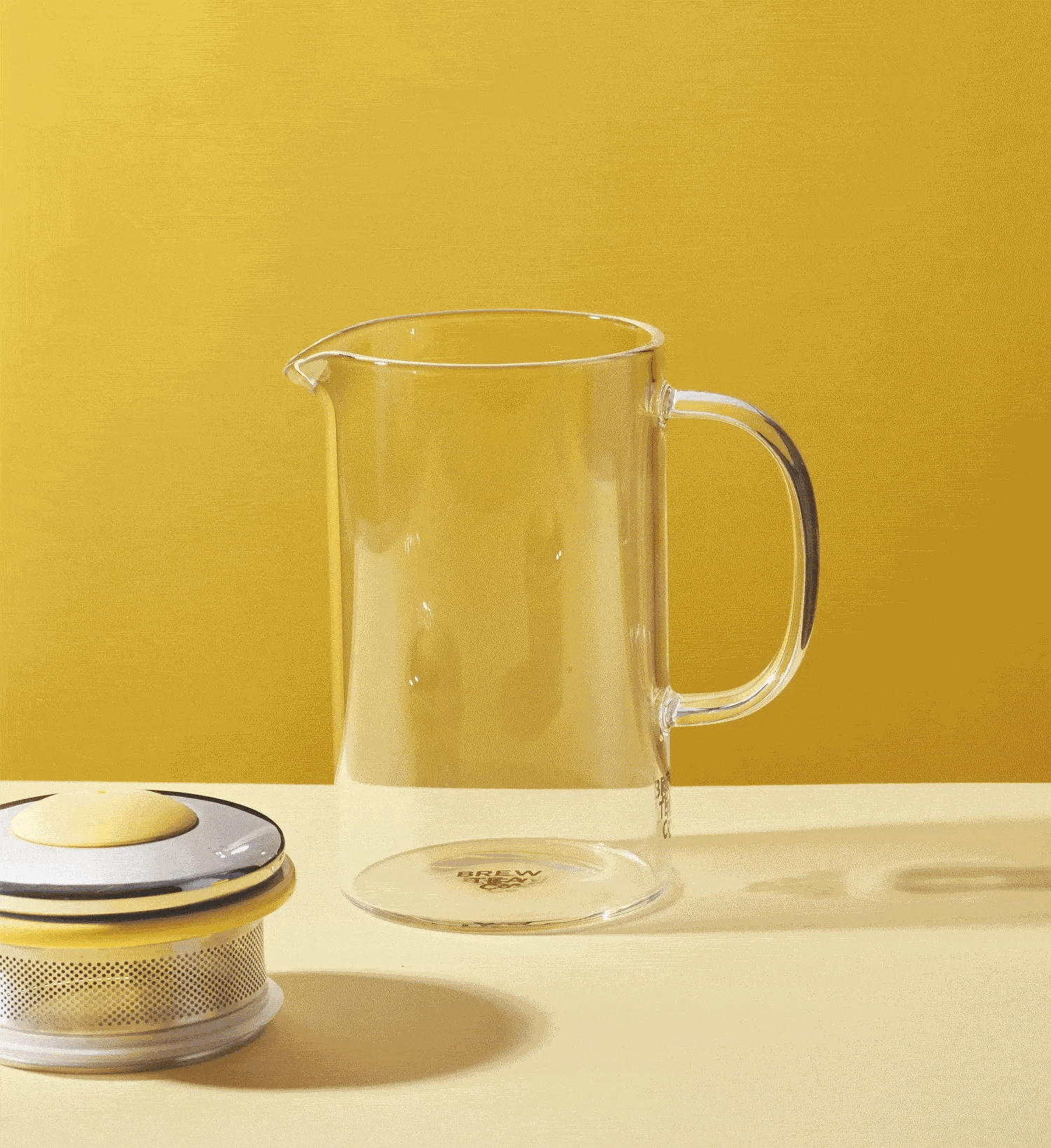
Each tea gets its color scheme and English Breakfast Tea is a nice yellow. The visuals are clean and minimal. The brand has used GIFs to show you to make a nice cup of tea but fails to use video on the page.
Narrative & Story
Brew Tea Co takes you on a journey with this product page. By the time you’re done scrolling, you know where the tea is from (Assam, India, and Ceylon, Sri Lanka), its tasting notes, and how it’s prepared.
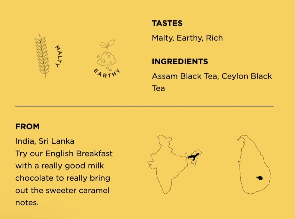
For non-tea buffs, whole rolled tea leaves contain all the flavor. Most commercial blends contain tea dust which adds nothing to the taste and only helps increase the product’s weight.
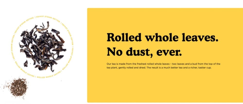
Brew Tea calls out this difference on its home page and the product page—they pluck two leaves and a bud resulting in a much better-tasting cup of tea.
Upsells & Cross-sells
Brew Tea tries to get you to purchase a subscription. And for what it’s worth, their subscriptions are flexible—you can pause, resume, or add products anytime.
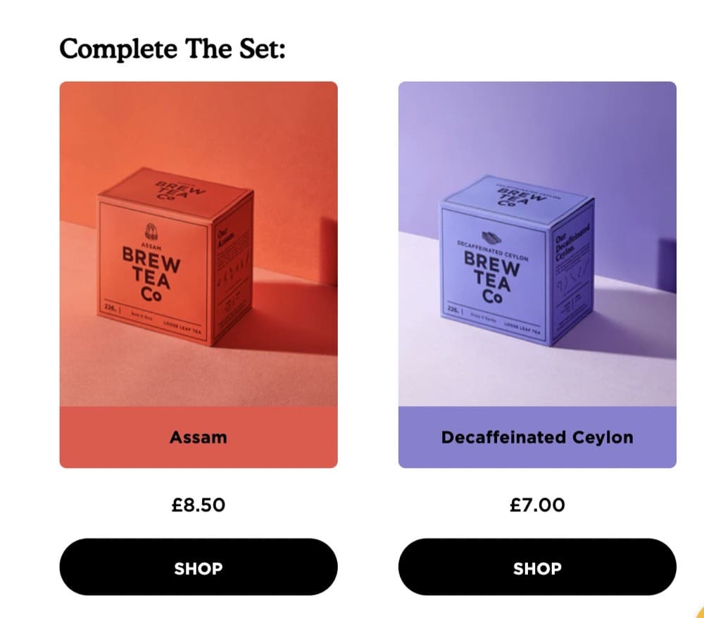
Under the buy section, the brand attempts to cross-sell other blends that you can add to your cart.
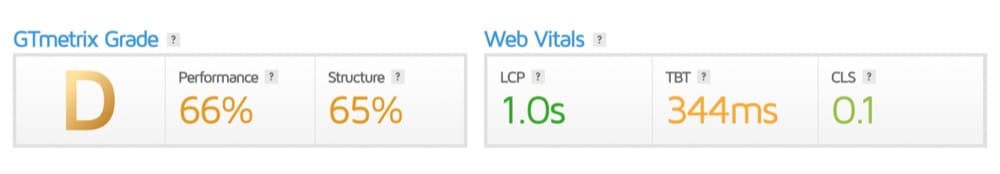
Performance
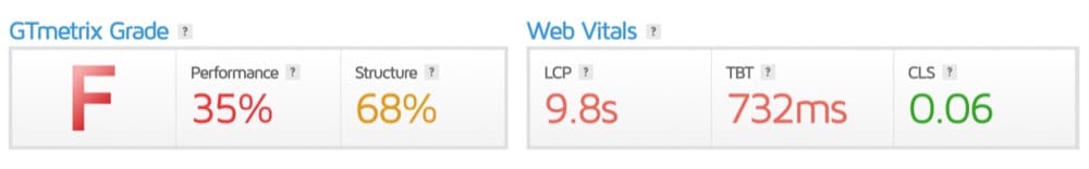
The page passed the Core Web Vitals on desktop but not on mobile. GTmetrix gave the page a “D” grade.
Let’s see how the page fared against the best practices recommended by Baymard:
Product Images: (0/2)
- Do they offer an in-scale image? – NO
- Do they show a human model? – NO
- Do the visuals show the “included accessories”? – NA
The “Buy” section: (1/3)
- Do they allow users to purchase out of stock items by increasing the delivery time? – NO
- Is it easy to access and “save” products for later? – NO
- Is the price per unit displayed if the product is sold in varying amounts or quantities – YES
Shipping, Returns & Gifting: (2/3)
- Do they offer an estimate of the total order cost? – NO
- Do they show or link to their return policy? – YES
- Do they place “free shipping” in and around the buy section? – YES
Specification Sheets: (2/2)
- Is the spec sheet highly scannable? – YES
- Are most terms explained or defined? – YES
User Reviews: (1/2)
- Do they only ask for relevant reviewer information in forms? – YES
- Do they respond to negative reviews? – NA (they don’t display negative reviews)
- Do they offer a ratings distribution chart at the top of the review section? – NO
Star Elements
- The product description is rich and describes how the tea tastes and everything you need to know about the blend.
- Brew Tea shares instructions on how to compost the packaging
- Brewing tips are shared with buyers
- There’s a Q&A section clubbed with the reviews
Areas of Improvement
- The buy section should have an image carousel.
- Use a sticky banner with “Add to Cart” CTA
- Missed opportunity – videos to show how the tea pours and reviews to describe the taste
- Compare other products with Brew Tea (it is a competitive space)
- Call out their sustainable packaging
- Display negative reviews and respond to them (all 5 stars can feel misleading)
- Brew Coins (their way of rewarding loyal members) is so confusing that it needs a dedicated landing page. Keep the concept but call it loyalty points.
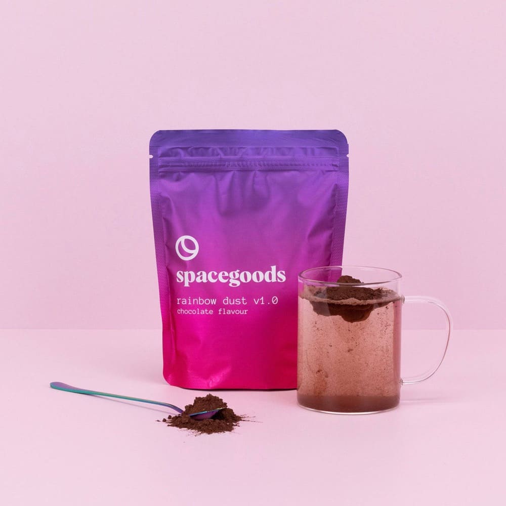
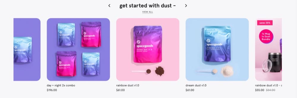
Product Page Example 4: Space Goods
Nominated by: Alex Blackburne, Founder of Digital Moats
Overall Branding & Value Proposition
I have to shout out Space Goods, founded by Matt Kelly in the UK.
The brand is less than a year old but has already scaled to over 7 figures in revenue. The biggest differentiator of the brand is the level of branding and the quality of their creatives.
They’ve taken an old industry (healthy coffee alternatives) and brought it into the year 3000 with their psychedelic, space-themed packaging & branding. The quality of their product photos and product page design is unlike any other brand I’ve seen. They even produced their own movie for their launch! This is a great website to study to show the power of high-quality & creative design in building a mega-brand.Alex Blackburne
Alex touches on most parameters that we will measure Space Goods against. So, in the interest of time, we’ll skip the things he has already mentioned.
We’re analyzing the Rainbow dust v1.0 – starter kit for this breakdown.
Offer & Pricing
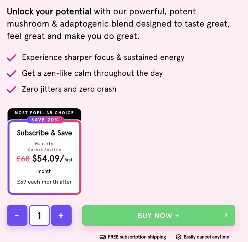
Banner offer: 15% off bundles

There is no way to make a one-time purchase for this product bundle. You pay $55 for a monthly subscription. Compared to other brands that sell “rainbow dust” aka mushroom and adaptogenic blends, the pricing is a little steep.
Shipping is free if you set up a subscription.
Nav bar: Cluttered
The buy section features the standard “Add to cart.” There is no sticky CTA bar. Other sections with “Order Now” lead you back to the buy section instead of adding the product to your cart.
Visuals
Images are overlayed with text to relay the benefits of the product.
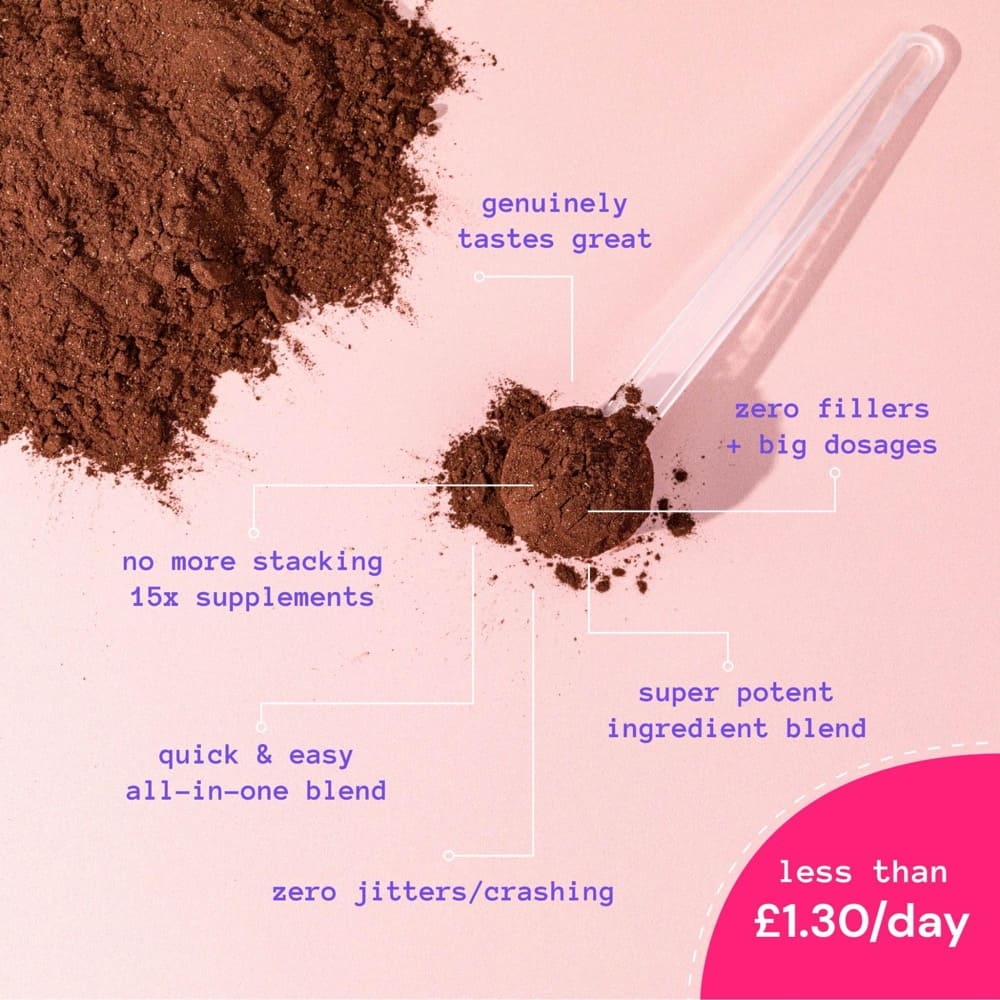
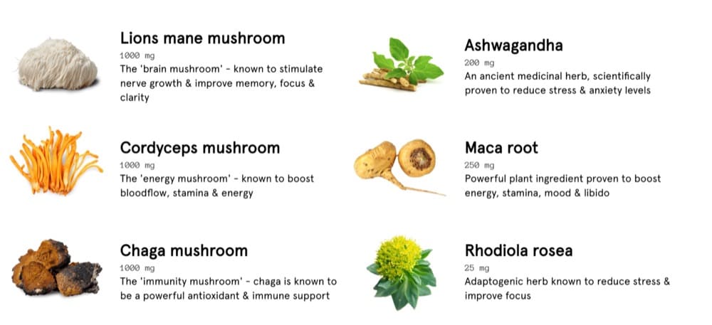
The ingredient list also shows an image of the ingredients which is rare.
A GIF shows you how to use the product.
Narrative & Story
Space Goods sells healthy coffee alternatives but unless you’re already deep in the rabbit hole, you’re probably not sure what adaptogenic blend means.
The product claims to help you “unlock your potential” and provide sustained energy throughout the day.
Who is Rainbow Dust for and what is it made of? The section right below the buy fold addresses that. It is perfect for biohackers that like the benefits of coffee minus the jitters and crashes you get with caffeine.
There’s also a quick comparison between the product and regular coffee. But unlike others on the list that rely on data to back up their claims, Space Goods doesn’t have research to fall back on.
Upsells & Cross-sells
If you scroll all the way down the page, you can see there’s an attempt to cross-sell other products.
The only upsell is to upgrade to a subscription.
Performance
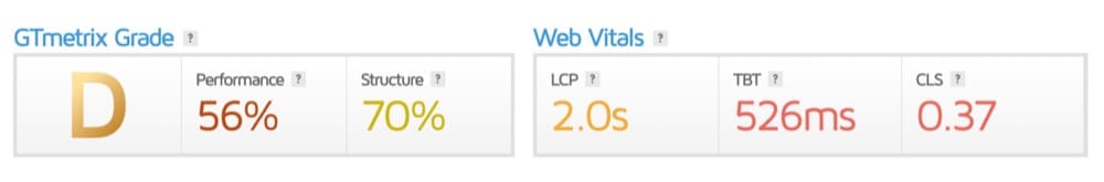
We ran the page through Page Speed Insights but it didn’t pass the Core Web Vitals assessment on desktop or mobile. GTmetrix gave the page a “D” grade.
Let’s see how the page fared against the best practices recommended by Baymard:
Product Images: (3/3)
- Do they offer an in-scale image? – YES
- Do they show a human model? – YES
- Do the visuals show the “included accessories”? – YES
The “Buy” section: (1/3)
- Do they allow users to purchase out of stock items by increasing the delivery time? – NO
- Is it easy to access and “save” products for later? – NO
- Is the price per unit displayed if the product is sold in varying amounts or quantities – YES
Shipping, Returns & Gifting: (2/3)
- Do they offer an estimate of the total order cost? – NO
- Do they show or link to their return policy? – YES
- Do they place “free shipping” in and around the buy section? – YES
Specification Sheets: (1/2)
- Is the spec sheet highly scannable? – YES
- Are most terms explained or defined? – NO
User Reviews: (1/3)
- Do they only ask for relevant reviewer information in forms? – YES
- Do they respond to negative reviews? – NO
- Do they offer a ratings distribution chart at the top of the review section? – NO (you have to click on it)
Star Elements
- The product page describes who Rainbow Dust is for at great length
- Ingredient list comes with images and the benefits
- The FAQ section is creative and comprehensive
Areas of Improvement
- Took us a while to figure out what Rainbow Dust actually was
- There is no explanation of what adaptogens are
- It would help to have a comparison chart between Rainbow Dust and other similar brands
- Cross-selling section should be moved up
- Claims made should be backed by research or surveys
Product Page Example 5: United By Blue
Nominated by: Daniel Chabert, Founder of Purple Fire
Overall Branding & Value Proposition
United By Blue is an eco-friendly outdoor brand that is committed to protecting the environment. Their product pages are also well-optimized, and I love them for a variety of reasons.
Daniel Chabert
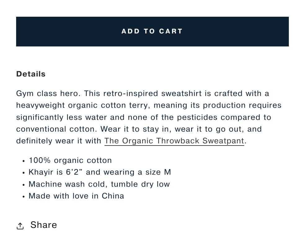
The brand offers “classic styles with modern sustainability” notably writing “Make Grandpa jealous” on its home page. For every product purchased, United by Blue “removes a pound of waste from the oceans and waterways.” We’re analyzing the Organic Throwback Sweatshirt for this breakdown.

Offer & Pricing
Banner offer: Free shipping on US orders of over $150 + free exchanges.

The sweatshirt costs $88, making it a premium product compared to similar items in the market.
Nav bar: Uncluttered Although there are many options in the nav bar, it doesn’t feel cluttered due to its small font size.

The buy section has the standard “Add to cart” CTA, but there’s also an option to “Share” the product.
Visuals
United By Blue’s photography is simple and elegant. You can see the sweatshirt from all possible angles and how it fits the model.
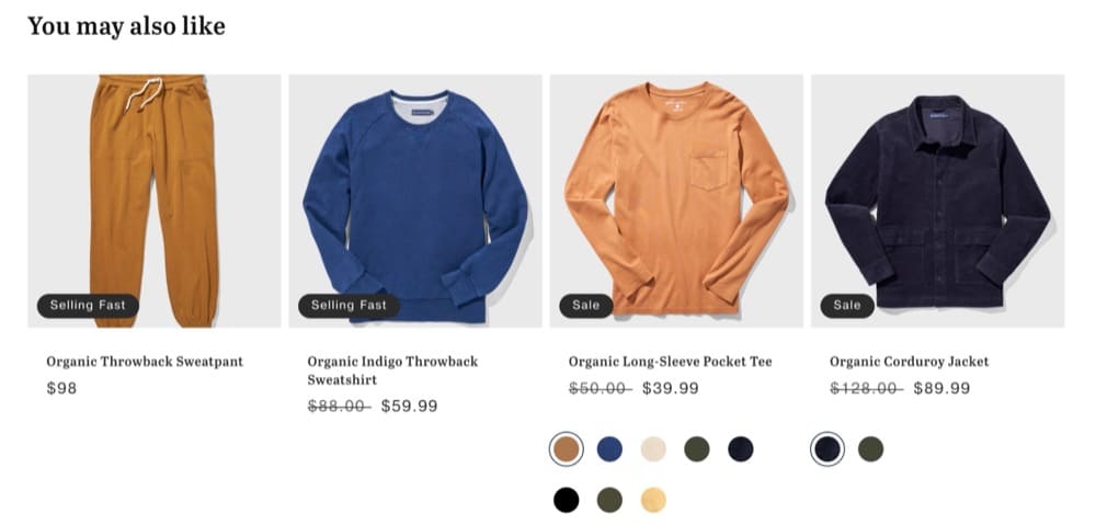
In the “You May Also Like” section, you can see a close-up or another angle if you hover over the product images.
Narrative & Story
The banner shows how much waste the brand has removed. And the product description is written in the same eco-friendly vein.
“This retro-inspired sweatshirt is crafted with a heavyweight organic cotton terry, meaning its production requires significantly less water and none of the pesticides compared to conventional cotton.”
The brand also employs memes and pop culture to sell. The product description starts with “Gym Class Hero” — a nod to both where you can wear the sweatshirt and the band.
Upsells & Cross-sells
United by Blue attempts to upsell the matching sweatpants with a subtle plug in the product description:
“Wear it to stay in, wear it to go out, and definitely wear it with The Organic Throwback Sweatpant.”
The “You May Also Like” shows you other unrelated products that aren’t necessarily compatible.
Performance
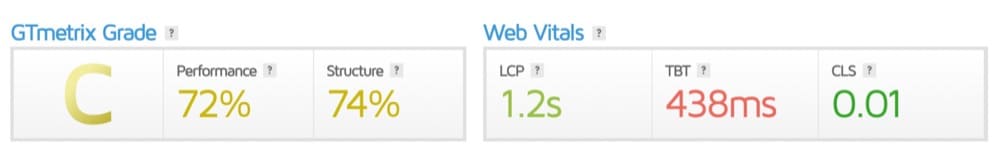
The page passed the Core Web Vitals assessment on desktop and mobile. GTmetrix gave the page a “C” grade.
Let’s see how the page fared against the best practices recommended by Baymard:
Product Images: (2/2)
- Do they offer an in-scale image? – YES
- Do they show a human model? – YES
- Do the visuals show the “included accessories”? – NA
The “Buy” section: (1/3)
- Do they allow users to purchase out of stock items by increasing the delivery time? – NO
- Is it easy to access and “save” products for later? – NO
- Is the price per unit displayed if the product is sold in varying amounts or quantities – YES
Shipping, Returns & Gifting: (3/3)
- Do they offer an estimate of the total order cost? – YES
- Do they show or link to their return policy? – YES
- Do they place “free shipping” in and around the buy section? – YES
Specification Sheets: (2/2)
- Is the spec sheet highly scannable? – YES
- Are most terms explained or defined? – YES
User Reviews: (1/3)
- Do they only ask for relevant reviewer information in forms? – YES
- Do they respond to negative reviews? – NO
- Do they offer a ratings distribution chart at the top of the review section? – NO
Star Elements
- Product descriptions are succinct and contain the selling angles
- The size guide shows you how to measure yourself for the right fit
- Reviews include fit, size, age, and height range
Areas of Improvement
- A product video of how the sweatshirt looks in motion
- Video or visuals to show how the product is made
- Reinforce the impact of the environment in the buy section
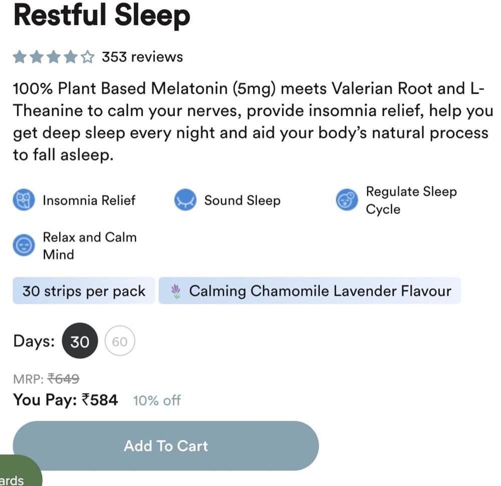
Product Page Example 6: Wellbeing Nutrition
Nominated by: Sneh Ratna Choudhary, B2B SaaS Content Marketer & Strategist
Overall Branding & Value Proposition
WellBeing Nutrition is a whole food multivitamin brand that is committed to taking care of people and the planet.
The hero products include effervescent tablets and strips that melt on your tongue. Compared to other supplements, they are easier to consume and 100% bioavailable since they are directly absorbed in the bloodstream.
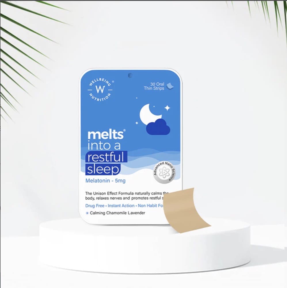
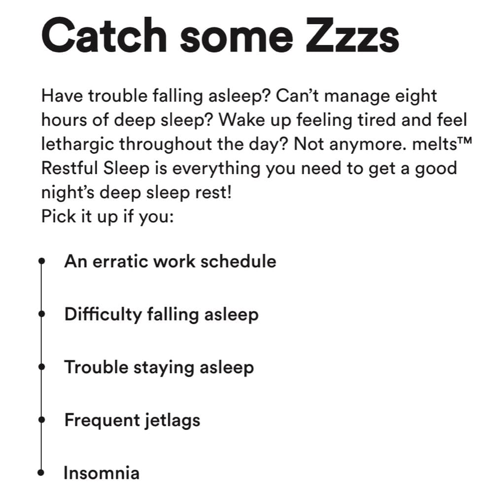
We’re analyzing the Restful Sleep oral strips for this breakdown.
Offer & Pricing
Banner offer: Freebies offered on a purchase of $24

The Restful Sleep oral strips cost between $6-13 depending on the pack size. Compared to OTC supplements, the brand’s pricing is higher but it is in line with other products that offer a similar delivery mechanism.
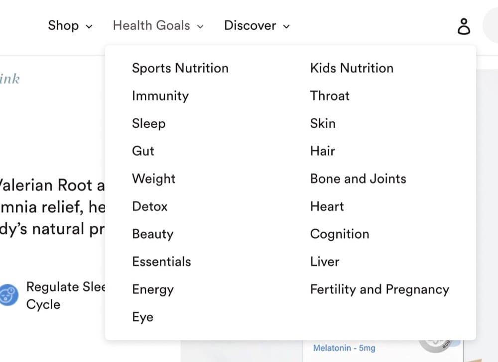
Nav Bar: Uncluttered
Despite selling an array of products, the nav bar is simple—Shop, Health Goals, and Discover. The dropdown menus do the heavy lifting and guide visitors to the right category.
The buy section features the standard “Add to Cart” CTA. Other sections use collapsible menus for easy navigation.
Visuals
The visuals are unambiguous and help drive the product’s narrative.
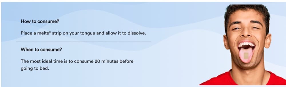
The buy section features close-ups of the tin that the strips come in. Underneath, you have the “How to consume” section which displays how you’re supposed to place it on your tongue.
The benefits section shows a person getting restful sleep.

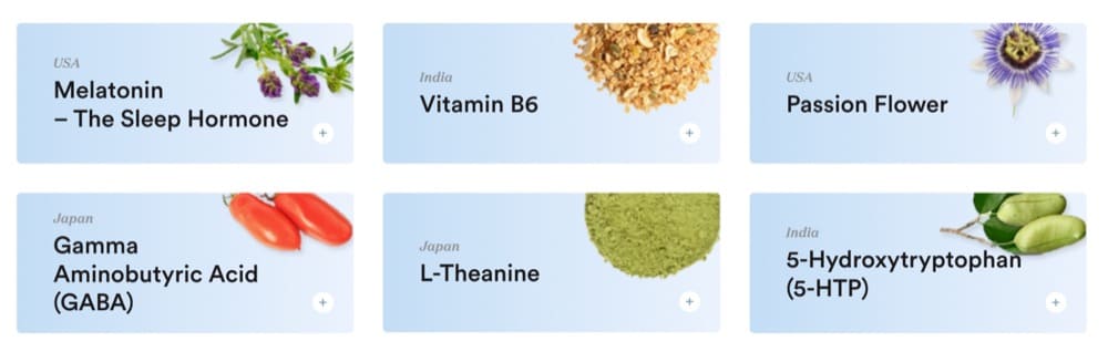
And the ingredient list features images of the ingredients like Space Goods.
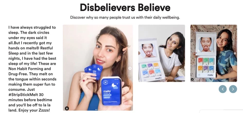
The featured reviews section called “Disbelievers Believe” strikes the right balance of high-quality photography and user generated images.
The product page also features some simple animation to explain how the strips work in the body.
Narrative & Story
The product page tells you exactly who the product is for (insomniacs or people with disturbed sleep) and how the natural ingredients work to provide you with better sleep.
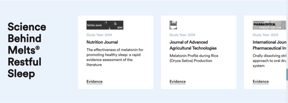
The claims are also backed by clinical studies and reports that can be accessed from the product page.
Although it may seem repetitive, the product page drills the benefits of the product vs. other forms of supplements into your head.
The featured and verified reviews help tell the story from a user’s perspective—it does what it says.
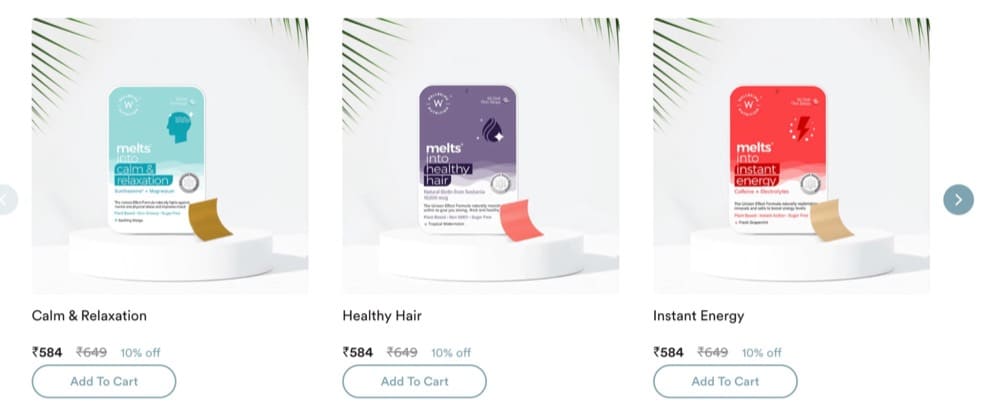
The best part about how WellBeing Nutrition names its products is you don’t need a lot of explanation to understand what it does. For instance, other products in the category include Healthy Gut, Healthy Hair, or Instant Energy.
Upsells & Cross-sells
Wellbeing Nutrition has two pack sizes available—a 30-day and a 60-day pack. The incentive to upgrade to the 60-day pack is the 15% discount.
When you scroll to the bottom of the page, you can see all the other oral strips available.
Performance
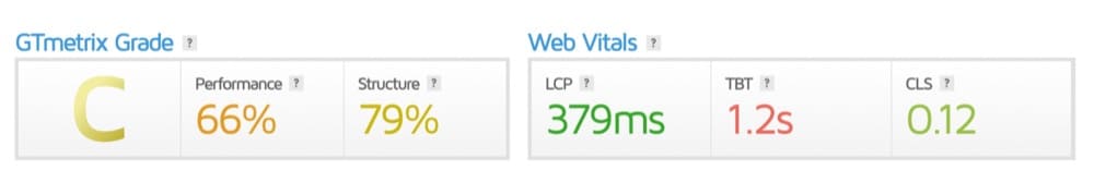
The page passed the Core Web Vitals on desktop but not on mobile. GTmetrix gave the page a “C” grade.
Let’s see how the page fared against the best practices recommended by Baymard:
Product Images: (2/2)
- Do they offer an in-scale image? – YES
- Do they show a human model? – YES
- Do the visuals show the “included accessories”? – NA
The “Buy” section: (1/3)
- Do they allow users to purchase out of stock items by increasing the delivery time? – NO
- Is it easy to access and “save” products for later? – NO
- Is the price per unit displayed if the product is sold in varying amounts or quantities – YES
Shipping, Returns & Gifting: (2/3)
- Do they offer an estimate of the total order cost? – YES
- Do they show or link to their return policy? – YES
- Do they place “free shipping” in and around the buy section? – NO
Specification Sheets: (2/2)
- Is the spec sheet highly scannable? – YES
- Are most terms explained or defined? – YES
User Reviews: (3/3)
- Do they only ask for relevant reviewer information in forms? – YES
- Do they respond to negative reviews? – YES
- Do they offer a ratings distribution chart at the top of the review section? – YES
Star Elements
- You can read more about the ingredients used without leaving the page
- The copy is fresh: Sleep like a baby, Small strips. Big Benefits, Catch some ZZZs
- You can see all the certifications the product has in the buy section
- Claims are backed by clinical studies
Areas of Improvement
- Add product videos/GIFs
- Include video reviews
- Show some before/after data
What Makes Product Pages Work: The Formula for Success
Revenue generating product pages aren’t a replica of each other but they do share these high-impact elements:
- A great banner offer
- Stunning visuals (including GIFs and video)
- Easy navigation
- Powerful CTAs
- Offer pop-up
- A strong narrative
- Persuasive copy
- Positive customer reviews
- The X factor (something to set the page apart)
- Decent performance (load speed, Baymard’s recommendations)
But you can’t ape best practices and hope the money will come pouring in.
After you whip your product pages into shape, you still need to run tests to learn how your audience behaves. Use that knowledge to continuously optimize your product pages—something we can help you with.
Start here to learn more about Shopify A/B testing with Convert Experiences.