Data visualization: How to transform analytics data into actionable insights
Tired of buried insights in complex reports? Turn overwhelming analytics data into clear insights with data visualization.
Today’s digital marketing seems to require an overload of data. With analytics platforms generating vast amounts of information across multiple channels, making sense of it can be challenging. This is where data visualization comes in — the key to transforming raw analytics data into clear, actionable insights.
This article explores how data visualization tools like Looker Studio and Tableau help you go beyond basic reporting to intuitive storytelling by simplifying big data, driving collaboration and unlocking powerful marketing insights.
The role of digital analytics
For over 25 years, a successful digital marketing strategy has relied on the marketer’s ability to measure success or failure. Tracking user behavior, engagement metrics, conversion rates and various key performance indicators (KPIs) using analytics are traditional methods for understanding marketing outcomes.
Google Analytics and Adobe Analytics, the two most popular tools, provide abundant data for analysis. However, users often find them lacking when it comes to extracting and presenting data effectively. The use of data warehouses complicates analysis further by combining analytics data with information from third-party tools. With the increasing volume and complexity of data, the demand for specialized tools to make sense of it is growing.
Dig deeper: Marketing analytics: What it is and why marketers should care
The challenge of big data and how data visualization tools bridge the gap
Analyzing vast amounts of data today is like panning through the sand on a riverbank, searching for a few grains of gold or, if you’re lucky, a valuable golden nugget that guides decision making. Complex software user interfaces, numerous marketing channels (SEO, paid search, paid social, organic social media, affiliate marketing, etc.) and the sheer volume of generated data can be overwhelming. Without proper tools to integrate data from multiple sources, you risk drowning in the data river without extracting meaningful insights.
Looker Studio and Tableau are popular data visualization tools for digital marketers. You should select the tool that suits your budget, technical abilities and requirements. Ensure whichever product you choose offers robust solutions that empower you to transform raw data into dynamic visual stories. When used correctly, these tools bridge the gap between complex analytics data and actionable insights, facilitating a deeper understanding of digital marketing performance.
Dig deeper: Breaking down data silos: A practical guide to integrated marketing data
The art of storytelling with data
I always emphasize the value of storytelling in presenting data to clients and executives. Using digital visualization tools goes beyond displaying numbers — it’s about crafting a visual narrative. In digital marketing, where clicks, impressions and conversions contribute to the story, it’s crucial to integrate all data points into a cohesive image.
Good tools recognize the importance of storytelling with data. Their data storytelling ability enables users to create narratives that guide stakeholders through the data, providing context and meaning to the numbers. This allows users to build dashboards/reports that unfold like a story, with each visualization contributing to the entire marketing story.
The storytelling approach not only simplifies complex data, but also enhances the insights. It enables us to go beyond mere reporting and convey the significance of the data in a way that resonates with decision-makers.
With data visualization, I keep Jakob Nielsen’s advice on usability in mind: “While a picture is worth 1,000 words, no one wants a page of 10,000 words.” Keep your dashboards clean and uncluttered. A dashboard should provide insights into a specific topic. Avoid creating single dashboards that include and report on everything.
Effective data visualization includes concise numbers supporting your story. When reporting on a KPI, display the percentage change visually, using symbols like arrows or thumbs up/down, enhancing audience comprehension and retention. This way, your audience will likely remember that a KPI was up 10% more than the actual number.
Dig deeper: How to tell an effective data story: Tips from Nancy Duarte
Examples of interactive dashboards
Check out the following interactive dashboards to see how helpful data visualization can be. They use sample data from Google Analytics 4 (GA4) and let you explore the benefits of visualizing data. The dashboards cover different situations.
1. Standard reports
If your analytics tool only shows the date dimension by day and is too complex for a general user to see two or three different metrics (i.e., Users vs. Sessions) on one graph, it might be a problem.
Data visualization lets users see multiple metrics simultaneously and control the X-axis (date frequency).
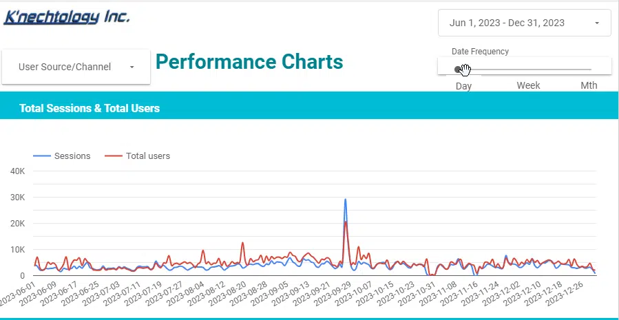
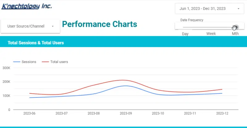
In the above graph, by changing the X-axis to show monthly data, the line gets smoother and the gaps between the two metrics are far easier to view.
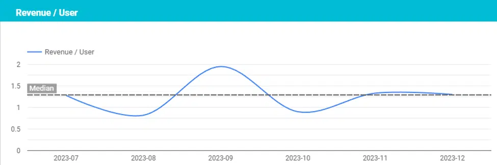
2. Median value
Perhaps you’d like to showcase the median value over a reporting period along with a calculated metric? This option easily allows the viewer to see the performance of the metric compared to the typical value.
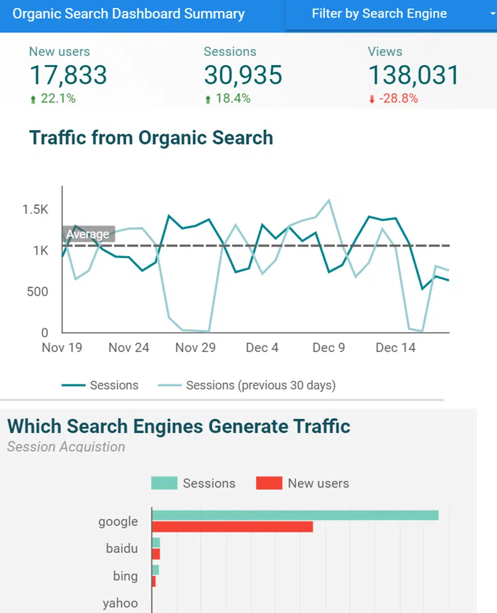
3. SEO performance
You’ll only want your stakeholders to see a dashboard showcasing SEO efforts and results. Simply create a data visualization dashboard and restrict all data to traffic from organic search.
4. Content marketing
What about data for a site that is content-only (blogger, informational site, etc.)? Your dashboard will likely focus on users, landing pages and conversions:

Real-time decision-making and collaboration in a fast-paced digital world
Time is always in short supply. Trends shift, consumer behaviors change and competitors adapt rapidly. Waiting for weekly or monthly reports is no longer a viable option. This is where the real-time capabilities of interactive data visualizations become essential.
Providing real-time updates with user-friendly interfaces, including drill-down options, keeps your stakeholders in the loop. Whether it’s tracking a paid social campaign, assessing the impact of recent SEO efforts or reviewing an email blast, up-to-the-minute data empowers them to make timely, informed decisions.
Real-time analytics dashboards enhance data accessibility, providing you with a competitive edge. The flexibility of real-time analytics, exclusive to GA4 with BigQuery integration, is crucial for digital marketers today. It enables us to promptly identify opportunities and tackle challenges, ensuring data-driven strategies that adapt to the evolving digital world and human behavior.
Using interactive visual dashboards/reports enables collaboration and empowers organizational stakeholders. It ensures everyone is on the same page without granting access to your complex digital analytics. Organizations can customize data access by using specific dashboards and reports alongside role-based access controls to share sensitive information only with those who need it.
The future of data visualization in marketing
As digital marketing evolves, data visualization will play a more advanced role. The future promises sophisticated tools integrating AI and machine learning for predictive analytics.
Picture this: digital marketers not just analyzing the past, but also receiving intelligent recommendations for future strategies through predictive modeling. AI-driven algorithms in tools like Looker Studio and Tableau will inform decisions and actively shape the trajectory of digital marketing campaigns.
Data visualization: The key to unlocking actionable marketing insights
In today’s world of big data, digital marketers face the challenge of sifting through overwhelming information to find meaningful insights. Data visualization is the solution. With intuitive interfaces, engaging visuals and real-time analytics, you can transform raw data into clear insights to guide strategic decisions.
By exploring data interactively, telling visual stories, and enabling collaboration, these tools empower us to keep up with and harness the deluge of data. The future of digital marketing is data-driven. With data visualization capabilities, you can navigate complexity and drive success.
Opinions expressed in this article are those of the guest author and not necessarily MarTech. Staff authors are listed here.
Related stories
About the author