What Is a Sticky Position?
A sticky position, or sticky element, is something that remains in a fixed position as you scroll through a web page.
Imagine browsing a site, and suddenly, a bright, colorful box pops up and sticks to the side of your screen like chewing gum. It could be a funny meme, a tempting offer for free pizza, or even a cool quiz about your personality type. That's a sticky element!
Sticky elements are design techniques that enhance the user experience on websites and in apps by offering users an easy way to access crucial information and perform essential actions. This approach involves placing specific content and elements in a designated position on the screen, allowing them to remain visible as a user scrolls.
For brands, they're a powerful tool with benefits that boost brand awareness, engagement, and conversions. Examples of sticky elements include navigation menus, contact details, or call-to-action (CTA) buttons readily available at a user's fingertips.
Here are some benefits of using sticky elements:
- Grabs a User's Attention: Sticky elements offer eye-catching visuals and placements that capture users' attention to your brand message or call to action. Consider using a bold, visually appealing banner to promote your services or products.
- Tailors Engagement: You can customize your sticky elements to appear on specific pages or display content relevant to a user's interests to deliver targeted messaging.
- Improves the User Journey: Sticky elements can enhance the user experience by providing quick access to customer support, social links, “Contact Us” buttons, or an FAQ section.
- Increases Brand Awareness: A sticky element such as a brand banner can be an ongoing reminder of your business as a user scrolls. Contrary to typical ads, a sticky element remains in place and helps to reinforce your brand's identity to users.
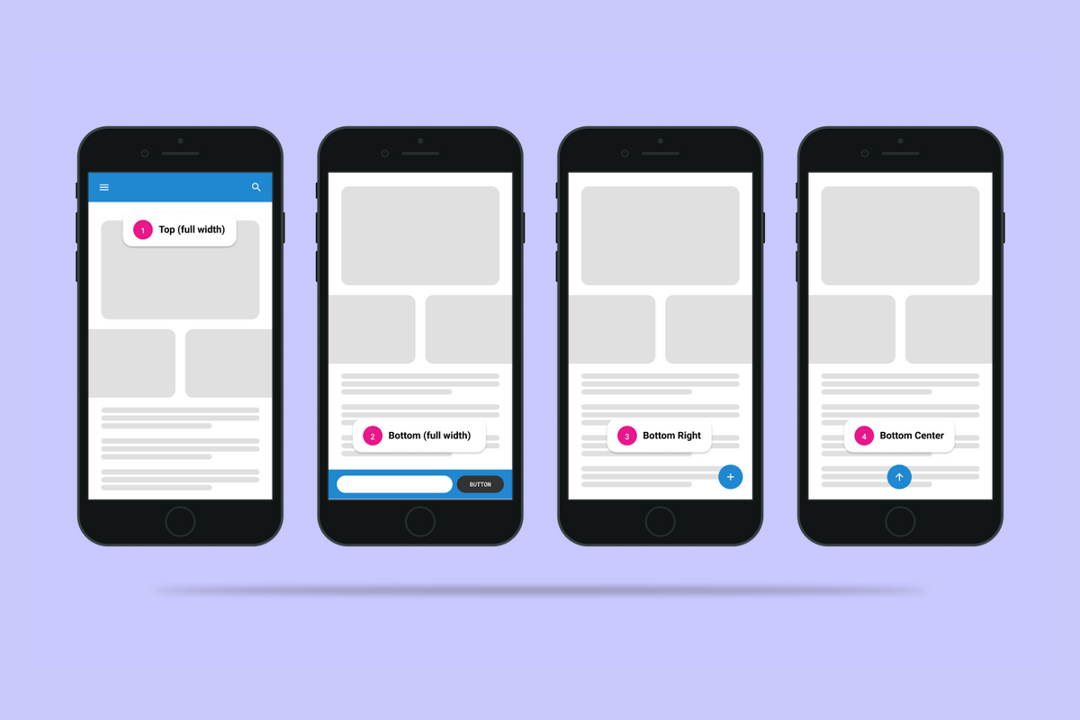
Common Uses and Placements for Sticky Positions
Place your sticky element in the best way to hold your users' attention and convert them at the ideal time. This placement could be on the side of the screen, at the top, or as a pop-up module, depending on what will benefit your users the most. Consider the following popular uses and placements for sticky elements that have the potential to produce gold conversions:
Navigation Menus
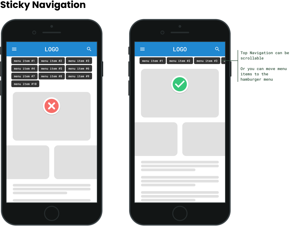
Sticky navigation menus are a common and effective design choice. When navigating a website, you can easily find essential links as you scroll down because the menu always remains at the top. This helps users navigate the site without scrolling up and down, improving their experience with a user-friendly website.
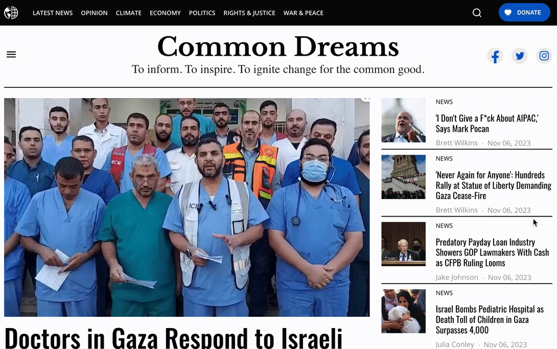
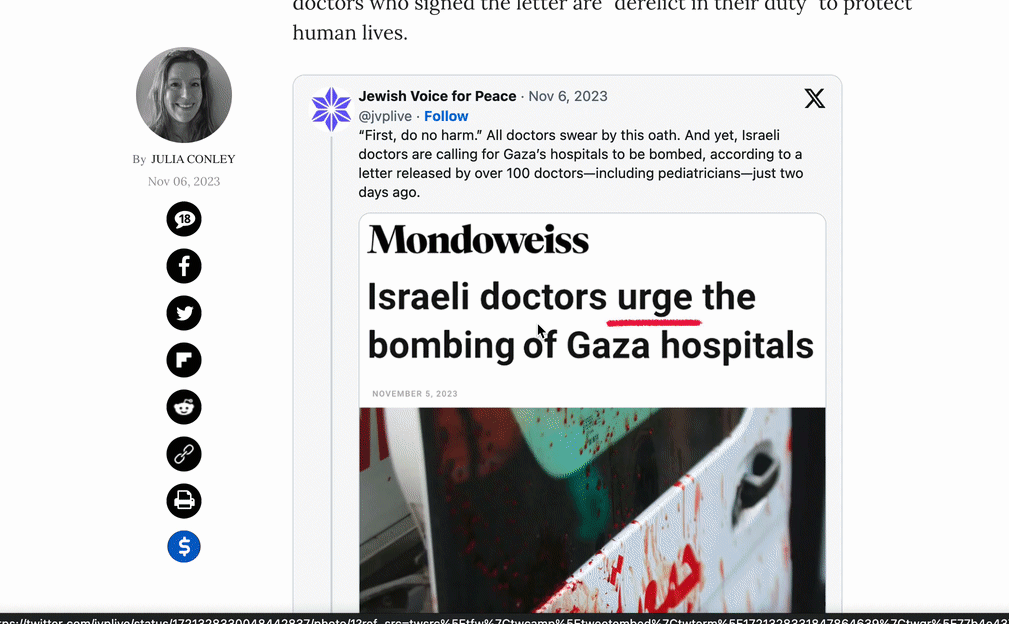
Social-Sharing Icons
Social-sharing icons usually remain visible on the side or on the bottom of a screen. These sticky elements are common for blogs and articles, allowing users to easily share content.
Call-to-Action Buttons
Sticky CTA buttons, such as “Sign Up” or “Buy Now,” are often placed at the bottom of the screen to help users take action.
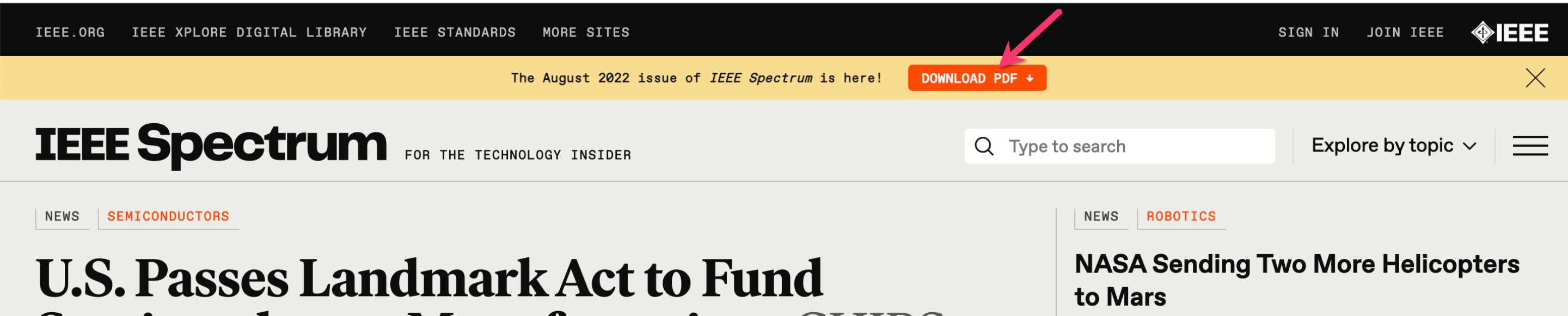
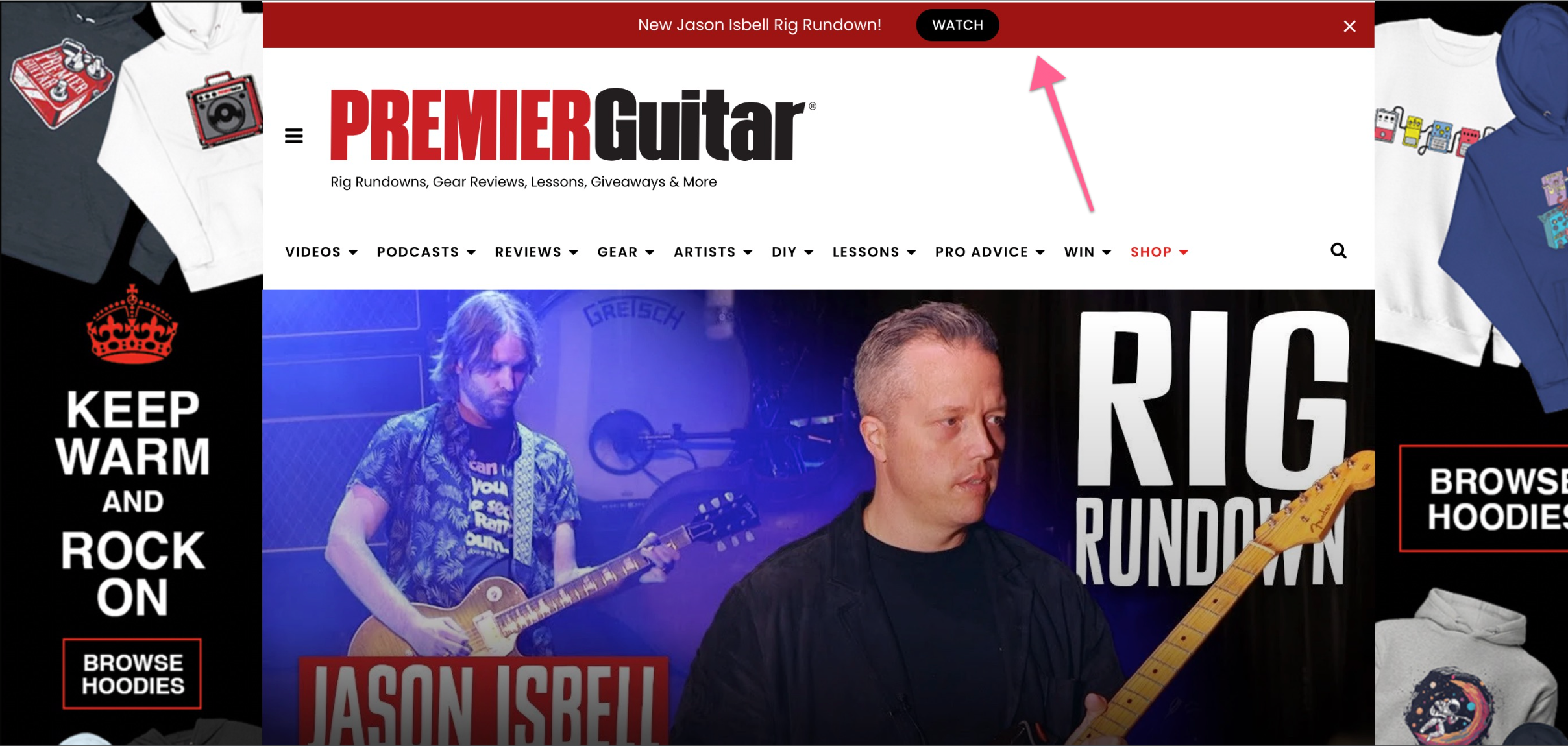
Announcement Bar
With an announcement and promotion bar, you can leverage the top area of your site to inform readers about breaking stories, events, campaigns, or anything else you’d like to feature prominently.
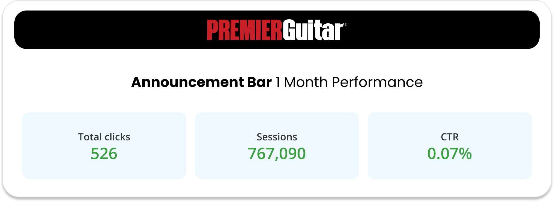
The announcement bar’s monthly CTR can range as high as 31.1% or as low as 0.05% in the first month. One month after implementing their announcement bar, Premier Guitar experienced a dramatic boost in their clicks, sessions, and CTR.
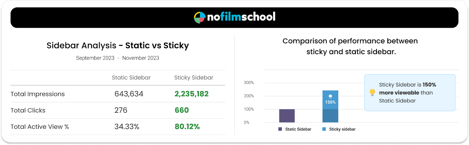
Sticky Sidebar Ads
Sticky sidebar ads increase visibility and revenue while giving users quick access to helpful content. These ads rotate after an entire scroll through to maximize space and income potential, as well as to ensure that users will see them.

Check out the following case study findings on sticky sidebar performance:
Scroll-to-Top Buttons
Users often scroll through lengthy pages, and having a scroll-to-top button offers a convenient way to swiftly navigate back to the top of a page. This is particularly useful on pages with extensive content.
Cookie Notices
A sticky cookie notice allows users to set their cookie preferences and manage their privacy settings efficiently.
Common Mistakes When Using Sticky Elements
Before implementing sticky elements, avoid these common mistakes:
- Avoid Overlapping: Make sure sticky elements don't overlap other essential elements on a page. For example, using a sticky bottom display ad can overlap a footer.
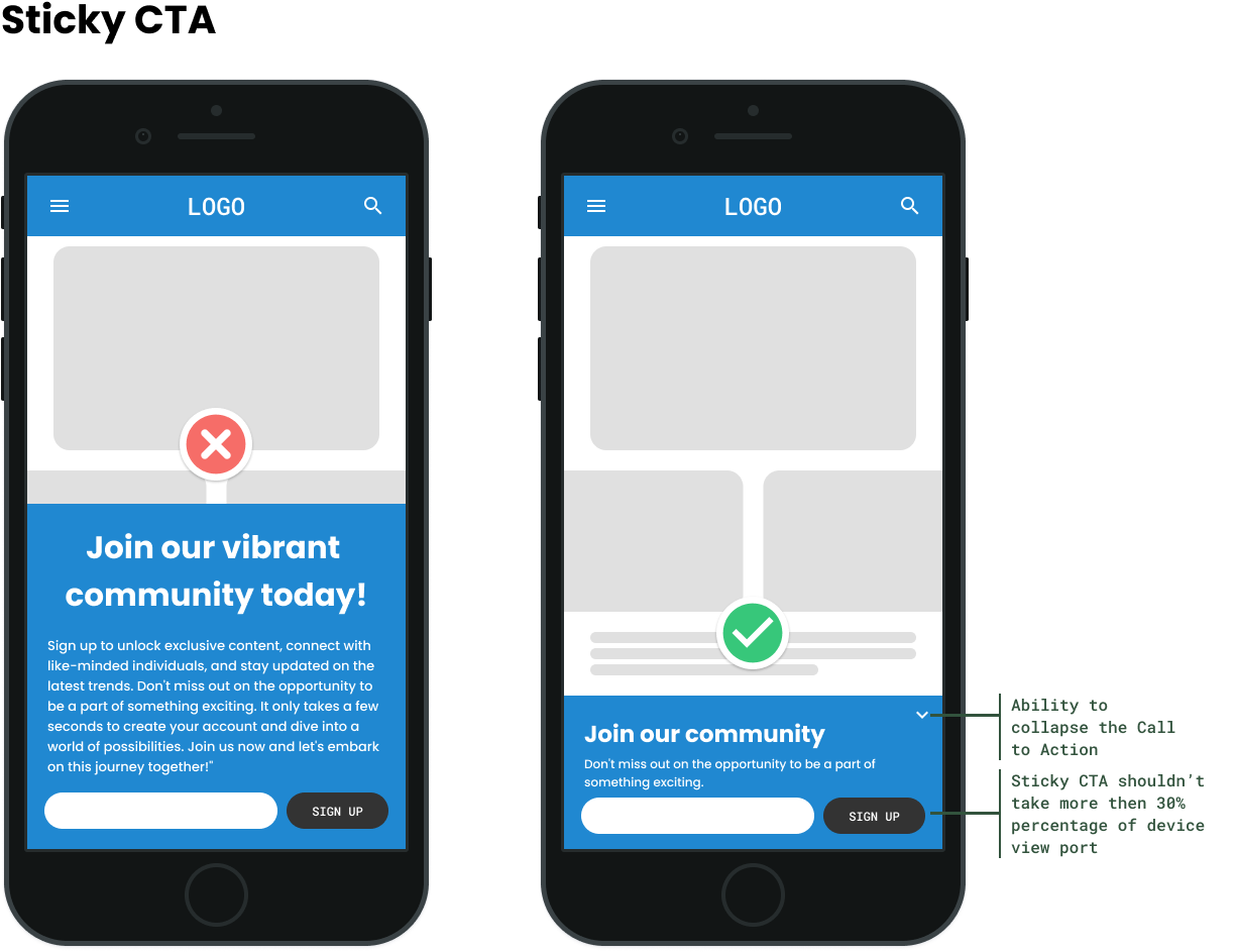
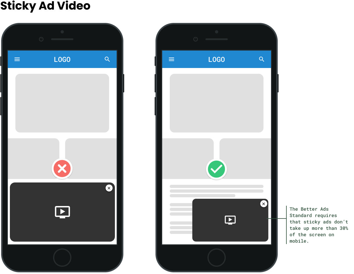
- Use Correct Sizing: Make sure the sticky sidebar fits the window vertically, because sometimes the bottom gets cut off on smaller screens. We recommend using a size that ranges from 300–500 px in height, or having the size be defined dynamically depending on the device being used.
- Create a Simple User Experience (UX): Make sure sticky calls to action or ads have a close or collapse button. This allows a user to remove any unwanted elements from their screen.
- Keep a Consistent User Interface (UI) Design: Make sure sticky elements are consistent and look correct across all devices.
- Steer Clear of Overcrowding: Ensure that you are not overcrowding your screen with too many CTAs, as this can distract and possibly frustrate your users.
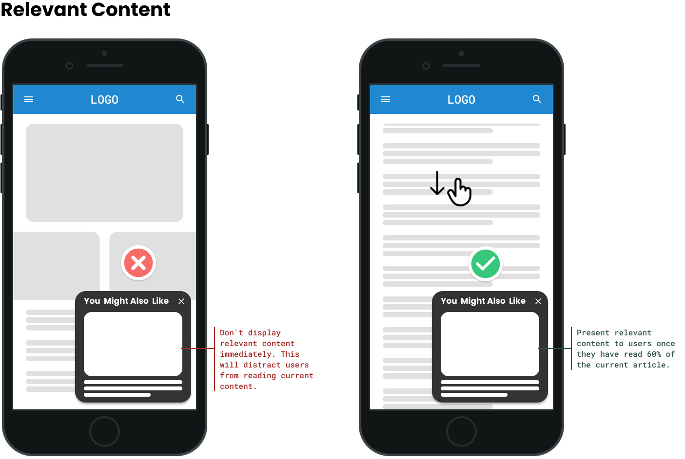
Sticky Element Design Dos and Don’ts
Explore the following collection of best practices, which includes a set of dos and don'ts to guide you toward effectively using sticky elements on your website.
Boost User Experience and Conversions With CSS Sticky Positions
Sticky elements provide users with a smooth and intuitive way to interact with a website. Website owners value a straightforward and engaging user experience that offers instant access to the navigation menu and calls to action that promote conversion.
Before implementing sticky elements, think about platform compatibility across desktop and mobile devices, placement to avoid clutter or on-screen distractions, techniques for evaluating their efficacy, performance metrics, and general usability to make the most out of your workflow. Sticky elements help optimize website navigation and engagement when used carefully and with a user-centric approach.
Need help strategizing around and implementing sticky elements across your site? Contact RebelMouse today to learn more about how we can help you move the needle for your business.


![Best CMS for News Websites and Large-Scale Publishing [2024]](https://www.rebelmouse.com/media-library/image.png?id=51952819&width=600&height=600&quality=85&coordinates=350%2C0%2C350%2C0)


