Transcript
Hi everyone. My name is James Niehaus from FunnelEnvy. And today I want to talk to you about multi-step interactive experiences and going beyond the form. So this is the third video in a series that we focus specifically on a technique we call multi-step interactive experiences. In the first two videos we talked about how to use this on B2B forms to really drive massive improvements in conversion rates. And today I want to talk about how to use the same technique on other parts of your site.
We Will Cover
- A quick recap on multi-step interactive experiences
- Why they work
- How they can work on other parts of your site
- 5 popular ways to leverage interactive experiences on your site
Full Recap of Multi-Step Interactive Forms
If you have not watched the introduction and multi-step advance use cases videos, watch these in these given links.
- Introduction to Multi-Step Interactive Forms
- Multi-Step Interactive Forms Advanced Use Cases(ABM/Personalization)
Examples of Multi-Step Form Flows
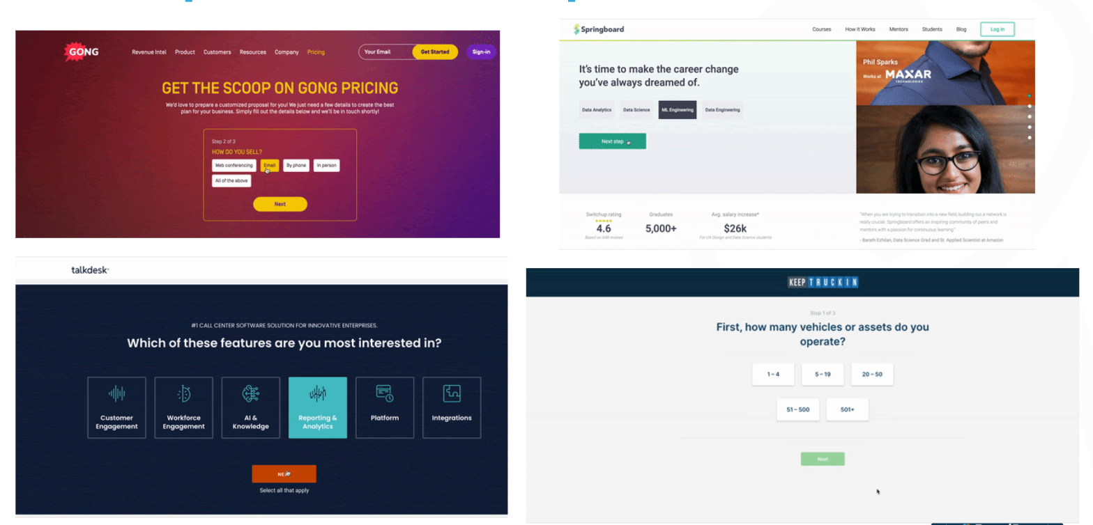
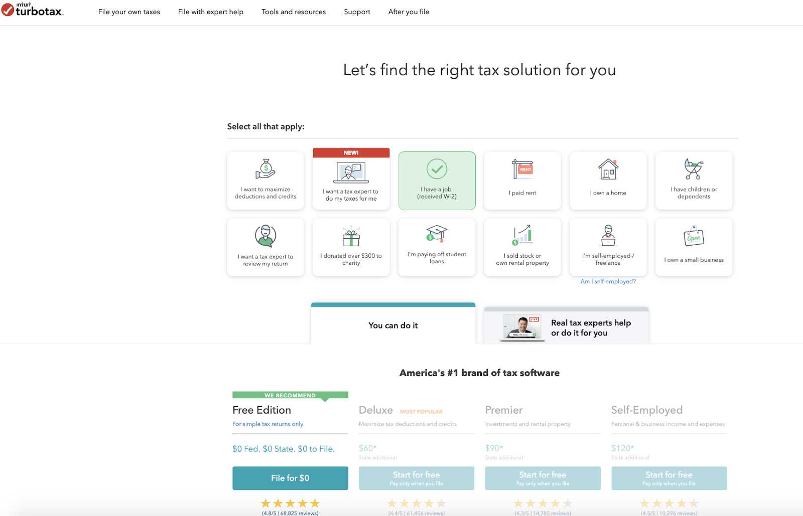
Here are just some examples of past client interactive experiences. So this should be self-explanatory, but as you see here, all we’re doing is taking your typical static B2B form, breaking it up into interactive steps, and leading with intent questions that make it easier for the user to raise their hand, provide you information, commit to the process and convert at higher rates. And we say convert at higher rates, we do mean higher rates. So here are just some examples of recent conversion lifts we’ve seen on client forms just by moving the static forms to multi-step experiences. So as you see here, it’s definitely pretty powerful and effective. And this is also a reason why we kind of then explored using this technique on other parts of the site.
Some Key Takeaways from previous videos
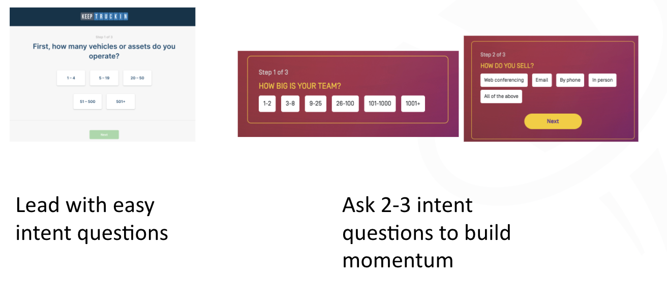
With a multi-step form experience, you usually want to ideally lead with intent questions that’s more about what’s in it for them. What features do they care about? How big is their company? What are they looking to do? What’s their role? But the whole idea here is that asking them easy to answer intent questions, helps guide them down the path towards finding a better outcome or helping you better guide them down to the right solution. So that’s the first takeaway.
The second takeaway is also ideally asking them a couple of those questions first because what you want to do is make it easy for them to get started, continue, and create that momentum and commitment to completing that process. And that’s how we get the higher conversion rates.
And then the nice part about this technique is that you then layer on additional strategies, and this is where it gets even more powerful. So on the left, you see an example where we actually start personalizing step two and step three of the form experiences based on what they provided as an answer in step one. So this is where it can get a little more targeted and personalized. Or on the right is a good example where you can use their information to then potentially route them to a different funnel or flow. An example there, they’re using company name, based on the email address, to decide whether they should send them to a scheduler as you see there, or to just give them the rest of the regular form. So this is where you can potentially provide custom experiences based on company size or target account or their role or what they’re looking to do. But this allows you to then go from a one size fits all static experience, to providing smarter, routed experiences that align with your personalization and ABM strategies.
More Powerful w/ ABM + Personalization
Personalize the rest of the form by their inputs
Multi-Step Works Beyond Forms
Multi-Step isn’t just for forms. They can work on most parts of your website. I mainly want to focus on five key areas of the site, or techniques.
Step #1 Homepage: funnel them to a multi-step form flow on the entry
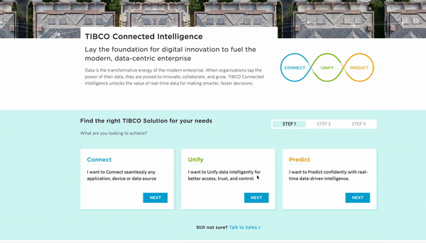
So starting this all off, starting the funnel on the home page. So for most B2B sites, the homepage is typically a static billboard that tries to communicate one message to a broad and diverse set of visitors. So recognizing that you’re probably not going to align exactly to what that user’s intent is, the idea here is that you actually use the homepage real estate to engage the visitor. And in this case, engagement means trying to get them to raise their hand, express intent, and get started with you, and go down a certain conversion funnel right at the homepage. So whether you start interacting then with them, with engaging questions on the left, you see examples there. Or, if they click on a certain action, present out that type of experience. But the whole idea here is that, rather than guess at what their intent is, or how they want to get started, give them some options to make it easy for them to kind of start exploring. And ideally, without even knowing, go start kicking off that conversion funnel from the home page.
Step #2 Homepage: guide and route users to the right content by intent
Use the homepage strategy, and instead of taking them to a form flow, guide and route those users based on their intent, to a better page or a better flow.
So that here is we’re trying to help them by skipping steps and helping them land on the right page so you can cut down on the cycles to get them to where they want to go. So this is more about routing and navigation. But again, the whole benefit of these techniques is that we’re engaging them from the get-go. We’re not forcing them to kind of decide themselves, try to find the right information, and leave it up to chance that they find the right place to go. And this same strategy makes a lot of sense on product pages.
This is an example of one of our clients, where on the left you see their traditional static page. As you see there, it’s your typical solution type page where you provide a lot of content. And give them their choice but through a lot of text and diagrams.
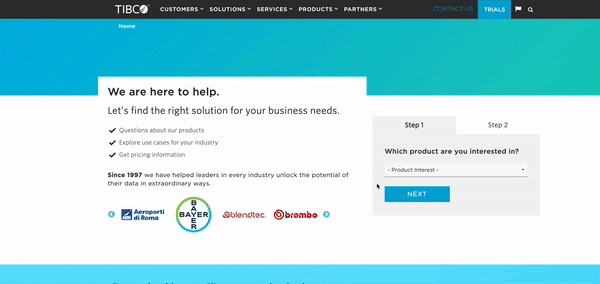
Step #3 Product Page: help them find the right solution
On the right, it’s taking that same content and packaging it up into interactive questions to make it easier for them to kind of, again, find what they’re looking for, raise their hand, express their intent or interest, and you help navigate them to the option that makes the most sense. So we saw some very positive engagement and conversion metrics when we did this technique on product pages like in this example here. But the whole idea here is you’re trying to provide that educated, guided hand that helps them find better what they’re looking for based on what they told you. So in this case you’re being helpful, helping them complete their job better, and in a more timely fashion. And of course, this makes sense on your product and pricing pages. So when you have packages and plans, most B2B sites have your typical good, better, best, here are three or four plans, whether it be based on company size or number of seats needed, or whether it be based on certain features, that’s your typical layout that we’re all used to.
On the product pages, a nice technique is to really use the strategy to help them find the right solution.
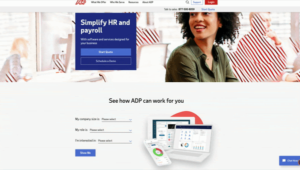
Step #4 Plans/Pricing Page: help them find the right package
The plans and pricing page is also another great place to use it to help them find the right pricing package or combination.
So we’re not saying you have to move away from that, but in these examples here they still show those tables of plans, but in both examples here they give options where, if you want to specify your interests or what you’re looking to do, or maybe talk through a questionnaire about who you are and what you’re looking for, they can then narrow down the plan packages to fit what you provided them as far as intent or profile. So the whole idea here is that, when you have a little more complex set of packages and pricing plans, rather than have them guess or maybe choose incorrectly, or maybe just waste their time combing through all of this, you give them an easier path of which they just simply specify what is their key intent, profile questions, and use that information to help narrow and guide them down to the right package or pricing plan that works for them.
Again, you know your product more than anyone else. You’ve seen the success of your products and packages on a variety of clients across your industries. This is all about using that intelligence to better guide new visitors, who first come to your site, come to your pricing page, and help them find a solution that fits their needs and best matches their profile. Because you want them to be successful, and this is your chance to guide them down that path in a more direct way. And both sides will win in the end.
Step #5 Quizzes/Calculators: help them get insights
And lastly, we shouldn’t forget the fact that, for most B2B sites, they do have interactive experiences typically in things like your ROI calculators, your organizational assessments, your company benchmark, and your various quizzes, right? So by all means, these are great options and techniques. We encourage you to keep using them. So in the end we’re just fans of anything that provides that interactivity. We’ve seen, from years and years of testing, that whenever you can give the visitor a chance to interact, raise their hand, you make it easier for them to get started, you reduce the complexity of that visit by allowing them to be guided down the right path. And you actually end up having more control over where they go through their journey, which is what we really want to do. Ideally, if we had a choice, we’d want to guide each visitor on the right journey for them.
Since we can’t really predict who they are and what they want, we think interactive experience are the best way to meet in the middle and provide them a set of choices that allow them to kind of really narrow down to their best options based on what their profile is and based on what their intent is. So it’s really a win-win for both sides.
Key Takeaways
- Multi-Step experiences, especially on the forms, work great as a great conversion tactic
- It works even better when combined with your ABM/Personalization strategies. So this is a great example where your conversion techniques and your strategic techniques should really work well together because they really compliment each other very well.
- They really work well in a couple of key places, like your homepage, your product pages, your pricing and packaging pages, as well as your traditional quizzes and calculators.
- Here are 5 ways to get started:
- Homepage: Start them in a conversion funnel
- Homepage: Route them to the right page by intent
- Product Pages: Find the right solution(s)
- Pricing/Plan: Find the right package
- Quizzes/Calculators: Provide custom insights
So really want to say here, we want to advocate for it, try it out, explore this on your site, you really won’t regret it. This is, again, better experiences for all.
And then lastly, as I said, if you haven’t had a chance yet, go visit our site. We have a couple of other videos that talk a little more in-depth about the strategy, especially as it relates to forms and personalization, and ABM. So check it out if you haven’t had the chance yet.
If you have questions, just drop me an email. And if you want to see our own interactive quiz, you can hit our website. And that quiz will actually help you evaluate whether you’re the right fit for working with us. So check it out and hopefully we can talk soon. With that, take care.