How to Design Accessible Emails for Color Blindness
You already know accessibility matters. As email marketers, making sure that everyone reading your email gets to love and appreciate it is *chef’s kiss* 👌
But for whatever reason, accessible design has this reputation as “a lot of extra work.” (Spoiler: It’s not.) Accessibility, especially in design, is less about flipping a switch—although we do have a switch for that—and more about changing how you think about design in the first place. Color, spacing, font, and layout all matter.
Today, we’ll look at one very specific aspect of accessibility in email design: How to design for readers with color blindness. We’ll cover why making sure your emails are visually accessible matters, what you can do to make that happen, and look at some common errors folks may experience along the way.
Ready? Let’s dive in.
Why is it important to design for colorblind users?
Great question, we’re glad you asked. Accessibility matters because your audience matters—and with over 3 million email users worldwide, that audience views and experiences your beloved in emails in a wide variety of ways. In the same way that different subscribers view your emails in different email service providers (ESPs), subscribers all view your emails with different visual capabilities, too. And just like designing for Dark Mode or Outlook, it’s important to make sure those users have a good experience with your emails.
It can be easy to think of your subscribers as numbers on a screen. But they’re people, too, and your job as an email marketer is to make connections with people, not just hit the numbers. Making sure your emails reach the people you want to reach matters.
How common is color blindness?
Color blindness is much more common in men than in women. It occurs in about one in ten men, according to the American Academy of Ophthalmology, and about one in 200 women. About 350 million people around the world are color blind (that’s about the population of the United States!)
Color blindness doesn’t mean a person can’t see. Every eye contains two types of cells that can detect light, called rods (which detect light level) and cones (which detect color.) Color blindness occurs when one or all of the cones in the eye are missing, damaged, or perceive a different color than normal. This results in a visual impairment where a person cannot distinguish between certain types of colors—usually reds and greens. While the majority of color blindness is congenital, it is possible for color vision issues to occur later in life as the result of disease or eye trauma.
What are the different types of color blindness?
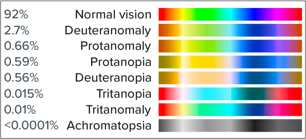
There are a range of different visual impairments that can impact a user’s ability to perceive color in different ways.
Image source: Wikipedia
Here’s a list, based on the data from the National Eye Institute:
1. Red-green color blindness
Red-green color blindness, as you might guess, makes it hard to tell the difference between red and green.It doesn’t mean a person can’t see the colors at all, just that they are difficult to compare. This is the most common type of color blindness, and there are four different varieties:
- Deuteranomaly is the most common, and it simply makes green look more red than it might otherwise.
- Protanomaly is the opposite—it makes red look more green, and less bright.
- Protanopia and deuteranopia are more extreme versions of both of the above. These versions of colorblindness mean that you are unable to distinguish between red and green.
When we talk about color blindness, we’re usually talking about red-green. But it’s not the only kind of color blindness.
2. Blue-yellow color blindness
Blue-yellow color blindness is a less-common type of color blindness that blurs the line between blue and green, and the line between yellow and red. There are two different types of this variety of color blindness:
- Tritanomaly is the simplest type, and makes it hard to tell the difference between blue and green, and between yellow and red.
- Tritanopia causes you to be totally unable to tell the difference between blue and green, purple and red, and yellow and pink—as well as making colors look less bright.
While less common than red-green color blindness, it’s still something to consider.
3. Complete color blindness
Complete color blindness is actually quite uncommon. This type of color blindness means you cannot see colors at all, and is technically called achromatopsia.
How accessible emails appear to color blind readers
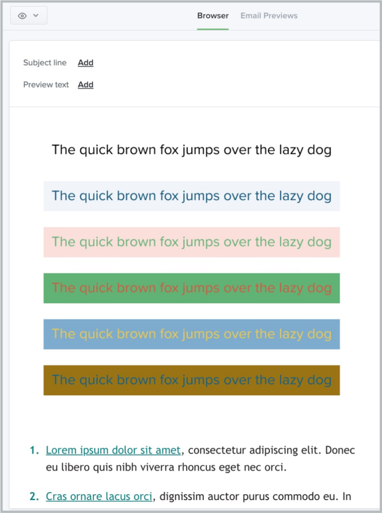
Let’s look at an example of how accessible emails appear to color blind readers using Litmus’ Visual Impairments Filter. Here’s an email before any filters have been applied to it:
It’s pretty simple, with black text on a white background. Now, let’s add a filter.
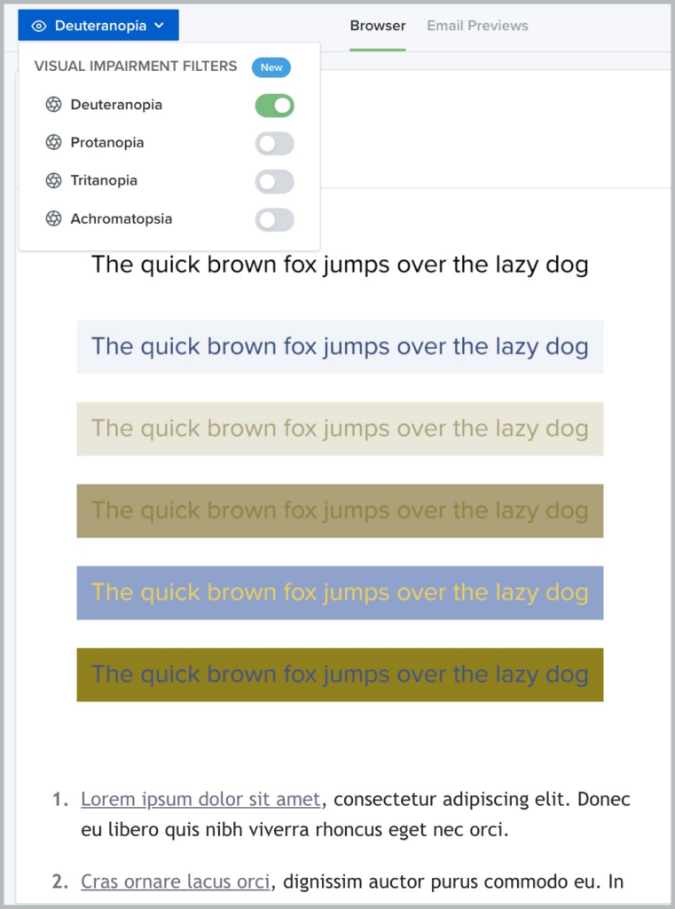
This is how that same email might appear to someone with deuteranopia. Notice how the difference between red and green disappears almost entirely, and the email appears to include mostly yellows and blues.
By using a simple background and high contrast text, however, we’ve ensured that all the text remains visible to readers with this visual impairment. We’ll talk more about accessible email design best practices in a moment.
Do you need to create a separate email for color blind users?
No, you don’t need to create a separate email for color blind users. That’s because optimizing your email for color blindness actually makes your email campaigns more accessible to everyone—whether or not they have a visual impairment. We’ll talk more about how to do that below.
5 best practices for designing emails for subscribers with color blindness
When designing for readers with color blindness, it’s natural to start with color. But it’s not the only aspect of your design that matters for accessibility. We’ll take a look at how other elements of your email design help convey your message more clearly or make it more confusing for those with color blindness. Here’s what you need to keep in mind:
1. Choose colors so text is easily readable
Your color choices are the most important aspect of designing emails for readers with color blindness. As you think about what colors make sense for your next email campaign, it may make sense to work with your design team to translate the visual language of your brand into something better suited for email.
Choose high-contrast colors
The more high contrast you can make your emails, the more accessible they’ll be. Contrast refers to the difference between color hues. No matter what your brand colors are, you’ll want to stick with only a few colors in your email—no more than two or three at the most. Not sure where to start? Pull out a color wheel and go for the colors opposite one another, like blue and orange.
Pay attention to your background color
Make your text easy to read against any background. (Sorry, MySpace users with your pink-on-purple pages.) High contrast text and background color combinations work the best here, like the classic black on white or Dark Mode style, white on black.
Steer clear of certain color combinations
With color blind subscribers, you’ll want to avoid certain color combinations, like red/green, blue/yellow, green/blue, and blue/purple. It’s not about which colors you use, but about the combination of colors that matters in your design—and how important it is to the overall message of your email.
2. Don’t solely rely on color to convey information
The next big thing we can do to design for color blindness is to use more than color to communicate ideas. Every element of your email design can convey information—now it’s time to use that real estate. This requires a little bit of thinking outside the box, but can be a powerful tool in your design arsenal.
Incorporate icons or shapes into your design
Adding icons or shapes into your email design can add a backup layer of communication for your message without relying on color.
“Thinking beyond color can look like a lot of things in an email. You can use shapes, sizes, symbols, borders, hover effects, motion, fill, or stroke effects to communicate a message without using text or color.”
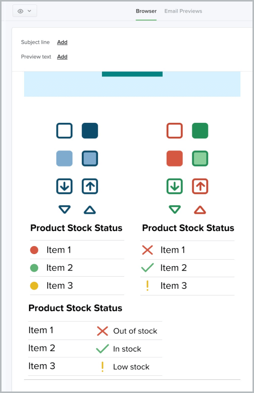
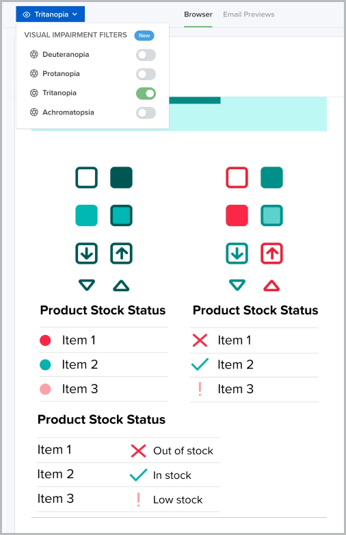
Here’s an example of what this could look like using icons or shapes in addition to color to communicate a message. First, let’s take a look at this email with different approaches to product stock statuses:
Red, yellow, and green indicate when something is in stock or not, using the traffic light system.
Now, here’s our same email as above, this time with the tritanopia filter applied. Looks a little different, right?
We can see three iterations of a message indicating a product’s stock status—but all three aren’t created equal. When the blues and yellows in the email are significantly reduced, the meaning of each icon is clearest when the shape of the icon communicates the status of the product, not just the color of the icon.
This is a great example of how to use shapes to communicate, rather than—or in addition to—color.
3. Organize your email in a clear and logical order
When a subscriber opens your email, they want to get the message as quickly as possible. Using a simple, clear layout makes this possible, whether you’re sending a newsletter that’s mostly text or a sales-driven campaign that’s showcasing new product images. Most emails follow the same pattern: a header that introduces your email campaign, body copy that adds more detail, and then a call-to-action.
Source: Really Good Emails
This email is a great example of a one-column design. A clear image, high-contrast text, and a CTA button make it easy to understand.
Source: Really Good Emails
You can also choose a classic S-curve design like this email from Krispy Kreme. This keeps the eye moving from side to side, pulling the subscriber down to the CTA.
4. Think of your text as visual, too
We often think of copy as separate from design, but the way you arrange the text in your email is its own design element, and one that you can optimize for accessibility, too. Using large text, easily readable fonts, and plenty of negative space goes a long way for readability.
At Litmus, we use at least 18px for body copy, and the smallest text in our emails (like footer copy or captions) is 14px. We also always left-align our text so it’s easier to read.
Actually use text in your emails
One of our biggest pet peeves in email design is the trend of image-only emails. Not only are they not accessible, they often break in funky ways across different email clients and devices, making that sleek image your graphic designer worked hard on disappear. Your emails should be more than one big collection of images so that no matter what happens to image displays, anyone (color blind or not) can understand what you’re trying to say.
Add a plain-text option for colorblind readers
Adding a plain-text version of your email is another way to add more text, too. Most ESPs have the option to add or edit a plain text version of your HTML before you send. Checking this box gives your color blind readers one more way to be able to engage with your campaigns without needing to figure out why you’re sending an image awash in gray.
Don’t forget your alt text
Alt text is one of those email elements that is so easy to do for accessibility but often gets overlooked. And it’s not just for color blindness—with more users turning off or blocking images, it’s a useful addition to your email for everyone. Good alt text clearly describes an image so that if a reader can’t see it (for whatever reason) they still understand what you were trying to convey.
5. Use Visual Impairment Filters
The best way to ensure your emails are accessible to those with color blindness is to use a tool that checks how your email looks to people with color blindness. You could also review the WCAG standards, use color contrast plugins in design tools like Figma, or use other third party tools for each email campaign. But these can add time to your design process and your overall workflow.
That’s why we advocate for integrating accessibility tools into the tools you already have and already use (pssst…like Litmus!) This is both simpler, and a better way to think about designing for accessibility, whether you’re thinking about color or other accessibility features.
Since there are so many different variations of color blindness, it’s important to test your emails against all of them. Each email can display a lot of different ways to a lot of different eyes. I mean…
Plus, since different email clients can mess with color contrasts, you’ll want to not only test with visual filters, but also test for different ESPs, as well. You can feel the headache coming on, right?
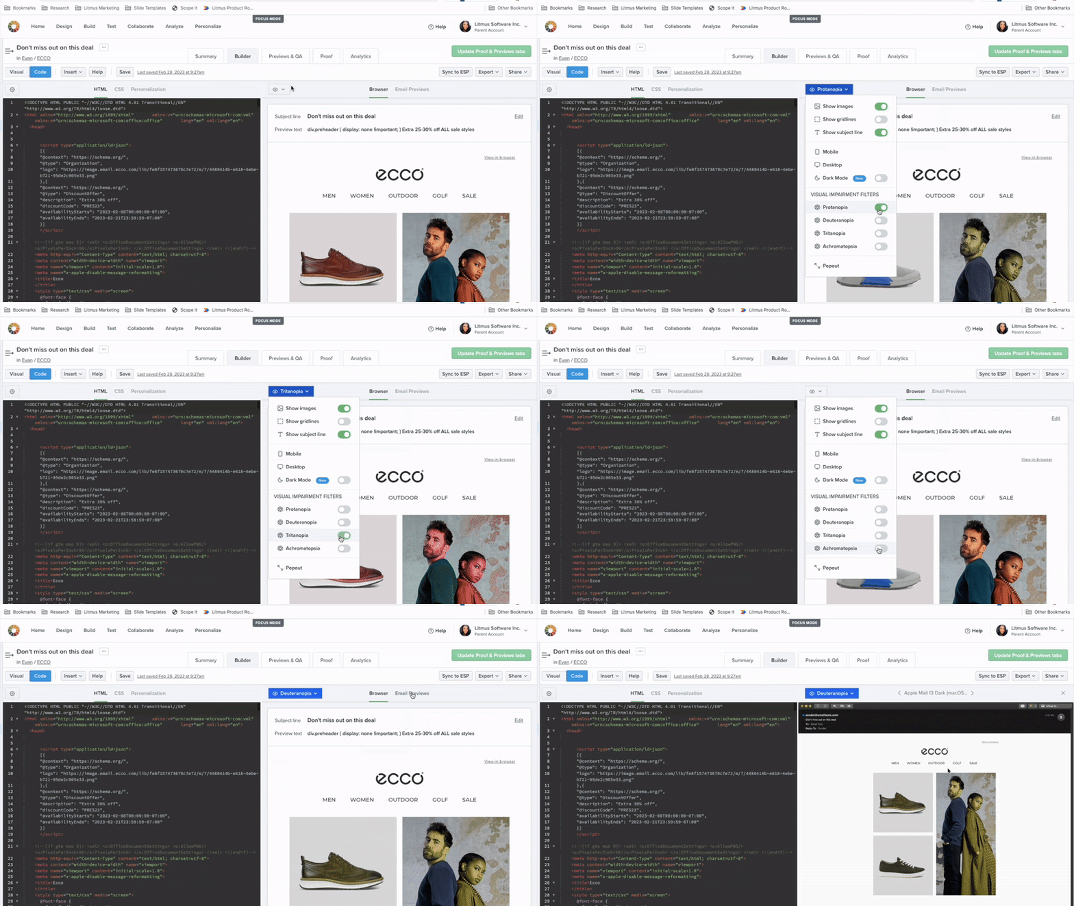
For Litmus users, we offer the Visual Impairment Filters feature across Builder, our Previews & QA checklist, and Proof. This feature gives our users the opportunity to view their email as their recipients will with color blindness related visual impairments.
By utilizing this feature, you can easily check to see that text is visible against backgrounds and check your color use across ESPs. With Litmus, it’s easy to design emails that can be viewed in a multitude of ways with a wide range of color detection capabilities.
Create more accessible emails for subscribers today
Designing for accessibility isn’t about checking a box. It’s about making your emails easier to read and understand for everyone, whether they have a visual impairment or not. Color blindness is just one aspect of accessibility to incorporate into your designs. Let’s make email better for everyone. Get our ultimate guide to creating accessible emails.
P.S. How are you and your team designing accessible emails? We love seeing examples of accessibility in action, so send any examples you have our way! We’d love to feature them.

Abigail Sims
Abigail Sims was a Content Marketing Manager at Litmus
