The end-user experience is a key, if not the most critical, consideration to crafting a successful new website. Seamless, exciting interactions between site content and its users are what deliver relevant information and a memorable experience initiates repeat visits. A poor UX design can leave users feeling bored or even frustrated with the website and associated brand. In order to avoid these UX pitfalls and have the highest chance at digital success, Bluetext has curated a list of our favorite and most functional UX design practices. See below for some examples of website interactions we’ve designed with the goal of keeping users engaged and getting users excited about the content in front of them.
Functional Micro Animations
For many organizations that release a new site after rebranding, a major goal of the new website is to get users to explore further content. There are numerous ways that clever UX design can subtly assist in this mission. User experience designers will tell you that subtle, almost subconscious psychological cues are the most effective ways to promote the discovery of more content. Especially when promoting brand identity, it’s important to keep in mind users’ priorities. They are visiting the site to find answers to their questions, not necessarily your brand’s life story. That being said, your brand’s story is still important but just needs to be presented in a clever way to sustain attention.
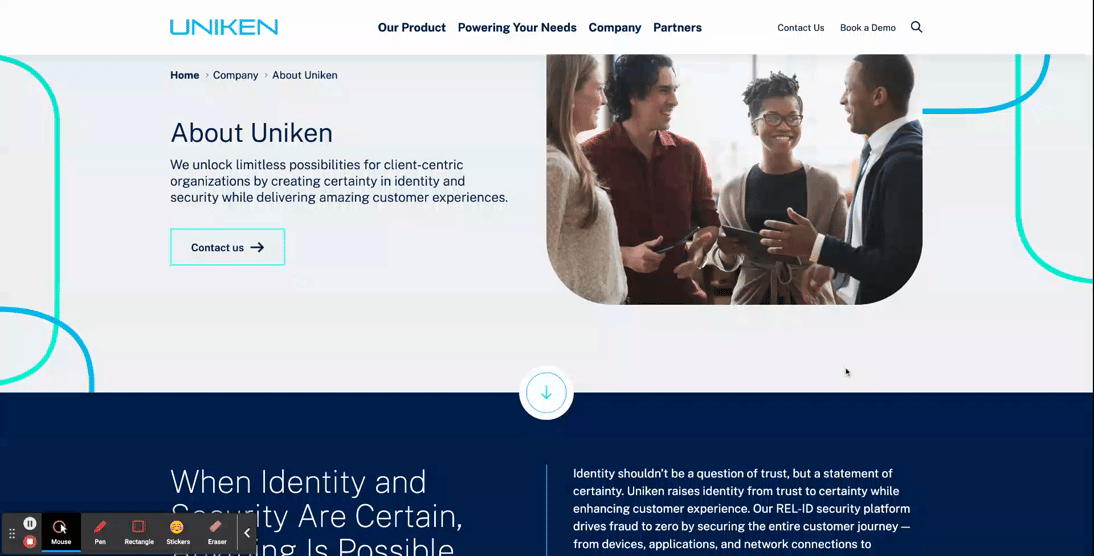
- Subtle motion can be used strategically to lead users’ eyes further down the page. Micro-animations such as the ones shown below create a natural sense of downward movement, which encourages users to move in that direction by continuing their scroll.
- Arrows can be used as quick jump links to reduce the required scroll and boost users to the sections of the page that are most important. This is especially helpful for brands that develop rich, visually dominant hero zones but want to allow users to quickly get past the first area of the page in order to discover more informational content.
Your brand doesn’t have to be high-tech or bold to incorporate the newest UX/UI trends. Even simple, sleek micro animations like card interactions on hover can make user experiences more delightful without detracting from the authority that comes with more traditional, conservative brands.
- Fairly simplistic card interactions can be used to reveal more information on hover and add more excitement to the user experience.
- Animated elements can also be used in hover states to add visual interest; this is particularly effective when users will be viewing the hover state for an extended period of time (in this example, for long enough to read a short paragraph of text).
Stylistic Micro Animations
Micro animations aren’t just used for functional purposes; animated elements can also be used to highlight core brand elements as well. Creating unique, ownable applications of motion to brand elements can be an effective way to show off the new brand, as well as cut down the need to use generic or less impactful stock imagery to add visual interest to page content.
- Animations in the hero zone are one tactful way to customize the UX design to bring greater excitement and powerful visuals to the front page of the site.
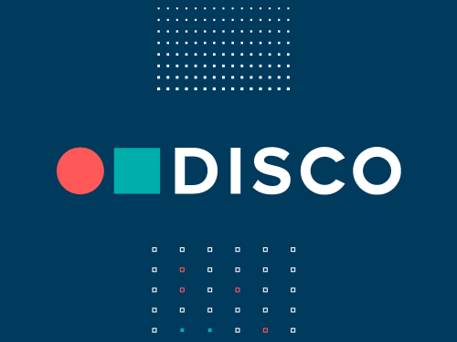
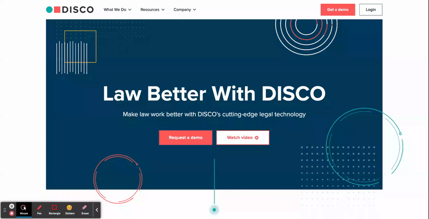
- DISCO: See how this AI Legal Technology company uses subtle animated elements throughout the hero area of its homepage to add stylistic visuals without relying on imagery. As an added bonus, they’ve also included a functional element of animation in the hero. The blinking dot at the bottom of the viewport isn’t just a cool visual; it’s also a subtle indicator to users that they should look further down on the page, where there’s more to be explored.
-
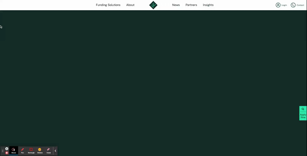
- Libertas: In a more streamlined hero design, this financing organization uses its logo mark as the major focal point of the hero. This animation is a grand introduction to the website, sweeping onto the screen to populate what starts out as an empty, unassuming hero zone.
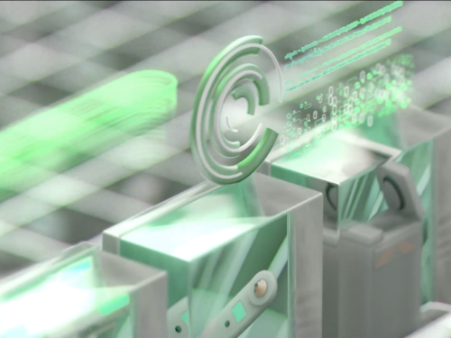
- Animations can also be used as key design elements for interior components as well
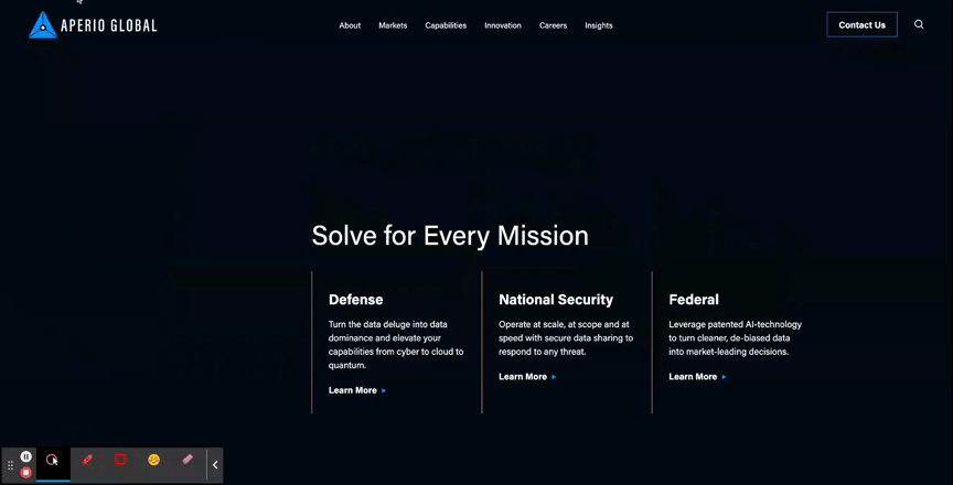
- Aperio Global: Here, you can see how this cyber company applied motion to a key graphic element of their brand to turn a text-based component into an eye-catching section of the page.
Unique Scroll Effects
One major challenge to website design is that users can get exhausted or frustrated with having to scroll through long pages of content. While it is best practice to keep page content concise when possible, another way to mitigate scroll fatigue is by creating interesting scroll effects that feel less effortful for users.
- The Parallax Scroll is an effect where the background of the page appears to move at a different speed than the content in the foreground. This can be an effective way to make the scrolling for users feel like it’s moving along quickly and seamlessly.
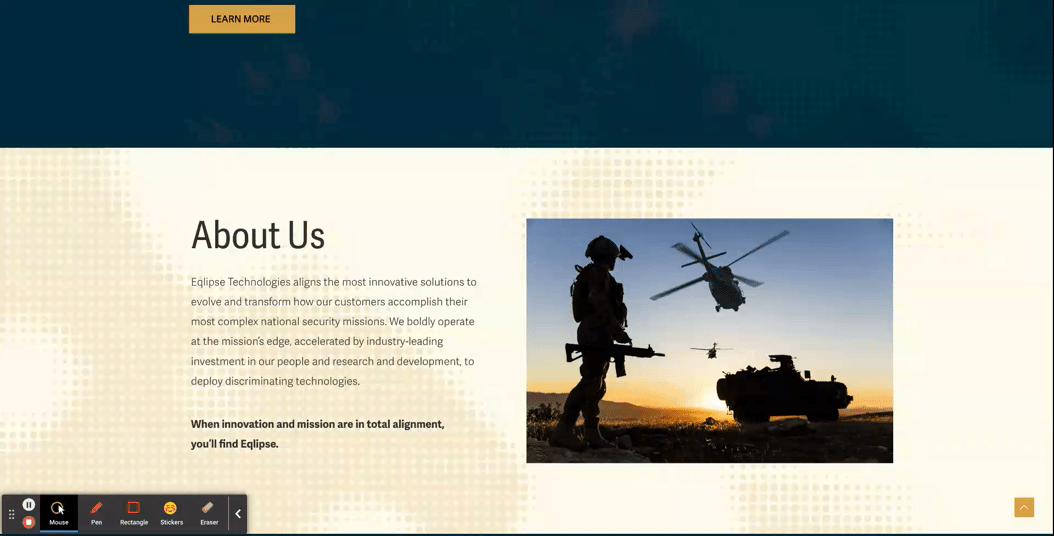
- Eqlipse: See how a static background image creates the appearance of a quicker scroll.
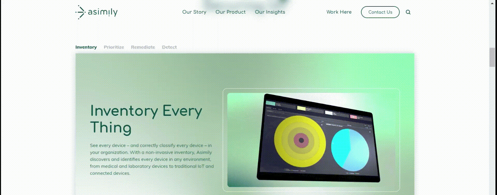
- A Locked Scroll is an experience where the page viewport stays “locked” in place, where only the featured information of the page switches out. A user cannot scroll up or down on the page without scrolling through all the information. Feeding content to the users in smaller bite-sized sections like this helps ensure that the users don’t skim through important information hidden under tabs or within large blocks of copy.
- Asimily: In this example, when a user scrolls down the page, the content switches over to the next tab’s information without changing the positioning in the viewport, and the tabs continue to filter through as a user scrolls. After they’ve navigated all the tabs, then the page experience continues more traditionally, so that the viewport shifts at the same speed as the scrolling.
Immersive Scroll Experiences
For modern, industry-leading, high-tech brands, one way to convey that they’re always staying ahead of the curve is by curating a website experience that is equally as bold. Immersive scroll experiences are one major trend for website design that companies can use for more cohesive storytelling on their website. If you’re interested in learning more about this design technique, read our UX Trends in Immersive Scrolling blog for a more detailed explanation of what makes a page experience immersive.
The creative minds at Bluetext are always excited about the opportunity to explore how branding can be applied to create a high-impact landing page that guides users through an immersive scrolling experience. See some of our favorite examples below:
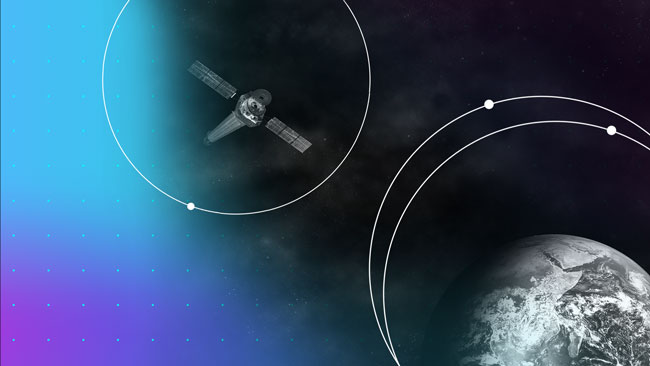
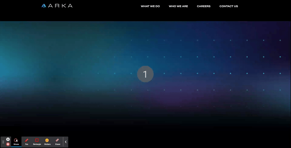
- ARKA
- With an aspirational message at the top of the page, “Beyond Begins Here,” the hero zone of this page kicks users off on an exciting journey. Notice that, while there are images, graphic elements, and motion incorporated in the first viewport, the messaging is the focal point of the screen. Project managers at Bluetext work hand-in-hand with designers to ensure that amazing visuals never overshadow important information.
- The placement of design elements is used to direct users where to go. You’ll notice that there’s a slight peekaboo of the next information on the page so that the user knows there’s more to explore. Additionally, the circles following the orbital patterns on the screen intentionally dip out of sight and into the next viewport, just another way of leading users to the next viewport.
- As you scroll further down the page, the text is animated to slide onto the screen, and images grow larger as you settle into the viewport. Since immersive pages tend to have more information on them, this allows users to ease into the components, rewarding them with exciting visuals for each new section they scroll to. This type of interaction tends to keep users on the page for longer, and they feel more engaged with the dynamic content rather than just scrolling past static areas.
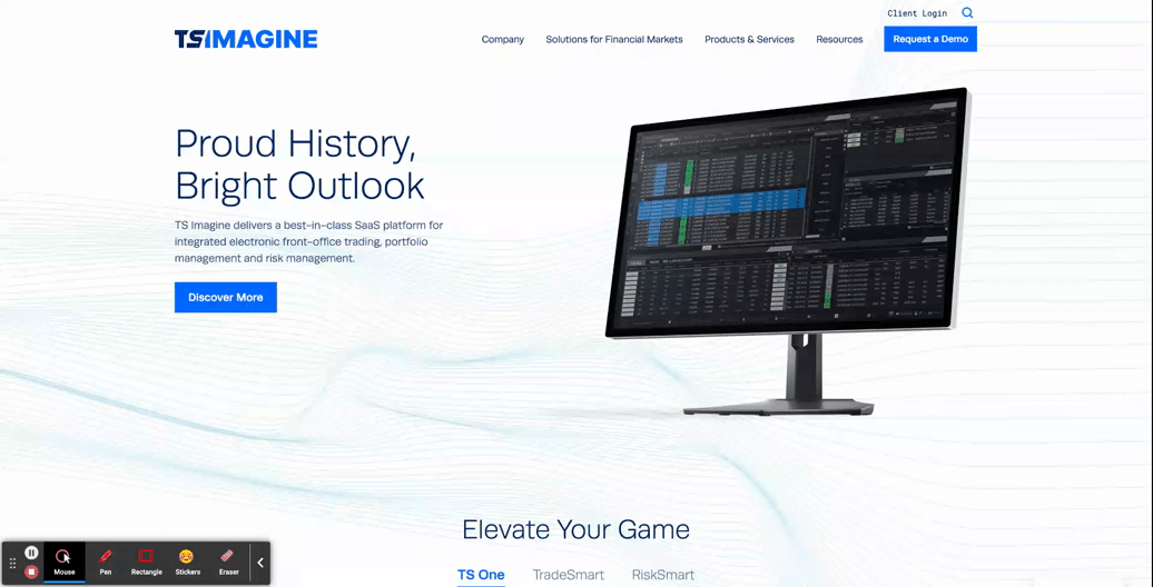
- TS Imagine
- The top portion of the TS Imagine homepage is a great example of how animation, graphic elements, and content placement all work together in an immersive experience to lead the user smoothly from one piece of content to the next.
Designing a smooth and exciting user experience for your brand’s website is a major undertaking. Whether you are updating a current website or starting from scratch, a design agency can help you to consider the best options for your user experience during every step of the process, to ensure that your new site is using UX to the fullest.
Need help? Contact Bluetext to get expert support in perfecting your user experience design.
Recent Posts
Bluetext’s Recent Work