
Making HTML emails instead of all-image ones is easier than you think
Email’s been around for 50 years as of this year, but in the beginning, it was all plain text emails. The idea of email marketing was born in 1978, but it wasn’t until the 1990s that HTML email became a thing. In the early world of email marketing, email SPAM was a common annoyance and email clients used many different filters to help block SPAM. One of those filters blocked all-image emails. As early as 2007, Mailchimp found that using a giant image in your email could cause your email to be blocked and increase your bounce rate by up to 23%.
As email marketing has evolved, so have SPAM filters. These days an all-image email won’t necessarily get you marked as SPAM, but just because you can create all-image emails doesn’t mean you should.
I think it’s time to have an honest conversation about all-image emails to address the reasons for and against them. And while we’re at it, we’ll take a look at how easy it can be to convert some all-image emails into live text emails.
Let’s evaluate all-image emails
Pros
“What do you mean, there are pros to all-image emails?!” you ask. Well, there are. All-image emails are not the email faux pas that they used to be. In fact, changing things up and sending an all-image email when you normally send live text emails may increase your engagement. Anything new is probably going to cause your subscribers to perk up. But there are other things that make all-image emails the preferred choice for some companies.
- Maintaining brand styles
If you’re working for a brand that is very specific about their brand styles being used, then all-image emails are probably the way to go. You can ensure the fonts are correct everywhere. And you can make sure any brand styles are maintained across all email clients. With all-image emails, you don’t need to worry about the email breaking as much as you would with a live text email. - Visually impactful
I’m not a huge believer in this personally, as I believe you can make visually impactful emails without resorting to all-image emails. But there are some things you just cannot do everywhere with a live text email (though not much if you’ve got a great email developer). ReallyGoodEmails is full of some awesome email inspiration and a large chunk of it is all-image emails because, honestly, they’re really nice looking. - Cheaper
Some people would argue that all-image emails are cheaper because you don’t need to pay a designer and a developer. (In some cases, I’m pretty sure these companies don’t even use a designer). You can create the images in your favorite photo editing program and then save them out and put them straight into your ESP. It’s a quick and easy way to send a beautiful email to your subscribers.
Cons
Our own Magan Le asked me my thoughts on all-image emails and, honestly, I’m not as anti-image-only emails as I used to be. I still don’t think you can provide a great email experience for everyone with an all-image email. But, for some businesses, an all-image email may make sense. But before you make the decision, make sure you’ve taken the downsides into account:
- Poor accessibility
All-image emails are not as accessible as live text emails. “But I put in accurate ALT text, Carin!” That’s great. And there are some companies that do all-image emails with really good ALT text. But accessibility isn’t just about putting ALT text in. Having an email that’s accessible for all means that it can be read by everyone. ALT text isn’t any help for those with dyslexia or users with low vision who use settings to increase font size. Those are just a few of the issues that live text emails can handle much better than all-image emails. - Poor user experience
Even for subscribers who have their images enabled, all-image emails can be a worse user experience than a live text email. Subscribers on slower internet connections may experience long wait times for images to load. Using large uncompressed images may eat up your subscriber’s data if they’re checking their emails while reading on mobile. And think about personalization! I can assure you that it’s much easier to drop a merge tag into a live text email than it is to get personalized images for your whole list. - Missing or lost calls to action (CTAs)
With all-image emails, any subscribers who have their images turned off will lose any CTAs that are in your image. Not to mention—everything else you may have in your email. You may think that because you have a low number of subscribers clicking without opening your email that you don’t need to worry about this. But how many subscribers are viewing your email with images off and don’t click because they can’t see your CTA?
Those are just a broad overview of the downsides. If you need more convincing (or your client does), Magan goes much more in-depth with why you shouldn’t send all-image emails.
What’s so great about live emails?
You’ve been sending all-image emails for your entire email marketing career and have been hearing the “don’t send all-image emails” refrain over and over, but you’ve had nothing but success? That’s great. But can I just let you know some of the awesome things about live emails?
Pros
- Easier to update
All-image emails are a pain to update. You have to update the image, re-save it, re-upload it, and then add it to your email. And you’ve probably got some approvals in there as well. With a live email, it’s a simple matter to update a misspelled word or an incorrect date. All you have to do is find the mistake and correct it. No need to go all the way back to the -literal- drawing board. - Better subscriber experience
With a live email, the copy will be resized for subscribers with higher resolution screens, the text doesn’t end up super small on mobile devices, and in Dark Mode you have some control over how the colors invert. And even if your subscribers have images off for some reason, the email content and CTAs will still be viewable.
Cons
- More expensive
“It’s too expensive to hire a developer for every email we do.” Yeah, it probably is. That’s why you shouldn’t hire a developer to do every email you send. Hire a developer to create a modular system that you can then implement yourself. Lots of email service providers (ESPs) offer templating systems, so hire a developer to build your company a customized template system. If your ESP doesn’t have that, you can have a developer create partials and snippets in Litmus Builder and then use Drag-and-Drop and Visual Editor functionality to create the email in Litmus. I promise you will save time in the long run with less back and forth to make edits to your emails. - Harder to create
Or are they? This is one of those cons that I hear from a lot of businesses. We don’t have a developer so we can’t do live emails. As pointed out above, many ESPs have templates and modular building solutions. And if your ESP doesn’t, Litmus has a Visual Editor and the Litmus Community has many templates and snippets that you can use to build your own emails. We even have a modular template and snippets to get you started. - Design isn’t identical across all email clients
Well no, most emails are not identical across all email clients. If you have a developer and lots of time, you can probably get pretty close. But do you really need your emails to be identical across all email clients? Yes, the colors should be the same, but having rounded corners on your buttons, having a slightly different font, or having the layout be the same on a smaller screen are not issues that are going to affect your subscribers’ experiences as much as unreadable text would be.
Converting all-image emails
Now we get to the fun part. Converting those beautiful all-image emails into live text. There’s a couple of techniques you can use to ensure that your email will still be as amazing and eye-catching as an all-image email.
Background Images
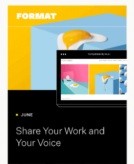
One of the most common reasons for doing an all-image email is that having interesting backgrounds that aren’t just white or a solid color creates a more visually interesting email. But you don’t have to use a solid color as your background in your email. You can use background images and they’re supported in most email clients if you code them correctly. Windows 10 mail is the biggest exception. If you have a large subscriber base opening on Windows 10 mail, then you should steer clear of background images.
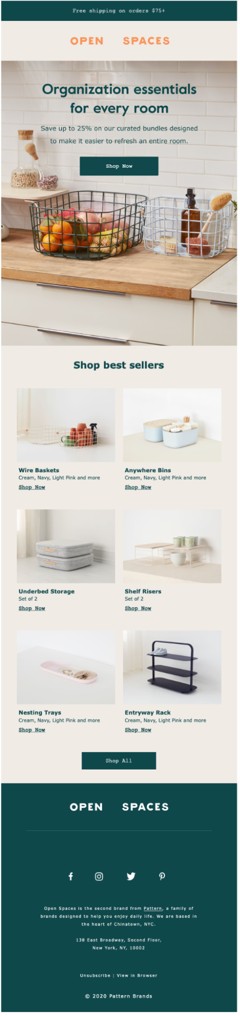
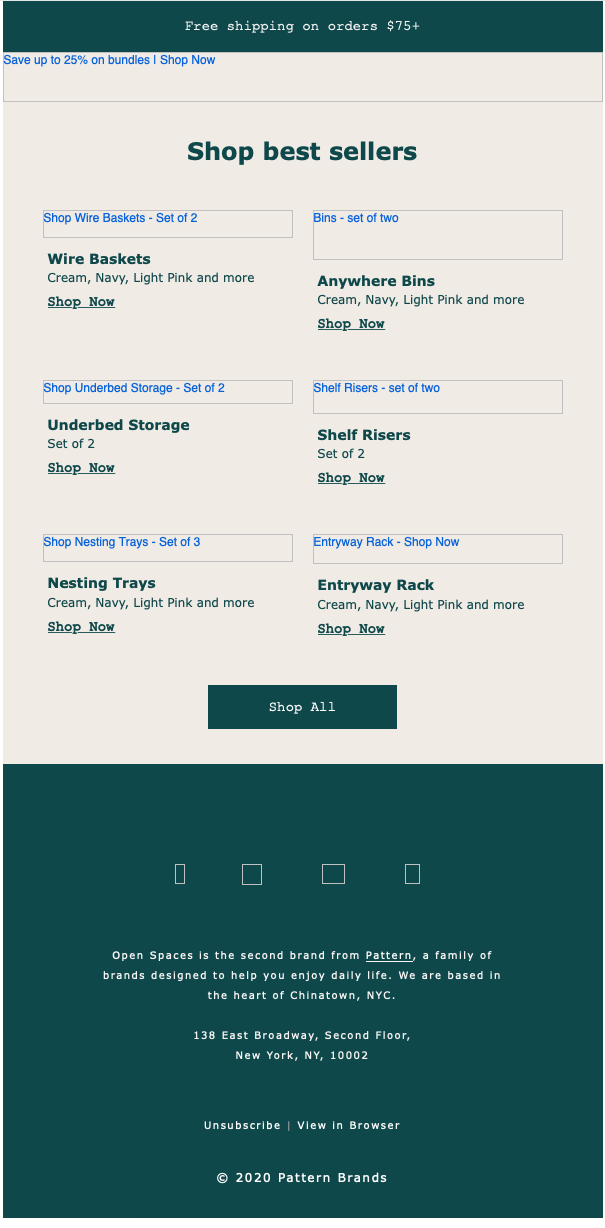
There’s a big difference between an email coded with a background image and an email coded as only an image. If you’re using a background image, all of the text is still visible even when images are off so the subscriber can still click on the initial call to action, as well as get an idea of what the email is about and who it’s from:
 |  |
| Email with background images implemented and images turned on (Source: Really Good Emails) | Email with background images implemented and images turned off |
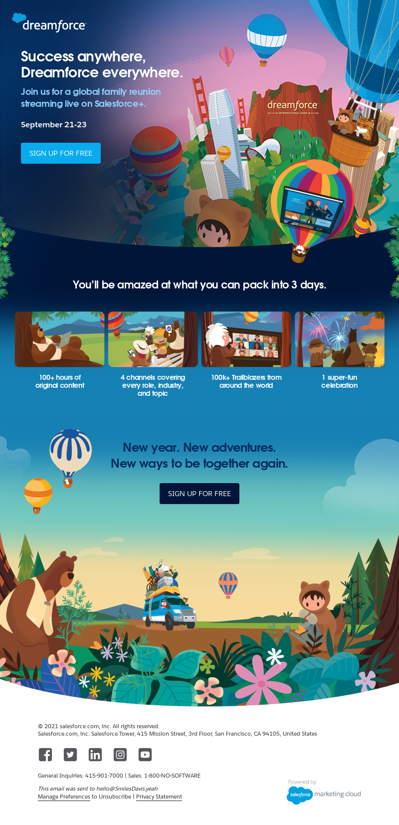
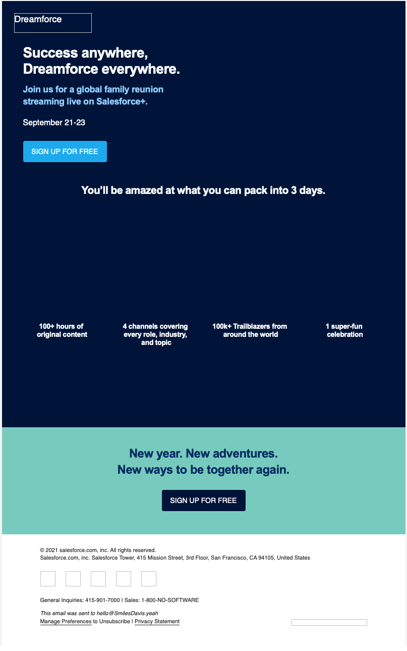
As opposed to an email where an image is used to create a background image effect. In this case, the initial CTA is lost (as is the logo and the company name). The email is not as impactful and, though the “best sellers” section is still visible and actionable, the point of the email—saving money on organizational bundles—is lost:
 |  |
| Hero piece is created with all-images—images turned on (Source: Really Good Emails) | Hero piece is created with all-images—images turned off |
Coding background images isn’t the easiest thing, but we have a blog post to help you with that. If you have templates set up with background images in Litmus, you can change out the background images in Visual Editor without even touching the code. Make sure the image sizes match the image that you’re replacing and that you have compressed the image that you are using so it isn’t too large.
Offset images and text
Anything that breaks away from the expected or the regular has a tendency to draw our eye and you can see examples of this everywhere, including in email.
The above example has the image offset, which you can easily do as a whole image, but what if you want to offset a block of text? Well, you have a couple of options. You could offset it by just a little so that the text isn’t actually offset, you just make it appear that the element is offset such as in this email:
Here the top of the email is offset, but as you can see it’s only a bit of blue that’s actually in the white part, there’s no text or images. So you can use an empty table cell. Or if you want rounded corners that work everywhere, you can use a decorative image. But more on those techniques later. In this case, the actual content of your email isn’t offset, but it appears to be.
The other option is to have everything offset like in this email:
This email has the whole callout section offset in a block over an image. This is easy to do on the web with absolute positioning, but as that isn’t supported everywhere in email it becomes a little trickier. There are two different methods that I’m aware of. If you have more, let us know in the comments!
First, there is Faux Absolute Positioning. Steven Sayo and Mark Robbins have written up some great step-by-step guides to learn how to do this technique. Steven and Mark provide fallbacks to make it work in Outlook and, from my limited experience with it, it has pretty good support.
If you aren’t that comfortable with code, you can also create this effect by slicing images and positioning them around the element you want to offset. A little bit messier, but it works. You do have to make sure to test, test, test as there is a higher probability of something going wrong and an image not lining up properly.
I’m a fan of the faux absolute positioning because it allows emails to have that dramatic offset while keeping the email live text and not having to worry about lining up sliced images, but either method will work.
Webfonts & live text
Maintaining brand standards is another big reason for using all-image emails, because you just can’t get fonts to show up everywhere. I get that. However, there are a lot more fallback options than Helvetica and Arial. Encourage your company or your clients to look into having a standard fallback font in your brand guidelines so that you can make sure your message gets across in all email clients.
Samsung keeps it interesting by using Trebuchet MS as the fallback font for their headlines. Not quite the Samsung One brand font, but still more interesting and eye-catching than Helvetica, Arial, ALT text, or nothing:
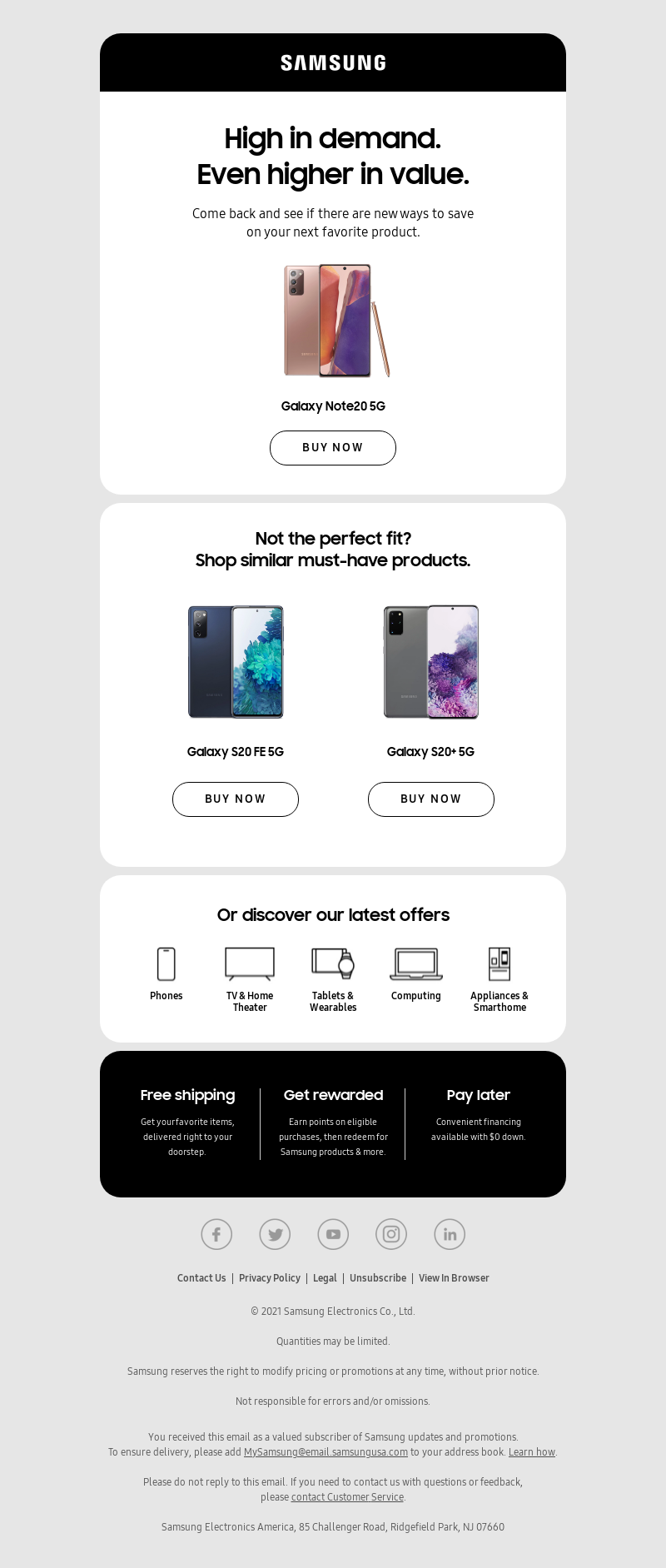 |  |
| Email with webfont enabled and images on | Email with fallback displayed and images off |
Adding web fonts with interesting fallbacks is one of the quickest ways to help make your email stand out when you’re not relying on images for your email. They’re easy to add once and then implement across your entire email design system. And once your email templates are set up with the web fonts, even non-coders can benefit from them if you’re using a templated system.
Styled ALT text
By styling the ALT text you are able to have the email retain some of the way it looks even with images off. We use styled ALT text here at Litmus to maintain a rough version of our logo, but you could also use this on those image-based buttons to make them stand out if you have to create all-image emails. You can style ALT text by adding CSS to the image tag and you can change background colors and most aspects of the font for the ALT text. It isn’t supported everywhere, but head over to our Ultimate Guide to Styled ALT Text to see where it is supported and how to do it.
Images, empty table cells, and styled horizontal rules as design elements
You don’t need to have the entire image to create interesting elements. Sometimes just using parts of the image to finish it off and combining that with table cells can be used to create visual interest.
To create rounded corners that show up in all email clients, I will add images of rounded corners to the tops and bottoms of containers. You can do similar things to create angles or shapes as transitions between sections of your email. Instead of creating the entire shape with an image, use background colors for the part with text and then add an image at the top or bottom of a section to make it stand out.
You can also style your horizontal rules to create interesting transitions or dividers between sections. We use simple styles in Litmus to create a line, but there are lots of different techniques you can try to create interesting dividers with just a horizontal rule. (Let us know how it goes!).
We also have a colorful divider that we use to break up content. This is done completely with background colors and table cells:
Get creative with your code and see what you can do without images!
Bulletproof buttons
This is my biggest pet peeve about all-image emails. Calls to actions that are image-based are hard for your subscribers to take action on if they can’t see them. If everything else is too hard to implement, please, at least start using live text buttons for your calls to action.
These are two different emails, one that uses a live-text button and the other is an all-image email with the button in one of the images. The email on the left is much more actionable than the email on the right.
 | 
|
| Email with live-text button with images off (Source: Really Good Emails) | Email with image-based button with images off (Source: Really Good Emails) |
If your argument for using all-image emails is that you don’t get many clicks without opens, so you must not have a large audience with images off, look at what your CTAs look like with images off. Not many people would click through if they didn’t know what they were clicking on.
There are several different ways to create live-text buttons, so make sure to use a method that works for your audience and, as always: Test, test, test!
Converting those all-image emails
I reached out to some fellow email developers to help me show you how some of these techniques can be used to convert all-image emails into live text. You’ll notice that converting these emails to live text didn’t just enhance the version of the email with images off, it also improved the mobile and the Dark Mode version of the email.
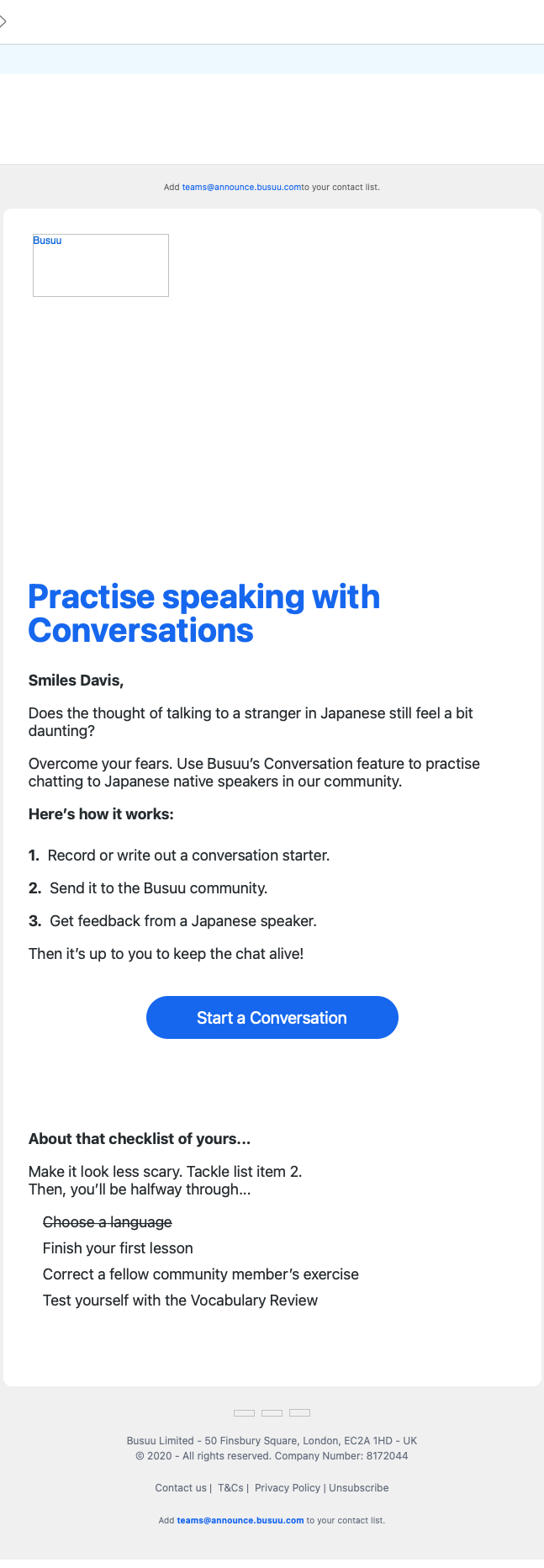
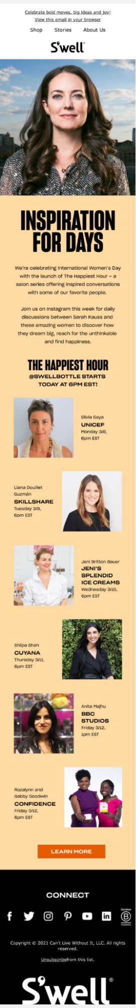
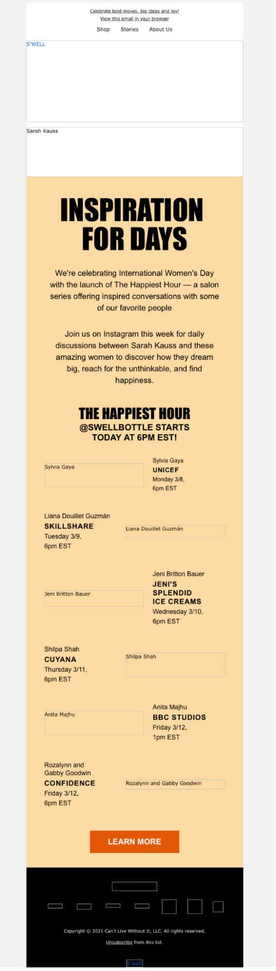
S’well email conversion
Anne K. Tomlin is the founder of Email’s Y’all. An experienced coder who knows the ins and outs of email quirks, she was all about showing off the difference live-text can make in an email.
In her own words: All-image emails don’t get your message to people who have images blocked by default and anyone using a screen reader or digital assistant (Siri, Alexa, etc). If your goal is conversions, you haven’t even given those people a chance to convert. S’well’s email was 10 times as bad as a normal image-only email because there was no alt text at all. A screen reader or digital assistant would read out: “Celebrate bold moves, big ideas, and joy! View this email in your browser. Shop. Stories. About Us. S’well.” and then immediately jump to read out the footer. What a horrible experience! Subscribers that have images blocked literally see a blank page. No one is going to look at a blank page and think, “I should check this out in a browser!” and click the “view in browser” link. You have 5 seconds to capture a subscriber’s attention, so if you have an all-image email and those images don’t load by default, you might as well not have sent an email at all. In fact, that subscriber could look at it as you are sending them nothing at all, so they should just unsubscribe.
Original email:
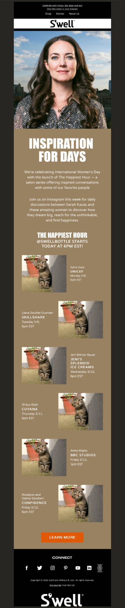
Anne’s live-text version:
I greatly prefer Anne’s version, mostly because of the cats, but also because of the increased accessibility on mobile and in Dark Mode. The text isn’t trapped in an image so instead of shrinking it remains legible. The Dark Mode version is actually dark and won’t be a blindingly bright light if I’m looking at it in a dark room, additionally, anyone who has their phone set on Dark Mode to reduce eye strain, won’t be confronted with the light mode that they were attempting to avoid.
| Original Mobile version | Anne’s Mobile version |
|  |
| Original Dark Mode version | Anne’s Dark Mode version |
|  |
And for the all-image conversion…. [drum roll, please]
Tada! Nothing is lost when the images are turned off (except the cute kittens). Subscribers can still take action and, most importantly: They can still read your message.
 | 
|
See how Anne does it
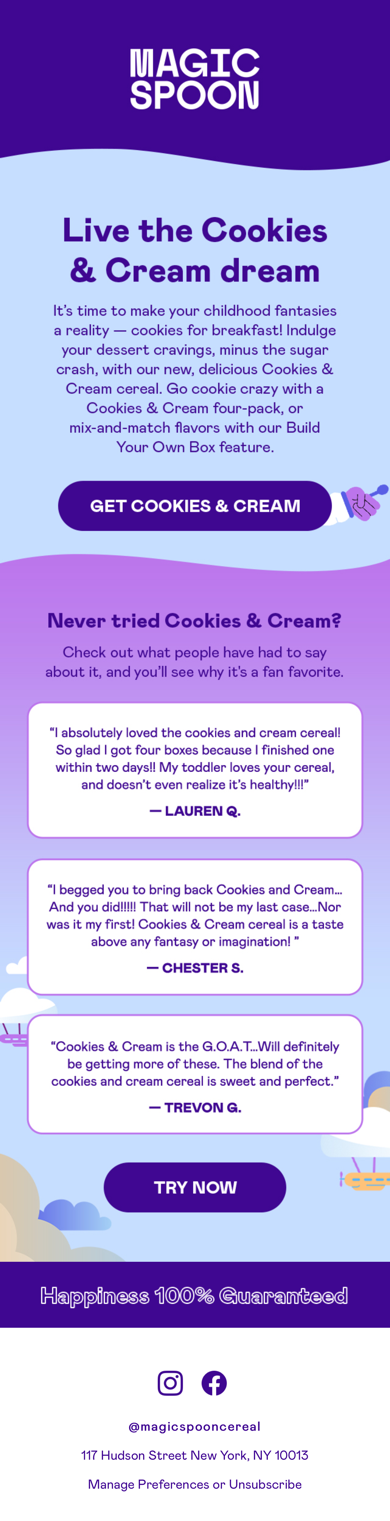
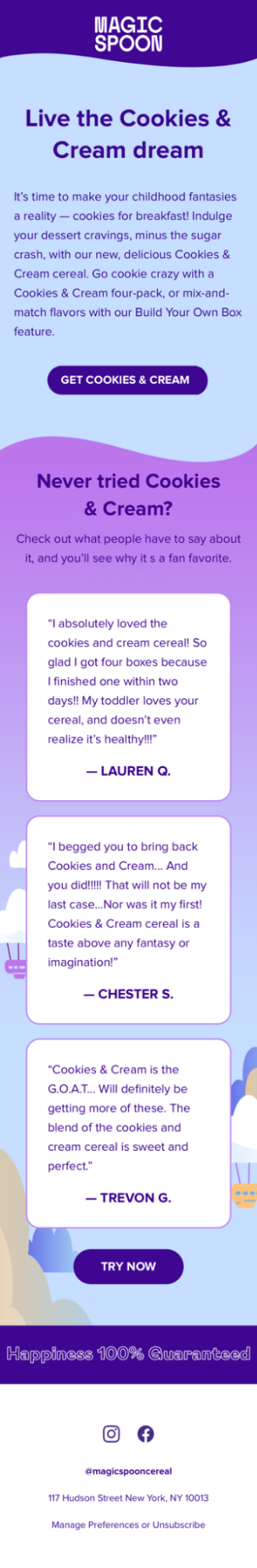
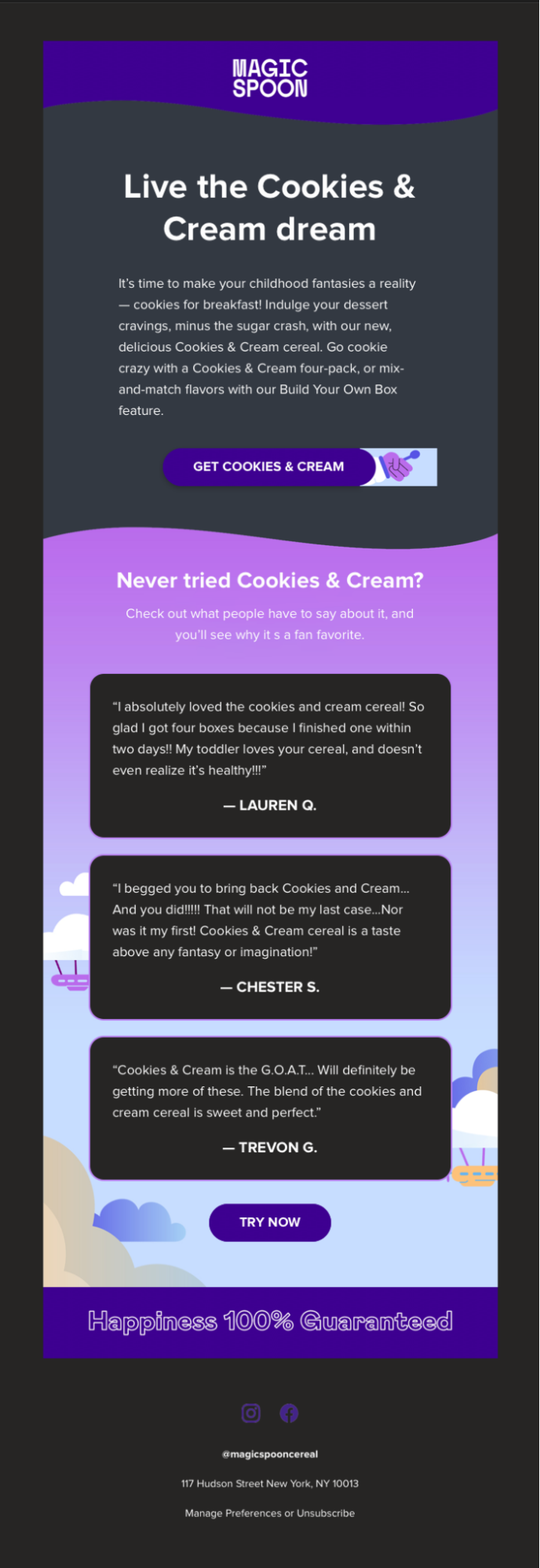
Magic Spoon email conversion
Carin Slater is the Email Marketing Specialist and the email developer behind all of Litmus’ emails. Wait, that’s me! Right, well, you know my stance on all-image emails.
I love Magic Spoon emails (and Magic Spoon cereal as well, so yummy 🤤) but I’m always sad when they come to my inbox as all-image emails. They’re usually pretty good with including the image text as ALT text so that you can still know what’s going on in the email if there are no images, but this email wasn’t as descriptive or inclusive as other emails they’ve sent. I thought I’d tackle this one as there’s a GIF button which is really fun and may seem hard to do without using images.
Original email:
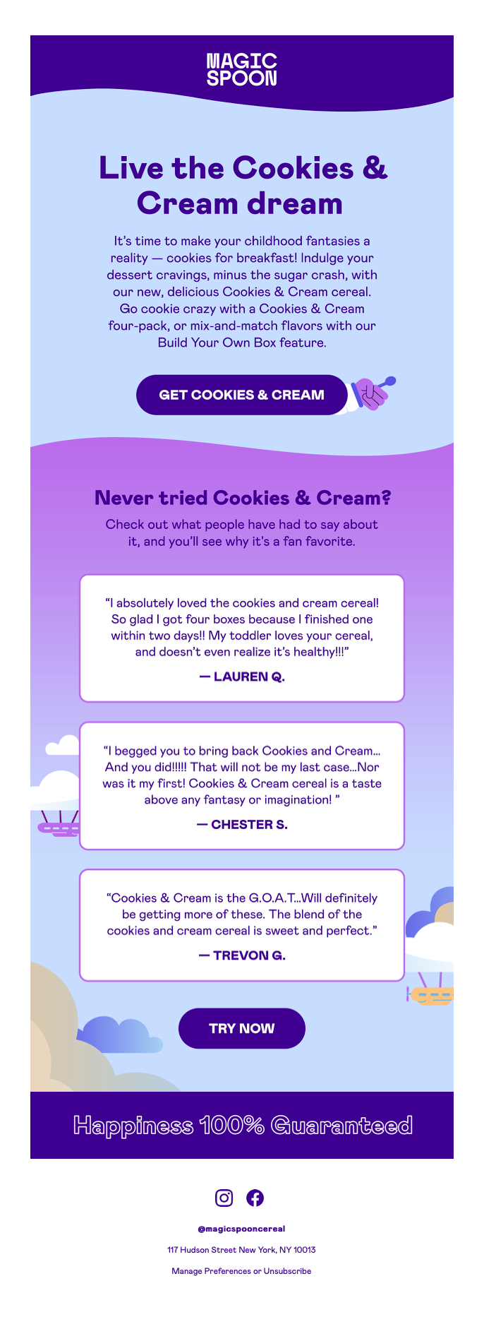
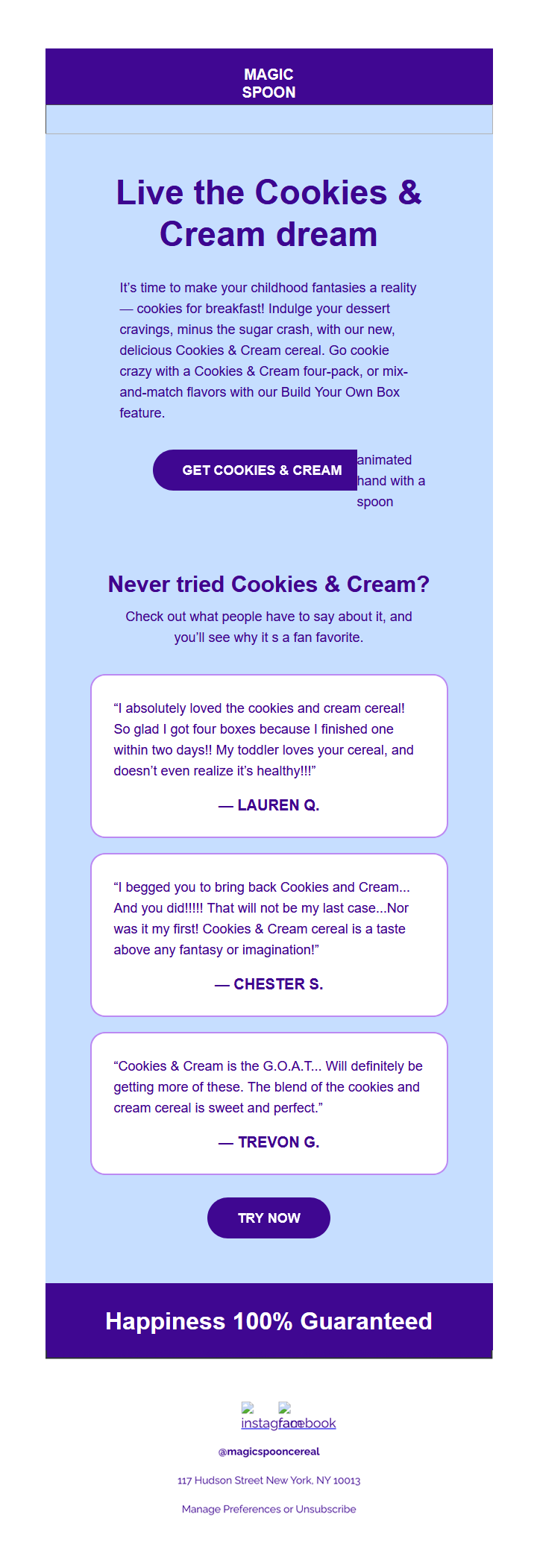
Carin’s live-text version:
I had to make a compromise in that it doesn’t look perfect in Dark Mode on Outlook 365 desktop clients on Windows, so that’d be something that may or may not be important depending on where Magic Spoon’s subscribers open their emails. And as I was working from an all-image email and not the design file, I wasn’t able to create a Dark Mode or mobile version of the GIF, both of which I would have asked for so that they could be swapped out if I was working with the original files. Despite those issues, the Dark Mode and mobile versions are improved in the live-text version. The GIF animation is retained in the mobile version and the text is more legible, though only by a little bit as Magic Spoon did create an all-image version that they swapped out for mobile (yay for mobile, but boo for having the email coded twice).
| Original Mobile version | Converted Mobile version |
 |  |
| Original Dark Mode version | Converted Dark Mode version |
| 
|
For the all-image version, I used stylized ALT text to maintain some semblance for the logo and the tagline in the footer, so the email looks similar to the image version when images are turned off. The live-text version, again, is much more visually compelling, actionable, and engaging than the all-image version.
 |  |
See how Carin does it
*All emails for conversion were pulled from my inbox
Make your emails shine no matter the circumstances
One thing I’ve learned from my years in email is that subscribers will always do the unexpected. Whether that be searching through emails instead of using folders, or opening an email in a browser on their phone, you don’t know how people are going to experience your email. So do your best to make sure they give your subscribers an optimal experience no matter where they’re opening your email.
Carin Slater
Carin Slater is the Email and Content Growth Marketing Manager at Litmus