
If Dark Mode is so great, should absolutely every email be dark?
Last year, I wrote a post highlighting an email design trend taking inboxes by storm: dark designs. With Dark Mode gathering momentum and the benefits of dark design for email becoming apparent, brands looked to harness the pros of a “Dark Mode first” approach to email—with dark designs appearing in both dark and light mode environments.
With Dark Mode’s negative contrast polarity (light text on dark background) hailed as an accessibility win that could help reach a wider audience, it’s understandable why this would trend. However, an online search of the advantages of negative versus positive contrast polarity (dark text on light background or what we refer to as “light mode”) will bring up many results. So, we wanted to dig deeper into the debate.
We recently reached out to the email community on social media, asking them whether they agreed or disagreed with two statements around light and dark modes. These were the results:
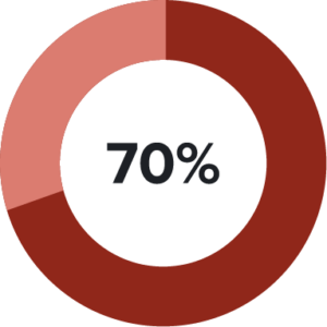
70% agree: If subscribers use light mode, you should send emails that offer a light color scheme.

57% agree: Now that we can design dark emails for Dark Mode, all light mode emails should be light.
While a clear majority of people think a light color scheme should always be an option, not nearly as many think that all emails viewed in light mode have to have a light design.
So should you always go with a dark design, then? Or should you keep your design light for light mode and only use dark designs for Dark Mode?
Dark Mode emails just got easy See a breakdown of which email clients offer Dark Mode, how their Dark Mode settings impact your email designs, and what you can do to improve your emails for subscribers who read in Dark Mode. |
Making the case for email accessibility
Both light and dark design contrast options have their merits. However, a positive for one can mean a challenging experience for another.
If we lean into studies and documentation that suggest which environments work best for different conditions, we can see that by offering just one solution—whether that’s light or dark—we don’t cater to the needs of everyone in our audience.
Light mode is ideal for people with: | Dark Mode is ideal for people with: |
Cataract and related disorders | |
Photophobia and other light sensitivities | |
Myopia (nearsightedness) |
One case for light color schemes comes from Sheri Byrne-Haber for UX Collective:
“One of my glaucoma-related issues is I see ‘halos’ (like rings around streetlights at night) when presented with light print on a dark background, which blurs everything into non-readability.”
On the flip side, research suggests that sustained exposure to light mode may be associated with myopia. And even though performance in light mode may be better in the short term, there may be a long-term cost associated with it.
Even when we’re gifted with research and best practice documentation that can help us consider the accessibility needs of a particular condition, it doesn’t necessarily represent all persons experiencing the condition. The British Dyslexia Association provides a Dyslexia-friendly style guide which suggests that positive contrast polarity (light mode) offers the best reading experience. However, many dyslexic readers find that negative contrast polarity (Dark Mode) is most useful to them.
So from an accessibility standpoint, you can’t ignore the benefits both light and dark designs give subscribers. There’s no one-color-scheme-fits-all approach.
Considering a UX approach to email design
The Dark Mode vs. light mode conversation has been prominent in the design world’s user experience (UX) corner for a number of years. In 2019, it gained further momentum when Apple announced that Dark Mode would be available across all native applications in iOS 13 and iPadOS, and “prefers-color-scheme” became a CSS property.
If we approach email design from a UX perspective, then we need to be empathetic to our subscribers. We should never assume what’s best for our audience. Humans are unique, each with a different set of needs and preferences.
Thanks to a long and happy career in digital design with many hours spent at a computer, I am nearsighted. As a result, my machine is in Dark Mode a majority of the time, but I do like the option to switch between modes depending on the time of day, the task I’m doing, or whether I’m fatigued. But it’s quite apparent that although I make my selection, it’s very hard for me to reap the benefits of one mode or another.
Many websites and applications have yet to harness Dark Mode CSS styling. Only one of the articles I read that discussed accessibility benefits and pitfalls offered a Dark Mode reading environment.
There’s also the hurdle of brand identity if a brand uses light or dark shades as primary colors in their brand palette. Bypassing specific brand guidelines to offer a visual experience that inverts brand colors may see a substantial amount of pushback.
The advantages of designing for both light and dark modes
But don’t let brand guidelines stop you. Perhaps they should even be updated to consider Dark Mode. If you’re looking to get your stakeholders and brand guardians on board, what advantages can you suggest by designing for two contrast modes?
✅ Improve email readability
✅ Reach a broader audience
✅ Help subscribers engage with content
✅ Elevate brand trust by honouring subscriber preferences
 “Implementing light mode and Dark Mode will require brands to rethink their colour palette, not just for their emails but their landing pages, too. Some people prefer light mode, and some people prefer Dark Mode. The important thing is to give them the choice.”
– Paul Airy, Accessibility and Usability Consultant at Beyond the Envelope™
When your emails are optimised for both light and dark modes, you give the choice to your subscribers on how they like to read your emails. So if they prefer light mode for any reason at all? They can read your emails with a light design. And if their preference is Dark Mode, your emails should pivot to a dark color scheme.
By giving subscribers what they want, you show you care and are listening to their needs. Even if your audience’s Dark Mode usage is low now, it’ll continue to gain momentum and possibly become a standard just like responsive design has. With our ultimate guide to Dark Mode email, designing and coding for Dark Mode emails is not a huge lift. And it helps you cater to everyone in a more inclusive world.
How many people actually read your emails in Dark Mode? For the first time ever, discover how many of your subscribers read your emails in select Dark Mode clients. With Litmus Email Analytics, you can detect Dark Mode usage, so you can invest the right amount of resources into Dark Mode emails. |
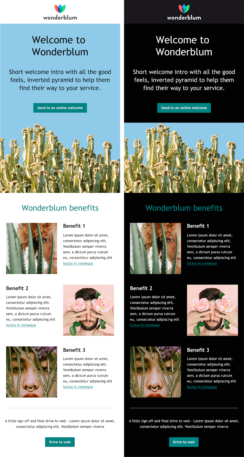
Light mode vs. Dark Mode email design examples
Here are a few examples of brands that have done a great job of designing their emails with both light mode and Dark Mode versions.
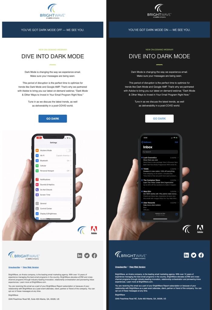
Brightwave
Even when discussing Dark Mode, Brightwave let their light mode subscribers digest content in the lighter colors of positive contrast while their Dark Mode audience received their dark email design. As for the mode-specific call-out, that’s the brand personality cherry on top.
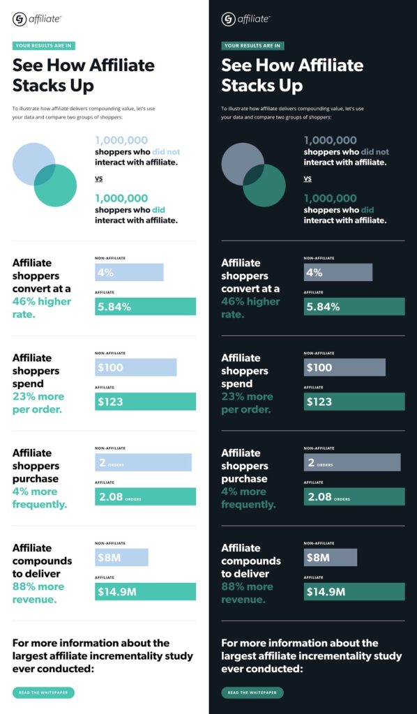
Commission Junction
There are a number of things I’m drawn to in this email from Commission Junction, but it’s the contrast in the Dark Mode experience that really grabs my attention.
Litmus
If you’d like some help getting off the ground with multi-contrast emails, we have a free resource to help you on your way. The team at Litmus have put together a set of Dark Mode optimised templates you can download and adjust to fit your brand.
Final thoughts: Embrace your subscribers’ preferences
There are many instances in which you might consider forcing a dark email in light mode or “disabling” Dark Mode so your emails can stay light. Maybe you don’t have the resources to design and code Dark Mode emails. Or maybe you want black backgrounds for Black Friday messaging. I would argue that Black Friday emails don’t have to be black (but that’s a topic for another day).
The point is: Just because something might look great to you doesn’t mean it looks great for everyone else. And you could be losing out on email engagement and conversions.
It’s not about Dark Mode vs. light mode. It’s about embracing both in your email design.
Both light and dark color schemes can be beautiful and fit within your brand guidelines, but whether an email should be read in light or Dark Mode should be up to your subscribers. Email remains the marketing channel with the highest ROI, and your subscribers are your lifeline to that. So subscriber experience should always be one of your top priorities.
What do you think? Are there any reasons you might do dark-only or light-only email designs?
See how your emails look in Dark Mode See how your emails render across 90+ email clients (including Dark Mode!) with Litmus Email Previews. And ensure your emails are on brand and error-free, every time. |
Lily Worth
Lily Worth was a Senior Email Designer at Litmus