
Understanding Retina Images in HTML Email
Apart from the onslaught of screen sizes, the mobile revolution introduces another interesting challenge for email designers: high-DPI displays. Often called Retina displays (a term coined by Apple), they can enhance any email campaign—or give your subscribers a less-than-stellar email experience.
In this post, learn exactly how high-DPI displays work and what that means for email designers and marketers.
When did Retina displays get introduced?
Back in 2010, Apple released the iPhone 4. Among other hardware improvements, the iPhone 4 featured what Apple called a Retina display. Apple’s Retina display was one of the first high-DPI, or high dots per inch, displays mass-produced for consumers.
On device screens, DPI refers to the number of pixels a manufacturer can fit into an inch of screen. The higher the DPI, the more detailed and clear images and text on that screen appear.
Although Apple was the first to introduce the Retina display to a mainstream audience, it wasn’t long before other device manufacturers hopped on board. While most companies started with smaller devices like phones, retina screens can now be found on tablets, laptops, and even desktop computers like Apple’s massive 27-inch Retina 5k iMac.
Why does email need retina images?
Subject lines, copy, and cadence all play an important part in looking good to subscribers, but visuals draw people to an email campaign first. After opening an email, our eyes move to the design and imagery before we start reading any copy or tapping calls-to-action.
If you’re not accounting for high-DPI displays, you run the risk of looking careless to subscribers. Because of the way high-DPI displays work, non-optimized images end up looking blurry and pixelated on retina screens. Here’s an example:
As users grow accustomed to retina screens, they expect text and images to appear crisp and clear. If you’re not optimizing your images for high-DPI screens, those users see a degraded email design, which can lead to equally degraded trust in your brand.
How to use retina images in email
How exactly can you optimize images for retina screens? Forturnately, it’s quite simple.
Roughly speaking, high-DPI displays have twice as many pixels per inch than their traditional counterparts. For images to look good on those screens, they need to be twice as large. When they’re scaled down in the email, there are more pixels for retina screens to display.
Here’s an example.
In our emails, we include the Litmus logo at the top. Using HTML, it’s sized so that it displays at 130 by 48 pixels. If we created and saved the logo image at that size, subscribers would see a blurry mess on retina screens:
To keep the logo crisp, we simply create an image at a larger size. In this case, the image file is 276 pixels by 102 pixels, but anything that’s at least double the intended display size works. Then, in our HTML, we use the original, intended display size in the width and height attributes to scale the larger image down:
<img alt="Litmus" src="logo@2x.png" width="130" height="48" style="font-family: sans-serif; color: #ffffff; font-size: 20px; display: block; border: 0px;" border="0">On high DPI displays, we get beautiful, crisp, retina images.
Using Retina Images in Outlook
Some versions of Microsoft Outlook still display the retina images at their full size, despite the explicit sizes set by the width and height attributes. To get around this, you can include a max-width rule in the style attribute of the image.
In the example below, we use the width attribute (no height attribute) and the max-width to get retina images working across all email clients.
<img alt="Litmus" src="hero@2x.png" width="600" style="width: 100%; max-width: 600px; font-family: sans-serif; color: #ffffff; font-size: 20px; display: block; border: 0px;" border="0">You’ll notice the inclusion of a width style set to 100%. This is a handy trick for making images responsive across different screen sizes. On larger screens, the max-width rule will kick in to constrain the image size, while on smaller screens they will fill 100% of the screen—or container—width.
Can background images be retina images?
You can use retina images as background images. The implementation is slightly more complex, but the principles are the same.
But note that this approach won’t work everywhere. For retina background images, you should use the background CSS property instead of the background HTML attribute on something like a table cell.
<td style="background:url(img-x2.jpg) center/cover;background-image:url(img-x2.jpg);background-size:100%;background-size:cover;">The background is set using both the shorthand property and using individual CSS background properties to account for some quirks in Gmail and Android clients. This Community discussion has a great overview of the techniques available to designers looking for gorgeous background images on high-DPI displays.
Considerations before using retina images
Doubling the size of your images helps ensure that they display beautifully on retina screens, but this technique is not without its drawbacks.
As we increase the dimensions of an image, the file size increases, too. That can cause an email to load slowly.
And, not every campaign needs retina images. If you’re using a lot of images in your campaign, or images that are really large, using standard, non-retina images may help provide a better user experience since the images will be quick to download and display in your campaign.
If you do need to use retina images, there are two techniques to help avoid bloated file sizes.
The first—and more complicated—is to use something called compressive images. These are images that are saved at huge dimensions, but very low quality settings.
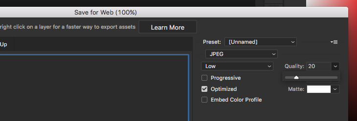
Most image editing programs allow you to set the quality at which images are saved. In Photoshop, for example, you can adjust the quality of a JPEG using a simple slider:
To create a compressive image, design the image at something around four times the intended size and save it at an extremely low quality setting. While the image looks terrible when viewed at full-size, after it’s scaled down to its intended size in an email, the artifacts shrink down and go unnoticed. And the low quality settings ensure that your file size is kept to a minimum.
The second way to keep file sizes in check is to use a dedicated program to further compress your images after saving them. Applications—many of them free—exist for every operating system that allow you to process and compress images after they are created.
Some of our favorites include ImageOptim, JPEGmini, TinyPNG, Compressor.io, and Kraken. In most cases, you simply drag and drop—or upload—your images to the program and they compress them. Then, you can upload those optimized images to your ESP or server to include in your retina-ready campaigns.
Jason Rodriguez
Jason Rodriguez was the Community & Product Evangelist at Litmus
 Blog
Blog 