
Using a Broken Grid Design in Email
Each year, we see new design trends shaping digital marketing—from the use of color and imagery to typography trends, interactivity, and more.
Broken grid designs and overlapping elements have been popular in web design and development in recent years. Read on to learn what a broken grid design looks like, why it’s used and examples of real emails that use this email design technique.
What is a broken grid design?
Rigid grid systems certainly serve their purpose: with them you can create clean, user-friendly designs that are easy to navigate and digest. As with most email design trends, bringing abstractions to your layout helps your email stand out, elevating your messaging within busy inboxes.
But using a broken grid design makes your creative unpredictable, builds curiosity, and demands attention which entices your subscribers to engage with your content.
Thanks to absolute positioning and pseudo-elements, creating unique, abstract layouts can be relatively easy to achieve. As very few email clients support these CSS styles, email design and production teams have found creative workarounds to harness the potential of broken grid design compositions.
Email examples that use a broken grid design
Check out these brands that let their emails break free from rigid grid layouts to create truly unique email experiences.
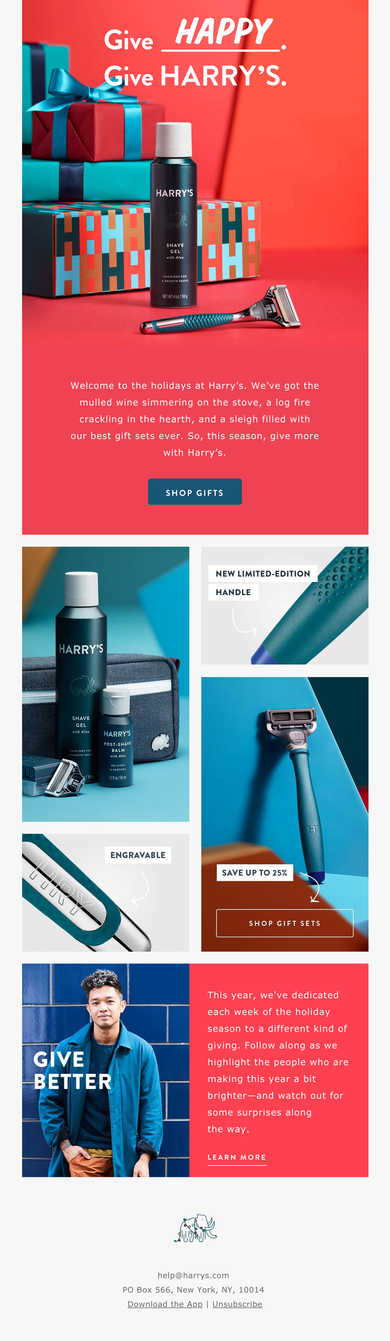
Harry’s
While still using a grid as a foundation, Harry’s breaks up the conventional two-column layout with staggered modules, offering a masonry style effect.
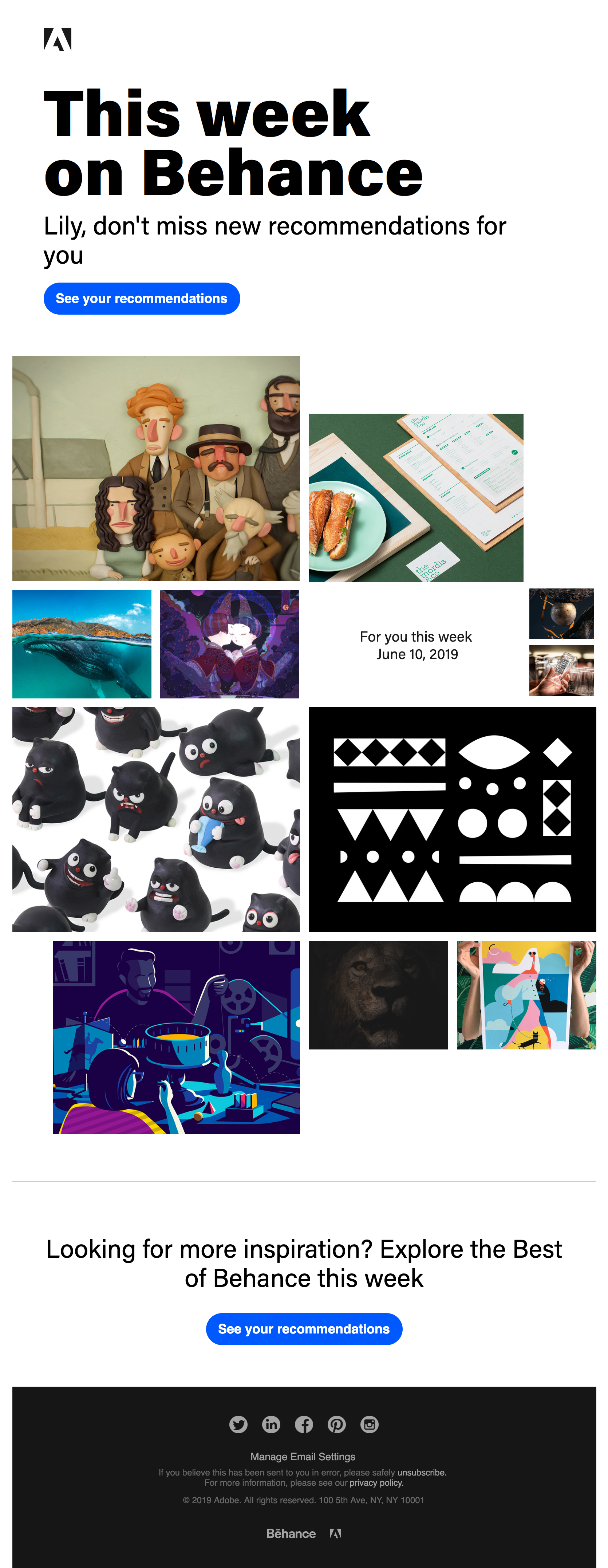
Behance
This weekly inspiration email by Behance, compiled with content relevant to a subscriber’s interests, generates unordered image blocks when viewed on desktop. A great example that proves that an email doesn’t have to be symmetric to be beautiful.
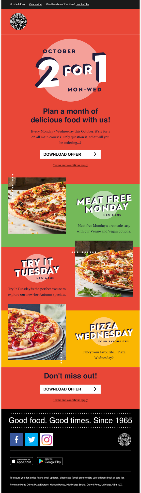
Pizza Express
This promotional email by Pizza Express demands attention, with big blocks of bold color and a generous helping of animation—but it’s the use of off-grid design that really makes this email stand out. Images breaking out of their containing row and overlapping the content above makes the email feel dynamic and encourages subscribers to scroll.
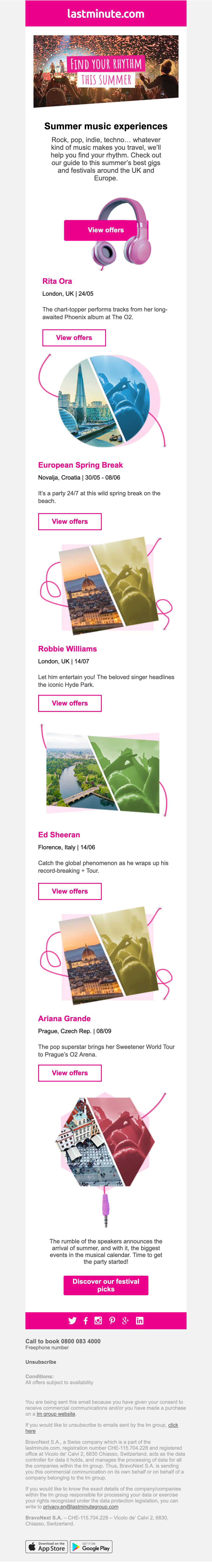
Lastminute.com
Abstract design can really help shape a journey and lead the eye. This design by lastminute.com, focusing on upcoming music events in Europe, kicks off with an asymmetrical hero image that pushes you to read on. If the call to action straddled by headphones doesn’t convince you to click through, then you follow a line down to various events.
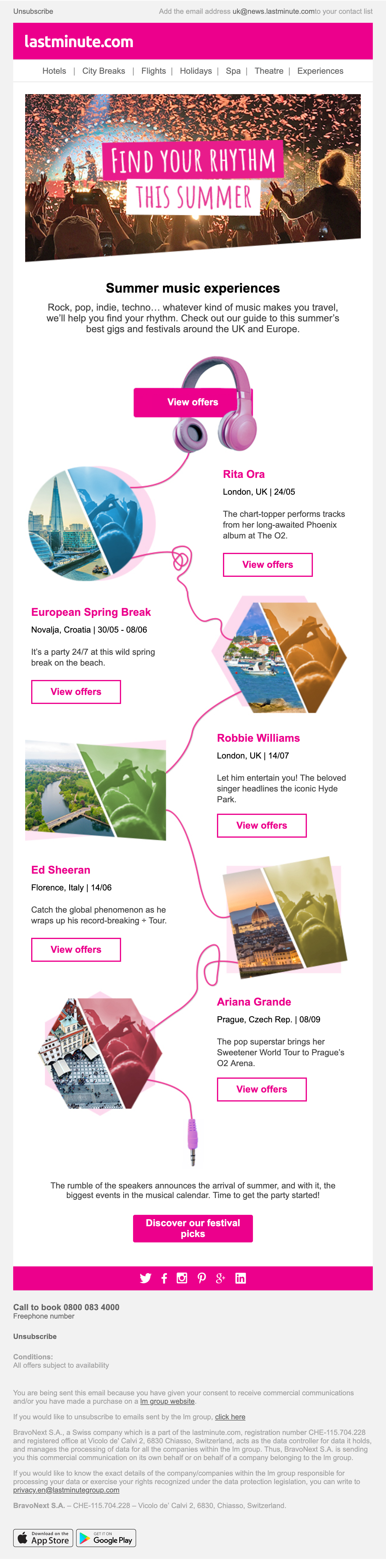
This email stacks beautifully for mobile and is a great example of creating intrigue with off-grid.
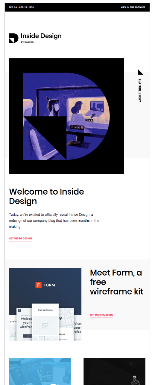
InVision
The design experts at InVision prove that even subtle off-grid elements can go a long way in adding a little special something to your email designs. While the email follows a grid layout—with single column elements mixed with two- and three-column sections—the addition of subtle elements that break from the grid make this email special. What seems like small details makes a big impact on the design of this email.
Retail brands push the envelope with off-grid design
Many retail brands are creating appealing layouts to showcase their products and offers, moving away from columns and rows and structuring their content in creative ways that feel more like printed promotional pieces, like a brochure or leaflet.
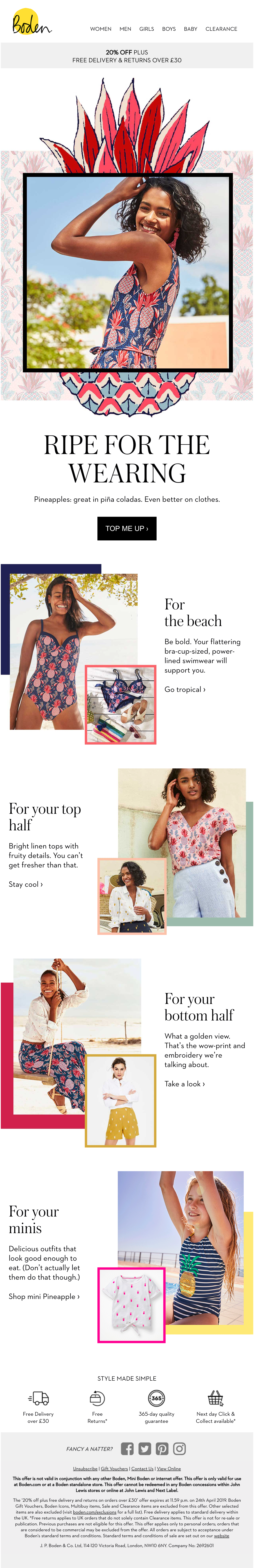
Boden
UK Fashion brand Boden goes off-grid with an unconventional composition of images that seem to break out of their containers. By stacking images and color blocks on top of each other, Boden’s design creates depth and makes this email fun and lively. This image treatment carries the look through to mobile.
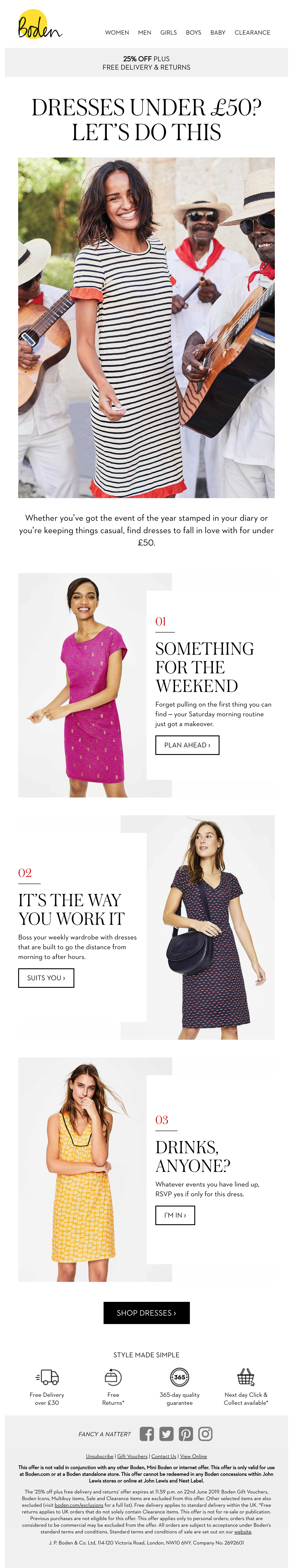
But we spotted another beautiful email by Boden that takes advantage of stacking effects. In this promotion, the text container overlays the image. Another great example of how a two-column grid can be shaken up with a broken grid feel.
Lacoste
Kudos to the team at Lacoste for the beautiful abstract design of this email. The model’s shots break free from each product image, taking this design off-grid. Add a generous amount of white space and you have this stunning email that doesn’t fail to stand out.
Using off-grid typography in email
This typography trick takes broken grid design to the next level. Partially overlapping text across images is another treatment often found in print design, such as magazine layouts—and now we see it in email design, too.
There are a few things to consider when applying off-grid typography to your designs. Overlaying text across busy images can be hard to read, so getting a strong contrast between text and image is a must. As CSS positioning styles are poorly supported in email, off-grid typography effects are often achieved using image-based text, so it is crucial to add well-written ALT tags and try and include live HTML text in your design, rather than creating an image-only email.
J.Crew
J.Crew showcases must-have fashion essentials with this exciting design, where background and text color contrast are well thought out. The zig-zag layout certainly catches the eye, but it’s the copy that partially overlaps the images that makes this email truly special.
Maude
This design by Maude shows how just a small amount of off-grid typography can have a big impact.
Beau Market
French creative agency Beau Market offsets text over a solid bold color, creating an exciting hero arrangement. Further down the email, the team presents examples of work created in 2018—unordered and grid-free.

Boost efficiency and scale email development
Craft consistent, on-brand emails with Litmus. Create and store reusable templates, code modules, and more.
Lily Worth
Lily Worth was a Senior Email Designer at Litmus
 Blog
Blog 