Typography is not just about fonts. It’s about how the written content in a B2B website design is structured and how it impacts the user experience on the website. In this post, we’ll take a closer look at why typography matters, steps to take to get improve your website’s typography, as well as trends and considerations for any B2B web design project.
The Impact of Typography on the User Experience (UX)
Research shows different typefaces impact our emotions, affect how well we learn and remember things, and even influence how we taste certain foods. But choosing the proper font involves more than considering a website visitor’s psychology. It must be a careful, thoughtful integration to ensure a seamless experience.
It’s About Balance
It is important for B2B website designers to balance unique design with clarity, presenting content that communicates the personality of a brand while ensuring all of the copy is readable. A really cool-looking font may actually not be legible or may clash with the overall design of the website. When not used properly, it may engender the wrong type of emotion and work against the brand’s objectives.
Brand Consistency Is Essential
It’s also crucial that font choice matches a company’s messaging and branding. For example, luxury brands typically use more of a curved font style, whereas restaurants tend to use a handwritten style for their menus. Working with an experienced designer is crucial to ensure the typography of a website is consistent with the overall brand.
Tips to Improve a B2B Website’s Typography
Even if you don’t plan an entire B2B website design overhaul, improving the site’s typography can make a sizable improvement. Here are a few tips to improve a website’s typography:
1. Select a legible font and optimize it for increased readability.
Be sure to consider the height and width of the characters when choosing a font to ensure it fits properly with the design and messaging. Another aspect of fonts that designers always consider is the weight of the font, aka how thick the characters appear. The weight is often an aspect that can be varied throughout a site to create a seamless experience while providing visual differentiators. Consider also the other characteristics of the letter shapes – things like the variation in upper case vs lower case, whether the letters are round or are boxier, and how similar letters appear (think v’s and w’s). Lastly, ensure the font has wide spacing (also known as kerning) since this can ensure that words aren’t smushed together when viewed on smaller screens.
2. Optimize for each platform.
The typography of a website on a desktop may look fantastic but turn nearly illegible when viewed on a tablet or mobile device. As many users view sites across various devices – it’s essential to test and evaluate how particular fonts impact the multi-device experience.
3. Consider accessibility.
Accessibility should be a consideration when designing a new website. We recently explored designing B2B websites for accessibility. When it comes to typography, accessibility should be considered in terms of legibility, contrast, weight, and spacing. All of these can impact how a user with low vision, poor vision, or even color blindness engages with a website. Regardless of age, we’ve all been on a website that is difficult to read for any number of the issues mentioned here.
Typography Considerations for B2B Web Design
Let’s look at a few tips and trends to consider when selecting the typography for your B2B website.
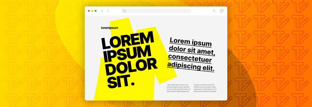
- Use bold text in the hero portion of the website. This helps draw the visitors’ eye to the main messaging of the website.
- Liven things up with a text fill. A great way to add interest to a font is the change the actual color of the text or to make it a gradient of a few different colors.
- Combine different fonts for emphasis. When done by a professional, the look can be seamless but visually appealing. When done wrong, it looks like a hot mess.
- Try a monospaced font. A monospaced font is one where each character fills the same amount of space – for example, a “j” and a “k” would have the exact same space usage.
- Use highlights and underlines – or other effects to draw attention to certain elements.
- Dare to be different. Trying out different treatments and elements on fonts can actually be fun and provide emphasis.
- Try out text animations. Animation can add playfulness to a website and movement.
Typography on the website doesn’t have to be boring. In fact, typography can often make or break a B2B website design or change the entire look and feel of a website.