We’ve worked with a variety of technology firms in the B2B space, including AI generative software firms, providers of engineering technologies, and security tech application companies. While their offerings vary widely, their robust technology solutions require equally robust digital marketing platforms to explain their products and services.
When we look at B2B branding and web design, design aesthetics from the B2C space often are a major source of inspiration for our clients and our designers. This doesn’t mean that B2C trends are driving B2B trends, but it does mean that B2B is often leveraging what works in B2C and modifying it to produce designs and brands that resonate with B2B buyers. Traditionally, in the B2B technology space, the designs can be a bit stuffy and outdated – at least from a web design perspective – but we are helping tech firms see that they don’t have to be.
Here, we investigate current B2B branding trends specifically for technology firms and how brands are using these to connect with their ideal buyers.
B2B branding trends in web design
Glows, Blurs & Gradients
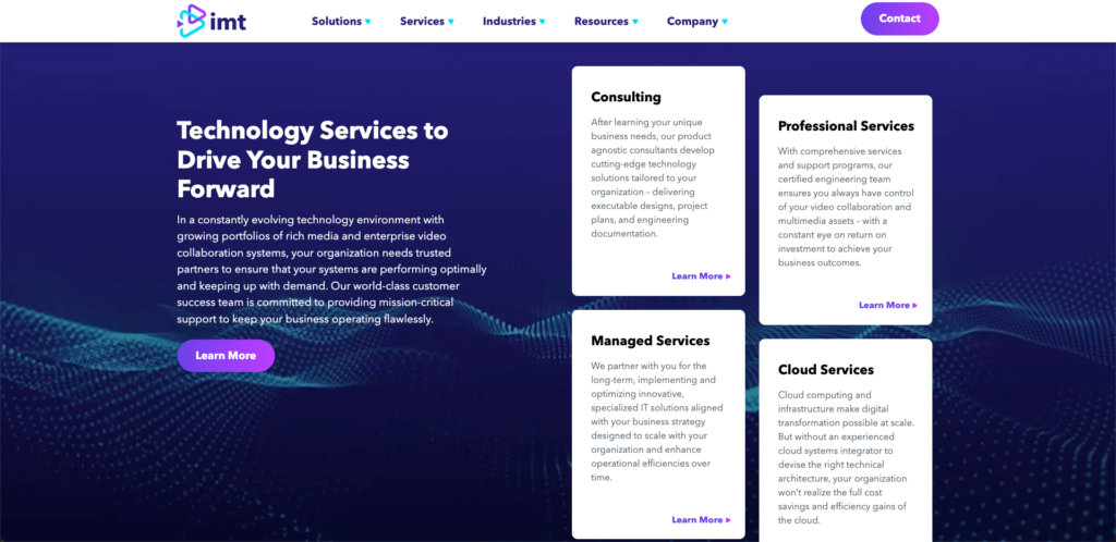
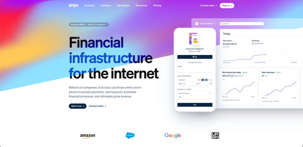
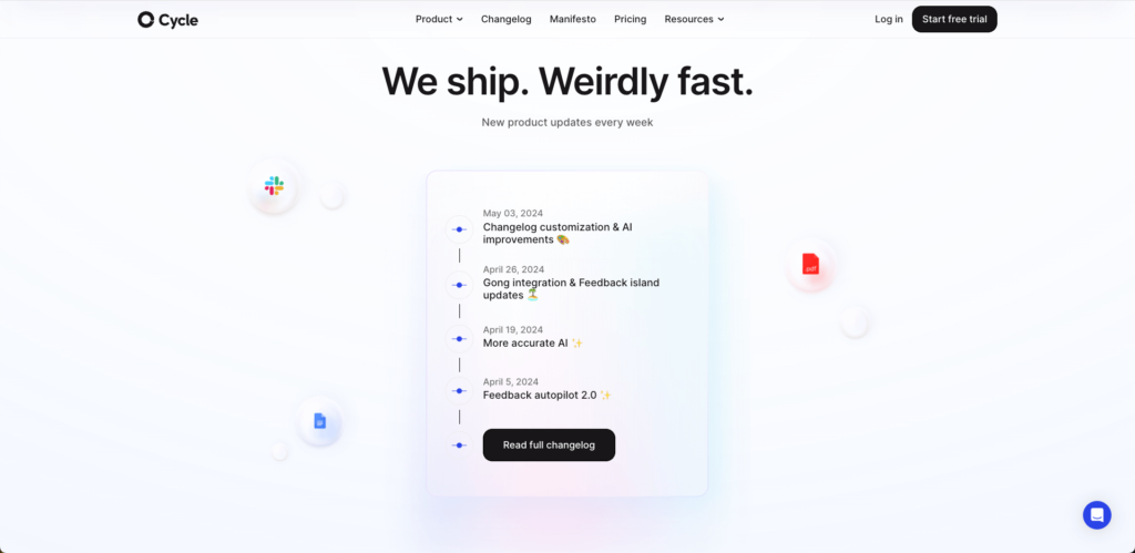
Subtle web design features like glow, blurs, and gradients have been used in a variety of industries and are becoming more popular for B2B technology firms. Examples can include a slight glow behind an image, a glass-like aesthetic that allows visuals to layer over each other, and blurring certain design elements so others can stand out.
Adding these subtle design elements helps elevate the benefits or features of the brand’s technology or platform. Any added animation should be smooth to help call attention to important features rather than overpower the content.
IMT
Stripe
Cycle
Abstracted Explainer Graphics
Explainer videos or animations are not new to tech firms – particularly for technology products or software that are complex. However, how these explainers have evolved from longer screen recording videos into cleaner graphic abstractions is new and trending. Rather than showing the actual software platform or technology tool right on the homepage, B2B brands are leveraging custom abstractions in their design. Whether static or animated, these engage the website visitor and explain complex tools with simplified visuals. Abstractions are particularly relevant for emerging technology firms looking to keep their product proprietary and for complex platforms where the platform user interface (UI) doesn’t make all the features clear. In these cases, abstract custom graphics can more easily communicate key differentiators of the product or platform. Additionally, B2B technology firms are leaning into animations when possible to engage as well as educate.
Laserfiche
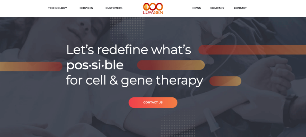
Custom Supporting Imagery
Large and oversized photos and graphics continue to maintain popularity. Brand enhancing photos and graphics are often used as full size background images on B2B websites to help draw attention to the messaging, especially for calls-to-action.
Lupagen
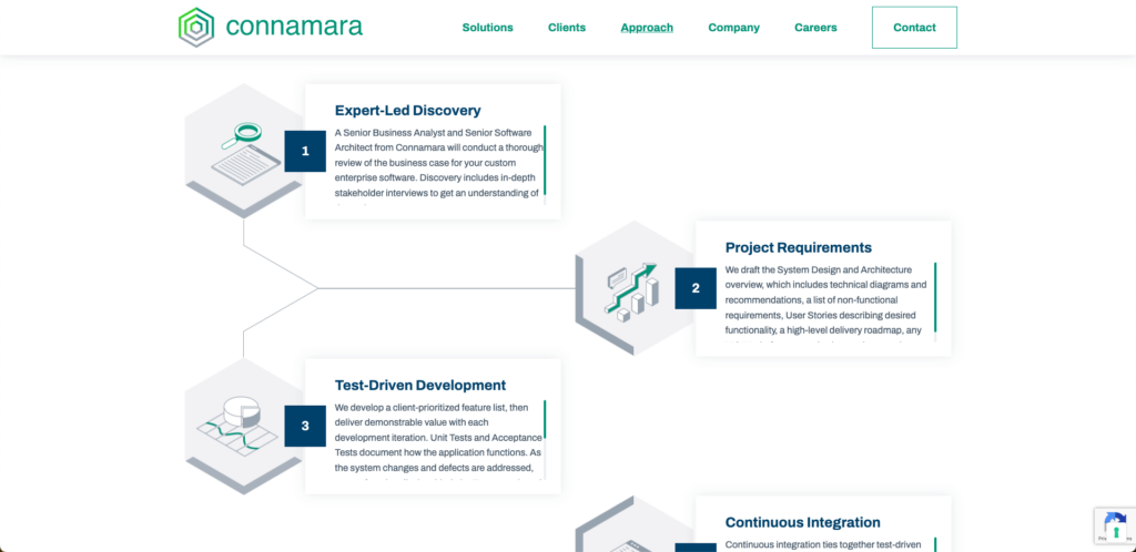
Supporting photos, videos or graphics are increasingly customized in some way to help maintain brand cohesion. Whether through color overlays, strict photo style selection, or consistent image frames, graphics throughout a website design should appear cohesive to add value to a B2B brand. In the following example, consistent image frames and illustration style combined with on-scroll line animations are used to help explain to prospective clients what the engagement process would look like.
Connamara
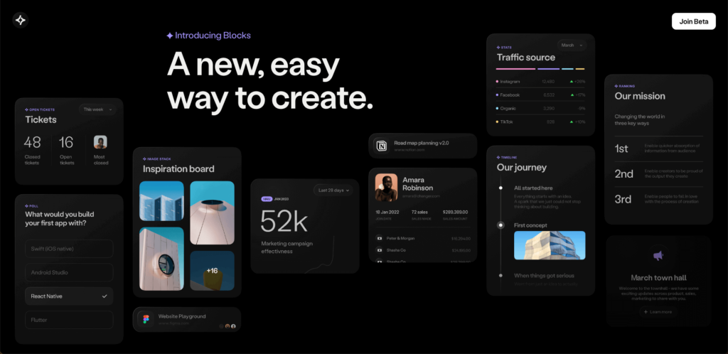
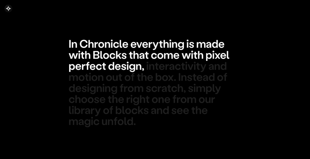
Bento Box Layouts
We are also seeing more examples of bento box layouts used in B2B web designs. This clean and organized design aesthetic started as a trend when Apple first implemented it to showcase products. If you aren’t familiar with the term bento box, the best way to describe this would be as a visually interesting but balanced grid. The boxes in the grid can span different column widths and may contain images, text or a combination of elements. The advantages include a more cohesive look for related information, and a responsive-friendly approach where the items neatly stack rather than scroll on different devices.
Chronicle
Anaergia
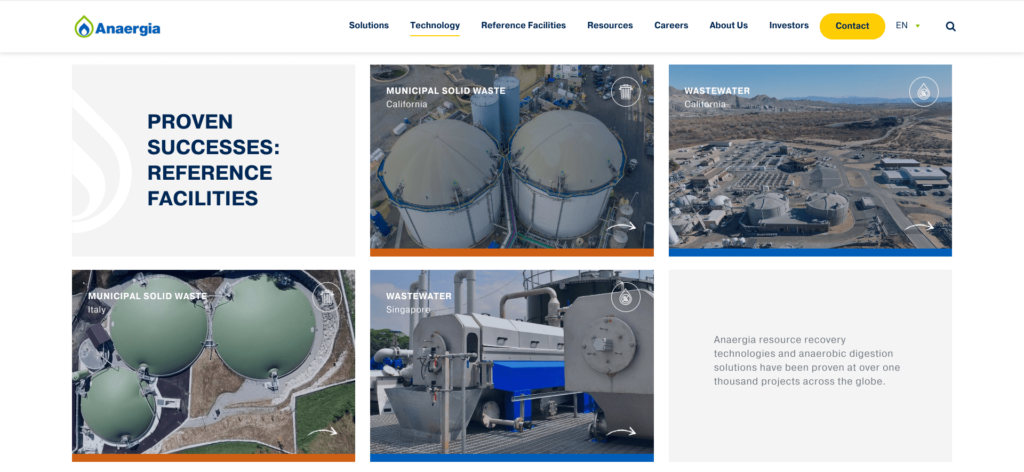
Employing this type of layout can help keep imagery or information contained to an area of the site that is visually organized and available at-a-glance rather than necessitating scrolling through a carousel. When used for products or features, this allows the user to quickly dig deeper into the item that interests them most. These grids typically combine imagery and text into an organized composition and may be combined with slight hover effects or animations to encourage click-through for more details.
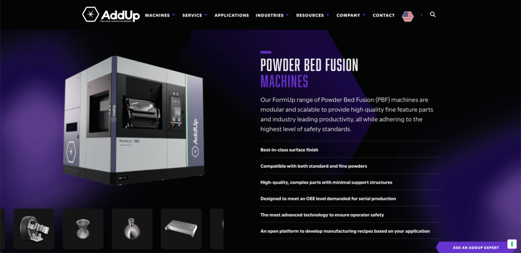
Dark Design
While this is different than dark mode – which is very popular for developers and other technical professionals to activate on most sites – we are seeing a trend of creating B2B web designs that are intentionally designed with dark backgrounds. For websites that lean into a dark color theme, the important thing is to ensure the design has a little something extra. Things like glows and moving highlights to draw the eye so a user doesn’t miss anything important.
AddUp
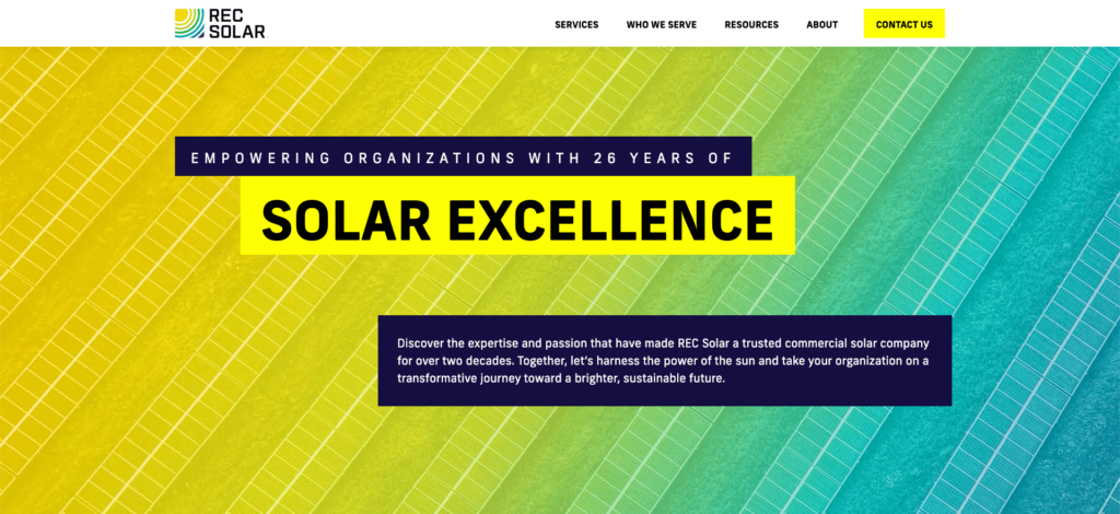
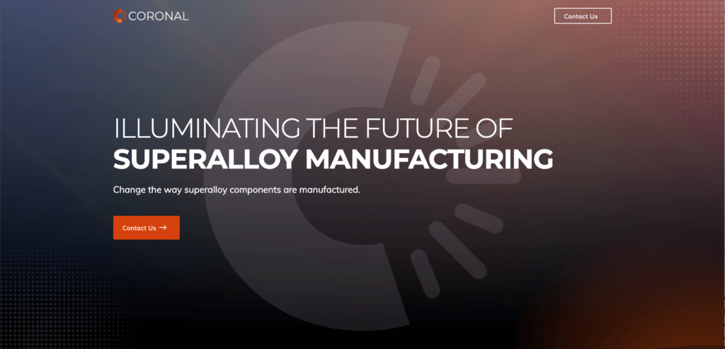
Oversized Type
Every professionally crafted website has a variation in font sizes to show hierarchy and to distinguish between primary content and summary or additional content. However, the use of intentionally large type takes this a step further and really grabs the user by the eyeballs.
The interesting thing about this trend is that it needs to be implemented very carefully. When a website visitor sees a large chunk or paragraph of oversized type, they may get overwhelmed and try to get past it as quickly as possible. Conversely when an oversized type is used strategically and in conjunction with great copywriting, the user is much more likely to pause and digest the text. A smart designer will help enhance the reading of large type through selection of proper font styling, use of complementary design elements and providing adequate breathing room on the webpage. Text alignment, animation, pause on scroll or other UI visual cues may further help guide the website visitor to pause and read key oversized brand story headlines.
RECSolar
Coronal
Chronicle
B2B branding considerations for web design
Trends are popular for a reason, but the implementation of the trends needs to be handled well and by a professional to truly be successful. We have a few recommendations and things to consider when incorporating any of these trends into your tech firm’s B2B website design.
Keep a UX perspective
Many of these trends will engage your target buyers, but you must be intentional. Don’t just do it because you like the effect. Focus on just one design element that works and keep it so only one thing is happening at a time. You don’t want your website visitors to get seasick with all too many design and animation concepts clashing together as they scroll through your pages.
Use hover effects sparingly
While some bold hover effects can create great interactions for users, we recommend subtlety and consistency across your website so that the user experience is not overwhelming. If everything a user hovers over jumps or twitches or wiggles, it looks like your website is full of ants and can create a distraction rather than a cohesive feel.
Implement animations strategically
Animations that are initiated when a user scrolls can be your friend or your foe – it all depends on where they are used and the intention behind the content on the page. If you want users to scroll quickly (like on internal pages), then scroll-initiated animations aren’t a good fit as the user may get caught on animations and not get to the section that speaks to them. However, for the homepage, you may want users to pause a bit at a few major sections and focus on the copy to get an overview of your firm’s products or services. Scroll-initiated animations do slow the visitor down so they can take in the information. Just be sure the animations aren’t intrusive and support the flow of the page and the storytelling.
Utilize Bento boxes sparingly
Just as you would want all the food in your bento box to be appealing and well-balanced, you will want to ensure that your bento box layout is visually pleasing. Strategically select what visual elements you will use and in what order. Carefully select any interactive, hover or animation effects. While graphics should catch the eye, make sure the composition doesn’t get cluttered, disjointed or overwhelming. Finally consider limiting the amount of times you use this layout on a page to keep your page flowing and reduce an overly boxy aesthetic.
Consider Accessibility
If taking steps towards accessibility is important for your website, there are a few things you need to keep in mind when working on your B2B web design. For example, you should not have automatic animations last longer than 5 seconds. If you do, you must include a pause button. Also, it’s good practice to ensure that most interactions are user-initiated. Overall it’s best to avoid setting elements to auto-play, auto-scroll or auto-loop.