
Special Characters, Emojis, Line Breaks: More Tricks for Optimizing Your Emails for Screen Readers
After taking the first steps by implementing these seven simple tricks to make your code more accessible and refactoring your bulleted lists for semantic accessibility, you might be wondering what to do next to optimize your email code for screen readers. No worries, we’ve got you covered!
Many of us already use role=”presentation” on our tables to streamline how our emails sound in screen readers and clarify our messages. That’s a great start. But what about all the other clutter? Ever since we added screen reader support to Litmus and did more research into email accessibility, we noticed that many elements marketers frequently use in their campaigns—including images, line breaks, and special characters—are a major challenge for screen readers.
Is your email accessible?Litmus’ Accessibility Checks make it easy to test your email against accessibility best practices. See how you can improve and make better emails for everyone. |
But how can you take advantage of these elements while still guaranteeing a great email experience for subscribers that rely on screen readers? On the most basic level, the solution is rather simple: You just need to hide any potentially confusing content from the screen reader.
In this post, we’ll look at some methods on how to hide content from screen readers and when and where to use them. Then we’ll look at real-life use cases that we’ve encountered in our own emails, so you can get some ideas for practical applications in yours.
3 methods for hiding content from screen readers
There are three ways to hide content from screen readers, and each serve a different purpose.
1. style=”display: none;” or style=”visibility: hidden;”
You might already be using these styles to hide content, such as preview text, from your emails. Congrats, that means this will hide it from screen readers too! But if you want users to actually see the content you want to hide from screen readers, try some of the methods below instead…
2. role=“presentation” or role=”none”
Again, many of us are already familiar with these methods from streamlining our tables. While this is very similar to aria-hidden=”true” in that it prevents screen readers from announcing elements that are still displayed visually, the role attribute differs in an important way: It does not apply to any nested elements while aria-hidden does — including any children content like text. This is why any content in your tables with role=”presentation” is still read out, and why you need to apply role=”presentation” to every presentation table rather than relying on inheritance. Basically, the role attribute changes the semantic meaning of an HTML element—for example, telling a screen reader that a table is just there for presentation and not to be read as a data table—but doesn’t remove it altogether like aria-hidden does.
3. aria-hidden=”true”
As we touched on above, this removes all children elements within the tag it’s applied to from detection by assistive devices. Also, it’s not recommended to apply this to any focusable element (something you can tab to when navigating on your keyboard, like a link) because this means that users can still tab to it, but it will appear to be empty to assistive technology, so be sure to apply carefully! Remember: No ARIA is better than bad ARIA.
So where can you use aria-hidden=”true”? For the purposes of email, it’s safe to use it to hide purely decorative elements or duplicated content like repeated text.
Use cases: how to fix common screen reader issues
Stop a screen reader from reading out image descriptions
You might be tempted to use techniques like role or aria-hidden to hide purely decorative images, but remember to keep it simple. The <img> tag is already semantic by nature. To hide it from a screen reader, just give it an empty alt attribute like this:
<img src="yourpic.jpg" alt="" />
Screen readers announce special characters out loud
We found that a couple of our frequently-used special characters sounded a bit clunky on a screen reader. Since they were purely decorative and didn’t contain any nested content, it was safe for us to hide them with aria-hidden=”true”.
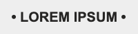
In this first example we use bullet points—an element thought to present unordered lists—to make a headline stand out. This, understandably, has the screen reader confused:
HTML (Before aria-hidden=”true”)
<p style="font-family: Arial, sans-serif; font-weight:bold; font-size:20px; line-height:30px; color:#262524; text-align:center; margin:0; padding:0;">
• LOREM IPSUM •
</p>
Screen Reader Transcript (Before aria-hidden=”true”)
bullet LOREM IPSUM bullet
Adding the aria-hidden=”true” label to the bullet points hides the decorative bullet points from the screen reader:
HTML (After aria-hidden=”true”)
<p style="font-family: Arial, sans-serif; font-weight:bold; font-size:20px; line-height:30px; color:#262524; text-align:center; margin:0; padding:0;">
<span aria-hidden="true">•</span>
LOREM IPSUM
<span aria-hidden="true">•</span>
</p>
Screen Reader Transcript (After aria-hidden=”true”)
LOREM IPSUM
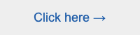
Or check out this example: Do you see the little arrow at the end of this CTA button? It’s a great visual element to drive the subscriber to take action, but to a screen reader, it just doesn’t make sense:
HTML (Before aria-hidden=”true”)
<a rel="noopener" target="_blank" href="https://litmus.com/" style="font-family: Arial, sans-serif; font-size:18px; line-height:25px; color:#235BA8;">
Click here →
</a>
Screen Reader Transcript (Before aria-hidden=”true”)
link
Click here right arrow
We can easily stop the screen reader from reading out loud the words “right arrow” like this:
HTML (After aria-hidden=”true”)
<a rel="noopener" target="_blank" href="https://litmus.com/" style="font-family: Arial, sans-serif; font-size:18px; line-height:25px; color:#235BA8;">
Click here <span aria-hidden="true">→</span>
</a>
Screen Reader Transcript (After aria-hidden=”true”)
link
Click here
Line breaks in headlines
We discovered that when we needed to add a <br /> tag in our heading tags for design purposes, it resulted in the screen reader saying “heading level (number)” twice! So instead of:
heading level 2
The quick brown fox jumps over the lazy dog
A screen reader would read:
heading level 2
The quick brown fox
heading level 2
jumps over the lazy dog
HTML for above example:
<h2 style="font-family: Arial, sans-serif; font-weight:bold; font-size:36px; line-height:44px; color:#262524; text-align:center; margin:0; padding:0;">
The quick brown fox <br />jumps over the lazy dog
</h2>
Not a great experience, right? It gives the wrong impression that there are two <H2> texts right next to each other instead of just one. There are a couple of ways to resolve this.
1. You can always shrink the width of the container so that you don’t need to add a <br /> to break a headline where you’d want.
2. If you can’t change your container dimensions for any reason, here’s a bit more of a nuanced technique. You can wrap the line you want to break in a <span> with style=”display:block;” applied to it, which breaks it into a new line.
Then, you can add a responsive class=”inline” to it so the copy flows inline again once it hits below your mobile breakpoint. Then add an before the <span> to force a separation between the words for the screen reader, and an optional at the end of the copy to prevent orphans. See code examples below:
<head> CSS
@media only screen and (max-width: 640px) {
.inline { display:inline !important; }
}
HTML
<h2 style="font-family: Arial, sans-serif; font-weight:bold; font-size:36px; line-height:44px; color:#262524; text-align:center; margin:0; padding:0;">
The quick brown fox <span class="inline" style="display:block;">jumps over the lazy dog</span>
</h2>
Styled subject lines (Unicode)
Perhaps you’ve seen fancy-pants subject lines like these in your inbox and thought, “Ooh, I want to try that!”

Well, you may want to think again. Not only can these subject lines come off as spammy—true story, this screenshot is from my actual Gmail spam folder—but they’re not accessibility friendly. This copy is comprised of Unicode, which is more similar to special characters or emoji than to semantic system text.
So for example, this subject line:
𝗧𝗵𝗶𝘀 𝗶𝘀 𝗮 𝗨𝗻𝗶𝗰𝗼𝗱𝗲 𝗦𝘂𝗯𝗷𝗲𝗰𝘁 𝗟𝗶𝗻𝗲
Would cause a screen reader to either skip over reading it at all, or read out the numerical code equivalents of every single character. Basically, it’s more suited for robot ears than human ears:
What’s the simple solution? Just use normal system text in your subject lines.
Emojis in subject lines
Speaking of subject lines, emojis have been trending in inboxes recently. After following guidelines on how to use emojis in your subject lines visually, you might want to consider how your emojis sound on a screen reader—both in your subject lines and in your email body.
Because you can’t use code like ARIA in your subject lines, your emojis are read out exactly as-is. Here are a few examples of how subject lines are announced by screen readers.
Subject Line: Claim your gift! 🎁
Screen Reader: Claim your gift! wrapped gift
Or…
Subject Line: This email is lit 😍
Screen Reader: This email is lit smiling face with heart-eyes
Since we can’t hide subject line emojis from a screen reader and also don’t have a way to influence how screen readers read out the emoji description, it’s really important to use emojis in subject lines with care. If you’re using an emoji, make sure you know exactly how your subject line will sound. Here’s a handy guide on what description your screen reader will use for each emoji.
Emojis in the email body
However, you have more control over how to treat your emojis in your body HTML. So here are a few examples of how to code the line below:
Original Screen Reader Transcript:
We red heart email!
That’s not ideal, is it? Let’s look at how we can make the screen reader announce that we love email:
1. Code emojis as images with your preferred ALT text. Not only is this the only way you can ensure that your emoji renders uniformly across all email clients, but it’s also semantically correct.
We <img src="emoticon-heart.png" width="22" height="22" alt="love" style="display: inline; margin: 0; padding: 0; vertical-align: -5px;" border="0" /> email!
Screen Reader Transcript
graphic
love
email!
2. Use ARIA to expose the emoji to assistive devices as an image, and give it an accessible name that you prefer.
We <span role="img" aria-label="love">❤️</span> email!
Screen Reader Transcript
graphic
love
email!
3. Hide the emoji. We would recommend using this very sparingly. For example, the “We ❤️ email!” example would not be the best application to hide emojis. It would look and sound something like this:
We <span aria-hidden="true">❤️</span> email!
Screen Reader Transcript
email!
Because aria-hidden=”true” hides this element from screen readers, adding an aria-label to it will not re-expose it. It just remains completely hidden. As a result, we would only recommend using it in situations where the emojis are purely decorative and hiding them makes sense audibly like in the following example:
Original Screen Reader Transcript
So let’s take a look at coding this with aria-hidden=”true” to hide the clapping hands emojis.
HTML
We <span aria-hidden="true">👏</span> love <span aria-hidden="true">👏</span> email! <span aria-hidden="true">👏</span>
Screen Reader Transcript
We love email!
How does your email sound when read out loud by a screen reader?
1.3 billion people live with some form of visual impairment and many rely on screen readers to consume online content, including emails. Litmus lets you listen to an audio recording of your email before you send, so you can be sure subscribers using screen readers will have a great experience.
Learn more about accessibility testing in Litmus →
 | Ultimate Guide to Email AccessibilityThis guide has the insights and step-by-step advice you need to write, design, and code emails that can be enjoyed by anyone—regardless of their ability. |
Alice Li
Alice Li was a Principal Email Engineer at Litmus