
The Best Way to Code HTML Email Background Colors and Gradients
Coding background colors sounds like a simple task right? The truth? Even this minor bit of styling has some pitfalls, and there are a few considerations that need to be made to get consistent rendering across email clients.
And it’s not just developers that need to appease the inbox gods. With Dark Mode gaining momentum, there are even more environments to be aware of, some of which will require email designers to take extra care when applying background colors in their designs.
In this blog post, you’ll learn:
- The benefits of background colors
- How to code a solid color background (+ email client support)
- How to code a gradient background (+ email client support)
- Tips to optimize for Dark Mode
Why use background colors in email?
Putting a background color strategy into place meets a few needs when it comes to elevating your email program. From a technical standpoint, implementing background colors doesn’t add any load time to your emails, and they’re still visible even when images are turned off. They can help separate content, call out messaging, or set an email apart from others in your subscriber’s inbox, potentially increasing engagement among your audience.
Stand out in the inbox
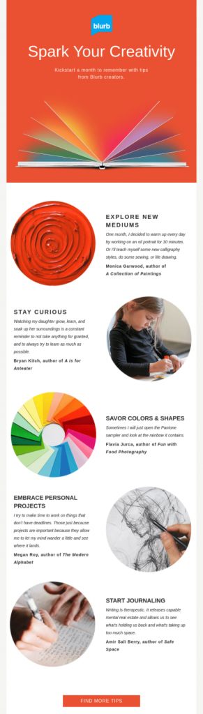
Just like personalization, a great background can create an impactful opening experience—like this email from Blurb.
The hero area packs a punch. The bold orange background makes an impact by contrasting against the blue of the logo, elevating the brand identity. Once the reader scrolls past the hero area, secondary content sits on a white background, offering the ideal reading experience for larger bodies of copy.
Separate out sections
If you’ve got a long email, color is a great way to visually separate different content blocks so it feels more digestible.
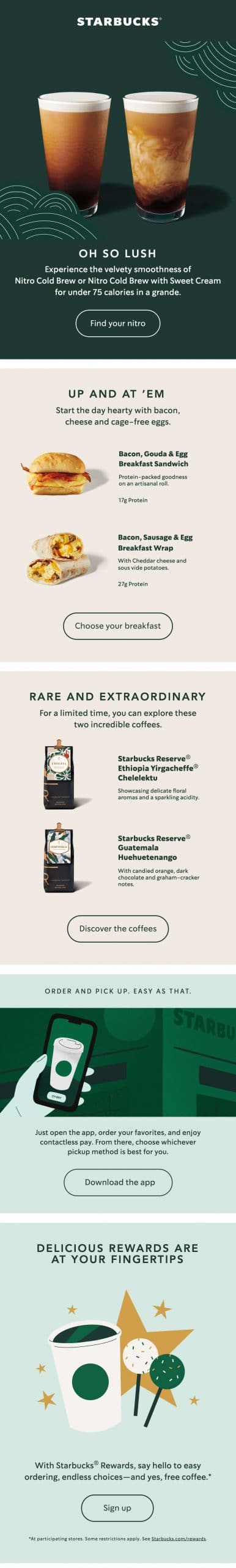
Promotional emails from coffee house giant Starbucks can be quite lengthy, with multiple promotions housed within a single email. To help sections stand apart from each other, different background colors are used.
Elevate brand identity
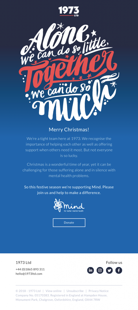
Gradients are part of Marketing Agency 1973 Ltd’s brand identity, which is why you often find bold linear gradients in the background of their emails. Background gradients can make compositions appear more dynamic, and even encourage the subscriber to scroll.
So what’s the best way to bring these techniques into your email development? I asked my teammate and developer of Litmus emails, Carin Slater, to give us the lowdown on coding solid and gradient backgrounds.
How to code a solid HTML email background color
Background colors can be coded in multiple ways and in multiple places. But each method is not equally supported among email clients. Here’s a quick chart of which background style code and color code method works for the top email clients.
Email client support for background colors
| Style code | CSS properties ‘background’ and ‘background-color’ | HTML attribute ‘bgcolor’ | ||||||
|---|---|---|---|---|---|---|---|---|
| Color code | 6 digit hex | 3 digit hex | RGB | RGBA | 6 digit hex | 3 digit hex | RGB | RGBA |
| Apple Mail 14 | ✓ Yes | ✓ Yes | ✓ Yes | ✓ Yes | ✓ Yes | ✓ Yes | ✘ No | ✘ No |
| Outlook 2016 (macOS 10.12.6) | ✓ Yes | ✓ Yes | ✓ Yes | ✓ Yes | ✓ Yes | ✓ Yes | ✘ No | ✘ No |
| Outlook 13, 16, 19 (Windows 10) | ✓ Yes | ✓ Yes | ✓ Yes | ✘ No | ✓ Yes | ✘ No | ✘ No | ✘ No |
| Outlook Office 365 (Windows 10) | ✓ Yes | ✓ Yes | ✓ Yes | ✘ No | ✓ Yes | ✘ No | ✘ No | ✘ No |
| Outlook Office 365 (Mac OS 10.15) | ✓ Yes | ✓ Yes | ✓ Yes | ✓ Yes | ✓ Yes | ✓ Yes | ✘ No | ✘ No |
| Windows 10 Mail | ✓ Yes | ✓ Yes | ✓ Yes | ✘ No | ✓ Yes | ✘ No | ✘ No | ✘ No |
| Gmail App (Android 10) | ✓ Yes | ✓ Yes | ✓ Yes | ✓ Yes | ✓ Yes | ✓ Yes | ✘ No | ✘ No |
| Gmail App (iOS 13.4.1) | ✓ Yes | ✓ Yes | ✓ Yes | ✓ Yes | ✓ Yes | ✓ Yes | ✘ No | ✘ No |
| Outlook (Android 7.0) | ✓ Yes | ✓ Yes | ✓ Yes | ✓ Yes | ✓ Yes | ✓ Yes | ✘ No | ✘ No |
| Outlook (iOS 12.0) | ✓ Yes | ✓ Yes | ✓ Yes | ✓ Yes | ✓ Yes | ✓ Yes | ✘ No | ✘ No |
| Samsung Mail (Android 7.0) | ✓ Yes | ✓ Yes | ✓ Yes | ✓ Yes | ✓ Yes | ✓ Yes | ✘ No | ✘ No |
| iPad 11 Air (Gen 4 iOS 14.2) | ✓ Yes | ✓ Yes | ✓ Yes | ✓ Yes | ✓ Yes | ✓ Yes | ✘ No | ✘ No |
| iPhone 12 (iOS 14.2) | ✓ Yes | ✓ Yes | ✓ Yes | ✓ Yes | ✓ Yes | ✓ Yes | ✘ No | ✘ No |
| AOL Mail (Edge) | ✓ Yes | ✓ Yes | ✓ Yes | ✘ No | ✓ Yes | ✘ No | ✘ No | ✘ No |
| Comcast (Edge) | ✓ Yes | ✓ Yes | ✓ Yes | ✓ Yes | ✓ Yes | ✓ Yes | ✘ No | ✘ No |
| Gmail (Chrome) | ✓ Yes | ✓ Yes | ✓ Yes | ✓ Yes | ✓ Yes | ✓ Yes | ✘ No | ✘ No |
| Office 365 | ✓ Yes | ✓ Yes | ✓ Yes | ✓ Yes | ✓ Yes | ✓ Yes | ✘ No | ✘ No |
| Outlook.com | ✓ Yes | ✓ Yes | ✓ Yes | ✓ Yes | ✓ Yes | ✓ Yes | ✘ No | ✘ No |
| Web.de | ✓ Yes | ✓ Yes | ✓ Yes | ✘ No | ✓ Yes | ✘ No | ✘ No | ✘ No |
| Yahoo! Mail | ✓ Yes | ✓ Yes | ✓ Yes | ✘ No | ✓ Yes | ✘ No | ✘ No | ✘ No |
We all know email clients can be a bit persnickety. So what’s the best way to code background colors so it works across all email clients? I’ll walk you through our recommendation and why.
1. Use tables and table cells
There are four places in your HTML that you can add a background color:
- <body>
- <div>
- <table>
- <td>
The safest place to add the background color is on a table or a table cell.
The <body> tag is deleted in Yahoo and AOL, so any background color applied there won’t show up in those email clients. And placing a color on a wrapping <div> after the body would work everywhere except Outlook clients since they don’t support <div> tags in emails.
To get the widest range of email client support, wrap your entire email in a 100% width <table> tag and put your background color there. And use table cells <td> for sections of your email so you have greater flexibility in coloring specific content blocks.
2. Add color with a CSS property and HEX color codes or RGB values
Background colors can be coded in multiple ways:
- Using the bgcolor HTML attribute
- Using the CSS property background-color
- Using the CSS shorthand property background
- Using the 6 digit hexadecimal color code
- Using the 3 digit hexadecimal color code
- Using RGB color values
As far as how to put the background color on your table or table cell, you should use a CSS property.
Testing the two CSS property methods—background-color and background—we found they both have the same, consistent results as long as you are only adding color (no images). According to caniemail.com, using the background property for anything other than adding a color may result in your color not showing up.
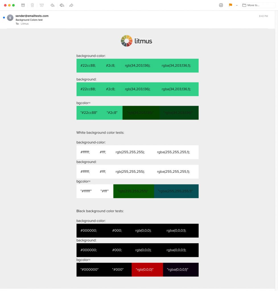
The bgcolor HTML attribute didn’t fare well in Outlook, with inconsistent support for 3-digit HEX codes. And the use of RGB and RGBA values resulted in the incorrect color, or the color being dropped completely.
Here’s our background color test using the various methods in Outlook so you can see for yourself:
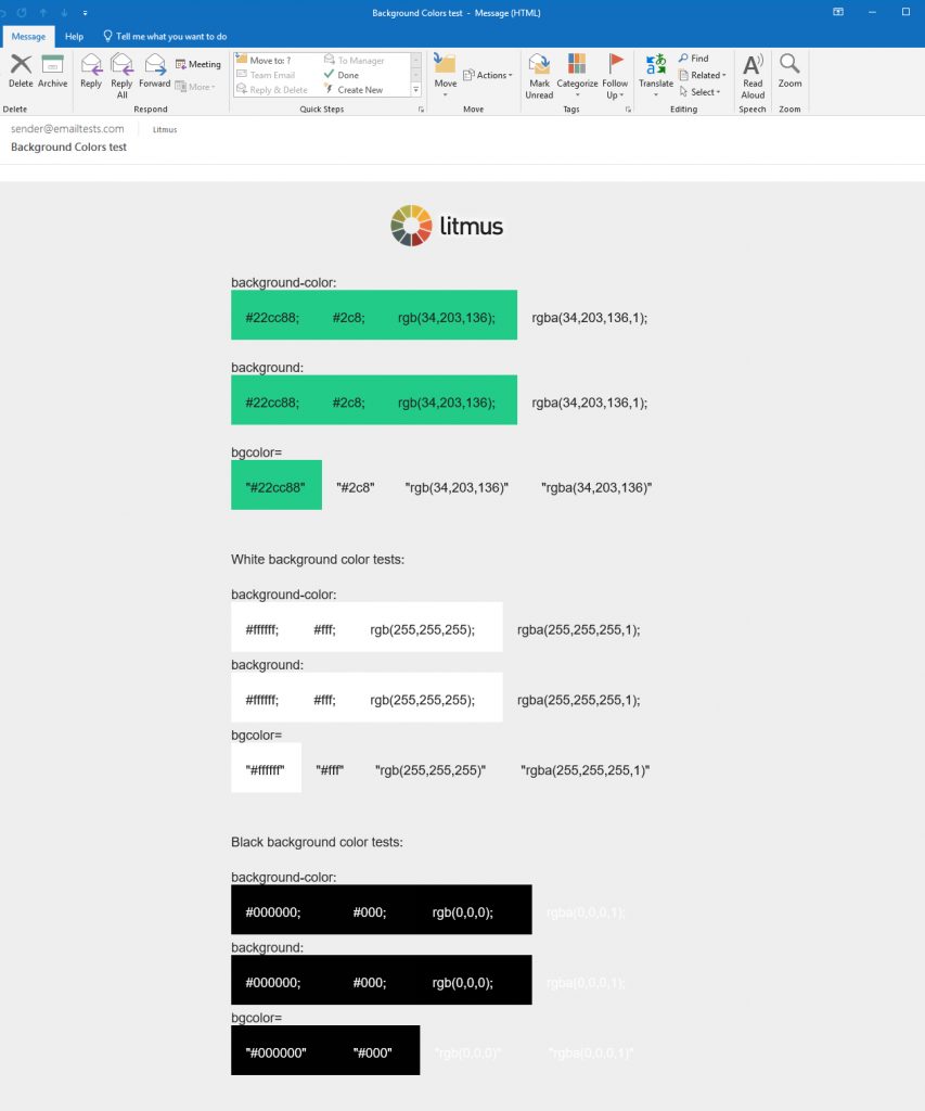
In other email clients, the 3-digit HEX code rendered well, but the RGB and RGBA values resulted in incorrect colors when applied to the bgcolor HTML attribute.
After all our testing, we came to one conclusion: Stick with the CSS properties, and use 3 or 6-digit HEX codes or RGB values. Those worked across all email clients.
Introducing opacity with the alpha for the RGBA value wasn’t supported in Outlook, Web.de, or GMX.de, but had decent support otherwise.
So your final code should look something like this to color the whole background of a table:
<table border="0" cellpadding="0" cellspacing="0" width="100%" style="background-color: #427CA9;">
Or add color to a specific table cell:
<td style="background-color: #427CA9;">
And that’s really it!
QA test your email’s background colors and more Did you do it right? See how your email looks in the most popular email clients—so you can ensure an on-brand, error-free subscriber experience. |
How to create a gradient background
When you want to take background colors up a notch, try adding gradients.
CSS gradients aren’t supported everywhere, but there are fallbacks that make it possible to render a gradient in almost all email clients.
Email client support for gradient backgrounds
| Email client | Support for CSS linear gradients | Support for CSS linear gradients, VML gradients, and image fallbacks |
|---|---|---|
| Apple Mail 14 | ✓ Yes | ✓ Yes |
| Outlook 2016 (macOS 10.12.6) | ✓ Yes | ✓ Yes |
| Outlook 13, 16, 19 (Windows 10) | ✘ No | ✓ Yes |
| Outlook Office 365 (Windows 10) | ✘ No | ✘ No |
| Outlook Office 365 (Mac OS 10.15) | ✓ Yes | ✓ Yes |
| Windows 10 Mail | ✘ No | ✘ No |
| Gmail App (Android 10) | ✓ Yes | ✓ Yes |
| Gmail App (iOS 13.4.1) | ✓ Yes | ✓ Yes |
| Outlook (Android 7.0) | ✘ No | ✓ Yes |
| Outlook (iOS 12.0) | ✘ No | ✓ Yes |
| Samsung Mail (Android 7.0) | ✓ Yes | ✓ Yes |
| iPad 11 Air (Gen 4 iOS 14.2) | ✓ Yes | ✓ Yes |
| iPhone 12 (iOS 14.2) | ✓ Yes | ✓ Yes |
| AOL Mail (Edge) | ✘ No | ✓ Yes |
| Comcast (Edge) | ✓ Yes | ✓ Yes |
| Gmail (Chrome) | ✓ Yes | ✓ Yes |
| Office 365 | ✘ No | ✓ Yes |
| Outlook.com | ✘ No | ✓ Yes |
| Web.de | ✘ No | ✘ No |
| Yahoo! Mail | ✘ No | ✓ Yes |
Here’s how you can get started.
1. Apply CSS linear gradient backgrounds to a table or table cell
Just as you would do with solid color backgrounds, apply CSS linear gradient backgrounds to a table or table cell, or a containing div (we’ll dive into an Outlook workaround shortly), to create something like this:
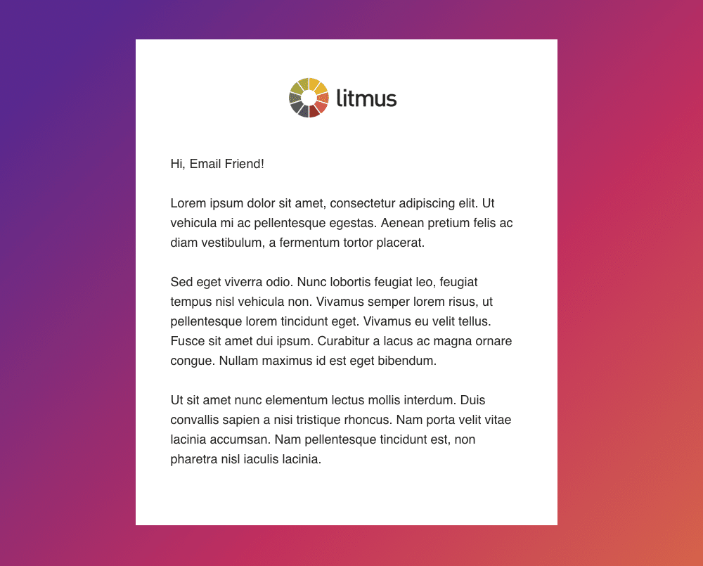
In this example, the gradient includes three colors: purple, magenta and orange. The styling starts within the HTML with a solid color fallback applied to the bgcolor attribute. Then within the inline CSS styles, we repeat that fallback using the background property and RGB method.
To create the linear gradient, we include the background property again and apply linear-gradient styling. Since the gradient we are creating renders diagonally from the top left to bottom right, we start with the gradient angle syntax (315deg). Then, in the order we would like the colors to appear, we use the RGBA method to declare each color.
After the RGBA color styling, include the position you would like that color to appear. This will help to blend your colors together nicely. To get an idea of how to select a color position you can use an CSS gradient online generator.
You should end up with code that looks like this:
<table border="0" cellpadding="0" cellspacing="0" width="100%" bgcolor="#e37b46" style="background: rgb(227,123,70); background: linear-gradient(315deg, rgba(227,123,70,1) 3%, rgba(198,51,92,1) 44%, rgba(86,50,139,1) 85%);">
2. Create a fallback for Outlook with VML gradients
Do a lot of your subscribers use Outlook? Then you’ll need to use vector markup language (VML) to add the background gradient.
<!--[if gte mso 9]>
<v:background xmlns:v="urn:schemas-microsoft-com:vml" fill="t">
<v:fill type="gradient" color="#e37b46" color2="#56328b" />
</v:background>
<![endif]-->
VML gradients work best with two colors. There is the option to do three or more colors, but it turns out looking very much like something from the early 1990s, and there isn’t much control over what you can do to tame it. If you want three or more color gradients, it’s best to use an image (and I’ll show you how in the next step).
For image-based VML gradients, you’ll have to play around with the image size to figure out the best way to get it to fill the space. You can use the type=”frame” or the type=”tile” attributes. I find really long skinny gradients work well for type=”tile”, whereas short wide gradient images work better with type=”frame”.
The best way to see what works is to put the image in and see what it looks like in Litmus.
3. Create an image-based fallback for Outlook, Yahoo, and AOL
If you’ve got subscribers on Yahoo, AOL, Outlook (iOS and Android), and Outlook.com, you can create image-based fallbacks for them.
Add a class of “gradient” to the cell or table you want the gradient applied to. Then, using different targeting methods, you can assign a CSS background image to override the gradient CSS style where the gradient doesn’t show up.
To target Outlook.com, use something like this:
[class~="x_gradient"] {
url('https://campaigns.litmus.com/_email/content-support/background-colors-blog/background-gradient1.jpeg') !important;
background-size: 100% 100% !important;
background-repeat: repeat-x !important;
}
To target Yahoo & AOL, use:
.& .gradient {
url('https://campaigns.litmus.com/_email/content-support/background-colors-blog/background-gradient1.jpeg') !important;
background-size: 100% 100% !important;
background-repeat: repeat-x !important;
}
To target both the Outlook mobile clients, use:
body[data-outlook-cycle] .gradient {
url('https://campaigns.litmus.com/_email/content-support/background-colors-blog/background-gradient1.jpeg') !important;
background-size: 100% 100% !important;
background-repeat: repeat-x !important;
}
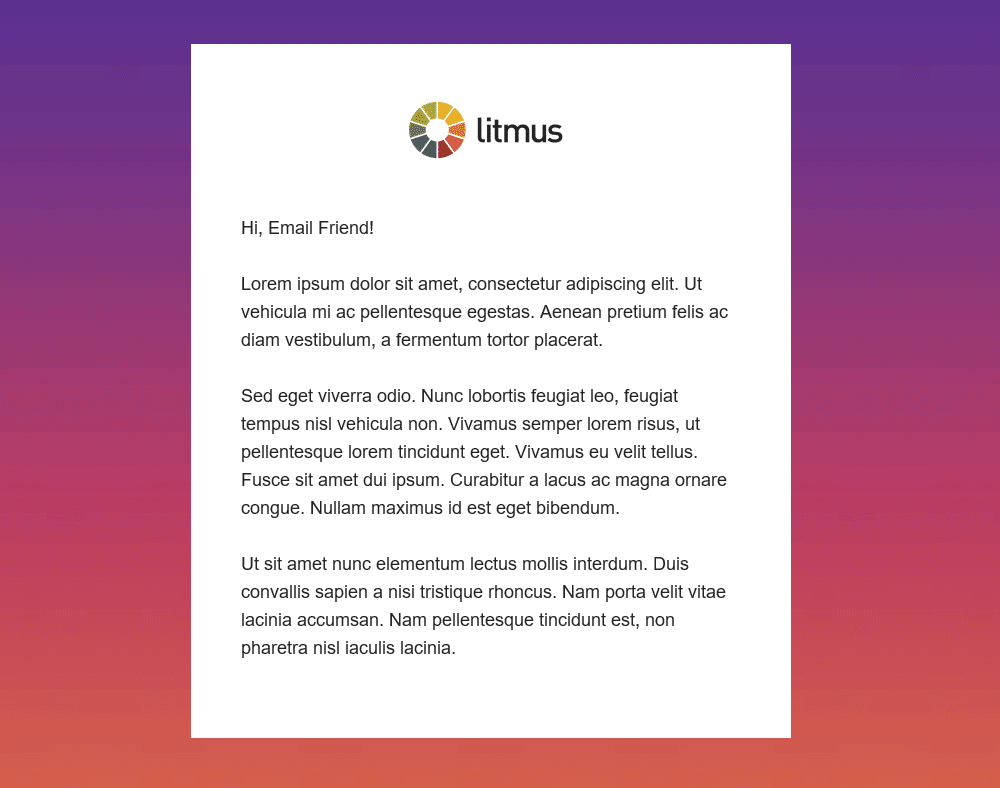
We created an image-based fallback for our example gradient. For this to repeat, we had to say goodbye to the gradient angle and arrange our colors to display from top to bottom:
4. Use a solid fallback color for all other email clients
For those email clients that don’t support either fix, make sure to provide a solid fallback color.
In this case, use the bgcolor attribute with the 6-digit HEX color to provide the fallback color for Windows 10 and Office 365 desktop clients. Web.de will use the CSS background property as a fallback.
So, if you want to color the whole background of a table, the final code to use inline in your emails is:
<table class="gradient" border="0" cellpadding="0" cellspacing="0" width="100%" bgcolor="#e37b46" style="background: rgb(227,123,70); background: linear-gradient(315deg, rgba(227,123,70,1) 3%, rgba(198,51,92,1) 44%, rgba(86,50,139,1) 85%);">
<!--[if gte mso 9]>
<v:background xmlns:v="urn:schemas-microsoft-com:vml" fill="t">
<v:fill type="frame" color="#e37b46" src="https://campaigns.litmus.com/_email/content-support/background-colors-blog/background-gradient1.jpeg" />
</v:background>
<![endif]-->
Or use this code if you want to color just a specific table cell:
<td class="gradient" align="left" valign="top" bgcolor="#e37b46" style="background: rgb(227,123,70); background: linear-gradient(315deg, rgba(227,123,70,1) 3%, rgba(198,51,92,1) 44%, rgba(86,50,139,1) 85%);">
<!--[if gte mso 9]>
<v:rect xmlns:v="urn:schemas-microsoft-com:vml" fill="true" stroke="false" style="width:[width]px; height: [height]px;">
<v:fill type="frame" color="#e37b46" src="https://campaigns.litmus.com/_email/content-support/background-colors-blog/background-gradient1.jpeg" />
<v:textbox inset="0,0,0,0">
<![endif]-->
If you’re not familiar with VML and want to make sure you have it right, Campaign Monitor has a handy tool developed by Stig for adding background images to email. You can use that same tool and replace the v:fill type=”tile” with v:fill type=”gradient” to create a gradient. Make sure to declare both your start and end gradient colors with color=”” and color2=”” and remove the src=”” attribute. In the above examples, use v:fill type=”frame” to make sure an image spans the entire frame and doesn’t repeat. This is also a great fix for retina background images, but we’ll leave that to Courtney Fantinato.
Don’t forget Dark Mode
Just when background color support was getting better, Dark Mode was thrown into the mix.
This opportunity to create a bespoke reading experience based on a subscriber’s contrast preferences, is a huge win for accessibility—but another hurdle for email designers and developers.
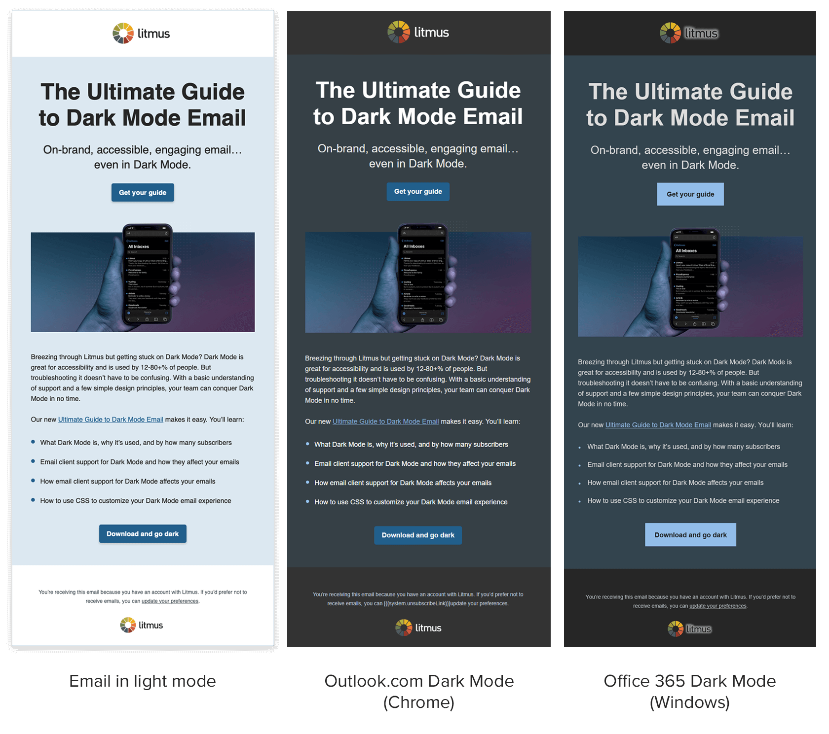
 | The Ultimate Guide to Dark Mode Email Optimizing emails for Dark Mode can be tricky. Check out our ultimate guide for coding and design tips for creating the best on-brand Dark Mode email subscriber experience. |
Whilst email clients such as Apple Mail, iPad, the iPhone native mail apps, HEY, and the Outlook app can be targeted with embedded CSS styling, there are also email clients that use their own default rendering to offer a Dark Mode solution.
Outlook.com, Office 365, and Gmail apps for iOS and Android all either partially or fully invert colors to create a Dark Mode experience, sometimes with horrible results.
There is no way to overwrite this color inversion yet. However, there are a couple of things you can consider to improve emails rendering in these environments.
Tip #1: Make informed design choices with color testing
It can be a little heartbreaking to see your colors get adjusted in ways you didn’t intend. And it’s somewhat worrying when a color doesn’t change but a font color does—and all your accessibility considerations go out of the window.
It’s worth testing your brand colors in email clients that invert colors for Dark Mode to see how they are altered. Once you have an idea of how your colors render, you can make informed color choices at the design stage.
We ran a similar test to see how some of our colors and tones faired across email clients that we had no control over:
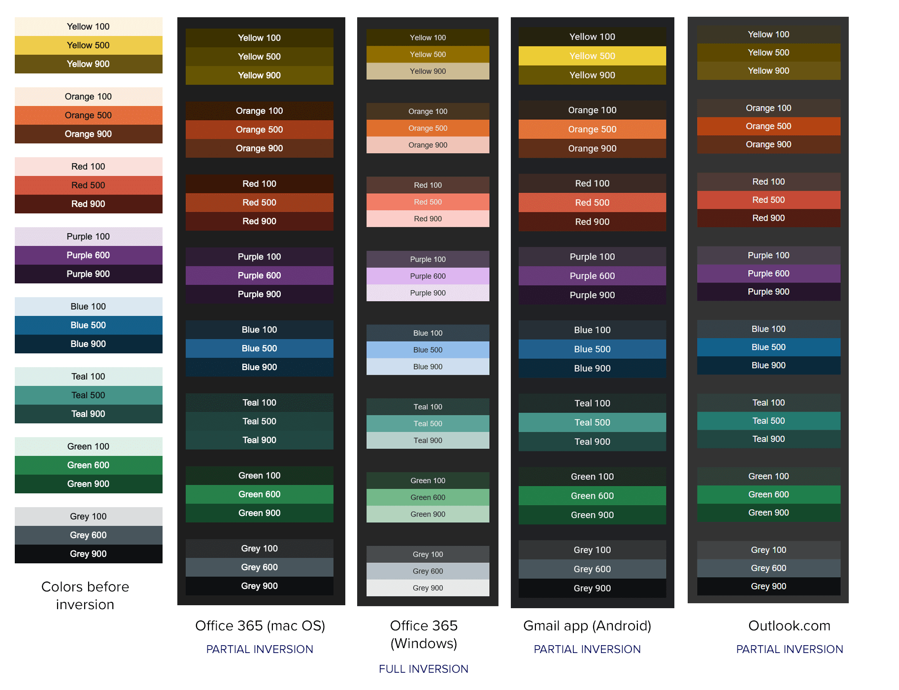
We found that using a light tone resulted in the background and text colors inverting reasonably well. And although the colors that render once inverted are not part of our color palette, we can offer an accessible reading experience in these email clients.
Tip #2: Use partial fixes for Gmail apps
Ways to tame color inversion within Gmail apps have come to light, thanks to the relentless efforts of the email community.
https://twitter.com/The_Annett/status/1204896185728716805
By applying a linear gradient containing your background color to container elements, you can force your chosen color to appear in Gmail’s light and Dark Mode environments.
To do this, you need to add your linear gradient to the background-image CSS property using the HEX color method. Then make both colors in your gradient the color you want Gmail to honour, like so:
<table border="0" cellpadding="0" cellspacing="0" width="100%" bgcolor="#e37b46" style="background-image: linear-gradient(#e37b46, e37b46);">
Rémi Parmentier has expanded this workaround to also prevent text colors from being inverted in Gmail apps using CSS blend modes.
Using these fixes can help you control some aspects of inverted rendering. However, this is only possible in Gmail and doesn’t give the flexibility to change the colors of your email depending on the contrast mode your subscribers select.
As frustrating as it is not being able to target email clients that invert your colors, you can regain a little control by: testing your color palette, making color choices based on test results, and working with these partial fixes.
Wow your subscribers with color
Color is a great way to add some oomph to the subscriber experience and keep your email content organized. And it takes less time and resources than images! That’s a win-win all around.
So get started with this guide—and we can’t wait to see your colorful backgrounds in our inboxes.
Make sure your colors show up correctly Do subscribers see your emails the way you intended? Preview how your emails look in over 90 email clients, apps, and devices—with Litmus Email Previews. |
Originally published on March 27, 2018, by Justine Jordan. Last updated on April 21, 2021.
Lily Worth
Lily Worth was a Senior Email Designer at Litmus