
The Litmus Team’s Favorite Emails of September 2021
🍂 As we make our way into fall, and the season that sees our inboxes burst with pre-holiday promotional emails, there is a wonderful sense of calm and clarity in the inboxes of the Litmus team.
We were delighted by beautifully crafted animated GIFs, simple and clean designs, clever subject lines, considerate copywriting, and popping design trends—making September an incredibly inspiring month.
Dylan Smith, UX Engineer
Bulb
Subject line: We will use this email address for your Bulb account
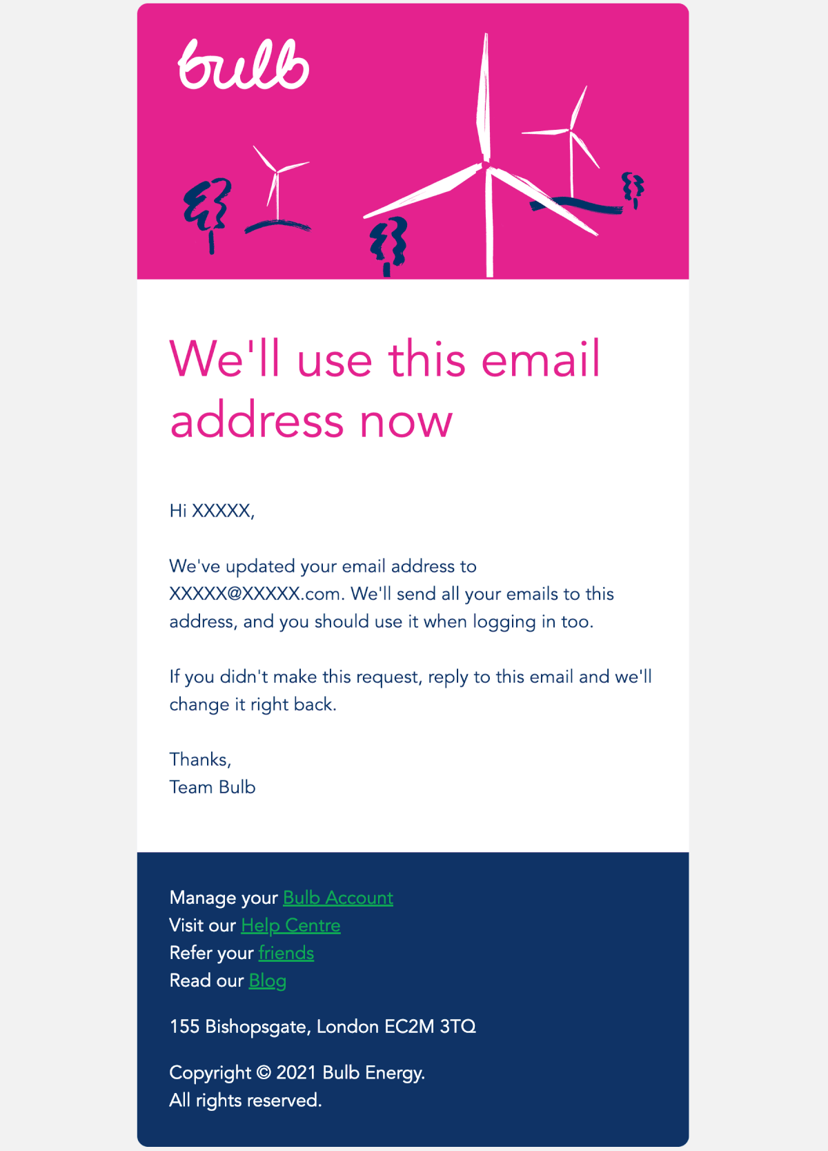
Dylan says: I recently changed my primary email address, and I’ve been updating online accounts to use the new one. Bulb’s confirmation email stood out because it’s the only one of dozens so far to use natural sounding language. They wrote it like they’d speak to me aloud.
I also like the animation, and the typography is well done. Very large, readable, and clear. The use of the location pin icon in the contact info is a nice touch, too. Bulb’s emails are always simple and attractive, and I’m glad to see this carries through to their transactional emails as well.
Emails like this are so often overlooked. They sometimes have no design or, maybe worse, outdated design that doesn’t match the current brand. They read robotically. They use overly technical terms. But account management is more important and high stakes to customers than the marketing emails, so a brand that pays attention to these interactions stands out.
Kimberly Huang, Content Marketing Specialist
Jay Shetty
Subject line: How to choose ease 🌸
Preview text: Your weekly dose of well-being.
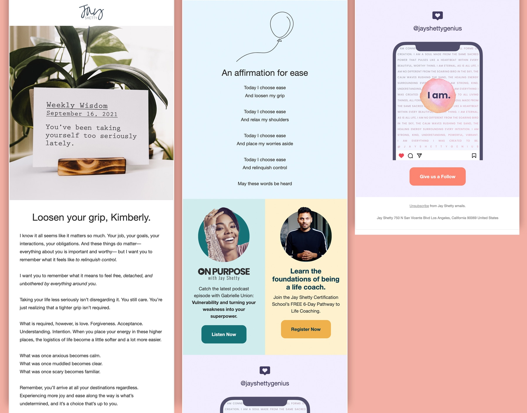
Kim says: Content and timing! This popped into my inbox at the right time during my morning. A lot of brands in the health and wellness space send nurture emails with an overarching theme of self-care—and most times, that can feel disingenuous. But this one stood out to me because the copy was thoughtful, and the design simple & clean (love the use of blocks and colors to break apart the email).
When brands find that balance between hard-sell content and content that is purely helpful, educational, and delightful—that boosts my affinity toward them. Although this nurture email had some soft-sells, I think they found the perfect balance.
Megan Moller, Director of Content Marketing
Wistia
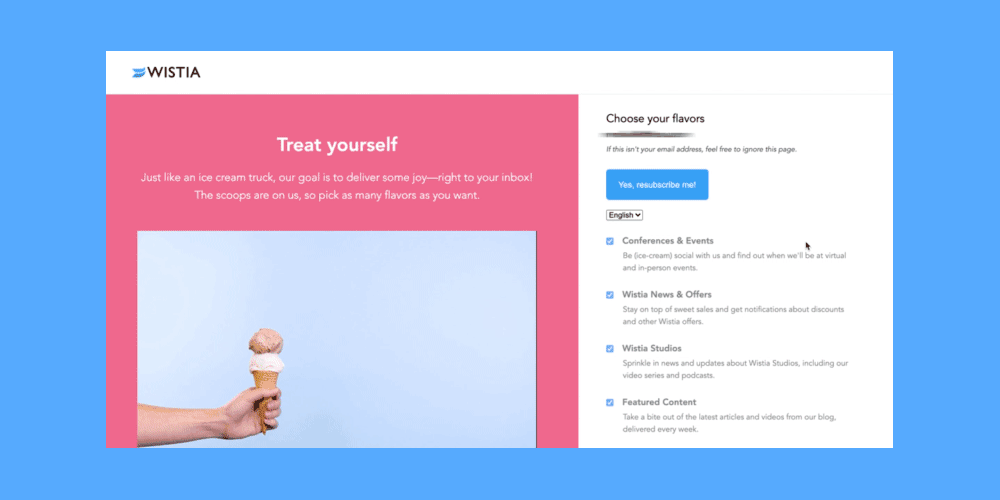
Megan says: I wanted to share something a little different this month—and share a preference center that stood out. We’ve been talking a lot about the importance of preference centers, especially with Apple’s Mail Privacy Protection and the death of the third-party cookie in 2023. People will need to focus more on preferences, first-party data, and personalization—to name a few—to deliver the experiences that subscribers want and deserve.
What I love about Wistia’s preference center is they make it fun. I was surprised and delighted by the ice cream cone animation and how they position their email content as a treat where you can get as many flavors as you’d like. Alternatively, when you unsubscribe, you’re taken to a cone-firmation page, further playing off the theme. The page also shows the ice cream going splat since you’ve unsubscribed. This page is such a wonderful foundation to build off for further customization and delight. As marketers, it’s important for us to think through and guide EVERY experience subscribers have… right down to the subscribe (or unsubscribe) one.
Magan Le, Content Marketing Manager
Canva
Subject line: Looking to give your business a boost?
Preview text: With Canva, you can
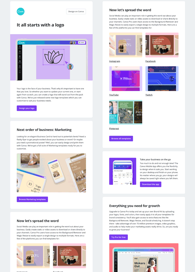
Magan says: I love the bold headline and animated hero image that shows you just how fast and easy you can create a logo. And the whole email tells a story almost step-by-step of what you need to do to boost your business (the promise given in the subject line) and how Canva can help you do it—with clear CTAs, too! There are also nods to their mobile app as well as upgrading to a Pro plan at the very end. I like that it’s not pushy, especially at this stage in my customer journey with Canva, but it’s there in case I happen to be ready.
Clockwise
Subject line: ⚠️ Your access to valuable Clockwise features has expired. Upgrade now to restore your scheduling benefits
Preview text: You no longer have access to key Clockwise features
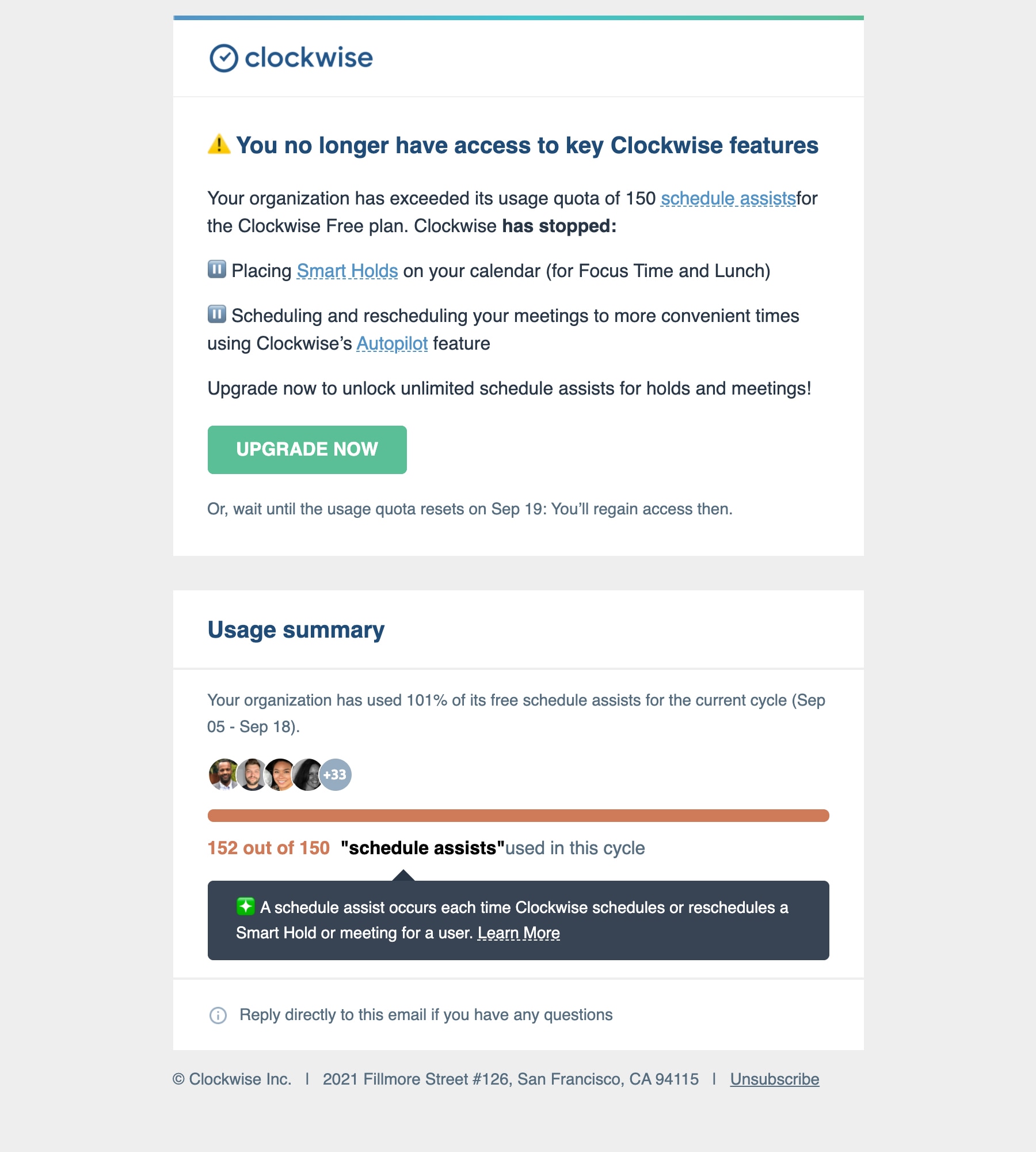
Magan says: This is a great upsell email combined with an account notification. It gets straight to the point, telling me what the quota is, which features have expired (along with brief copy on their benefits), and a usage summary. I also like that they provide a reminder that the quota does reset every month and the exact date that would happen so I can make the choice to either go without for now and wait or upgrade if I can’t wait. The yellow alert emoji is a nice touch to emphasize the message’s importance without feeling over the top, and the email also has pause button emojis to serve as visual cues that these features are on pause.
Daniel Hawkins, Marketing Designer
Imperfect Foods
Subject line: Padma Lakshmi unpacks our sustainability mission 🌎
Preview text: N/A
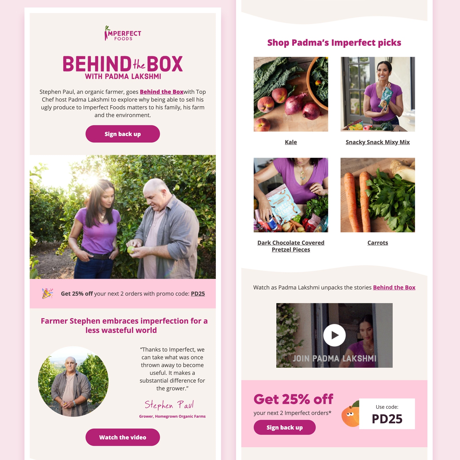
Daniel says: Nice, clean design. Color themed throughout the whole email including backgrounds, photos, and even products featured. There are also some nice subtle background shades and wavy shapes that help the whole thing flow really well.
Jaina Mistry, Senior Manager of Email Marketing
Chubbies
Subject line: This email
Preview text: – may cause drowsiness
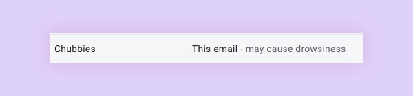
Jaina says: It’s not actually the email itself that stood out to me, but it was the subject line and preview text combo that stood out in the inbox to me. This email from Chubbies highlights how important it is for not just your email to stand out AFTER it’s opened, but ensuring your email stands out in the inbox itself to encourage that open. Also, I can’t ignore emails where the subject line and preview text work hand-in-hand this perfectly.
Lily Worth, Email Design & Production Specialist
G2
Subject line: Thanks for joining us!
Preview text: N/A
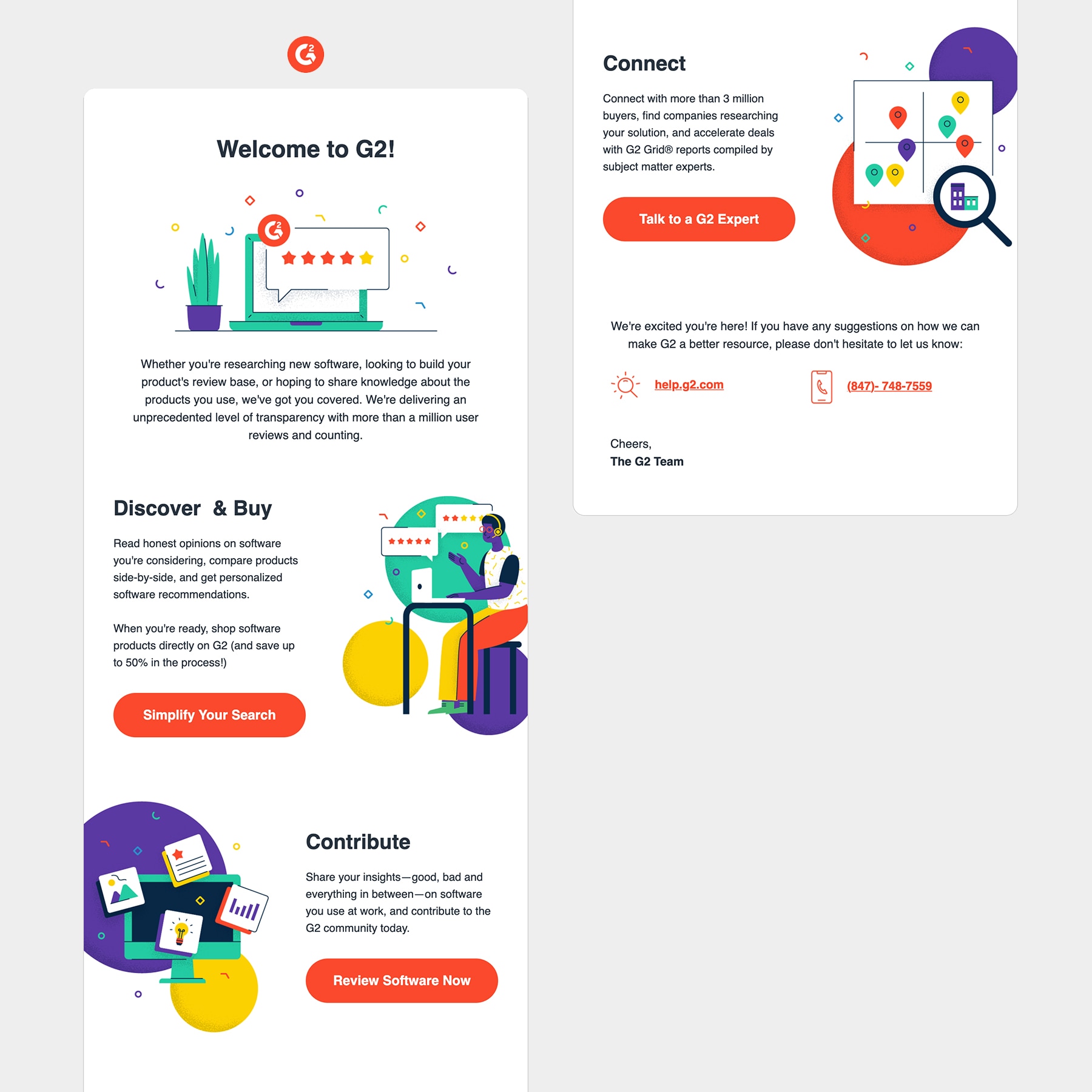
This is a welcome email that pops! The use of bright colours and modern illustrations grab my attention on open. As I am new to G2, there are multiple links in the email taking me to places where I can get started, and with three of these links styled as large buttons, it could become overwhelming. However, the designer behind this email has presented the content in a Z-pattern, a great way to separate content and help the reader to engage.
I really like the positioning of the illustrations against the left and right sides of the body container, cutting off a small part of each image. It is much less common to see this kind of image placement, which grabbed my attention and made me want to consume the full email, and then share it with my team… and beyond.
Abstract
Subject line: Meet us in the margin
Preview text: Notes from the design lifecycle. We’ve missed rounding up the latest design articles and thoughts on the industry and sharing them with you.
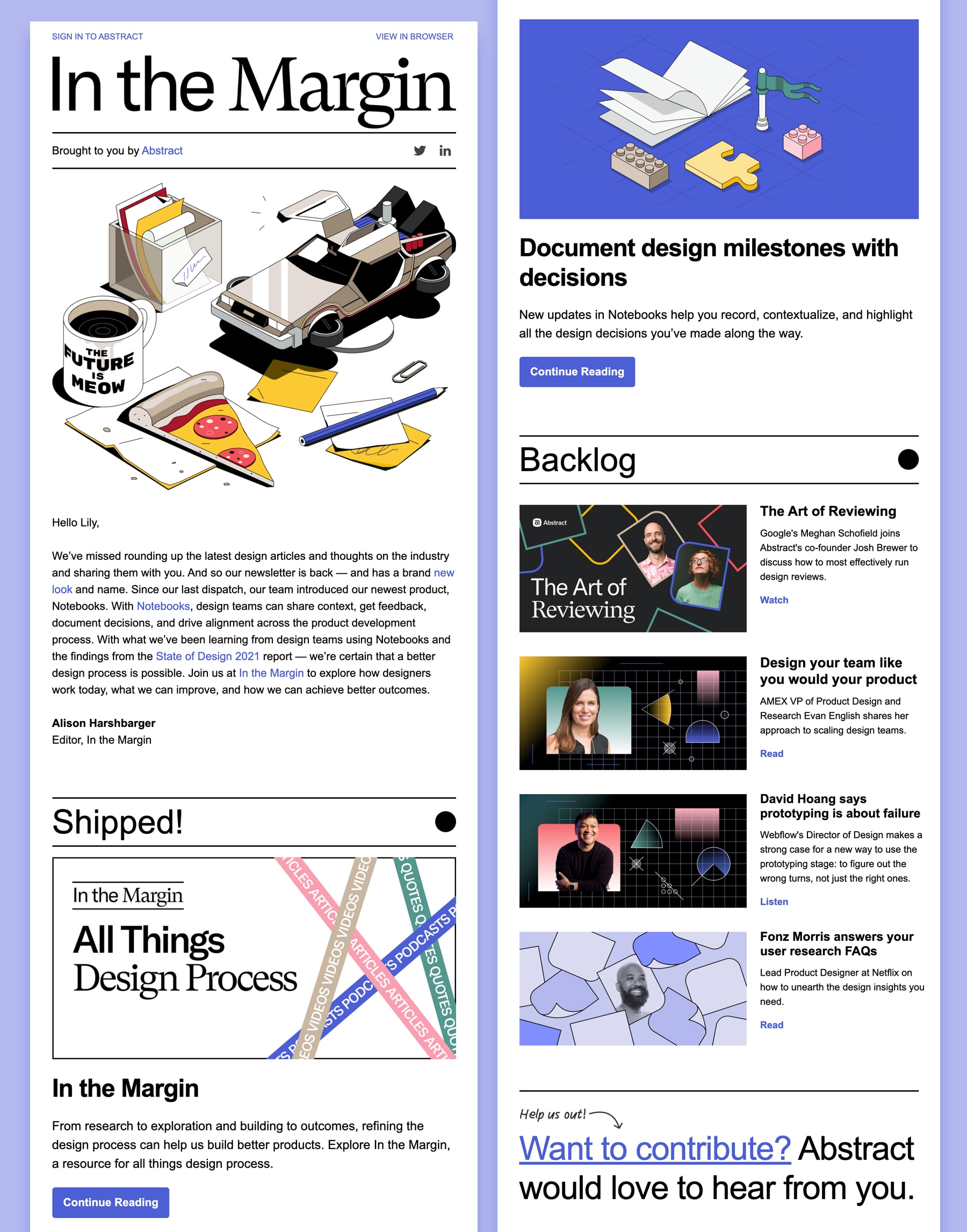
When this brand new Abstract newsletter hit my inbox recently, I was completely blown away. I love to track design trends in email and this one is absolutely packed with them. The overall vibe of this email design is Retro Futurism, a fusion of past and present. This is showcased beautifully with the use of isometric imagery—a 3D design style–that packs a punch on open. There is no image I can think of that says ‘Future Retro’ to me more than the DeLorean.
The typography also gets my heart racing, which has been really well considered to help the reader engage with each section and understand the hierarchy. I even love that they are shouting at me right at the very end to make sure I don’t miss out on the chance to contribute.
We shared ours—so share yours!
What emails caught your attention in September? We want to know! We love hearing from our email community and want to see the ones that stood out to you.
Lily Worth
Lily Worth was a Senior Email Designer at Litmus