Catching Up With Parse.ly’s 2022 Feature Releases

From the Parse.ly Content Helper and recirculation rate to the Bottom Listings Report, Parse.ly released many exciting and helpful new features in 2022.
In case you missed any, here’s a summary of what’s new with our platform.
- Updated content recommendation API
- Parse.ly Content Helper
- Comparisons
- Recirculation rate
- Bottom Listings Report
- Author, campaign, tag, and referrer groups
- Check for metadata updates
- Conversions and campaigns in Overview
- UI improvements
Updated content recommendation API
We made significant improvements to the natural language processing that powers our content recommendation API. It now provides an even more compelling experience for readers, adding content suggestions to your articles, webpages, apps, and newsletters that will keep readers clicking through to read more of your content.
Our original recommender system is based on the “bag of words” model—how many of the same words occur in two articles represents how likely they are to be about similar content. This is how almost all commercial content recommendation systems are built, for example things built on Elasticsearch. It does a great job.
Our new system is built on “transformer models” and is the first commercial application of them to power content recommendations. What that means is that the recommendations are now based on semantic similarity: the overlap in abstract meaning. This new approach tells our API when two pieces of content are about the same topic but happen to use different words.
For example, it now understands that an article titled “Obama speaks to the media in Illinois” is closely related to an article titled “The President greets the press in Chicago.” With this improved understanding of phrase meaning, our API recommends hyper-relevant content and provides an even stickier experience for readers.

Parse.ly Content Helper
We released the Parse.ly Content Helper for WordPress users—which provides content analytics data from Parse.ly within the WordPress Editor. It provides insights and information about the content you are currently editing, in the same place you’re editing it.
For instant data-driven context on the content you’re creating, open the Content Helper and find the Performance Details and Related Top-Performing Posts panels—visible as a sidebar on the right side of the WordPress Editor page. This is available to everyone using the Parse.ly plugin with WordPress, and is included by default for all WordPress VIP customers.

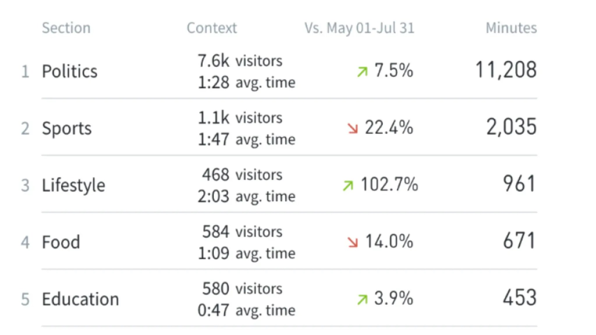
Comparisons
We introduced two new comparison features: comparison mode and author/section comparisons. These make it easy to see the “before and after” impact of your work and contextualize trends in your content performance.
Comparison mode lets you compare one time period of results against another—side by side, in a single view. It calculates the percent differential for you, too. Use it to answer questions like:
- Is a topic more interesting to my audience this month compared to last month?
- How did my additional effort on distributing content perform this quarter versus last?
- Did a post perform better after I made SEO changes to its metadata?
Author/section comparisons contextualize data from one author or one section to another. They make it easy to see how writers on your team and sections on your website stack up against each other through various KPI lenses. Use it to answer questions like:
- Who should write for which stage in the funnel?
- Why are the authors with the most views not converting? How can we learn from each other?
- Which goals should each section be working toward?
Recirculation rate
We added a new metric—recirculation rate—to our analytics dashboard. It helps you understand what keeps readers on your site, ranking content by how much traffic each piece refers to other parts of your site. You can think about it as the opposite of bounce rate—but better.
Use recirculation rate to draw conclusions like:
- If a story gets high traffic but low engaged time and recirculation rate, you’re not targeting the right audience. Promote it through different channels to reach the right audience.
- If a story gets high traffic and engaged time but low recirculation rate, there may not be sufficient relevant links to click on, or the story too long to get visitors to another page.
- If a story has average traffic but great recirculation rate, promote it in more places and see if the rates hold up—if they do, every single page view may be worth 1.5 page views based on the recirculation rate.

Bottom Listings Report
We released a new report—Bottom Listings—which surfaces content that is performing worst for a given metric in a given timeframe. It helps you understand which content is not working.
It’s easy to focus on posts doing most of the heavy lifting, but real progress happens when you learn from and improve upon less successful pieces. Use the Bottom Listings Report to systematically surface the projects that didn’t produce the results you expected so you can fine-tune and improve your content strategy. One of our customers told us that they use it as part of their weekly 1-on-1s.

Author, campaign, tag, and referrer groups
We created four new grouping features in the Parse.ly dashboard: author groups, campaign groups, tag groups, and referrer groups. They let you see the performance of metadata in groups—instead of inspecting each one individually.
Author groups
Author groups make it easy to view data about the performance of collections of authors. This feature lets you organize authors based on team, employment type (freelancer vs. full-time), or what type of content they write.
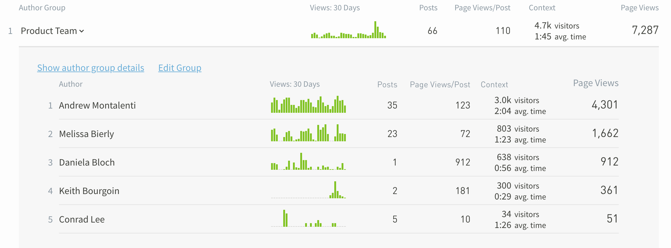
It also helps you clean up author data from your CMS—consolidating name variations like “Jane Doe,” “Doe, Jane,” and “jane doe” into a single entity.
Campaign groups
Campaign groups let you view data about the performance of collections of campaigns. One thing they’re great at is making it much easier to separate paid and non-paid traffic. Create a campaign group that excludes paid traffic—when a visitor lands on a piece of content from a paid promotion—to see what’s driving results organically.
This feature also makes it easier to fix mistakes in campaign values. UTM parameters are case sensitive, so if you tag one article with “utm_medium=Social” and another with “utm_medium=social”, they’ll show up as two separate campaign mediums in Parse.ly. With campaign groups, you can group these two values together to eliminate variations and attribute traffic more accurately.
You could also group types of campaigns together—for example, “Beauty Q2 Campaigns,” “Fashion Q3 Campaigns,” “Home Goods February Campaigns,” “Developer-Oriented Campaigns,” so on and so forth.
Tag groups
Tag groups let you view the performance of collections of tags, making it easier to organize your tag data in a meaningful way. Organize them by topic, section, content type, or any other grouping that matters to you.
For example, you can group the tags “Bitcoin,” “Ethereum,” “Dogecoin,” and “NFT” into a “Crypto” group to quickly get the macro big picture of how your crypto content is performing.

Referrer groups
Referrer Groups let you view the performance of groups of referrers to get a wider, more flexible view of referral traffic patterns.
Group your various social referrer channels to keep tabs on your overall social traction. Or group influencer blog referrers together to see how much impact your third-party mentions make in aggregate. “Here’s all the backlinks we get from the tech blogs,” for example.

Check for metadata updates
We added a check for metadata updates feature to our dashboard, helping you easily confirm that changes you make to content metadata are reflected in your Parse.ly dashboard.
When you modify metadata—refresh titles, update authors, or edit tags or sections—you want those changes reflected in your analytics tool. Otherwise the data in your dashboard will be less accurate and meaningful.
Now you can make these updates directly in your Parse.ly dashboard, whenever you want, on any post, all by yourself. This feature is available on individual post detail pages.

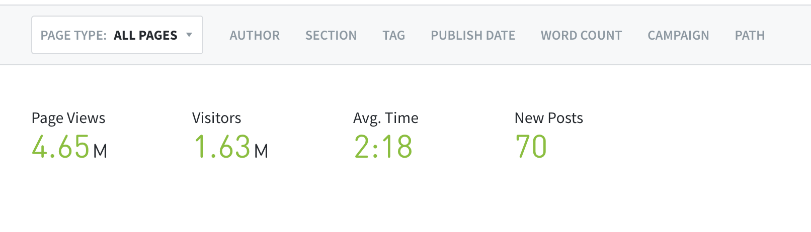
Conversions and campaigns in Overview
We added conversion metrics to the Overview screen of the Parse.ly dashboard. Now you can see your top converting section, tag, or conversion label as soon as you log into Parse.ly. If you have team members who don’t frequently dig into the data beyond the overview screen, you can suggest they change what’s immediately shown upon log in over to the metrics you specifically care about.
We also added campaign data to the Overview screen. Select any campaign parameter to display and see how your campaigns are performing upon login.

UI improvements
We added a few “quality of life” UI improvements to our platform. They make Parse.ly more pleasant to navigate and use.
Copy to clipboard
Hovering over the big green stats on listings pages now gives you the option to copy and paste the full number. Just move your mouse over the number and click to copy to your clipboard.
More data on the Benchmarks page
We added conversions and post count metrics to all Benchmarks pages, making it even easier to see how impactful and efficient your team is at a glance.

Refreshed color system
We refreshed the color system in our dashboard to improve accessibility and readability, and improve the consistency in light and dark modes.

More informative graphing on the Overview timeline
We updated the timeline on the Overview screen so that now it compares current performance to historical average more directly.

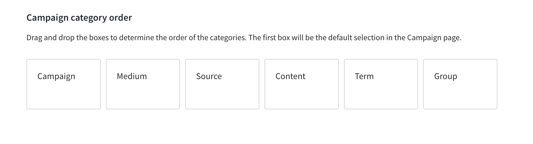
Movable campaign category orders
We made it possible to change the order that UTM campaign parameters show up in the campaigns tab of your Parse.ly dashboard. Just drag and drop the boxes into the order that makes sense for you.
For more information on all of our latest Parse.ly updates, check out our full feature release notes. And if you have any questions or want a live demo of any of these features, click the button below.