
Trending in Email Design: Organic Shapes
Each year, we see new design trends shaping digital marketing, from the use of color and imagery to typography trends, interactivity, and more. In our “Trending in Email Design” series, we look at the hottest digital design trends and dive into how they translate into email marketing.
Most email designs are driven by symmetry and geometry. But we’re seeing more and more email designers break up their email designs with shapes inspired by nature—and the results are stunning.
Email designs inspired by nature
Organic shapes are often described as forms that take influence from nature. The irregularities they display rebel against the patterns and rules that define the geometric shapes we’re accustomed to seeing.
Curved lines and soft blobs have gained momentum in web design in recent years, helping to make minimal designs more dynamic and draw attention to key content. With email design often taking influence from web trends, it’s only natural that we would start to see organic shapes taking center stage in email compositions. But how can these irregular forms benefit our email campaigns?
As with the adoption of most design trends, creatives are looking for ways to boost an email’s engagement and draw the prospect to key messaging and calls-to-action. Fluid shapes can also break up content without the use of harsh lines, make visual content more interesting, or create abstractions.
Curious how brands are putting organic shapes to work? Here are 6 brands that use fluid, organic shapes to level-up their email design.
How brands are using organic shapes in email design
Tattly
Tattly, a cheerful temporary tattoo retailer, is well known for their imaginative and exciting email marketing campaigns. In this joyful example, they offer crafting ideas for quarantined subscribers, and the generous use of asymmetric shapes brings the email and its message to life.
Buffer
The hero of this Buffer email uses irregular shapes, organic mark making, and patterns to brighten up this otherwise text-focused invite email. The abstract nature of this composition with no identifiable elements draws the eye on open, helping to entice the reader to consume the email content.
Magic Spoon
This example from Magic Spoon shows how fluid forms can be more than just decorative elements. Here, the organic shapes divide and structure the email content. Moving away from the harsh lines we typically see to provide email design structure, this approach helps to soften the transition between sections and encourages the reader to continue their journey through the email.
WGSN
You know that a trend is worth considering when a leading trend authority applies it to their own email design. WGSN uses an organic shape to mask the photography in their hero image—an unusual take that gives this email an abstract look, piquing curiosity for this webinar announcement.
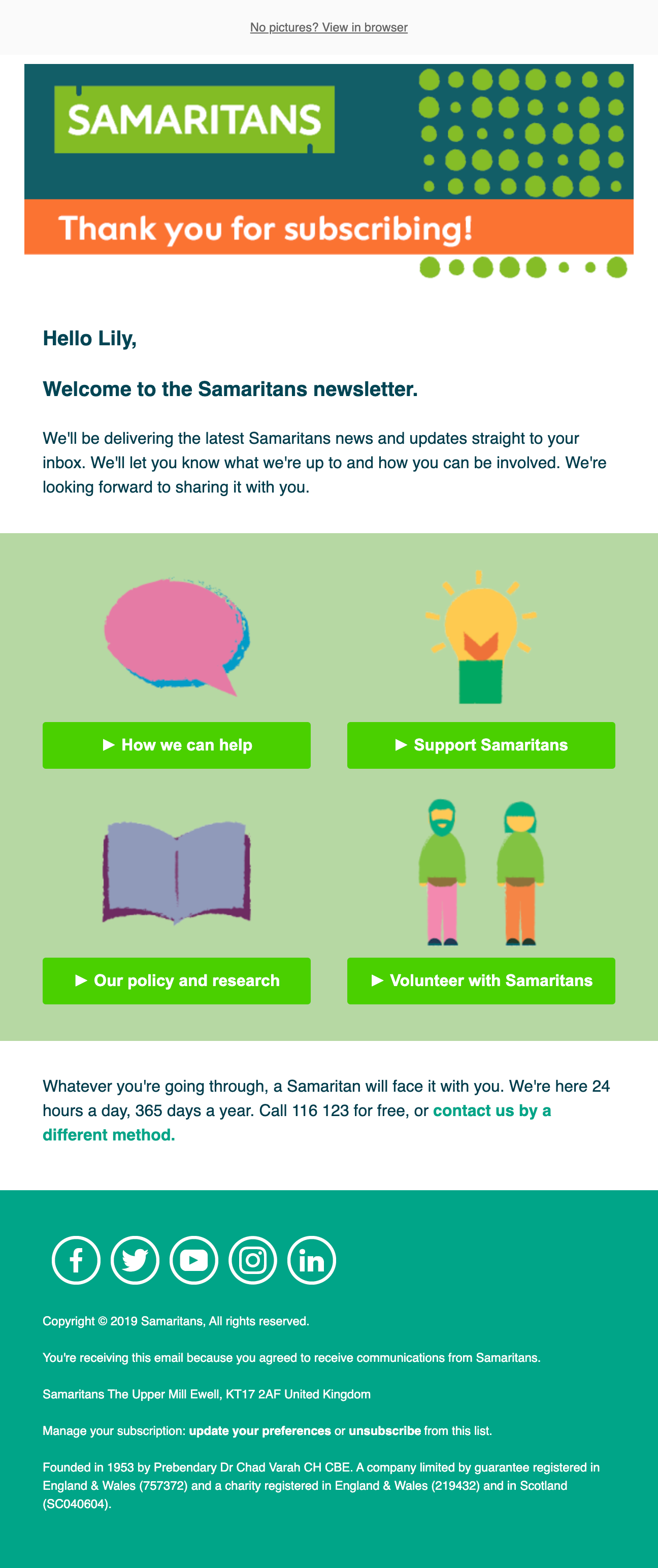
Samaritans
Organic shapes don’t have to be the centerpiece of your email design. Even as secondary, subtle design elements, they can help give your emails a little special something—just like UK Charity Samaritans does in the header of this welcome email. They also incorporate some textured illustration and bold colors to create an interesting and contemporary email design.
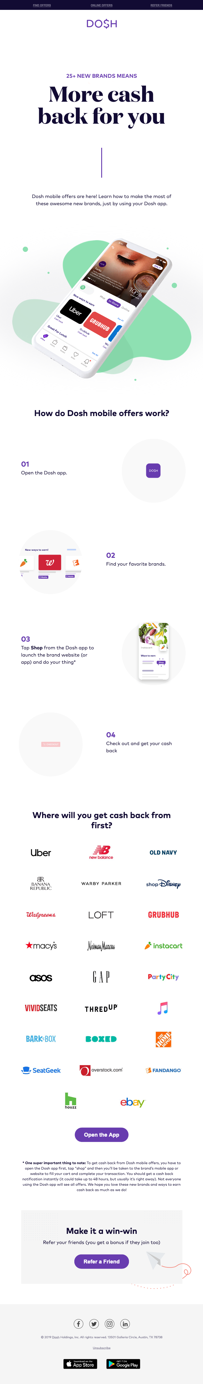
Dosh
This email is a beauty in general, but it’s the organic shapes that help put the app screenshot in the spotlight. The green blob shapes frame the phone and make it stand out in a design that’s otherwise dominated by white space.
Lily Worth
Lily Worth was a Senior Email Designer at Litmus