How to Stack Columns in Responsive Emails
Sooooo, I’m going to date myself for a little bit here, but stick with me.
Back when smartphones first started becoming something that email marketers had to deal with, the common solution I saw from everyone was single-column emails. Which makes sense since not many mobile email clients supported media queries. The easiest choice was to avoid the issue altogether by sticking with single-column designs in desktop that easily resized for mobile.
But with more media query support these days, you can create more interesting designs that take advantage of responsive coding to have your email design respond to the screen size that your subscribers are viewing them on.
I’ll walk you through:
- Normal vs. reverse stacking order
- 2 ways to code content that stacks
- When you shouldn’t stack mobile content
Why you should stack columns on mobile
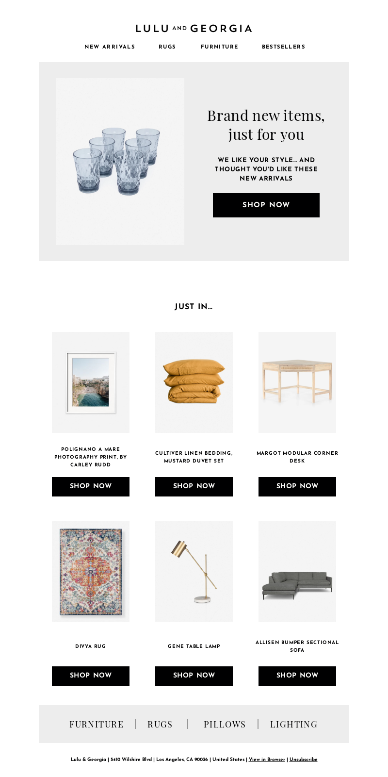
Mobile devices give a very limited viewing screen, and the ideal design for mobile devices is one column. But we don’t want to limit ourselves to single-column designs on desktop where we have loads of space. Enter media queries to let you stack content on mobile to make sure your content is optimized for the smaller screen.
| Desktop | Mobile |
|---|---|
 |  |
| Source: Really Good Emails |
Keeping email content in the same desktop layout results in very tiny text and images or squished content on mobile devices. It’s not a good user experience as your subscribers will most likely have difficulty reading your content, like this email as wide as the screen on some mobile phones:

Do your subscribers a favor and make sure your emails look their best in every reading environment.
Stacking methods for email design
When you do want to stack columns on top of each other, there are two different ways the content can stack: with the left column on top (normal stacking) or the right column on top (reverse stacking).
Normal stacking
Normal stacking is the most common form of stacking. It takes the content in the left column and stacks it on top of the content in the right column, like so:
Reverse stacking
Reverse stacking is when the content in the left column stacks under the content in the right column. It is most commonly used for the middle row if you have a Z-pattern on desktop, but you want the rows to all look the same on mobile. In this example the first and last rows are normal stacking, but the second row is a reverse stacking column:
2 ways to code columns that stack on mobile
There are a couple different ways to code stacking columns. I’ll walk you through using CSS media queries and then a hybrid coding method. Test them out and see what works best for you.
Using CSS media queries
You can create two columns simply by creating a two-column table and then using classes to have the columns stack.
The CSS would look like this:
 <style>
     @media screen and (max-width:600px) {
          .block { display: block !important; width: 100% !important; }
     }
  </style>
And the HTML would look like this:
 <table cellpadding="0" cellspacing="0" border="0" role="presentation" style="width:600px;">
     <tr>
          <td class="block" align="left" valign="top" style="padding:10px 0;" width="50%">
                <img src="http://via.placeholder.com/300">
        </td>
          <td class="block" align="left" valign="top" style="padding:10px 0 10px 10px;" width="50%">
               <p style="font-family: Helvetica, Arial, sans-serif;font-size:18px;line-height:28px;mso-line-height-rule:exactly;color:#262524;">Somebody once told me the world is gonna roll me. I ain't the sharpest tool in the shed. She was looking kind of dumb with her finger and her thumb in the shape of an "L" on her forehead.</p>
        </td>
     </tr>
 </table>
The block class turns the table cells into blocks on mobile, and the content behaves accordingly and automatically stacks on mobile. This results in a normal stack.
If you want to create a reverse stack, you can use table-header-group and table-footer-group as the display property value in your CSS, like so:
 <style>
     @media screen and (max-width:600px) {
          .top { display: table-header-group !important; width: 100% !important; }
          .bottom { display: table-footer-group !important; width: 100% !important; }
     }
  </style>
And the HTML becomes:
<table cellpadding="0" cellspacing="0" border="0" role="presentation" style="width:600px;">
      <tr>
            <td class="bottom" align="left" valign="top" style="padding:10px 0;" width="50%">
                     <img src="http://via.placeholder.com/300">
            </td>
            <td class="top" align="left" valign="top" style="padding:10px 0 10px 10px;" width="50%">
                  <p style="font-family: Helvetica, Arial, sans-serif;font-size:18px;line-height:28px;mso-line-height-rule:exactly;color:#262524;">Well the years start coming and they don't stop coming. Fed to the rules and I hit the ground running. Didn't make sense not to live for fun. Your brain gets smart but your head gets dumb.</p>
            </td>
      </tr>
 </table>
Hybrid coding
This is the method I use. It is much more code heavy, but it has saved my butt on several occasions when email clients didn’t support media queries. (Mad props to Nicole Merlin for her tutorial that first introduced me to hybrid coding.)
In this case, you use two divs with display: inline-block. This keeps your content sitting next to each other on desktop and pushes them to stack on mobile. Here’s what your code would look like:
<div style="display:inline-block;vertical-align:top;">
      <table cellpadding="0" cellspacing="0" border="0" role="presentation" style="width: 300px;">
            <tr>
                  <td align="left" valign="top">
                        <img src="http://via.placeholder.com/300">
                  </td>
            </tr>
      </table>
</div>
<div style="display:inline-block;vertical-align:top;">
      <table cellpadding="0" cellspacing="0" border="0" role="presentation" style="width:300px;">
            <tr>
                  <td align="left" valign="top" style="padding-left: 10px;">
                        <p style="font-family: Helvetica, Arial, sans-serif;font-size:18px;line-height:28px;mso-line-height-rule:exactly;color:#262524;">So much to do, so much to see, so what's wrong with taking the back streets? You'll never know if you don't go. You'll never shine if you don't glow.</p>
                  </td>
            </tr>
      </table>
</div>
Then we wrap all of that in a table cell and set the font size to 0 so that no extra space is added around the divs and align the whole thing in the center of the table cell:
     <tr>
          <td style="font-size:0;" align="center" valign="top">
               <div style="display:inline-block;vertical-align:top;">
                     <table cellpadding="0" cellspacing="0" border="0" role="presentation" style="width: 300px;">
                           <tr>
                                 <td align="left" valign="top">
                                       <img src="http://via.placeholder.com/300">
                                 </td>
                           </tr>
                     </table>
               </div>
               <div style="display:inline-block;vertical-align:top;">
                     <table cellpadding="0" cellspacing="0" border="0" role="presentation" style="width:300px;">
                           <tr>
                                 <td align="left" valign="top" style="padding-left: 10px;">
                                       <p style="font-family: Helvetica, Arial, sans-serif;font-size:18px;line-height:28px;mso-line-height-rule:exactly;color:#262524;">So much to do, so much to see, so what's wrong with taking the back streets? You'll never know if you don't go. You'll never shine if you don't glow.</p>
                                 </td>
                           </tr>
                     </table>
               </div>
          </td>
     </tr>
But wait! Because Outlook doesn’t support divs, you also need to add in some ghost tables around everything to get it to work in Outlook:
     <tr>
          <td style="font-size:0;" align="center" valign="top">
               <!--[if (gte mso 9)|(IE)]>
               <table cellpadding="0" cellspacing="0" border="0" role="presentation" style="width: 100%;">
               <tr>
               <td valign="top" style="width: 300px;">
               <![endif]-->
                    <div style="display:inline-block;vertical-align:top;">
                          <table cellpadding="0" cellspacing="0" border="0" role="presentation" style="width: 300px;">
                                <tr>
                                      <td align="left" valign="top">
                                            <img src="http://via.placeholder.com/300">
                                      </td>
                                </tr>
                          </table>
                    </div>
               <!--[if (gte mso 9)|(IE)]>
               </td><td valign="top" style="width:300px;">
               <![endif]-->
                    <div style="display:inline-block;vertical-align:top;">
                          <table cellpadding="0" cellspacing="0" border="0" role="presentation" style="width:300px;">
                                <tr>
                                      <td align="left" valign="top" style="padding-left: 10px;">
                                            <p style="font-family: Helvetica, Arial, sans-serif;font-size:18px;line-height:28px;mso-line-height-rule:exactly;color:#262524;">So much to do, so much to see, so what's wrong with taking the back streets? You'll never know if you don't go. You'll never shine if you don't glow.</p>
                                      </td>
                                </tr>
                          </table>
                    </div>
               <!--[if (gte mso 9)|(IE)]>
               </td>
               </tr>
               </table>
               <![endif]-->
          </td>
     </tr>
This code works well without media queries if you’re using columns that are 50% of your containing table. But if you’re using smaller columns, you’ll have to add some media queries to update the width to 100% on mobile. More on that below.
The reverse stacking version of this takes advantage of the dir attribute to order the divs in the opposite order. We add dir=”rtl” on the cell containing the two columns, and then each column needs to have dir=”ltr” added to the table in order to have the content display correctly:
     <tr>
          <td style="font-size:0;" align="left" valign="top" dir="rtl">
               <!--[if (gte mso 9)|(IE)]>
               <table cellpadding="0" cellspacing="0" border="0" role="presentation" style="width: 100%;">
               <tr>
               <td valign="top" style="width: 300px;">
               <![endif]-->
                    <div style="display:inline-block;vertical-align:top;">
                          <table cellpadding="0" cellspacing="0" border="0" role="presentation" style="width: 300px;" dir=”ltr”>
                                <tr>
                                      <td align="left" valign="top">
                                            <p style="font-family: Helvetica, Arial, sans-serif;font-size:18px;line-height:28px;mso-line-height-rule:exactly;color:#262524;">Hey now, you're an all-star, get your game on, go play. Hey now, you're a rock star, get the show on, get paid. And all that glitters is gold. Only shooting stars break the mold.</p>
                                      </td>
                                </tr>
                          </table>
                    </div>
               <!--[if (gte mso 9)|(IE)]>
               </td><td valign="top" style="width:300px;">
               <![endif]-->
                    <div style="display:inline-block;vertical-align:top;">
                          <table cellpadding="0" cellspacing="0" border="0" role="presentation" style="width:300px;" dir=”ltr”>
                                <tr>
                                      <td align="left" valign="top" style="padding-left: 10px;">
                                            <img src="http://via.placeholder.com/300">
                                      </td>
                                </tr>
                          </table>
                    </div>
               <!--[if (gte mso 9)|(IE)]>
               </td>
               </tr>
               </table>
               <![endif]-->
          </td>
     </tr>
Something to keep in mind when coding with the reverse stacking hybrid version: Whatever is in that first <div> is going to end up in the right column, which is counter intuitive and takes some getting used to. It is also not always the best for accessibility.
Coding for two different column widths
As mentioned above, if you want to use different sized table cells, you’ll have to add in media queries to change those table cells for mobile. The most common case of this is using a 100% class which you may already have set up in your CSS. If not, it could look something like this:
.w100p { width: 100% !important; }
And then adding that class to the div and table in your HTML like so (this example has a column that’s 100px wide and another that’s 500px wide):
     <tr>
          <td style="font-size:0;" align="center" valign="top">
               <!--[if (gte mso 9)|(IE)]>
               <table cellpadding="0" cellspacing="0" border="0" role="presentation" style="width: 100%;">
               <tr>
               <td valign="top" style="width: 100px;">
               <![endif]-->
                    <div class=”w100p” style="display:inline-block;vertical-align:top;">
                          <table class=”w100p” cellpadding="0" cellspacing="0" border="0" role="presentation" style="width: 100px;">
                                <tr>
                                      <td align="left" valign="top">
                                            <img src="http://via.placeholder.com/300">
                                      </td>
                                </tr>
                          </table>
                    </div>
               <!--[if (gte mso 9)|(IE)]>
               </td><td valign="top" style="width:500px;">
               <![endif]-->
                    <div class=”w100p” style="display:inline-block;vertical-align:top;">
                          <table class=”w100p” cellpadding="0" cellspacing="0" border="0" role="presentation" style="width:500px;">
                                <tr>
                                      <td align="left" valign="top" style="padding-left: 10px;">
                                            <p style="font-family: Helvetica, Arial, sans-serif;font-size:18px;line-height:28px;mso-line-height-rule:exactly;color:#262524;">So much to do, so much to see, so what's wrong with taking the back streets? You'll never know if you don't go. You'll never shine if you don't glow.</p>
                                      </td>
                                </tr>
                          </table>
                    </div>
               <!--[if (gte mso 9)|(IE)]>
               </td>
               </tr>
               </table>
               <![endif]-->
          </td>
     </tr>
You don’t need to worry about changing the widths in the conditional code, as that is solely for Outlook for desktop.
Which method to use?
Both of these methods work well now that mobile email clients support media queries.
| Media queries method | Hybrid method | |
|---|---|---|
| Pros |
|
|
| Cons |
|
|
The media-query based method is less code heavy, and because you can put the classes on either column, you are able to leave the content in an order that makes sense to screen readers, while still displaying it in a way that makes sense visually.
So if accessibility is a large concern, the media-query version is probably your best bet.
However, if you’re concerned about having a version that is more foolproof and less susceptible to the whims of email clients, the hybrid version is the way to go.
When not to stack content on mobile
This isn’t to say everything needs to be stacked on mobile. Don’t go stack crazy. There are cases where things don’t need to stack on mobile, like this email signature:

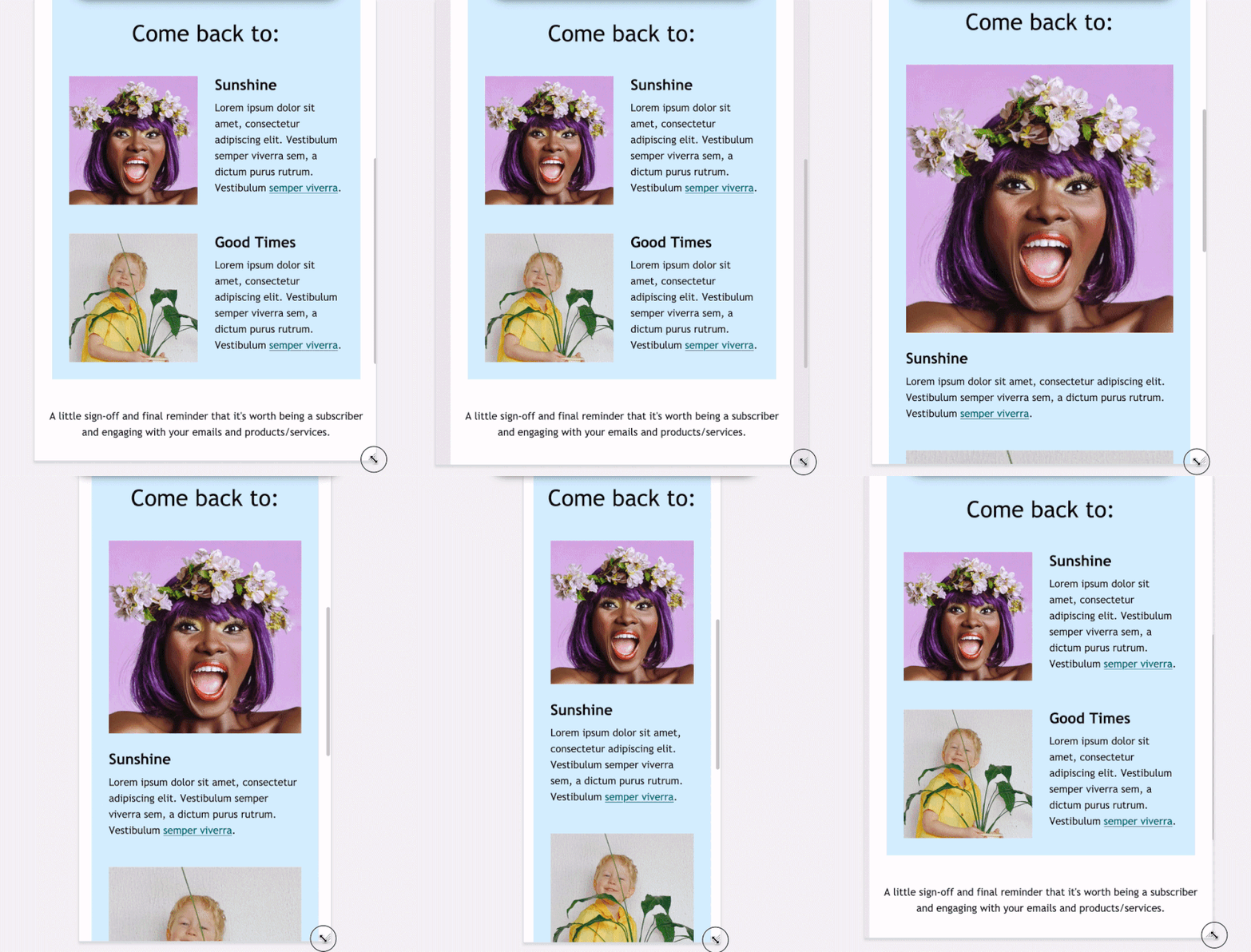
Or cases where you want to go from stacked on desktop to non-stacked on mobile.
Our January 2021 newsletter had all our resolutions laid out with each section stacked on top of each other in three columns. When stacking these on mobile, we wanted to make better use of space. So, we had the images, names, and titles become “un-stacked” while each column became a new row:
| Desktop | Mobile |
 |  |
So as you can see, stacking everything isn’t always the answer. Make sure you are making the best use of your space when designing for mobile. In some cases, that includes not stacking content.
Coding my interesting stack variation
I created the above effect by using modified versions of the hybrid stacking code. In this case, I started with a hybrid three column:
<tr>
     <td align="center" valign="top" style="font-size:0; padding-bottom: 60px;">
     <!--[if (gte mso 9)|(IE)]>
     <table cellpadding="0" cellspacing="0" border="0" role="presentation" style="width: 100%;">
     <tr>
     <td valign="top" style="width: 180px;">
     <![endif]-->
          <div style="display:inline-block;">
               <table class="wFull" cellpadding="0" cellspacing="0" border="0" role="presentation" style="width: 180px;">
                     <tr>
                         <td align="center" valign="middle">
                              [--column 1 content  goes here--]
                         </td>
                     </tr>
               </table>
          </div>
     <!--[if (gte mso 9)|(IE)]>
     </td><td style="width: 30px;">
     </td><td valign="top" style="width: 180px;">
     <![endif]-->
          <div style="display:inline-block;">
               <table class="wFull" cellpadding="0" cellspacing="0" border="0" role="presentation" style="width: 180px;">
                     <tr>
                         <td align="center" valign="middle">
                              [--column 2 content  goes here--]
                         </td>
                     </tr>
               </table>
          </div>
     <!--[if (gte mso 9)|(IE)]>
     </td><td style="width: 30px;">
     </td><td valign="top" style="width: 180px;">
     <![endif]-->
          <div style="display:inline-block;">
               <table class="wFull" cellpadding="0" cellspacing="0" border="0" role="presentation" style="width: 180px;">
                     <tr>
                         <td align="center" valign="middle">
                              [--column 3 content  goes here--]
                         </td>
                     </tr>
               </table>
          </div>
     <!--[if (gte mso 9)|(IE)]>
     </td>
     </tr>
     </table>
     <![endif]-->
     </td>
</td>
Then, in each column, I added a row with two-column stacking and a second normal row for the quote. Since I didn’t want the image and the name to be side by side on desktop, I left out the ghost column separator between the divs. And I set the tables in the divs to have max-widths that would result in the divs being inline on mobile.
The columns themselves were set to 180px width, which is much smaller on mobile, so the divs stacked until those tables were set to 100% by a media query on mobile. So each column now looked like this:
          <div style="display:inline-block;">
               <table class="wFull" cellpadding="0" cellspacing="0" border="0" role="presentation" style="width: 180px;">
                    <tr>
                         <td style="font-size:0; padding-top: 30px;" align="center" valign="middle">
                         <!--[if (gte mso 9)|(IE)]>
                         <table cellpadding="0" cellspacing="0" border="0" role="presentation" style="width: 100%;">
                         <tr>
                         <td valign="top" align="center" style="width: 180px;">
                         <![endif]-->
                              <div style="display:inline-block;vertical-align:middle;">
                                   <table cellpadding="0" cellspacing="0" border="0" role="presentation">
                                             <tr>
                                                  <td align="left" valign="middle">
                                                       <img src="https://via.placeholder/79" alt="" width="79" height="79" >
                                                  </td>
                                             </tr>
                                   </table>
                              </div>
                              <div style="display:inline-block;vertical-align:middle;">
                                   <table cellpadding="0" cellspacing="0" border="0" role="presentation">
                                             <tr>
                                                  <td align="left" valign="middle">
                                                       [-- content that stacks on desktop, but not on mobile goes here--]
                                                  </td>
                                           </tr>
                                   </table>
                              </div>
                         <!--[if (gte mso 9)|(IE)]>
                         </td>
                         </tr>
                         </table>
                         <![endif]-->
                         </td>
               </tr>
               <tr>
                         <td align="left" valign="top">
                              [--content that stacks on both desktop and mobile goes here--]
                         </td>
                    </tr>
               </table>
          </div>
Then I set the tables to have max-width values that would result in them being situated next to each other on mobile. But on desktop, the containing cell was too small for them to be situated next to each other, resulting in the content stacking on desktop.
          <div style="display:inline-block;">
               <table class="wFull" cellpadding="0" cellspacing="0" border="0" role="presentation" style="width: 180px;">
                    <tr>
                         <td style="font-size:0; padding-top: 30px;" align="center" valign="middle">
                         <!--[if (gte mso 9)|(IE)]>
                         <table cellpadding="0" cellspacing="0" border="0" role="presentation" style="width: 100%;">
                         <tr>
                         <td valign="top" align="center" style="width: 180px;">
                         <![endif]-->
                              <div style="display:inline-block;vertical-align:middle;">
                                   <table cellpadding="0" cellspacing="0" border="0" role="presentation" style="width: 79px;">
                                             <tr>
                                                  <td align="left" valign="middle">
                                                       <img src="https://via.placeholder/79" alt="" width="79" height="79" >
                                                  </td>
                                             </tr>
                                   </table>
                              </div>
                              <div style="display:inline-block;vertical-align:middle;">
                                   <table cellpadding="0" cellspacing="0" border="0" role="presentation" style="max-width: 221px;">
                                             <tr>
                                                  <td align="left" valign="middle">
                                                       [-- content that stacks on desktop, but not on mobile goes here--]
                                                  </td>
                                           </tr>
                                   </table>
                              </div>
                         <!--[if (gte mso 9)|(IE)]>
                         </td>
                         </tr>
                         </table>
                         <![endif]-->
                         </td>
               </tr>
               <tr>
                         <td align="left" valign="top">
                              [--content that stacks on both desktop and mobile goes here--]
                         </td>
                    </tr>
               </table>
          </div>
See the code in action for all the different versions of stacking—including this one.
Final thoughts
As you can see, when you combine these different methods, you can come up with all kinds of interesting ways to stack and sort content. So ensure that your subscribers have the best viewing experience and make sure your designs stand out on mobile by stacking those columns for optimal readability. Try it out and let us know what you come up with!

Carin Slater
Carin Slater is the Email and Content Growth Marketing Manager at Litmus


