
In email marketing, you might be tempted to test everything from your subject line's word count to the hue of your CTA button.
But think about this: is testing the shade of blue against green as impactful as, say, analyzing two radically different email layouts? While there are a million variables at play, it's important to know which ones truly move the needle.
This blog zeroes in on 10 specific, high-impact A/B testing ideas. Whether you're looking to refine your current strategy or explore new avenues, these suggestions will give your campaigns the clarity and direction they deserve.
Table of Contents
1) Subject Line Tone: Curiosity-Driven vs. Benefit Highlight
Curiosity-Driven Subject Lines aim to pique the interest of readers, compelling them to click open out of sheer intrigue. They tease the content without giving everything away. An example might be, "You won't believe what we have for you!" While it doesn’t disclose the exact content or offer, it evokes a sense of wonder, urging readers to find out more.
On the flip side, Benefit Highlight Subject Lines present the primary value or advantage upfront. There's no beating around the bush. A straightforward example might be, "Save 30% on your next order". The benefit is clear and direct, giving the reader an immediate reason to engage.
Deciding between the two involves understanding your audience and the nature of your content. If your brand leans towards being enigmatic or you’re unveiling something new, curiosity might be the way to go. However, for clear-cut offers or announcements, highlighting the benefit can yield better results. Testing both approaches will grant invaluable insights into your audience's preferences, optimizing your email campaigns for the future.
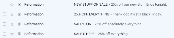
Example of brands testing subject lines (sourced from my inbox) —
2) Hero Image: People vs. Product Shots
Visuals are a dominant force in the realm of email marketing. As the old saying goes, "A picture is worth a thousand words." When we discuss the hero image – the primary visual element of your email – the debate often centers on two leading contenders: People-Centric images and Product-Centric shots. Each has its strengths and resonates differently with audiences.
People-Centric Images focus on human interactions, emotions, and contexts. They can showcase your product being used in a real-life scenario or simply capture a human emotion relevant to your content. For instance, an image of a delighted person unboxing your product might evoke feelings of anticipation and joy. Such images foster a sense of relatability, suggesting the experiential value of what you're offering.
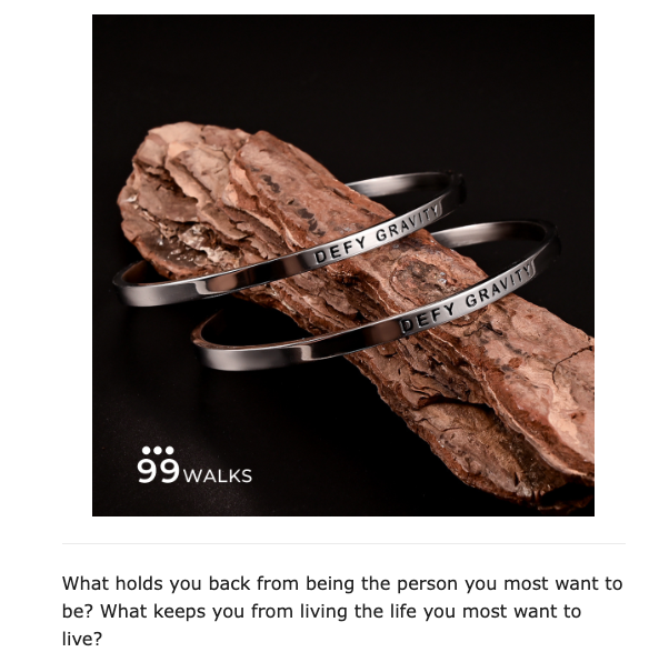
Example of people-centric shot by 99walks —

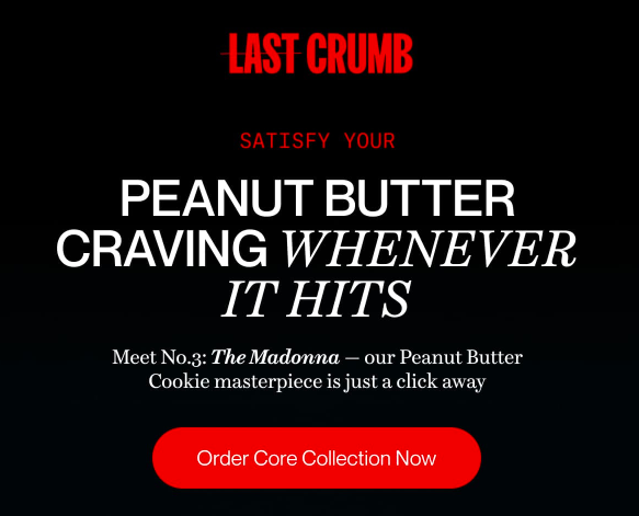
Conversely, Product-Centric Shots place undivided attention on the product itself, often highlighting its design, features, or aesthetics. A close-up shot of a new sneaker design, capturing its intricate details, would be a fitting example. This style focuses on the tangible attributes, promising clarity and specificity about what’s being offered.
Example of product-focused image in the email —
To harness the power of A/B testing, segment your audience and send one half an email with a people-centric image and the other half the same email but with a product-centric image. Analyze open rates, click-through rates, and even conversion rates to discern which imagery strikes a chord with your subscribers.
3) CTA Text: Action-Oriented ("Grab Yours Now") vs. Benefit-Oriented ("Experience Better Sleep")
The call-to-action (CTA) button is arguably the most critical element in an email. It's your direct invitation to the reader to take the next step. The phrasing of that invitation can dramatically influence click-through rates.
The Action-Oriented CTA is direct, urging readers to take immediate action. Phrases like "Grab Yours Now" exude urgency and are straightforward in their intent. They push the reader to act fast, capitalizing on impulse or the fear of missing out.
Conversely, The Benefit-Oriented CTA emphasizes the value or positive outcome the reader will receive by clicking. "Experience Better Sleep" isn't just about buying a product; it's about the transformative effect it promises. This approach targets the reader's desire for improvement or enhancement in some aspect of their life.
For your A/B test, create two versions of your email: one with an action-oriented CTA and another with a benefit-oriented one. By monitoring click-through rates and subsequent conversions, you'll get a clearer picture of what motivates your audience more—immediate action or the allure of a benefit.
4) CTA Positioning: Above the Fold vs. End of the Email
Where you place a CTA can be as crucial as what it says. It's all about timing and visibility. Do you capture attention immediately or build up to your task? Let's explore this through the lens of A/B testing.
Above the Fold CTA: This approach is all about immediacy. Just as your email loads, the CTA is right there, unmissable. It targets those readers who know what they want and don’t need further persuasion. For someone already familiar with your brand or product, this could be the nudge they need to quickly proceed.
On the other hand, placing the CTA at the end of the email is akin to delivering the climax of a story. It assumes the reader has absorbed all the preceding content, and now, with all that context, is presented with a call to action. This positioning can be effective for emails that are informative, narrative-driven, or rely on building a compelling case before asking the reader to act.
Example
5) Content Type: Video Embed vs. Static Imagery
Video Embeds introduce motion and narrative into the email experience. A video can explain, enthrall, or evoke emotion in a manner few static images can match. For instance, a 15-second clip showcasing a product's functionality might be far more impactful than a descriptive paragraph. However, it's worth noting that video playback depends on the email client, and not all recipients may have the bandwidth or inclination to watch.
Contrarily, Static Imagery offers a consistent, no-frills visual representation. A well-chosen image can convey a message instantaneously, without the time investment a video demands. It's universal, with no concerns about compatibility or load times. An image of a serene beach, for instance, can instantly communicate the idea of a vacation or relaxation.
When A/B testing these content types, focus on the broader context of your campaign. Is your goal pure engagement, or are you aiming for education and awareness? Measure metrics like engagement depth (how much of the video was watched) or the time spent on the email.
Check the post-click behavior: Does one content type lead to more prolonged website sessions or higher conversions? By diving deep into these metrics, you'll uncover insights that go beyond the immediate campaign, shaping your long-term content strategy for maximum efficacy.
6) Offer Presentation: Percentage Discount vs. Fixed Amount Off
Percentage Discounts, like "Save 20%", often sound appealing for higher-priced items where the savings feel substantial. They convey a proportional saving, which can seem more valuable to many.
On the other hand, Fixed Amount Off offers, such as "Get $50 off", provide clear, tangible savings. They’re straightforward and can be especially effective for mid-range products where the discount feels significant.
For your A/B test, present one offer format in one email variant and the other format in a separate variant. By observing which offer drives more conversions, you'll gain insights into your audience's discount preferences, enabling you to tailor future promotions with precision.
7) Urgency Indicators: Countdown Timer vs. "Limited Stock" Mention
Infusing urgency in emails can spur recipients to act swiftly. Two prominent tactics in this strategy are Countdown Timers and the Limited Stock mention. But which truly resonates and drives immediate action?
Countdown Timers are dynamic elements showing time ticking away towards a deadline. For example, for a flash sale ending in 24 hours, seeing the hours, minutes, and even seconds count down can ignite a sense of urgency.
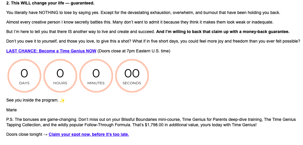
Incorporate a visually appealing countdown timer near your CTA. Most email marketing platforms like SendX offer widgets or plugins to embed real-time countdown timers.
"Hurry! This offer ends in [TIMER]." Place this copy above or near the timer for clear emphasis. Ensure the timer's end coincides with the offer's actual end time.
On the flip side, a Limited Stock Mention such as "Only 10 items left!" emphasizes scarcity over time. The focus shifts to the fear of missing out on a popular product, potentially driving immediate purchasing decisions.
Use bold, contrasting fonts to emphasize the limited stock message. Including an image of the product with a "low stock" banner can also help emphasize the urgency.
"Only [X number, e.g., 10] items left in stock!" Make sure the stock number you mention is realistic and consistent with your actual inventory.
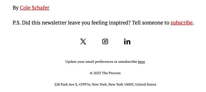
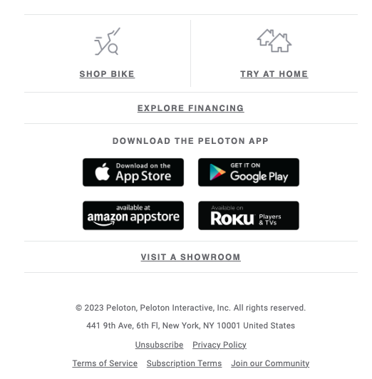
8) Footer Content: Minimalist (Only Unsubscribe & Address) vs. Feature-Rich (Links to Blogs, Socials, etc.)
The email footer, while often overlooked, plays a vital role in shaping the subscriber's journey and brand interaction. It can be a subtle nudge for extended engagement or a simple endnote to your message. Here's a deep dive into testing two primary footer philosophies: Minimalist and Feature-Rich.
Minimalist Footer:
- Design: Clean, with only the essential legal requirements and an unsubscribe link.
- Components: Mainly the company address and an "unsubscribe" link.
- Purpose: This design respects the subscriber's time and provides clarity, reducing distractions. The focus remains solely on the email's primary content.
Feature-Rich Footer:
- Design: More detailed, providing additional resources and touchpoints.
- Components: Links to latest blog posts, social media profiles, customer support, other product categories, or even a mini about-us section.
- Purpose: Designed to drive further engagement. For subscribers not intrigued by the email's primary content, the footer offers alternative routes to interact with the brand.
9) Offer Presentation: Exclusive Offers vs. Public Promotions
Exclusive Offers present deals available only to a select group, often email subscribers. They carry an allure of privilege. For instance, "Exclusive for our email family: 20% off our premium range!" This can create a sense of belonging, making subscribers feel valued and unique.
Contrastingly, Public Promotions are open for all, without the exclusivity tag. A common example might be, "Summer Sale: 20% off storewide!" Here, the wide accessibility can appeal to a broader audience, potentially driving higher traffic.
Testing between exclusive offers and public promotions necessitates a methodical approach. Here’s a step-by-step guide for email marketers:
- Segmentation: Split your email list into two random, equal parts. Group A receives the exclusive offer, and Group B gets the public promotion.
- Craft the Offers:
- Exclusive Offer: "Special for our email subscribers: Enjoy 25% off!"
- Public Promotion: "Everyone's Invited! Get 25% off storewide!"
- Consistent Design: Ensure the rest of the email (images, text, CTA buttons) remains consistent between the two variants. You want the offer presentation to be the only variable.
- Send Timing: Dispatch both versions simultaneously to eliminate time-based discrepancies affecting results.
- Monitor Metrics:
- Open Rate: While the subject line will play a role, it's worth noting if the exclusive tag impacts the open rate.
- Click-Through Rate (CTR): This will highlight which offer type is more compelling to your audience.
- Conversion Rate: Beyond clicking, observe how many took advantage of the offer.
- Duration: Run the test long enough to gather significant data. For most brands, this means waiting until at least a few hundred recipients have opened the email.
10) Segmentation Strategy: Behavior-Based (based on past engagement) vs. Demographic-Based (age, location, etc.)
When it comes to email marketing, segmentation is a powerful tool that can vastly improve your A/B tests' effectiveness. The idea here is simple: instead of sending the same email to your entire list, divide it based on specific criteria.
Behavior-Based Segmentation: This strategy divides your audience based on their past engagement with your brand. For instance, you might segment users who opened your last three emails differently from those who haven’t opened any. By A/B testing within these segments, you can craft tailored messages that resonate with how users have previously interacted with your content.
Demographic-Based Segmentation: Here, you're categorizing your list based on static information like age, location, or occupation. For example, an email targeted at millennials in New York might have a different tone or offer than one for retirees in Florida. A/B testing within these segments ensures that the content is relevant and appealing to that specific demographic.
In both cases, the goal is the same: to send the most effective message to each subset of your audience. By aligning A/B testing with segmentation, you can achieve higher open rates, better engagement, and ultimately, better results.
Final Thoughts
Mastering A/B testing is a game-changer for email marketers. It's not just about knowing what works best but understanding why it works for specific segments of your audience.
With tools like SendX, the process becomes seamless. Not only does it offer top-notch segmentation capabilities, but it also allows for A/B testing on any part of your email content, be it subject lines or the body text. Especially for businesses sending emails in high volumes, ensuring high deliverability is crucial, and SendX is tailored for just that. Claim your free trial here (no cc required!)