When done right, B2B website fonts should be invisible.
If someone takes a look at your B2B website design and their first question is “what font is that?”, chances are it’s not because they love it. A good font selection integrates seamlessly into the overall design and does not stick out unnecessarily. Your B2B website fonts should be enhancing, not getting in the way of, your brand’s look and feel, your carefully crafted messaging, or your customer experience.
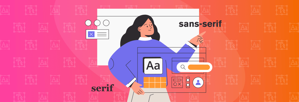
A sans serif font does not have to be boring. Applying fonts in specific ways, by utilizing specific weights, sizes, and uppercase treatments can create a unique style. For example, CNW’s pithy headlines are enhanced by a 900-weight ALL CAPS application of the font Nimbus Sans.
Intentional and consistent type hierarchies should be set up that will work across subpages as well. In our CNW example, the use of lighter weight and size in the same headline font helps divide up longer sentences or phrases. This intentional division assists with quicker reading and easier comprehension.
Even when a specific font works great for headlines, an additional font may be needed for smaller blocks of paragraph copy. For CNW, “Source Sans Pro” was selected for body copy specifically for its easy reading at smaller type sizes.
Read more: 5 things that make a website design look outdated.
For every “should” there are exceptions.
Of course, there are circumstances in which a unique font can stand out and be noticed on a B2B website design. This is especially true if it was carefully selected and intended to act as a design differentiator.
The following B2B web designs show how more visually distinctive typefaces can be applied successfully on a B2B website:
Olberding
The Olberding Brand Family offers brand strategy and design solutions. The visually nuanced SilkSerif font with high contrast lines not only adds visual interest to headlines but lends an air of sophistication that is very much in keeping with the Olberding vision and service offering. A modern sans serif font, Avenir, has been added for blocks of body copy to help balance out the unique headline treatments.
Headline Font: SilkSerif, Body Font: Avenir, Buttons: Arquitecta
retrain.ai
As an ai-driven company whose goal is to improve talent acquisition, retrain.ai chose a friendly font for headlines to help humanize its messaging. A simple and streamlined sans serif was also included in their brand for ease of reading for any paragraphs or buttons. Although unique and a bit playful this website font selection works well with the company logo, mission, and color scheme.
Headline Font: Lemonde-Courrier, Body Font: Proxima Nova
Bandalier
The Bandalier website is able to showcase large impactful headings through the use of the Google Font Mohave, a display typeface specifically designed for larger applications. The condensed letterforms are fairly narrow allowing for bigger type sizing than would not be possible for wider fonts across the same number of columns. An accompanying slab serif Google Font Aleo was selected for a more unique but still legible body copy style. The added serifs help give a softer and more scholastic character to the text that not only helps balance out the large uppercase headline treatments but is in line with the company’s additional offering, Bandalier University, a skill-building program designed for job seekers.
Headline Font: Mohave, Body Font: Aleo
Read more: Planning for a B2B website redesign.
Font Selection Best Practices:
Select fonts that balance style with functionality to make sure your brand will look and feel appropriate for your industry.
The nitty gritty web design tips:
- Select fonts with a good number of styles, glyphs, and adequate language support for your needs and intended audiences.
- Use professionally designed fonts with clear licensing guidelines.
- Avoid overly ornate or trendy fonts as they may become tired or overwhelming for longer headlines or when applied in too many places across the website.
- Try to narrow your selections down to one or two font families for your website.
- If a unique headline font is used, balance the need for smaller paragraph legibility by selecting an easy-to-read secondary font.
- Make selections based on style and functionality (ease of reading, font versatility, etc.)
- Select fonts from a single source or foundry for easier integration into your website.
- Avoid “free” download sites. They may not have the full font family or legal rights to share it.
- Consider Google Fonts, especially if pricing is a factor and many people in your organization will need easy, no-cost download access to your specific font selections.
- Consider the costs/benefits of font subscription services such as AdobeFonts versus individual foundry licenses for your specific marketing needs.
Ultimately you want your fonts to work for you, not become a hindrance to your B2B website UX or overall brand strategy. Comfortable reading is an important and sometimes undervalued goal. Don’t let an inappropriate font style get in the way of your brand communication.