How Modular Design Saves Time for Service Agents – and Customers

One Trailblazer made a client's member portal easier to use with Salesforce Lightning Web Components.

Kate Hughes
Subscription-based companies know its customers want frictionless experiences. So, when a security tech company had an issue with its member portal being difficult to navigate, it was an opportunity to rethink the design. They needed an easier way for users to perform basic accounts needs (e.g. resetting passwords and updating account information). Working with Kander Consult, the company recreated its portal to have a modular design. This way, its members could update profile information simply and service agents could resolve cases faster.
The key to the redesign was prioritizing modularity and composability.
Discover Salesforce Lightning Design System (SLDS)
Start building immediately, without worrying about detailed specs. SLDS lets you focus on the big picture to deliver the best possible user experience.


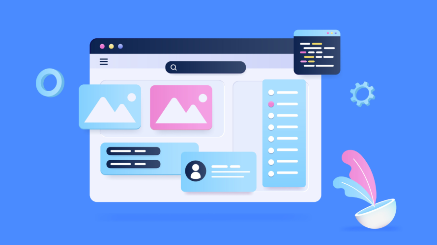
A design approach that centers parts versus whole
Modular design is an assembly of parts. Like with building blocks, you can access or change a unit without replacing the entire design. Salesforce Lightning Web Components (LWC) enable this form of design with powerful tools to build apps and workflows. As someone who contributed to the design of LWC, Salesforce UX Architect Alan Weibel knows what an impact it can have.
“Composable user interfaces are a design approach that is more flexible for Salesforce customers,” Weibel said. “They can design once and apply that design in multiple places across multiple applications. The Lightning Web Components encapsulation technology helps build trust that the designs work well when applied with distinct visual styles from application to application.”
Flexibility was a priority to the team redesigning the member portal. Instead of updating the existing system, they created a new portal using Lightning Web Components. From upgrading a trial to resetting a password, each action now has its own home. Customers get a more direct path to the task they want to accomplish. It’s also a relief for service agents who can send a link instead of giving multi-step instructions.
“Today, customers can be self sufficient and not face frustration,” said Pallavi Agarwal, Golden Hoodie Trailblazer and founder of Kander Consult, who has put her Salesforce UX Design certification to good use.
A design system that improves UX/UI
Every brand touchpoint can instill users with a sense of ease and trust. This includes the online experience. To ensure it felt seamless, Agarwal’s team, the developers, and Salesforce Technical Architect Peter Churchill rigorously prepared. They gathered use cases and thorough requirements, drew diagrams from the Well-Architected framework, and began wireframing using the SLDS library in Figma.
“Design and development worked hand-in-hand to build as efficiently as possible,” Agarwal said. “That alignment made sure that we made the best possible user experience.”
The approach was SLDS-first. If the design system had it, the team used it. Overall, they opted for configured design versus custom design (e.g. using padding, margins, and error screens to ensure future compatibility). Then, if a SLDS Styling Hook was available for buttons, they used that. Other times, the team made an additional investment in branding (e.g. using CSS to maintain a consistent look and feel for log-in). The result is a modern user interface that’s spacious and clean.
Modular design has a measurable impact
Modularity also means better analytics. “Being able to track which features people engage with is a game-changing result of this redesign. It gives us a feedback loop that will inform future optimizations,” said Agarwal.
This has been a welcome relief to service agents, who now resolve cases faster. They can simply send customers direct links to relevant modules – wherever it may happen to live in the navigation menu. The redesign team achieved this by using a structured hierarchy of components in the design of the application.


For example: It used to take time to help a customer manage their linked accounts to external partners. An agent would sometimes have to call the external partners’ customer service team to talk through the issue and solution. Now, users can accomplish this task independently.
Other internal teams benefitted, too. Service agents now field fewer cases at large and are more efficient on the cases that do come in. On the IT team, developers have a reprieve with clean code. Further, work even lightened for marketers, who can now insert promotional modules for seasonal campaigns and modify the prices for testing in a snap.
By centering modular design and systems design, Agarwal and team paved the way for both internal employees and external users to have improved experiences.


