Want More App Engagement? Try Human-Centered Design

Designing with, not for, your users helps build trust and increase adoption.

Kate Hughes
When Fordham University relaunched its student advising app in 2022, appointment bookings doubled. The IT team credits this increase to human-centered design.
“We brought users into the conversation instead of having the IT team dictate the requirements,” said Fordham University VP and CIO Anand Padmanabhan. “It was a true partnership that created shared trust and helped improve app adoption.”
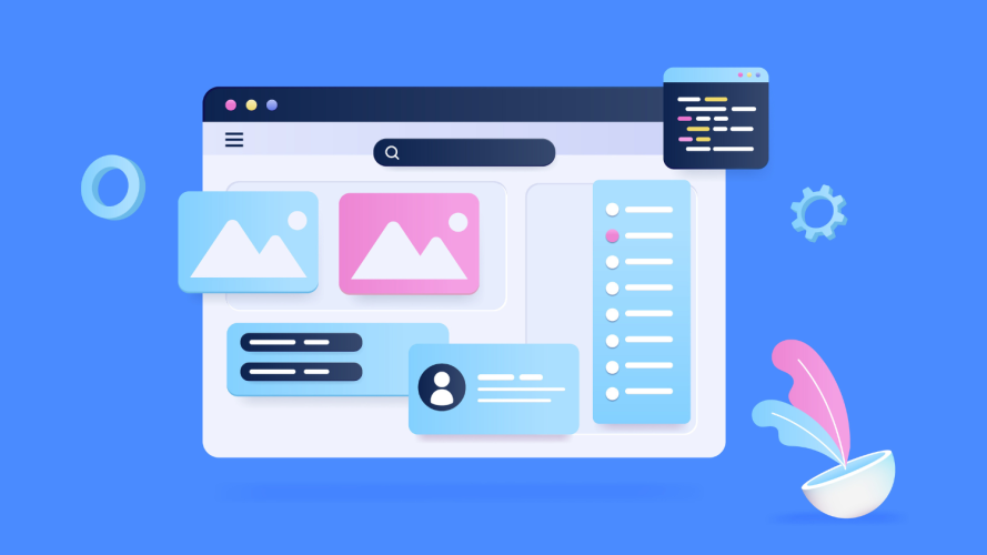
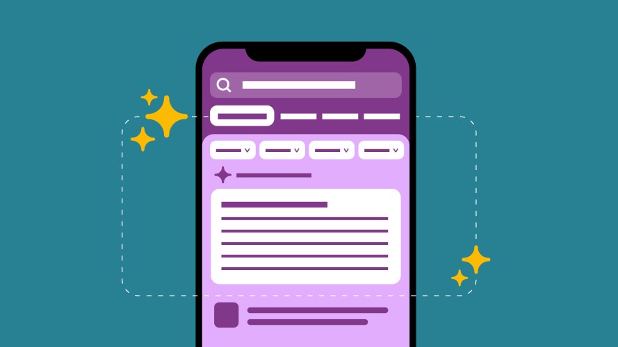
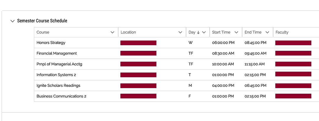
Here’s what the Fordham Student Success Hub app looks like today:
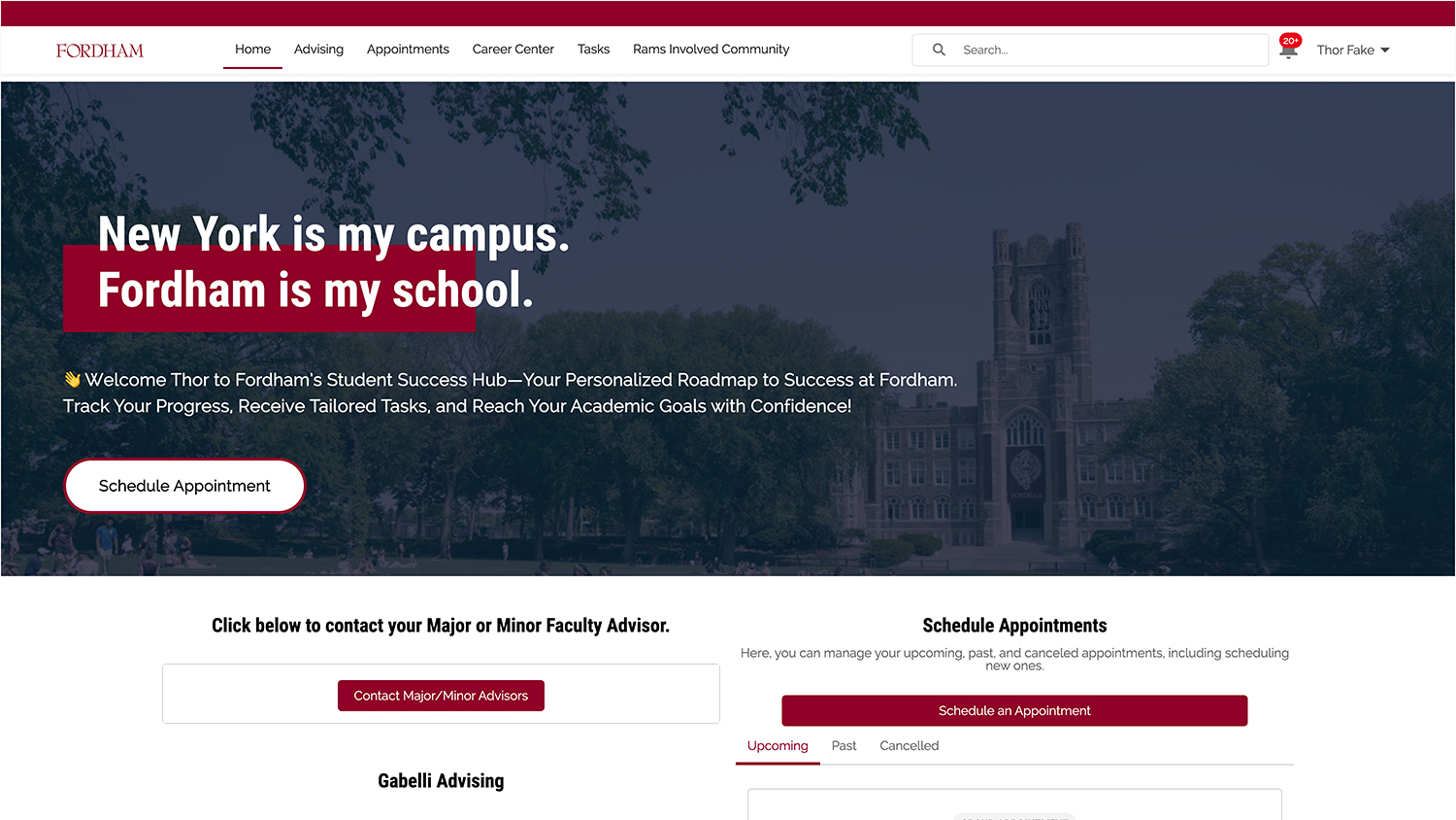
Students and advisors previously resorted to long email chains to schedule appointments – which isn’t efficient or sustainable. The new app, however, resulted in more than 15,000 appointment bookings for student advising.
To build the new app, the team applied human-centered design.
What is human-centered design?
Human-centered design is an approach to problem solving that begins with identifying user needs and then creating solutions that meet those needs. It’s about designing with, not for, your users.
Bringing in users early and often is essential. For Fordham University’s project, the user group consisted of more than 2,000 freshmen, and 400 advisors and support staff.
Each group had a wish list for the new app: The students wanted to be able to book academic advising appointments in only a few clicks. The advisors wanted to easily identify students at risk of academic consequences. For example, they might want to know about all the first-year students with lower than a 2.4 GPA who are not campus residents and may be first-generation students.


Katherine Gomez, Fordham’s assistant director of core applications, prioritized these goals as the Jobs to Be Done – which is a framework for discovering what users want to accomplish on your application.
“We meet users where they are,” she said. Her team turned to the Student Success App in Education Cloud. Its capabilities – including advisor assignment, alert management, and success analytics – received enhancements by the accelerator from Attain Partners, a management and technology consulting firm.
Integrating Service Cloud, Experience Cloud, and Marketing Cloud increased the app’s efficiency. Specifically, incorporating case management capabilities allowed students to submit questions as tickets and advisors to easily reply.
This is just one example of translating human-centered design into actionable pieces in the system. On the backend, Attain Partners also set up dozens of business rules to create an intuitive and low-custom-code user experience.
The same considerations drove the visual design.
Let common use cases drive the visual hierarchy
Everything critical must be on the first page. The team reduced click paths by focusing on the most common use cases. These include:
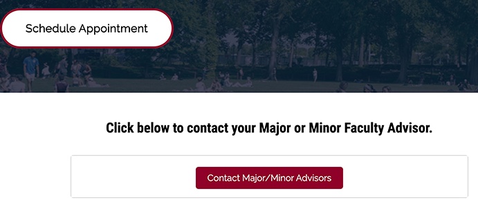
- Advisor and advisee identification
- Appointment scheduling
- Course schedule view for students
- Student services overview
- Overdue appointment notifications for advisors
- Academic concern and progress report alerts for advisors
“Any action item is on the dashboard and above the fold,” said Sara Sapienza, Fordham University Digital Campus Experience Manager and Trailblazer. She focused on getting the information architecture right. It needed to match the users’ mental model of how they think about advising and campus services.
To map this out, Sapienza turned to the Salesforce Lightning Design System Figma library as her go-to place for designing an effective user interface. As a quality check, she also moved her design to a Salesforce Sandbox environment that showed her what the components could do.
Throughout the user journey, the goal was to make it easy for everyone to use the app.
Simplify the user experience
Making something easy to use isn’t always easy. Ideally, the user knows what to do and how to achieve their goals. Design can speed up task completion and increase user satisfaction. Two ways to simplify include:
1. Match features to user needs
An easy-to-navigate app starts as soon as the user logs in. The Fordham Student Success Hub app serves two sets of users: students and advisors.
A student’s first question is: Who is my advisor? That answer is front and center in the layout. A contact may seem easy to find, but when it’s buried, it can impact student success at large.
In a survey, 71% of participants selected academic advising as one of the top three supports that would’ve helped them complete a degree. Today, students can find the right person and easily book an advising appointment while traveling across campus.
Similarly, when advisors log in, they might ask: “Who are my advisees?” and “What tasks do I need to do today?”
The dashboard highlights immediate tasks and events, so the most pressing matters are visible. This way, advisors don’t need to guess which students need more immediate support. The app surfaces people with more than 180 days since their last appointment. This functionality works thanks to those business rules Attain Partners set up.
Other automations help ensure students get the attention they need. Advisors receive an alert with mid-semester progress reports on their advisees. Plus, faculty can flag absences or tutoring needs for an advisor anytime.
Every design lever supports Fordham University’s goal of improving the student success lifecycle. That improvement continues with updates throughout its phased launch.
2. Gain valuable feedback from additional UX research
Sapienza reaches out to students for their opinions frequently. She brings them new design prototypes and asks them how they would navigate the page to accomplish a particular task. In one case, it was clear some students didn’t understand tab names. This made them unaware of the subsections in the app.
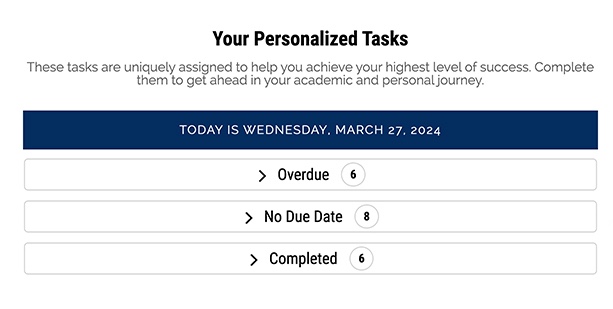
“Plain language is important,” said Sapienza, who continues to update UX copy to be more descriptive and user-friendly. Recently, she changed “Subject” to “Your Personalized Tasks.”
Tone matters, too. Sapienza added emojis to notification copy to make it feel friendly to its Gen Z users. “Good design is iterative,” she said.
UX research provides Sapienza with visual design optimizations. Once, the team changed button formatting after students misidentified it as a heading. Another time, students told Sapienza they wanted to see only what’s important for them. So she customized the log-in page to say, “Welcome, [Firstname]” and show their profile photo with the academic school in which they’re enrolled.
Most recently, she added a Course Connection object to grant students their request for a one-click view of their course schedule. Even small things make a big difference.
Freshmen and their advisors enjoyed the app so much in 2022, that all 25,000 undergraduates got access in 2023. Graduate students are next.
Discover the results of human-centered design
The team aimed to make the app so useful that other academic services would ask to be involved. Thanks to a focus on usability and human-centered design, that’s exactly what happened. First, the Prestigious Awards department reached out and then the Campus Ministry department followed.
“We wanted them to come to us,” said Padmanabhan. “Our hub did such a great job at marketing itself.”
Student success starts here
Increase engagement with Student Success software powered by Education Cloud. Imagine what you can do with one platform that offers a complete view of every student.