


Even after putting hours of hard work into designing an enticing email for your audience, weren’t the results as expected?
There was an interesting subject line, good graphical layout, vibrant images, and a clear call to action...
…so, what went wrong?
More than 50% of people read their emails on their mobile phones.
Now, no matter how attractive your email is, if this audience sees it as an incoherent illustration, they’ll simply ignore it or delete it.
Your emails should appeal to all users irrespective of the device they choose to engage with you.
This doesn’t mean that you’ll have to create separate emails for all devices. You can do this with a single well-designed email only.
In this post, we’ll see what a responsive email is, how it can help you engage with a wider audience, and what are some of the things to keep in mind while designing such an email.
Table of Contents
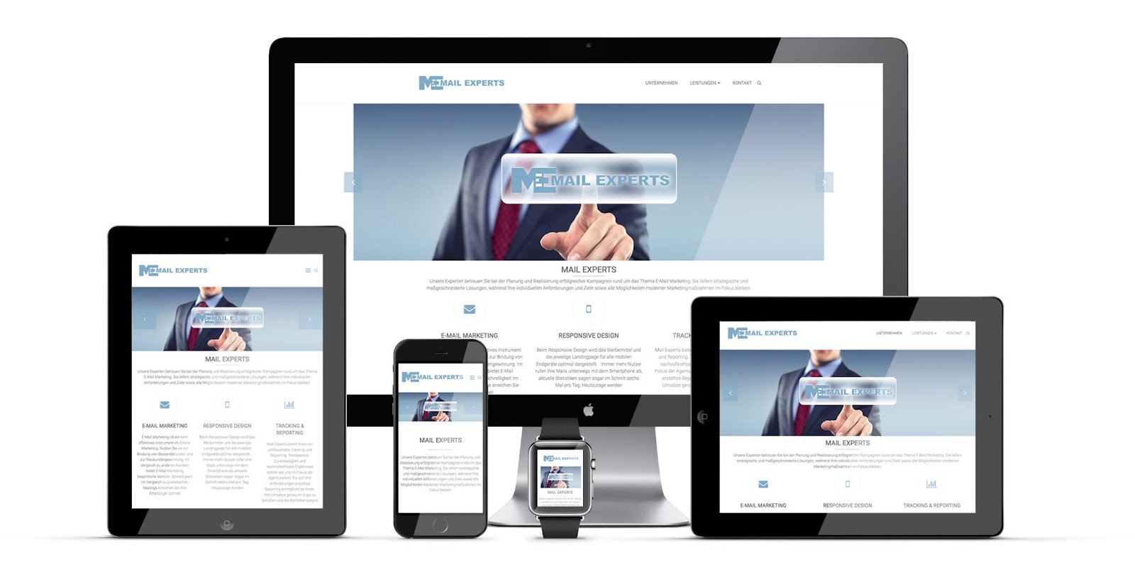
What Is A Responsive Email?
An email that looks the same on all devices is called a responsive email. These graphical emails are designed to ensure that the email adapts to the screen resolution whether it’s a mobile, a desktop, or a tablet.
What Is The Importance Of Responsive Designs?
For the audience on the go
In a period of 4 years, the number of emails opened on smartphones increased to a whopping 500%.
People don’t wait to find a desktop anymore to check their emails. They rely on mobiles for accessing online information. Everyone checks their mobile while commuting, waiting in line for coffee. And you should meet your readers on devices they are on. According to a report from Search Engine Land, over 50 % of searches turn up on mobile devices. this is why many Website Design Companies, across the world, are focusing on responsive website designs.
So, if your email looks attractive only on a desktop, you’re limiting your outreach.
To get better conversions
A responsive email makes it easier for your readers to quickly navigate and find all the necessary information and the call to action button.
An incomprehensible email with components looking like puzzle pieces will only frustrate the reader. But an email that clearly shows your reader what they’re supposed to do next will naturally boost your conversions.
To avoid getting marked as spam
An unresponsive email diminishes your credibility and affects the readers’ trust. It’s also more likely that the user will mark your email address as spam to avoid getting further emails from you.
You should design a responsive email to engage your users and build brand loyalty. A loyal customer base reacts better to promotional content leading to more profits.
6 Best Practices & Tips For Responsive Email Design
Here’s a list of some best practices that you can consider while designing your next responsive email.
1. Use a single-column layout
The single-column layout has only one column where the content is added in a hierarchical order. After the logo, image, a short content body, a clear call-to-action will be added.
The advantage of using this layout is that it’s compatible with any device the user has. It can be viewed the same on mobile or desktop. Also, since it’s a single column, its development is much easier.
It makes skimming through the email easier for the user, and the hierarchical order doesn’t distract them from the CTA.
2. Choose a proper font and maintain content hierarchy
Use a font size that can be read easily, even on a small screen. Keeping headings to at least 20-pt and the sub-headings to a minimum of 14-pt will improve readability.
Since you’ll be using a single column for showing all the information, it’s crucial to offer the client what they need upfront to boost conversions.
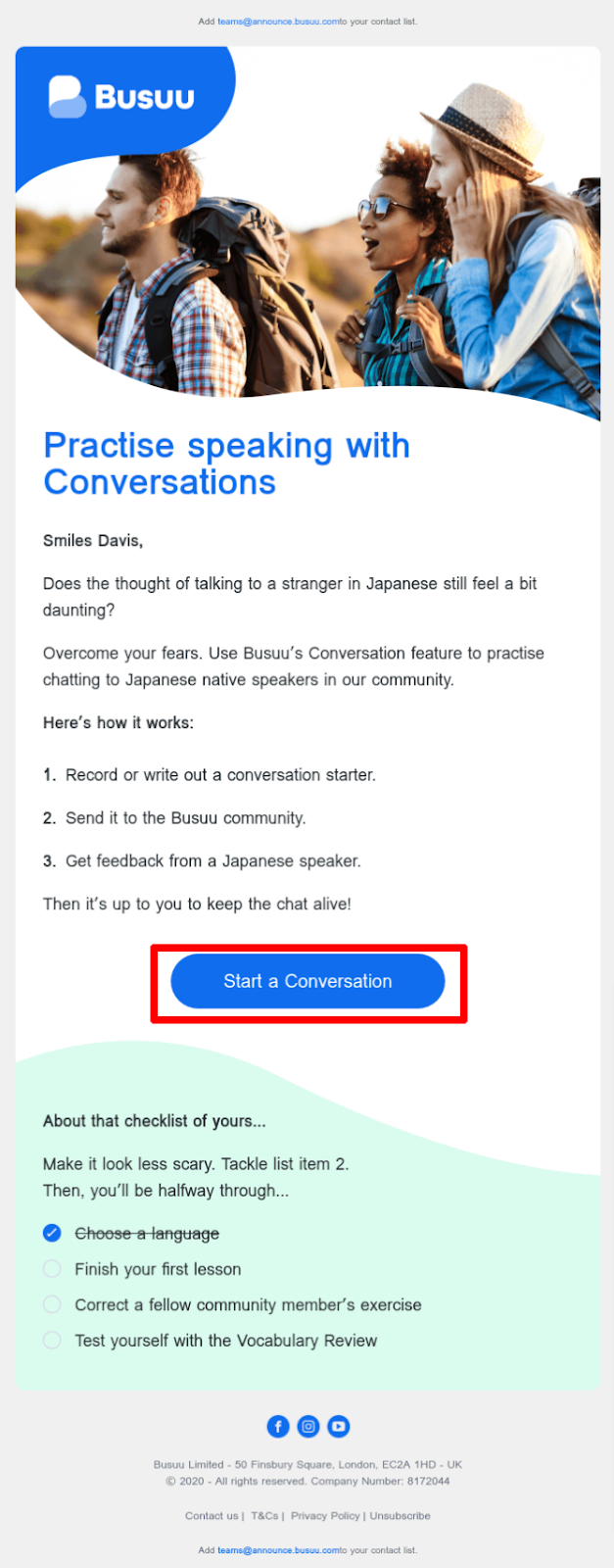
In the above email, the content follows a hierarchy where the most important information is at the top. The email offers a clear value to attract the reader, and then the visible call-to-action button tells the reader what to do next.
3. Have a conspicuous CTA
The goal of designing a responsive email is to improve conversions and increase revenue. And that is done through your call-to-action button.
But if your CTA is blending with the rest of the email, then there are slim chances that the reader will notice it.
The CTA should rank higher in your email hierarchy, but it should also be visible to attract the reader’s attention.

Use a CTA that stands out in the email through a contrasting background and a clear goal.
Keep the button big enough so that it is clickable and responds as soon as the reader clicks on it. Remember, the readers are busy, and a buggy CTA will instantly force them to move on to the following email in their inbox.
4. Use smaller and responsive images
No email designer should underestimate the power of good visual content that can grab readers’ attention and engage them.
Use smaller images so that scrolling on mobile devices becomes more effortless. It’s important to ensure that the images are responsive and maintain the integrity of the email across devices.
Images should complement your email content instead of distracting attention from it. Use images that are persuasive and necessary to enhance your message.
5. Avoid too many hyperlinks
Hyperlinks direct traffic to an external web page, your website or some other post.
It’s important to use these wisely in your email because if the reader clicks on a hyperlink and lands on a new page, they might forget about your email altogether (curse the short attention spans).
Also, adding too many hyperlinks clutters your email and the user might face a problem navigating in a smaller device without accidentally tapping on an unnecessary link.
Instead, use a big and clear CTA button without overcrowding.
6. Preview your emails
Test your emails before sending them to the user’s inbox. Send the email to yourself first to test what the email will look like to the rest of the audience.
While testing, make sure that your email looks the same on all devices and all the CTAs are working properly.
You can try online tools like Litmus, Mailtrap, or SendX to make this testing easier.
Conclusion
Email marketing is one of the most cost-effective ways to build relationships with your audience. It can help you at all stages of your customer journey, whether it’s brand awareness, engagement, or enhancing user experience.
To maximize the returns from such email campaigns, it’s important to make them appealing and valuable to the reader. And if you’re still relying on emails that make sense to only desktop users, then you’re losing out on a huge market.
Responsive emails help you increase your potential prospects and enable growth with a loyal customer base. A well-designed responsive email can make your email marketing profitable.
Creating a good graphical email doesn’t mean you’ll have to enroll in an HTML coding class. There are many online tools that can help you design templates from scratch, without any technical prerequisites. One such tool is SendX. It's an intuitive and easy-to-use email marketing software.
Sounds easy? It is. Get started and see your numbers improve.