
Subscriber Email Examples to Boost Email Experience
Email remains one of the most effective channels for building a relationship with your audience. The subscriber email examples you’ll see in this article will show you how subscriber emails help you build and nurture your audience relationships–without requiring that you constantly reinvent the wheel.
Whether you’re sending celebratory anniversary messages or re-engagement emails designed to win back subscribers whose engagement has waned, read on for subscriber email examples and free Litmus email templates that make for a simple email creation process–and messages that resonate in the inbox.
What is a subscriber email?
When a prospect or customer provides your company with their email information and opts-in to give you permission to email them, they become an email subscriber on your list. A subscriber email might take on the form of a welcome message when they initially provide and confirm their email address. It might offer them a special birthday message, or be an attempt to win back a subscriber whose engagement seems to have waned.
The intent of the subscriber email can vary–but is typically to further build the relationship with a subscriber over time.
Why are subscriber emails important?
While having a person join your email list is a great first step–it’s probably not the only goal you have for the relationship. Ultimately, you might hope that your email convinces them to buy something, further engage with a product, interact with your company, or become a more active member of your organization’s community or cause.
Email is lauded for its high return on investment and comparatively low cost compared to other channels—but seeing that payoff from email requires far more than simply having an email address. Subscriber emails help you build a customer relationship, and learn more about they types of messages your individual subscribers respond to and engage with, based on the email metrics you use to gauge performance. With every subscriber email you send, you have an opportunity to further engage with the customer, and possibly, convert them into whatever action it is that you have for your email program.
5 Great Subscriber Email Examples
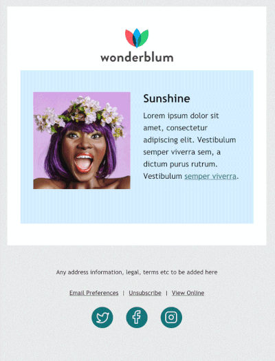
Example 1: Welcome email
Zoës Kitchen’s welcome email for their reward program summarizes how people earn points, both through the app or in-store. It then prompts the subscriber to make an order.
Want to send a welcome email? Get started here.
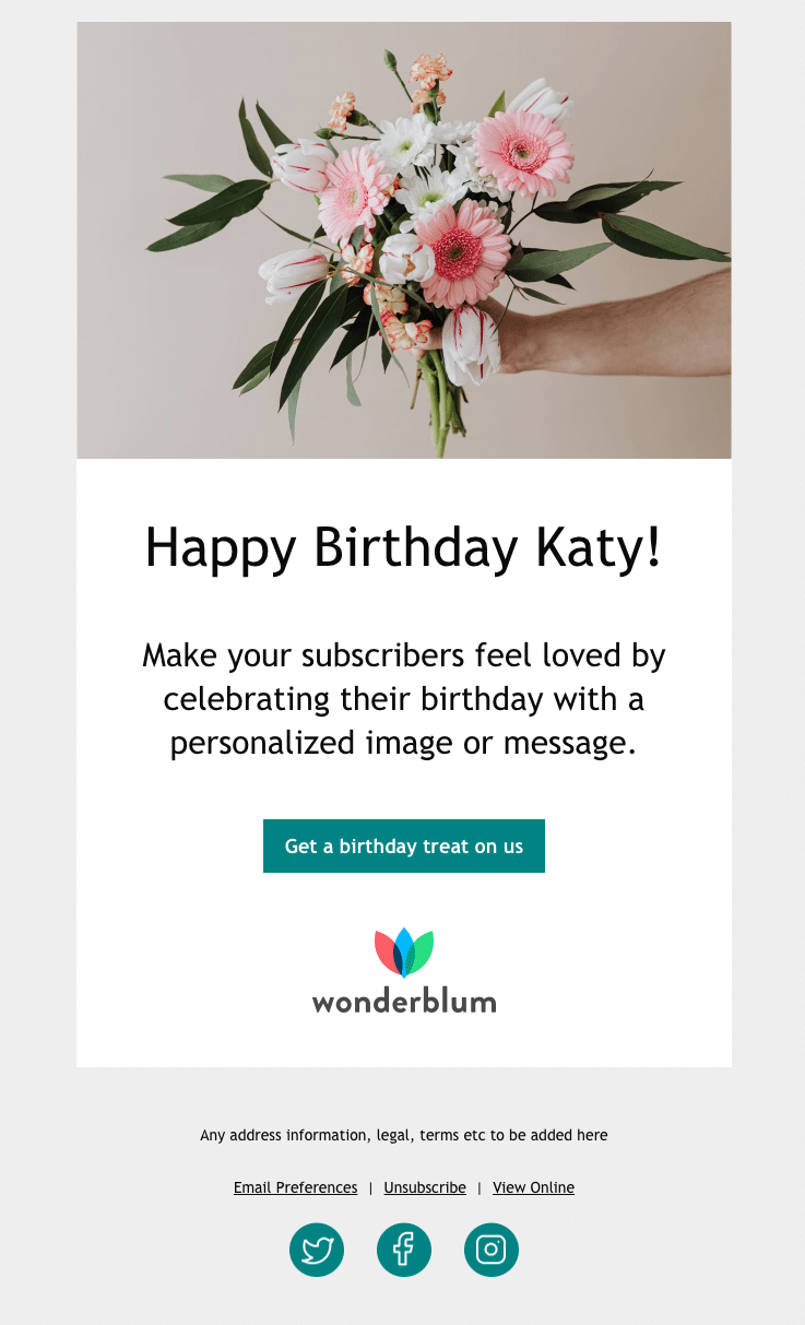
Example 2: Birthday email example
Birthday emails are one of the most common subscriber emails. One way to stand out in the inbox is to send birthday emails before the actual day.
Outdoor Voices celebrates their subscribers’ half birthday, sending them an email with a discount code before their big day, showing subscribers they’re thinking ahead. Then on their actual birthday, they send another email with a discount code, too.
Want to send a birthday email? Get started here.
Example 3: Anniversary email example
User anniversary emails are a great place to utilize personalized data about past purchases or activity—and encourage them to keep it up. SurveyMonkey celebrates its users once they hit their first anniversary.
Want to send an anniversary email? Get started here.
Example 4: Post-purchase email example
Post-purchase emails work best when they’re short and sweet—like Athena Club does. They let the subscribers know how long leaving a review will take (ten seconds) and show appreciation for taking the time.
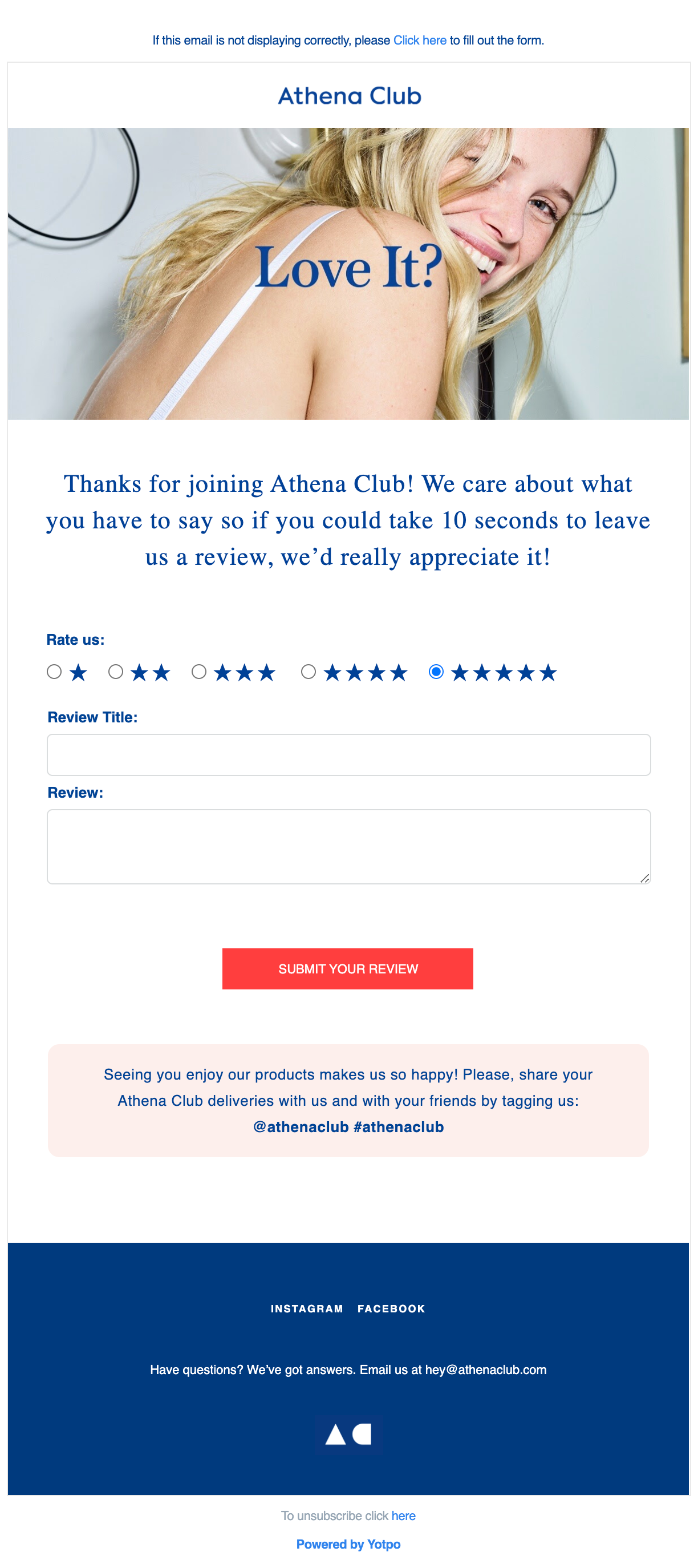
Want to send a post-purchase email? Get started here.
Free subscriber email templates
To help marketers give their subscribers a bit of love, we created these Free Email Templates. All free, and fully optimized for over 100+ email clients, apps, and devices–including Dark Mode. You’ll find subscriber templates for:
- Welcome email: Create a great and lasting first impression.
- Anniversary email: Thank your customers for their loyalty.
- Birthday email: Celebrate your subscribers on their special day.
- Review email: Get feedback to improve your audience’s experience.
- Re-engagement email: Win back those customers who’ve strayed.
- Plain text style email: Add a one-to-one touch with a friendly face.
- …and so many more!
Read on for guidelines and tips on how you can use them.
General template design tips for customizing your brand
The designs for every single one of these email templates were made with busy people in mind—those with small teams or limited resources. You can easily pick up the templates and, with a few design changes, use them for your own brand. Here’s how.
Familiarize yourself with the design grid
Have design resources? Want to create layouts in a design application (like Figma or Sketch) before applying changes to the email templates? Get a head start by understanding the details of the grid that the emails were designed over.
Each template uses the following six-column grid structure:
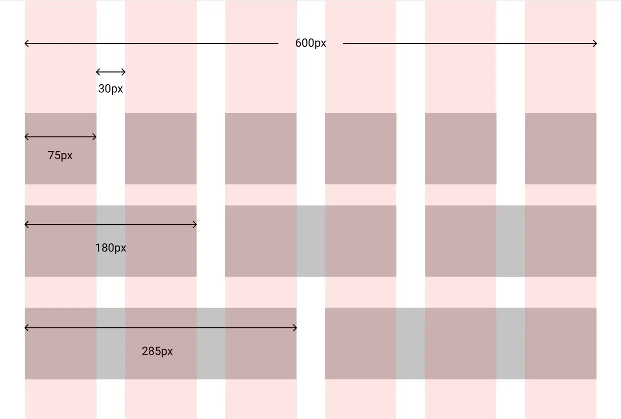
The emails are all 600px wide with six columns that are each 75px wide. And there is 30px of space separating each column. This gives you flexibility to create single-column, two-column, three-column, or even six-column designs that stack nicely on mobile.
Create Dark Mode versions of your images
Each email template has been optimized for Dark Mode, so the appropriate changes will be applied to background and font colors when viewed in Dark Mode. Because of this, it’s important to ensure that your visual assets—such as your logo—are legible with the lights turned off.
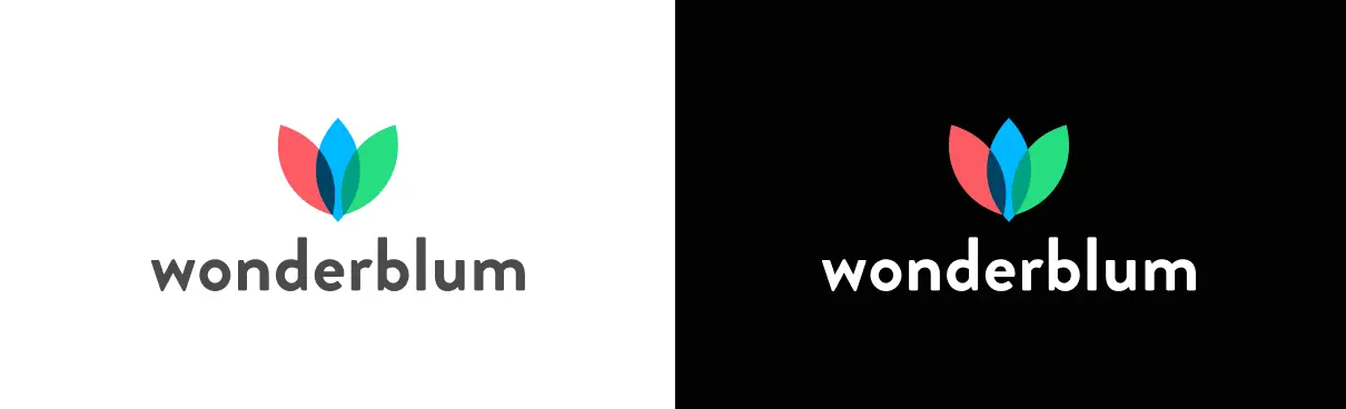
In the example above, we’ve swapped out the placeholder Wonderblum logo, changing the text from gray to white for Dark Mode, to ensure it doesn’t get lost against the dark background. I recommend you use similar tactics.
Update emails with on-brand imagery
We sourced all of the imagery in the email templates from the free stock imagery site Pexels. Unsplash is another site we like for an extensive collection of free imagery.
If you’ve got a bit of budget, we highly recommend either Shutterstock or iStock. These sites provide photography and vector downloads if illustrations are a better option for your brand.
When creating imagery, save images at twice the size you display them in the email. This will give you a nice crisp rendering on retina displays. Be sure to define the width and height for your images in the HTML to stop Outlook from warping your imagery. This will be overwritten for devices by the mobile CSS media queries, which are embedded toward the top of the template code.
Keep image file sizes small
To keep your email at a healthy weight, compress any of the graphics you plan to use. There are some free online tools you can use to compress images, such as tinypng, tinyjpg or ezgif. (Our compression tool of choice is ImageOptim).
General subscriber email template coding tips
Diving under the hood of these templates can be intimidating–but we’ve heavily commented the code in the templates to help you through it! Be sure to take the comments out before you hit send to keep your email file size low, and to avoid slow loading times or clipped messages.
Here are some more helpful tips:
Use a web-safe font
We used Trebuchet MS as the default font for these emails. Trebuchet has 99.67% support on Windows and 97.12% on Macs. Break out of the standard Arial or Helvetica font spiral without the difficulty of web fonts (minimal support and more coding required) by picking a web-safe font with good support.
Get the hang of hover effects
We added some interactive elements to the email templates to help with accessibility and make the emails pop.
All of the call-to-action buttons have two hover effects: the colors change as well as a scale effect. They’re a great addition in the places where they are supported (though they aren’t supported everywhere). Think of them as another way to surprise and delight your subscribers!
Text links and linked images also have a hover effect. For text links, the underlines disappear as a visual cue that they’re actually linked content and not just underlined content. The linked images have a fade effect to act as a clue that the image is linked.
All of the hover effects are created in the header CSS styles with the :hover pseudo class which has decent support across most email clients.
Take note of the two-column stacking rows for mobile
The two-column blocks were created using the hybrid coding method. They use a Z-pattern so that images alternate being on the left and right of text as you go down the email, creating a zigzag.
This creates two types of stacking blocks: standard and reverse.
In the standard stacking order, the content on the left comes first in the code and ends up on top when stacked:
With reverse stacking blocks, the content on the left comes second in the code and will end up on the bottom when stacked:
Check to make sure you’re updating the correct content block so that your blocks stack the way they should on mobile. Hint: The reverse stacking rows are denoted by dir=”rtl” in the code aka the direction is “right to left” since the right will sit on top of the left on mobile.
The welcome and the re-engagement email templates use both standard and reverse stacking content, so pay close attention!
Specific guidance for each email template
Our Litmus subscription email templates are at their best when combined with a spot-on strategy on both the marketing and design/development side.
Here are some template-specific tips to make your experience seamless.
Welcome email template
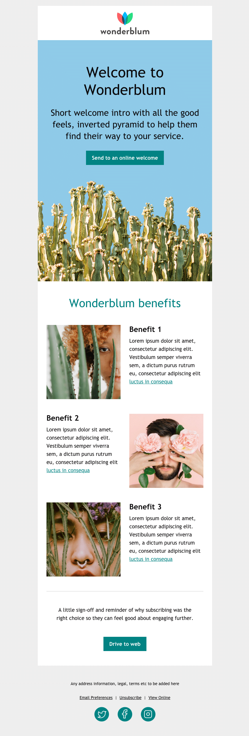
A welcome onboarding email is likely going to be the first email your customers or subscribers see from you. With welcome email templates, you’ve got no excuse not to make a great first impression!
Start your relationship with new email subscribers by sending this message as soon as you can. You don’t want them to have forgotten about you by the time your first email hits their inbox.
While I don’t believe in the fold (I believe in the SCROLL!), the hero section at the top of the email is incredibly important. It’s the first thing your subscribers will see in email from your brand. Make it count.
Visually, the design calls for the content to flow seamlessly into the image. This effect can be done with either a JPG or a PNG file. However, a transparent PNG offers a more flexible experience in both dark and light modes. This will allow the background color to be controlled with CSS, so the cohesiveness of the hero area can be maintained.
Dark Mode with a transparent PNG gives you the option of changing the background color with media queries so you could create either of the options shown in the example below. Using a JPG limits you to the option on the right.
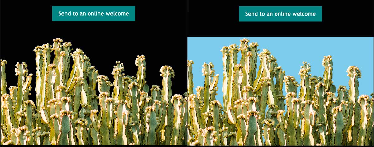
This also helps the fade effect that’s used to indicate that the image is linked.
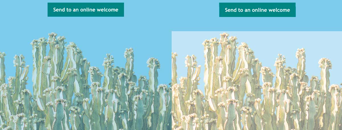
When a JPG is used, the background in the image fades, which creates a color block effect. When a transparent PNG is used, only the image fades leaving the background color to match the area above it.
See an example of the fade effect in light mode with a transparent PNG (on the left) versus a JPG (on the right):
Once you’ve got your subscribers’ attention with visuals, keep it with an impactful call-to-action (CTA) button.
Think about where your new email subscribers should go after they’ve just signed up to receive your emails, or have just entered into a relationship with your organization. Is there an introductory page, or do you want them to jump in and start buying or browsing on their own?
While we’ve included an entire section in the email template that we call “benefits”, this section is entirely optional and can easily be removed from the email template. But, If you have something to offer here (like a free trial or offer for new subscribers) take advantage of this space. If not, there’s nothing wrong with a short and sweet welcome email with a single CTA button.
As we mentioned previously, this email uses the two-column stacking rows.
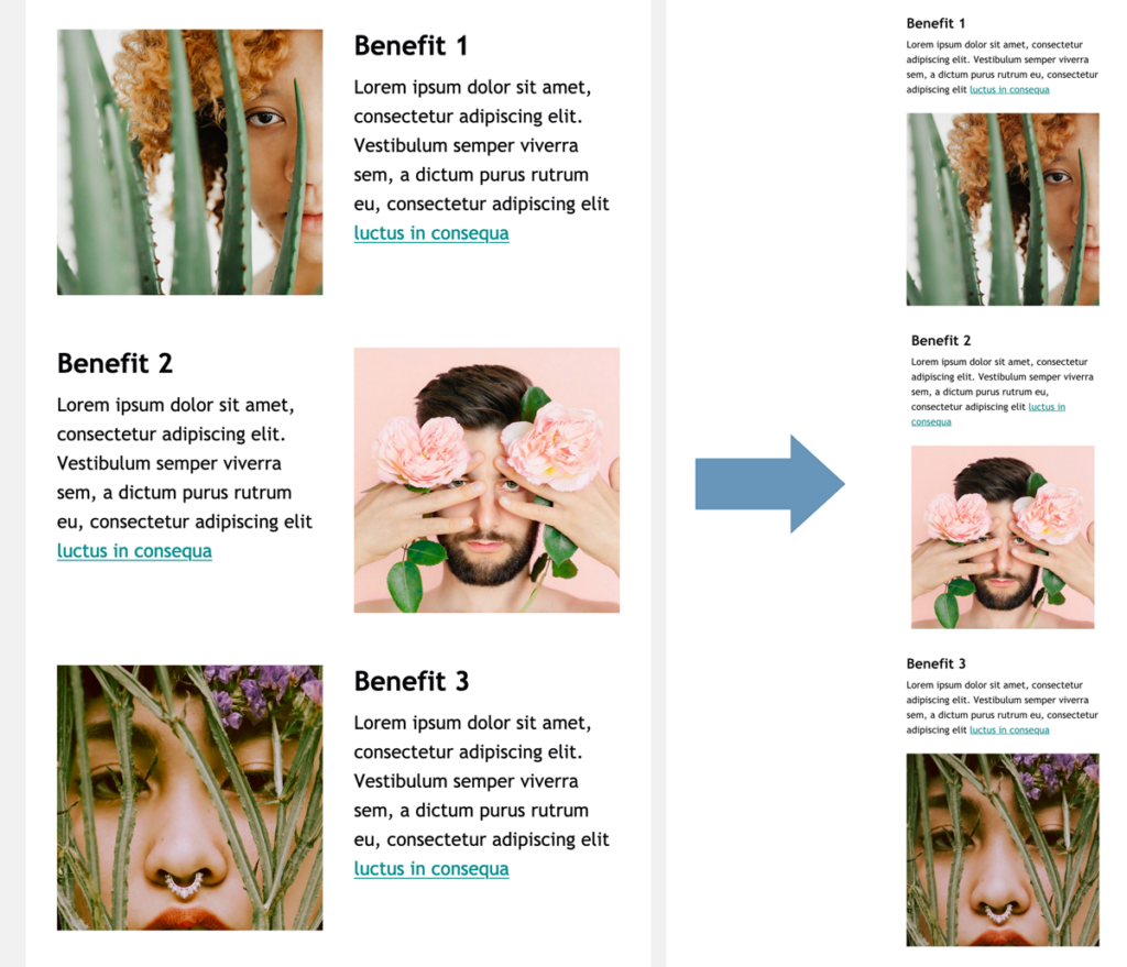
Specifically in this email, the section starts and ends with reverse stacking rows and has a standard stacking row between them. This creates a Z-pattern for the desktop layout with the image starting on the left, but allows for a mobile layout where the copy sits on top of its coordinating image.
Birthday email template
Birthday emails don’t require that you give subscribers a coupon or promotional offer as a best practice–but they are often classified as “surprise and delight” emails.
If it makes sense to use the birthday email template with your audience based on your business, get creative about how you can surprise or delight them with your message.
Anniversary email template
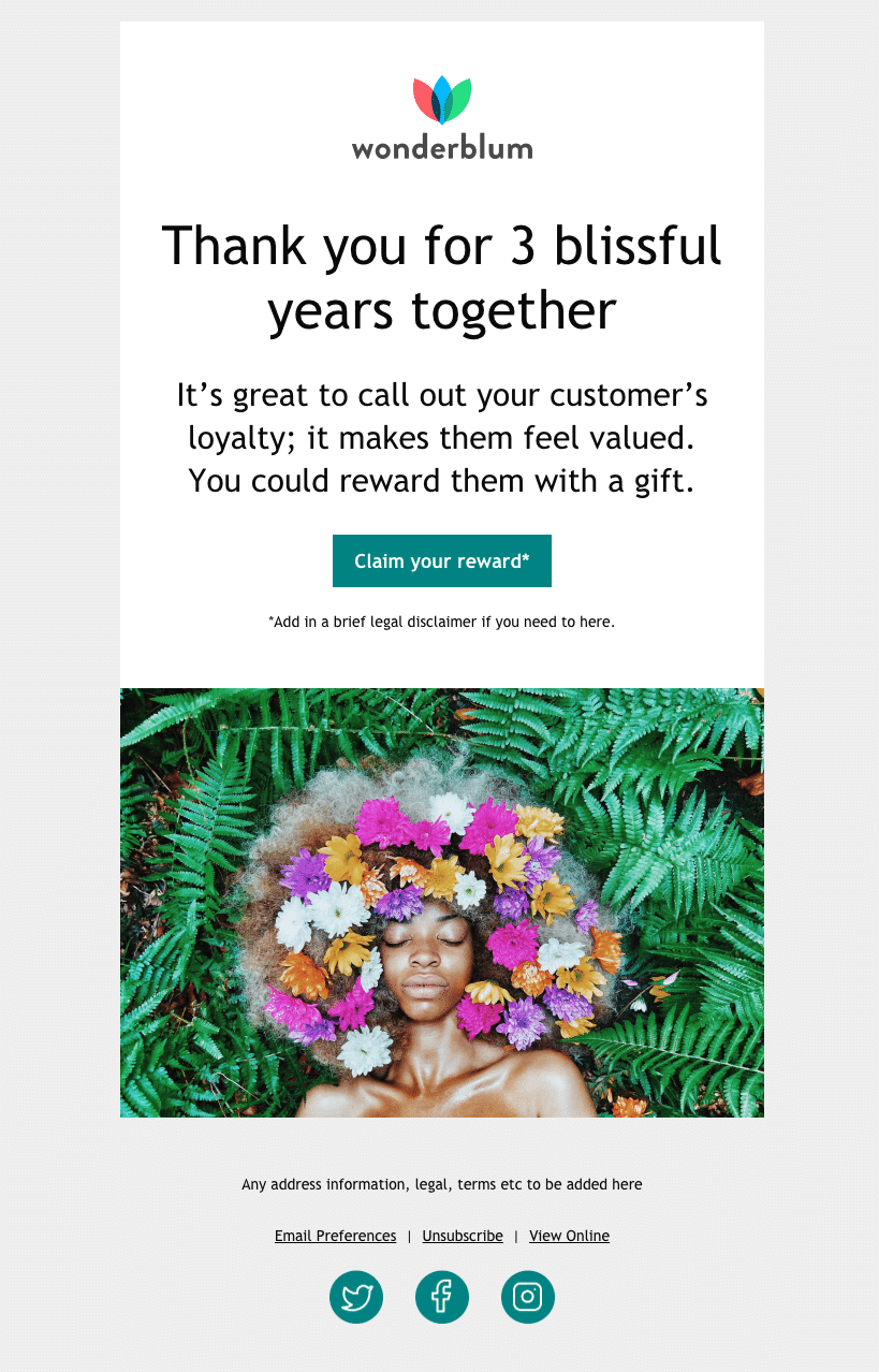
Like the birthday email, you’ll get the most out of the anniversary email template when you offer a genuine reason to email subscribers about a specific anniversary.
For example, you might remind them of how long they’ve had a relationship with your company by celebrating the day they first signed up for your email list. This type of messaging shows that you care about your customers’ loyalty.
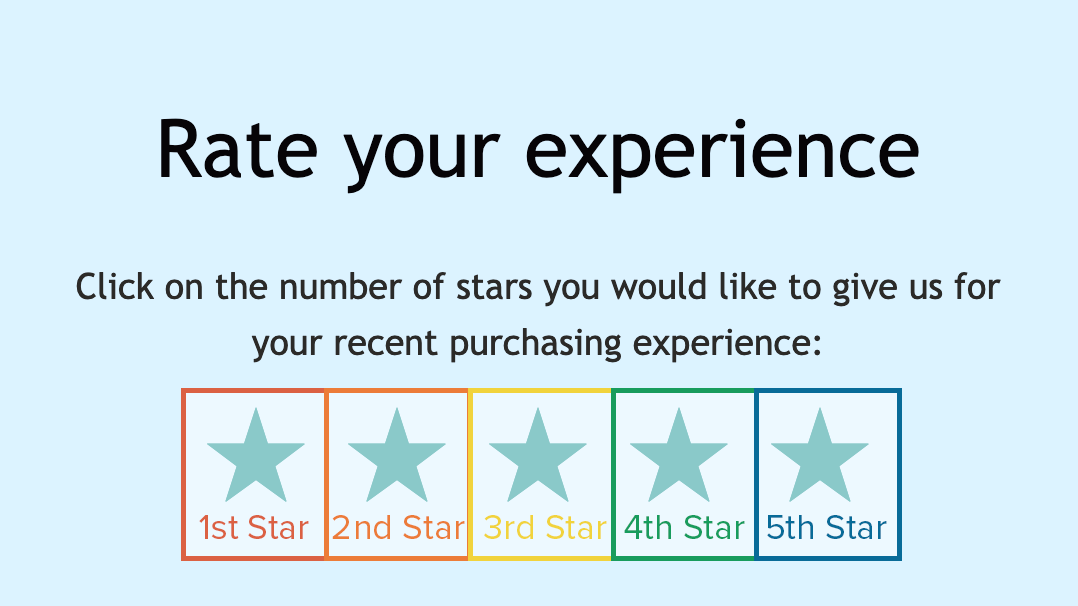
Rating and review email template
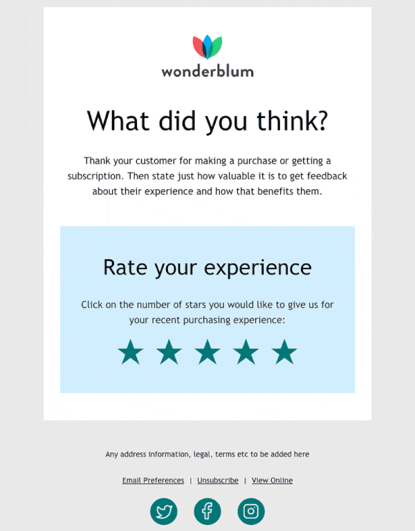
When you’re asking your customers to rate your services or products, timing is essential. You don’t want to ask for a review before they’ve had a chance to properly use and assess your product.
We’ve positioned the rating and review email template to apply to a product or service–but you can easily use it to ask for feedback on a newsletter, or as a net promoter score (NPS) email, too. Consider sending this type of email every quarter to get ongoing quantitative feedback that’s meaningful to your email marketing strategy.
As you dive into the code of this email template, make sure you assign the correct URL to the correct star. The increasingly highlighted star effect is created by using HTML symbol stars, pseudo selectors, and the dir=”rtl” attribute. (So the first star that appears in the email is controlled by the last star in the code.)
We put comments in to help make sure you add the URL correctly, but here it is visually as well:
<tr>
<td align="center" valign="top" dir="rtl" style="padding:0 0 50px">
<p class="star" style="font-family:'Trebuchet MS', Arial, sans-serif; font-size:18px; line-height:28px; color:#262524; margin:0; padding:0;">
<!--Fifth Star-->
<a rel="noopener" target="_blank" href="http://www.example.com" style="font-size: 50px; color: #028383; text-decoration: none;">★</a>
<!--Fourth Star-->
<a rel="noopener" target="_blank" href="http://www.example.com" style="font-size: 50px; color: #028383; text-decoration: none;"> ★</a>
<!--Third Star-->
<a rel="noopener" target="_blank" href="http://www.example.com" style="font-size: 50px; color: #028383; text-decoration: none;"> ★</a>
<!--Second Star-->
<a rel="noopener" target="_blank" href="http://www.example.com" style="font-size: 50px; color: #028383; text-decoration: none;"> ★</a>
<!--First Star-->
<a rel="noopener" target="_blank" href="http://www.example.com" style="font-size: 50px; color: #028383; text-decoration: none;"> ★</a>
</p>
</td>
</tr>
The HTML above is color coded so you can see which piece of code relates to which star in the screenshot of the email below:
As an interactive rating scale, it pairs great with a survey tool such as SurveyMonkey or GetFeedback.
In this case, you’d create a survey with the first question (or only question) as a rating question. Grab the URL for each rating and paste it in the corresponding star’s href in the code. Make sure to set up the thank-you page for your survey for your audience to land on when they click through.
Alternatively, you can use it in a less complex way: Set up a thank-you landing page and link each rating to that same page. In this case, you’d add a query string at the end specific to each rating:
<tr>
<td align="center" valign="top" dir="rtl" style="padding:0 0 50px">
<p class="star" style="font-family:'Trebuchet MS', Arial, sans-serif; font-size:18px; line-height:28px; color:#262524; margin:0; padding:0;">
<!--Fifth Star-->
<a rel="noopener" target="_blank" href="http://www.example.com/thank-you?rating=5" style="font-size: 50px; color: #028383; text-decoration: none;">★</a>
<!--Fourth Star-->
<a rel="noopener" target="_blank" href="http://www.example.com/thank-you?rating=4" style="font-size: 50px; color: #028383; text-decoration: none;"> ★</a>
<!--Third Star-->
<a rel="noopener" target="_blank" href="http://www.example.com/thank-you?rating=3" style="font-size: 50px; color: #028383; text-decoration: none;"> ★</a>
<!--Second Star-->
<a rel="noopener" target="_blank" href="http://www.example.com/thank-you?rating=2" style="font-size: 50px; color: #028383; text-decoration: none;"> ★</a>
<!--First Star-->
<a rel="noopener" target="_blank" href="http://www.example.com/thank-you?rating=1" style="font-size: 50px; color: #028383; text-decoration: none;"> ★</a>
</p>
</td>
</tr>
Then, use the click tracking from your ESP to track which rating was clicked. Easy!
Re-engagement email template
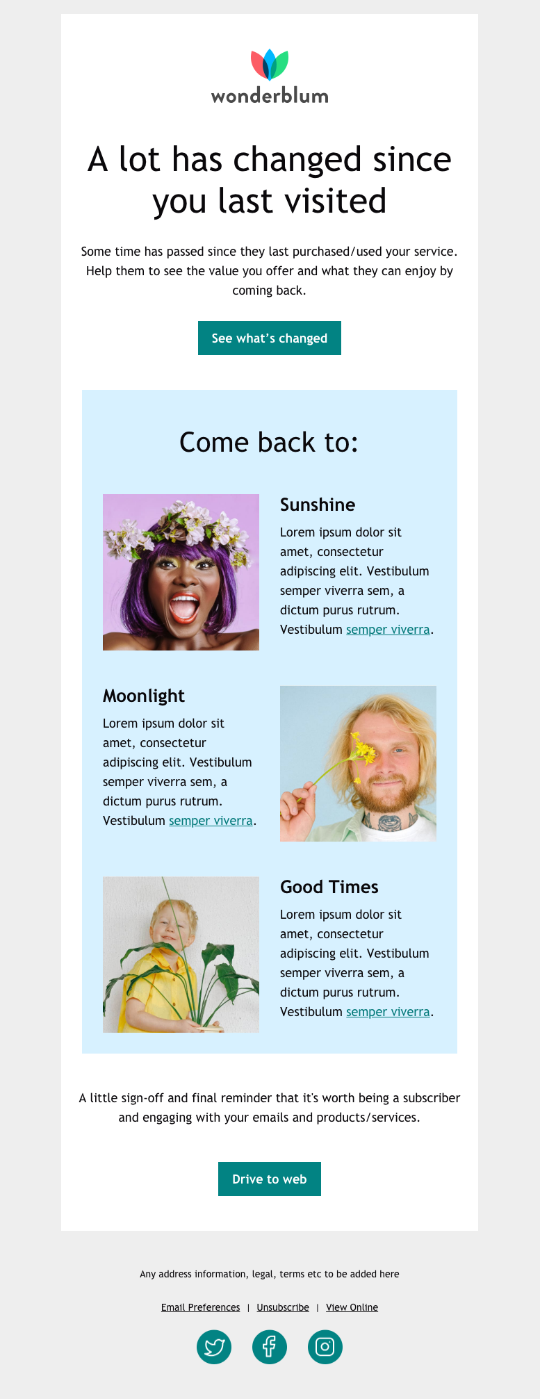
If customers haven’t purchased from you within a specific period of time, or subscribers haven’t opened or engaged with an email you’ve sent for some time, this re-engagement email template could help you win them back.
Design-wise, the re-engagement email looks similar to the welcome email, but uses standard stacking rows on the top and bottom, and a reverse stacking row in the middle.
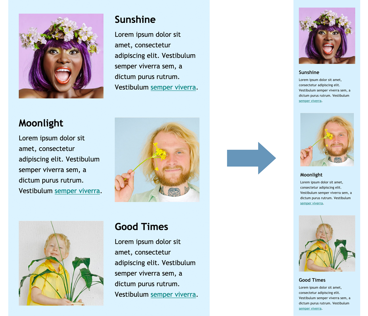
The Z-pattern is the same on desktop as in the welcome email, but on mobile, the images end up on top.
Plain text style email template
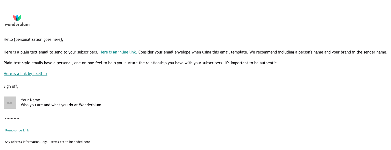
Along with five beautifully designed email templates, we’ve added a fully optimized plain text style email template, too.
Why? Because we’ve had success with plain text style emails for some campaigns–they definitely have a place in our email program. (It may be testing to understand if they have a place in yours, too).
Plain text style emails can work really well when messaging aligns with the format. Plain text style email templates should feel genuine– as if they’re coming from an actual human being! For that reason, there are no CTA buttons.
Instead, you’ll rely on text links within specific parts of your text to add to the authenticity. We’ve found that linking text that’s related to the action or goal of the email works best.
Use these templates to win over your subscribers
These Free Email Templates are just the start of what you could do to show your subscribers why they made a good choice by joining your email list, and building a relationship with your brand. Use them to simplify your email creation process–and win attention in the inbox.
Email Templates That Your Subscribers Will Love Ready to wow in the inbox? Check out our free email templates to help you boost your email engagement and overall brand loyalty! |
Jaina Mistry
Jaina Mistry is the Director, Brand & Content Marketing at Litmus