Identify
 Personalize
 Benchmark
 Agencies
 Integrations
 Case Studies
 Use Cases
 Blog
Blog Resources
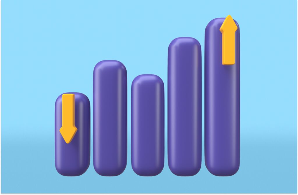
As a marketing or sales professional, you’re always looking for new ways to track and analyze your data. While tracking your analytics in a sheet can be helpful, it’s not always easy to interpret data like that. Waterfall charts can help you and your team track and analyze data easily, and set goals based on these numbers. By using waterfall charts, your team may be more likely to understand your positioning, and how they can improve. In this article, we go through what waterfall charts are, how to create them, and how to use them to improve your business analytics.
What is a Waterfall Chart?
A waterfall chart, also known as a bridge chart or cascade chart, is a graph that shows how a value is impacted by intermediate values. The first value can be impacted both positively and negatively. In most cases, waterfall charts are used to track and analyze sequential data. This is to help you identify any patterns and help your team predict future trends.
Why Should Your Company Use Waterfall Charts?
Waterfall charts are a great way for your company to track and analyze metrics. While tracking your metrics in a spreadsheet can be helpful, it may be hard to fully understand the metrics. By using a waterfall chart, you can visualize the metrics and see what is working. This way you can see if anything needs to be improved upon.
Interpreting a Waterfall Chart
When you first look at a waterfall chart, it may seem confusing. But, once you know how to read the chart, it can be pretty simple. When you are looking at a waterfall chart, you read it from left to right. Below is an example from Hubspot, where they display marketing spending versus marketing earnings. Here, you can see how much each marketing tactic costs to implement, and how much they earned. This can help marketers compare and contract their marketing tactics, and see what tactics are driving the most revenue.

Examples of Waterfall Charts
Of course, now that you know what a waterfall chart is, you want to know how your company can use waterfall charts to track your marketing and sales efforts. There are a ton of different ways that companies can use waterfall charts, here are just a few of the most common ones that we see.
Revenue Tracking
One of the most important metrics that both sales and marketing professionals need to track is revenue. Revenue determines how much you can spend on marketing expenses, which can change how many leads you are able to generate in a given time period. So, by using a waterfall chart, you can instantly see which months are bringing in the most revenue. This can help you see trends throughout the year. And, if you continuously see that certain months bring in more revenue, you can alter your marketing budgets.
Expense Tracking
Tracking expenses can be tricky. It’s very easy for some expenses not to be properly tracked. As a result, some expenses may not be paying off and are worth the money. By using waterfall charts, your team can easily see exactly how much money is spent in certain areas. Then, you can see if certain expenses are worth it. Or, if that money could be put towards other areas that bring in more revenue.
Lead Generation
Most companies will experience ebbs and flow with their lead generation. Some months may be consistently slower than others, while some are a lot busier. Using a waterfall chart to show these trends can help you see if there are opportunities to improve in certain areas. If you see that your company is continuously slow in the spring, then that could be a good time to try out new lead generation and marketing tactics.
Social Media Engagement
Now more than ever, social media engagement is essential to track. By using waterfall charts, you can see how much engagement your company gets in a certain time period. With this metric, you can track weekly or monthly engagement so you can get a better idea of what your followers are responding to. This can help you decide what to continue sharing, what to share more of, and what might need to get a refresh.
Monitor Website Traffic
While Google Analytics can be a great tool to track your website traffic, it’s not always the best solution. Waterfall charts are a great way to get a closer look at your website traffic for landing pages, blog articles, and other key pages on your website. By tracking your website traffic with waterfall charts, you can see if any abnormalities pop up. As an example, if you noticed a decrease in traffic with your blog articles, Google might have made an update to its algorithm that affected how your pages rank. You can take this opportunity to update your content and not miss out on traffic.
How to Create a Waterfall Chart in Excel
Waterfall charts can seem complicated to build, but once you have the numbers, it’s not as difficult as it may seem. Here are 7 steps you should follow to create your own chart.
1. Collect Your Data
Of course, the first step in creating your waterfall chart is to collect the data that you’d like to visualize. As I mentioned earlier, your data will need to be in a consistent time frame so it can be properly compared. Once you have this data, you’re ready to get started.
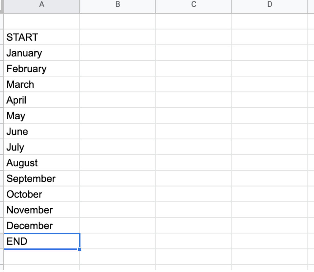
2. Create a Table
For this example, we are going to track leads generated versus unsubscribers. This will help you see if you are generating enough leads to fill your funnel, compared to the number of clients who are no longer with your company. Leave cell A1 empty. In cell A2, write “START”, followed by January to December. In cell A15, write “END” to signal that the data is complete.
3. Enter Your Data
Now, it’s time to enter all of your data. In cell B2, write your starting point. Then, in cells C2 and D2, write “GAIN” and “LOSS”, respectively. From here, enter your data. Ensure your “LOSS” stats are negative.
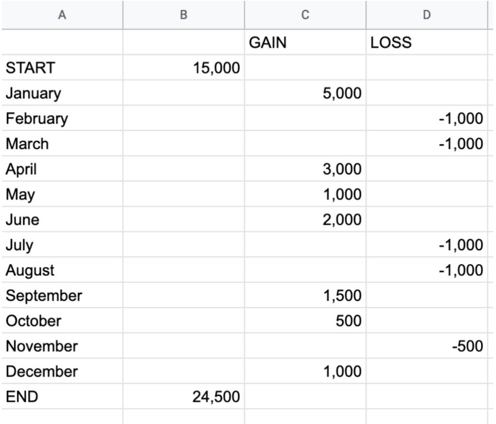
4. Add Your Values
Once all of your data is entered into the chart, add up all of the values into cell B15. You can do this by entering the following equation:
- =SUM(C3:D14)
5. Highlight Your Data
Now that your values have been added up, highlight the entire chart.
6. Insert Your Waterfall Chart
Finally, to create your waterfall chart, go to Insert > Chart > Waterfall.
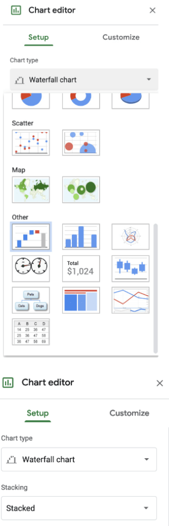
You’re done! Double-click on the chart to bring up chart options to customize colors, and borders, and change text options.
Final Words
As you can see, there are a number of different ways that you can use waterfall charts for your sales and marketing efforts. Tracking your marketing and sales with waterfall charts can help you and your team track and analyze stats in specified time frames, letting you see if there are any abnormalities or areas that you can improve on. Then, new strategies can be implemented to help your company continue to grow.