How UX Design Principles Drive Sales Innovation

Learning about the products people actually need and designing them to be easy to use increases trust and success.

Kristen House
Designing and building world-class enterprise products is a delicate balance of art and business. Every day, UX designers at Salesforce do the work of closing the gap between what our customers need and what our current product can do. In fact, UX design’s mission-critical goal isn’t just “making things look good,” it’s making hard things easy. Having core design principles to guide our team’s thinking has increased our trust in one another and led to greater successes. Product UX design principles can help you and your team, too.
Whether you’re an admin, a developer, an architect, a business leader, or a designer, discovering what people need is likely at the heart of your job. Getting to the right solution isn’t easy and, most of the time, different members of the same team may have wildly different approaches to even simple solutions. To better align on goals, the product design team at Salesforce follows three foundational UX design principles:
- Meet people where they are. Learn what people actually need and build that.
- Low walls, high ceilings. Make products easy by default, and more complex by choice.
- Biased towards simplicity. Simpler is (almost) always better.


3 UX design principles to consider:
1. Meet people where they are
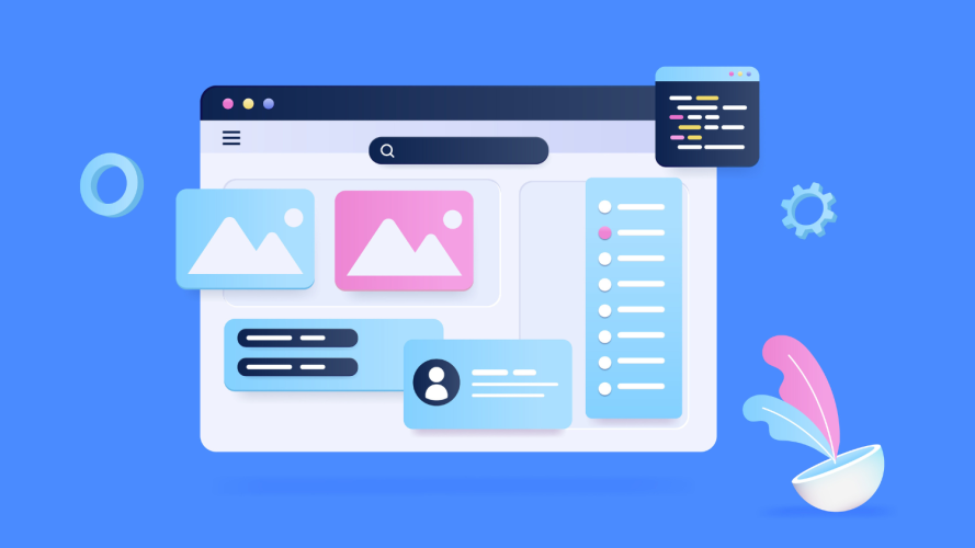
How do these UX design principles show up in our product? One example of how we’re meeting our users where they are is Sales Cloud Everywhere. It’s a browser plugin that allows your CRM data to come with you wherever you work online. This means users aren’t required to log into their CRM to be able to update their data. Exciting, right?
We realized that Salesforce was making a pretty bold assumption: you’re working inside Salesforce’s app all day long, so we’ll put all the power of our product inside our application. In reality, we know you’re browsing the web, playing tunes on Spotify, and checking your email. So when we meet our users where they are – outside of our application – we can solve for their most common tasks on their terms.
Enter Sales Cloud Everywhere. Now, users don’t have to leave their context to come into ours, and they don’t have to think too hard to make an update. If a customer is browsing on social media and notices that their customer just got a promotion, they can make updates to their CRM record without the unnecessary friction of logging in.
2. Low walls, high ceilings
From user research, we’ve found that when people are starting something difficult and new, they have a high level of anxiety. Our second UX design principle shows up in the Sales Performance Management getting started page. We created three quick-start templates for users to choose from. This makes it easy (low walls) for anyone to get started. But we also offer the option to advanced users to build their own configuration (high ceilings). We made sure to put this fourth option below the three templated choices, and we chose not to draw attention to it with bright pops of color or motion design: advanced users will find it, because they’ll be looking for it.

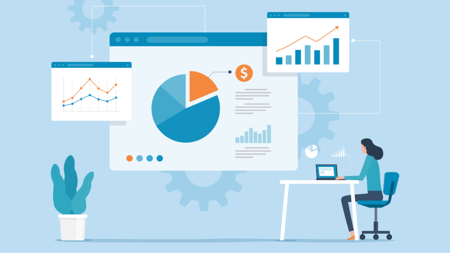
Deeper in the product, this principle also holds true for Pipeline Inspection. This rollup summarizes sales targets, projections, and other data at a glance (low walls) at the top of the page. It’s snackable and easy to find. To get the details of those calculations, users hover over the summary numbers to review the data (high ceilings). It’s critically important information and we’ve designed it in a way that makes it accessible and useful to everyone.

3. Biased toward simplicity
Planning out territories for sales reps so that they have an equal opportunity to sell and earn is a difficult process. For many sales leaders, this is a manual task using spreadsheets. We wanted to simplify that experience with a map that helps capture a vast trove of data in a meaningful way without being overwhelming. If a sales rep wants to click in and see which cities are actually in their plan, all they have to do is hover over those dots. This simplicity that’s backed by data is a kindness we want to give our users.

Ultimately, UX design isn’t just how something looks, it’s how it works and how you build it. Sales Cloud builds products using patterns because patterns build confidence. Even when we’re developing radically different products, we end up with familiar designs because we’re starting with the same root principles. Building great products is hard work, but if you use principled design practices, working together doesn’t have to be.
Learn how Sales Cloud Everywhere works
Move deals forward as you move around the web. You can view relevant information outside of Salesforce while prioritizing and completing your tasks.