
It’s the middle of the night and all of a sudden: drip, drip, drip…
You wipe your face and peer through the darkness at the ceiling. Uh-oh, something’s leaking up there. Like most people, you reach for your smartphone and search for a plumber that would be available to help at this ungodly hour.
Scroll, tap, and voilà: There’s a landing page for 24/7 plumbing in your area with a CTA to dial the number right away.
In the olden days, you’d likely look up the number in the phone book (a phone what?). Now, people turn to their mobile devices as soon as they have a problem that needs solving or a question that needs answering.

We all know there’s nothing more reassuring than hearing a human voice at the other end of the line. And that’s why optimizing your landing pages for pay-per-call advertising campaigns is crucial in this digital landscape.
Why Pay-Per-Call Ad Campaigns Are Critical in the Mobile Age
Pay-per-call ad campaigns are the holy grail of mobile online marketing. They’re what every marketer dreams about and strives for.
Why? Because today 56.75% of all web traffic originates from a smartphone, a device that can make a direct phone call to your business with the single tap of a call to action button.
It’s never been easier to generate high-quality leads with virtually no friction. Consider this:
- Phone leads enjoy a much higher conversion rate than form-based leads (a 5-1 advantage or better is not uncommon).
- With a phone call, leads don’t need to hide behind technology: no intrusive qualifying questions to reply to, no multiple-choice buttons, no pull-down menus, no CAPTCHA riddles.
- Phone leads are more engaged and less guarded.
Why Are Landing Pages Important for Pay-Per-Call Campaigns
A landing page is the first thing your potential customer will see after they click on your pay-per-call ad. To be effective, your page needs to become an extension of your ad by:
- Showing clear benefits that answer your prospect’s search query: If the search term is “weekend plumbers near me” your benefits must reflect your ability to be on site in 30 minutes or less, your lack of a weekend surcharge, the fact that you run a 24/7 operation including holidays, and so on.
- Reflecting the needs of your prospect through putting yourself in their shoes: “We know how frustrating it is when your plumbing fails in the most inopportune time, the inconvenience of a pipe leak, or a clogged kitchen sink when all hardware stores are closed.”
- Presenting a clear call to action: This is where you reach out offering your help, where you say, “Our reps are always on standby, just a phone call away to get all your problems solved.”
What Should You Include in Your Pay-Per-Call Landing Page Design?
When it comes to pay-per-call landing page design, you need to use a less is more approach. Your job is to persuade your prospect to call you without making them fall into a rabbit hole of unnecessary information.
Don’t sell your business by showing endless feature lists and a company backgrounder. Instead, build a bridge of trust by reflecting their needs and presenting your solution in a way that makes them feel you’re the white knight that’ll come to their rescue.
To this effect, your pay-per-call landing page design needs to include:
- A headline and sub-headline that reflects your prospect’s main pain point and your solution. Make this text, font, and color clearly contrast with your page’s background palette.
- A call to action button that jumps out of the page so there’s never any doubt in the mind of your prospect that a single tap will immediately put them in touch with you.
- An offer that creates peace of mind. In other words, an offer that’ll relieve their pain, not showcase your bells and whistles (so, stay away from expressions that have nothing to do with your prospect, like “30 years in business,” “No job is too small,” etc.).
- Last but not least, your business logo.
Examples of Pay-Per-Call Landing Pages
The proof is in the pudding, as they say, so let’s look at a few pay-per-call landing page examples and discuss their key elements.
1. Health and wellness
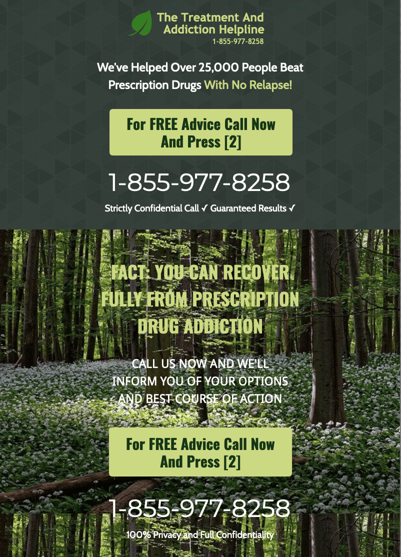
As you can see, the choice of a forest hero shot evokes a sense of grounding and peace, which is what someone in need of the services of a drug rehab center is looking for.
The messaging encourages without being forceful, emphasizing confidentiality coupled with free advice.
Most importantly, the call to action is clear and tells you exactly what to do when you call (“Press 2”), yet it uses a subdued tone that complements the color palette of the background.
2. Home services

Here’s a landing page in response to a search for an “affordable weekend plumber.” Cost is key in the messaging to counter the expectation that a weekend plumbing call is going to be a lot more expensive than a regular business hours call.
This landing page’s job is to convey the message that even though they operate 24/7/365, they’re still affordable. To make this even clearer, the call to action button stresses that there will be no charge to get an estimate for the work.
Finally, the hero shot shows an expert’s hand and tools to instill trust and peace of mind—meaning that no matter how dire the plumbing emergency might be, the prospect shouldn’t worry (because things will get better soon).
3. Legal

This is a landing page for a legal firm specializing in food poisoning personal injury claims. The focus here is to get top compensation for their clients, a key expectation for these types of calls.
They clearly point out the fact that clients are not expected to have any out-of-pocket expenses whatsoever and that all services will be offered on a contingency basis.
They also stress their 24/7 availability, because food poisoning cases often occur after hours and they want to make sure their prospects know they’ll be available when the incident happens, so they can advise them what to do while the iron is hot.
The call to action is clean and the message makes it clear how to navigate the firm’s phone answering choices since personal injury law firms handle many different types of cases.
Finally, the hero shot reflects the predicament of the victim, signaling empathy towards their situation.
Want to Optimize Your Pay-Per-Call Landing Pages? We’re Here to Help
When it comes to optimizing your landing pages to maximize pay-per-call conversions, you always need to make sure that the job of your page is not to “sell” your services, but to become the natural solution to your prospect’s pain points.
All your design choices, from the color palette to call-to-action buttons to hero images, must be chosen to reflect the needs and hopes of your prospect.
The same goes for your messaging: Empathy drives conversions. The more your prospect identifies with your messaging and feels that you truly understand them, the more they’ll feel comfortable taking action and making that call.
Try Smart Builder to create and optimize variants of your landing pages, and watch your pay-per-call conversions get the boost they deserve.

