

8 SaaS Pricing Page Strategies to Boost Conversion Rates
Looking at the growth rate of the SaaS industry, you’d think that people are more than willing to spend money on software solutions that promise to make their everyday lives (and professional endeavors) easier.
Not quite, though. Despite projections forecasting the total SaaS spend to reach $171.9 billion in 2022, most buyers still prefer free solutions. In fact, according to Blissfully’s 2020 SaaS Trends Report, organizations use three times as many free apps as they do paid ones.
But what does this mean for businesses marketing cloud-based software?
Well, it’s simple. The data clearly shows that achieving stellar conversion rates doesn’t just take investment in getting more people to become aware of your solution. On the contrary – achieving exceptional results (and a healthy revenue) requires a fully-optimized bottom section of the advertising funnel.
So what better way for SaaS brands to secure conversions than to ensure their pricing pages perform as well as possible? The following eight SaaS pricing page strategies are sure to help boost conversion rates.
Don’t Clutter the Decision-Prompting Elements
One easy fix to improve conversion rates on SaaS pricing pages is to look at the overall design and remove unnecessary clutter.
The logic behind designing minimal pricing pages is simple, and it has to do with the standard buyer’s journey.
The sales funnel moves people from one decision-making stage to the other by gradually presenting them with relevant information on what they can expect from a solution. Considering that pricing pages occupy the final stage of the funnel, it’s safe to assume that the web visitors looking at these assets already have a solid idea of what features and functionalities they’ll be getting.
So, the best way to utilize pricing pages is not to repeat information potential customers already know. Instead, you’ll want to focus your efforts on persuading them to convert.
Minimal design can do a lot to make this happen because the way it uses negative space allows high-value elements, like call-to-action (CTA) buttons, to draw attention.
Of course, this doesn’t mean pricing pages shouldn’t provide details on the differences between plans. But considering that people will spend 80% of their page viewing time looking at content above the fold, the first screenful of your pricing pages needs to focus on the act of convincing people to invest in your product. And one way to do this is to use minimal design to let your unique value proposition shine.
For an excellent example of a clutter-free page that lets decision-prompting elements shine, check out Aura.
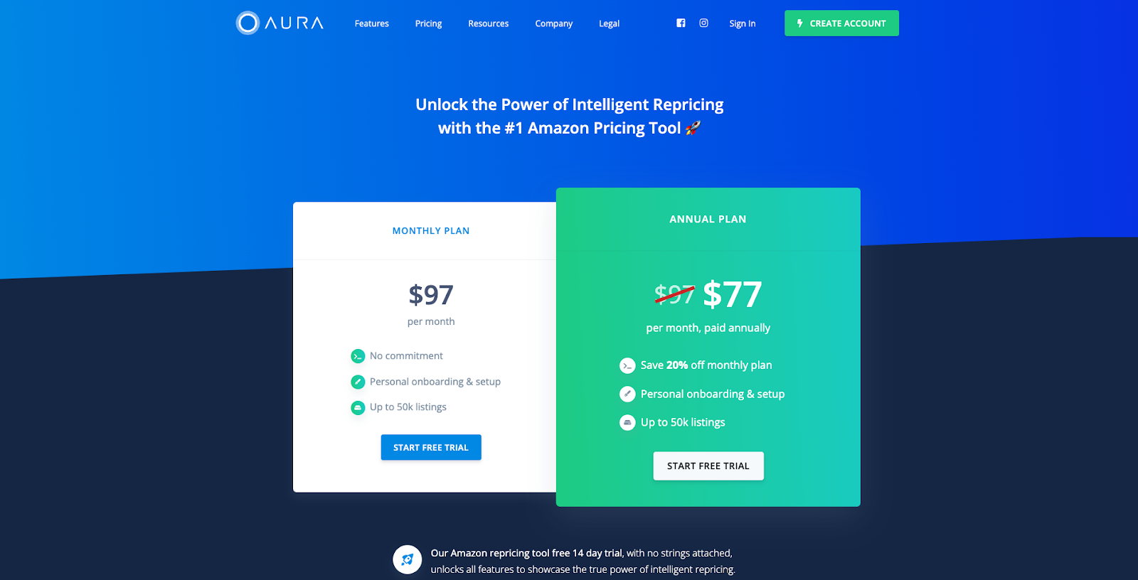
As you can see, this page captures buyers’ attention with a well-worded sales proposition. The proposition invites users to “unlock the power of intelligent repricing with the #1 Amazon pricing tool.” Then, it presents two subscription plans, distinguishing them with core differentiators only, and encourages visitors to start their free trial with an attention-grabbing CTA button.
Speak Directly to Each Plan’s Target Persona
One common conversion killer that sneaks onto pricing pages is choice paralysis. When you present users with too many options, they simply become too overwhelmed. They get stuck and have no idea how to proceed.
Fortunately, there’s a simple strategy to overcoming choice paralysis on your SaaS pricing pages: speaking directly to each plan’s target persona.
By using copy (and visuals) to help potential customers decide what subscription plan caters to their needs, you can help them move through the bottom stage of the sales funnel. In other words, you need good copy and visuals to prevent them from leaving your website without converting.
For example, if you check out the MURAL pricing page, you’ll see that it does several things right.
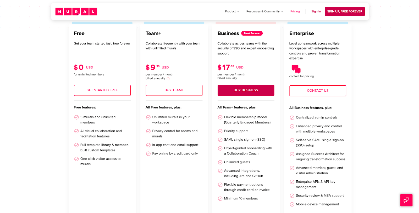
- First and foremost, the brand names each tier according to the type of user it’s meant for.
- Secondly, it uses tier descriptions to specify the pain points each plan solves.
- Lastly, the section below each CTA button lists the product features that make each plan suited to its target persona. This helps web visitors identify the best choice for their needs and allows them to convert without worrying about potentially making the wrong choice.
Promote Annual Subscriptions
Don’t forget that, as a SaaS business, you’re bound to lose a portion of your customers every month.
Hopefully, your monthly churn won’t be higher than 1%, which will get you to that sweet spot of a 5-7% annual churn rate. But to ensure that your users stick around for longer (warranting an increased customer lifetime value, improving cash flow, and garnering a more predictable revenue for your business), it’s not a bad idea to promote your annual subscriptions.
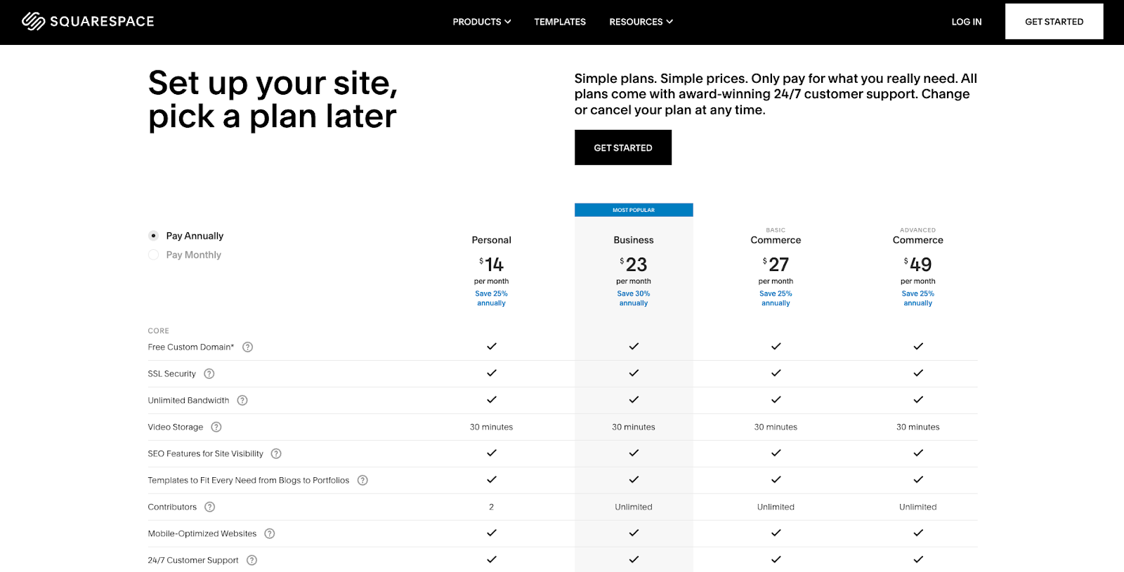
Squarespace does this rather well by setting the annual subscription option as the default on its pricing page. The brand also encourages new users to pay up front by highlighting how much customers save when they get a yearly subscription.
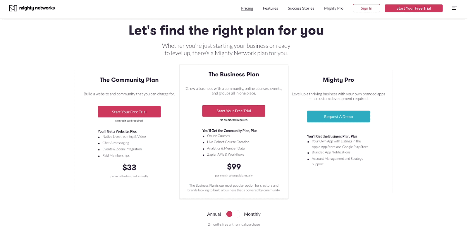
For a slightly more user-oriented way to do this, look at the Mighty Networks site. This brand chooses to add an interactive toggle to its pricing page, allowing potential customers to see for themselves the difference between paying on a monthly vs. an annual basis.
If this strategy doesn’t apply to your business model, look for alternative ways to harness its benefits on your pricing pages.
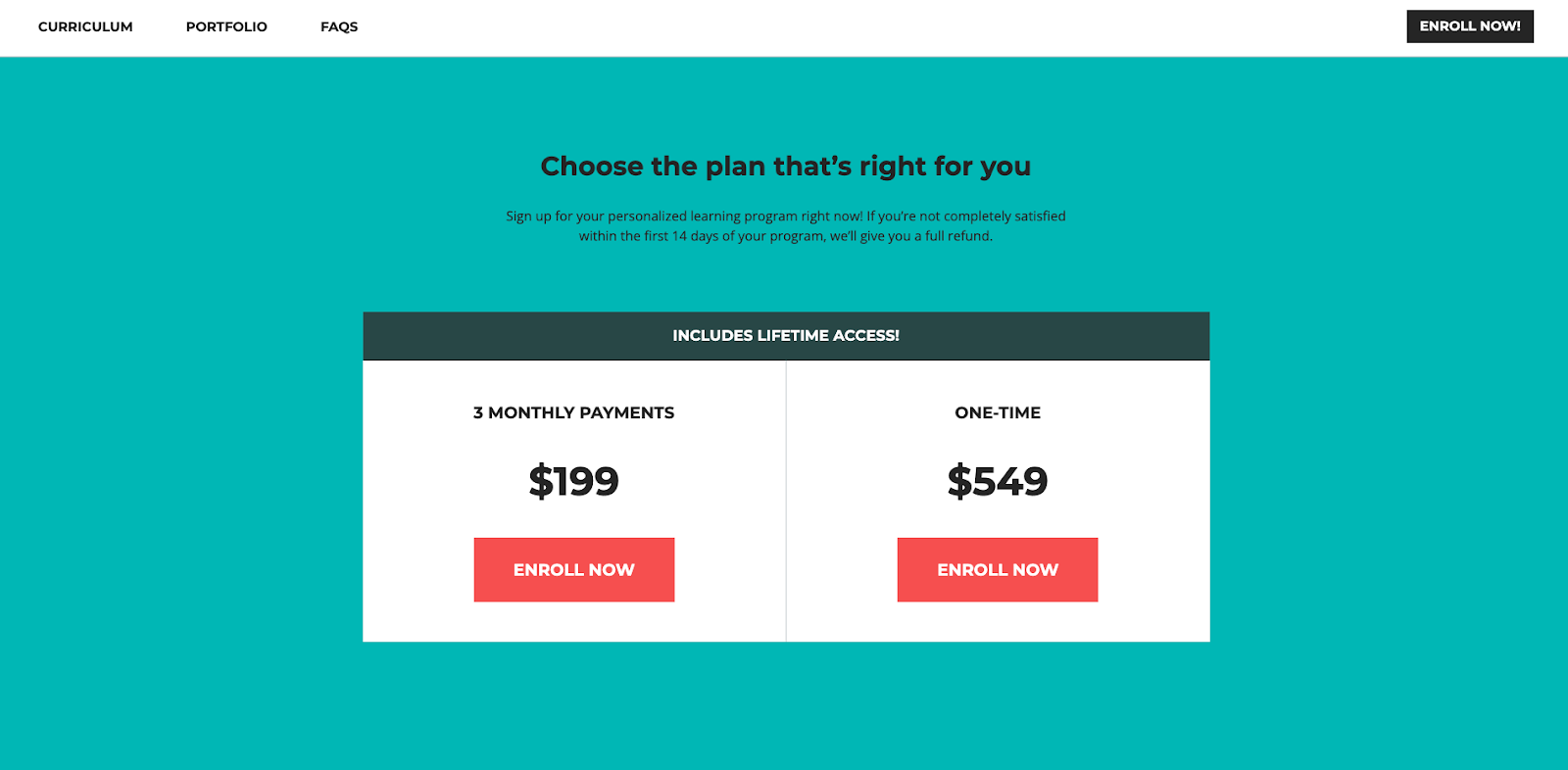
For example, SkillCrush sells a pricey learning program that comes with lifetime access. So, to ensure that web visitors convert, the brand allows buyers to choose between two payment options. They can either pay in three monthly installments or get the course with a one-time payment. Note how the second option allows them to save $50, providing users with the benefit of paying a lower price and giving the brand quicker access to the funds from the sale.
Use Meaningful CTAs
Optimizing calls to action is another excellent strategy to implement on SaaS pricing pages.
When designing CTAs, most marketers follow copy and design best practices that promise to increase conversion rates. These include:
- Placing calls to action above the fold to ensure they grab user attention.
- Utilizing attention-grabbing and high-contrast colors to help CTA buttons visually stand out.
- Using negative space and repetition to maximize button visibility.
- Making typography choices that increase CTA readability.
- Keeping calls to action short, to the point, and using action-oriented language to encourage conversions.
- Creating a sense of urgency by using time-oriented words.
- Utilizing trust-building microcopy to present offers as risk-free.
However, while all of this advice can lead to higher conversion rates, there’s one thing that not all SaaS brands know how to get right: making their CTAs meaningful.
Think about making your offer come off as relevant to your audience’s needs.
Don’t just use pricing pages to show how much it costs to solve your audience’s pain points. Instead, present potential customers with meaningful CTAs that encourage them to fix their frustrations by investing in your software solution. Moreover:
- Communicate rewards.
- Give web visitors agency.
- Ensure that each CTA you use appeals to the specific audience segment it targets.
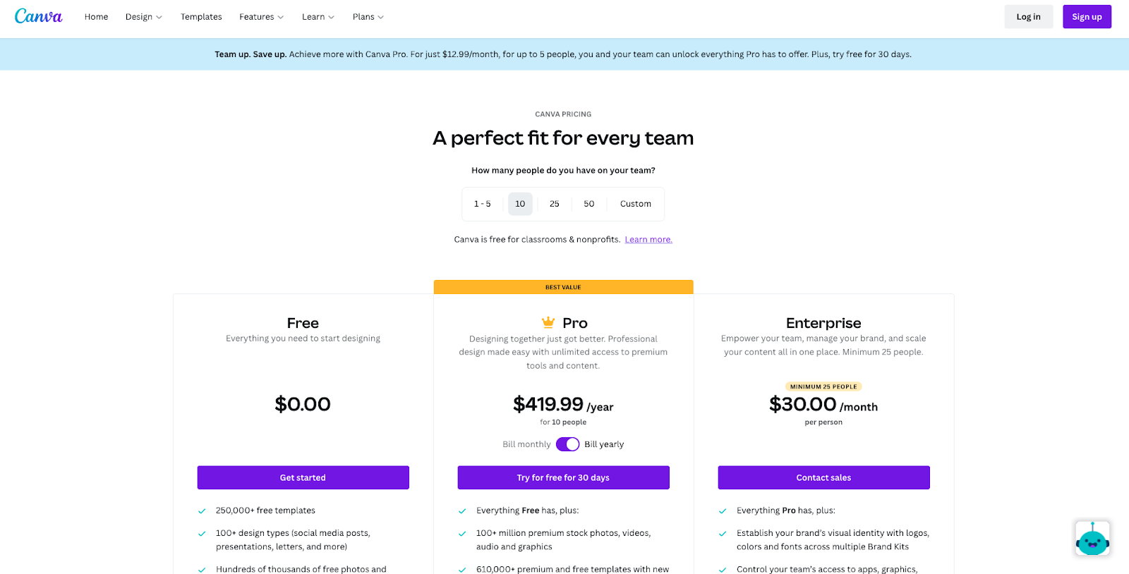
For example, see how Canva uses three different CTA buttons on its pricing page. To convert users who want the free plan, the brand invites them to “get started.” For those who need pro-level features, it encourages them to “try for free for 30 days.” And knowing that large teams require custom solutions, Canva invites enterprises to “contact sales” to get a personalized offer.
Don’t Be Afraid of High-Touch Sales
There are numerous benefits to a highly-automated sales cycle. But the fact that you’ve optimized your SaaS website (and pricing pages) to do all the hard work doesn’t mean you should shy away from human contact.
More often than not, what separates successful brands from their competition is their personalized approach to solving consumer needs. And what better proof than the fact that 9 in 10 people consider customer service as a decision-impacting factor when deciding what brand or product to choose.
So, as you look for ways to boost conversions on your SaaS brand’s pricing pages, consider whether encouraging interaction might give you that extra edge over your competitors.
For example, if enterprise users continually bring in a lot of revenue for your brand, why not encourage them to get in touch and have your expert sales team present them with a solution that will turn them into loyal users of your product?
For an excellent example of how you can do this, check out the Optimal Workshop pricing page.
This brand allows visitors to select the number of users on their team. When that number exceeds ten users, the CTA changes from “subscribe” to “talk to us,” encouraging potential customers to reach out and get an offer personalized to their unique requirements.
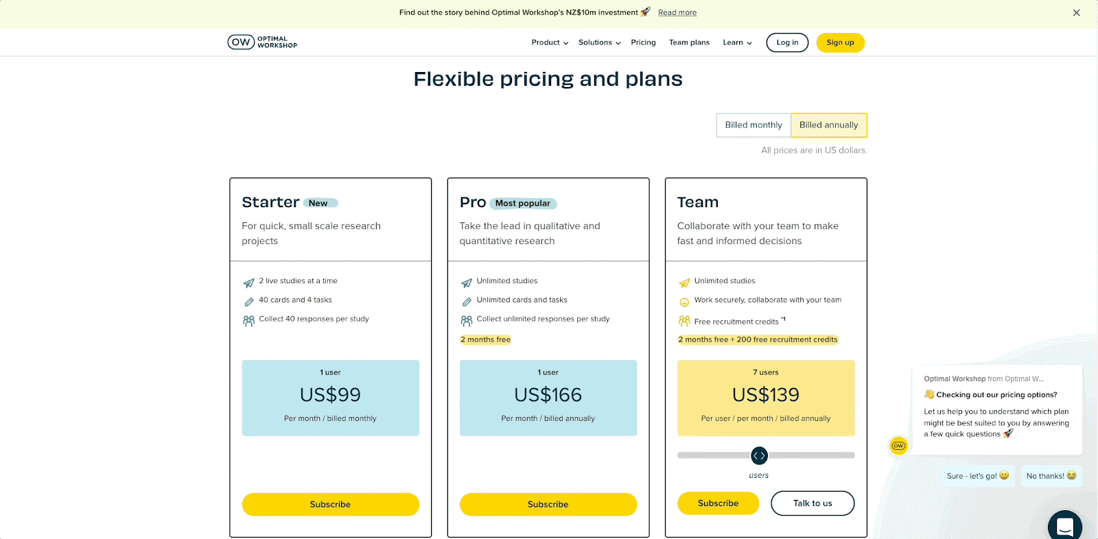
Note how Optimal Workshop’s approach also gives sales teams more flexibility. It allows them to present potential users with lucrative offers without being limited by pricing plans shown on the business’ website.
Recommend One Option
Is there one subscription plan in your offer that brings the highest value to most of your customers? If that’s the case, highlighting that plan might be an excellent way to make decision-making easier and boost conversion rates on your SaaS website.
Of course, when doing this, be transparent about why you’ve selected that plan. Does it offer the most value for money? Does it include the maximum number of features? Is it the most suited for your primary target audience, like small or medium-sized businesses?
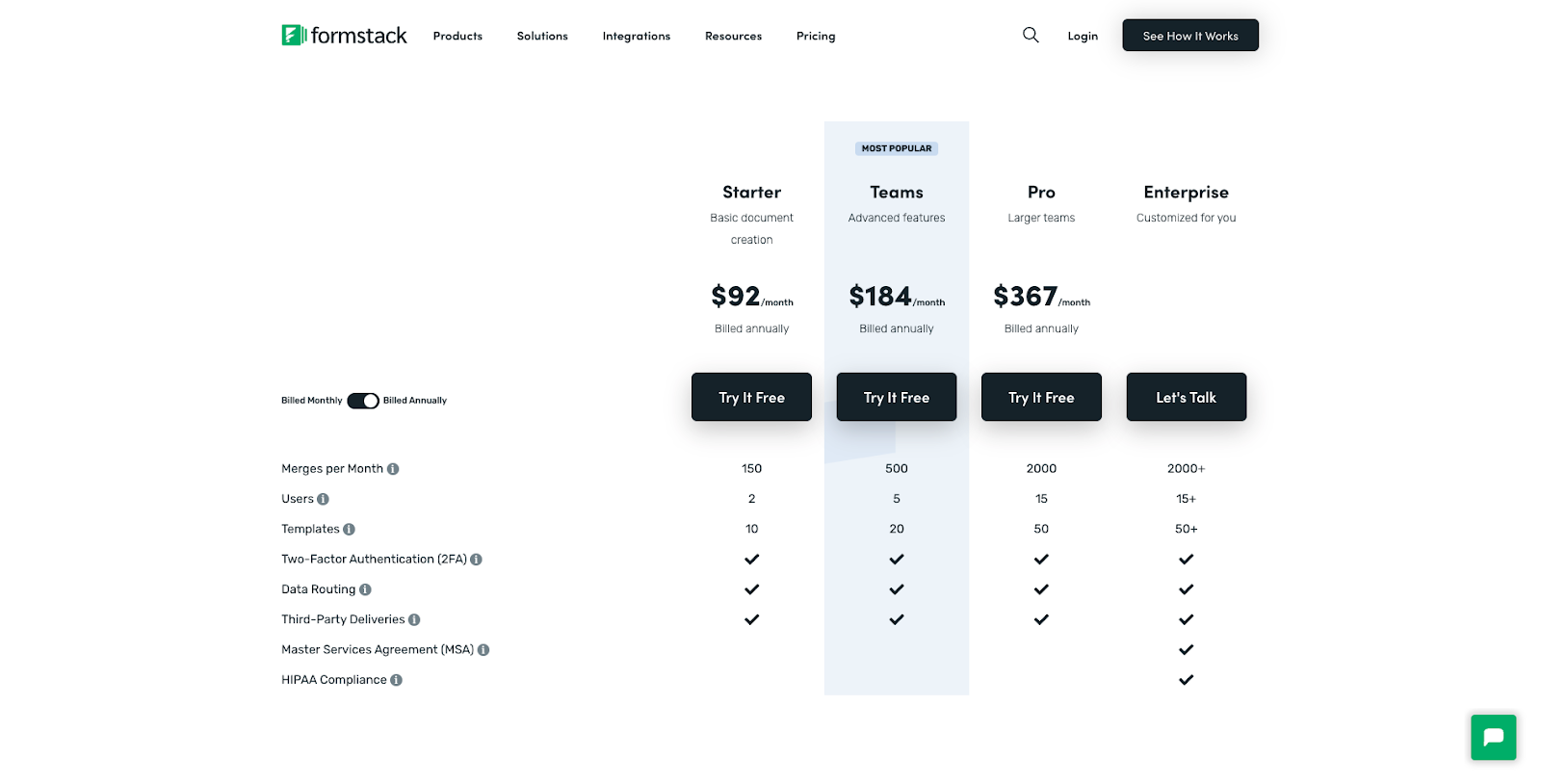
Formstack, for example, highlights its Teams plan, as it’s the most popular in its offer.
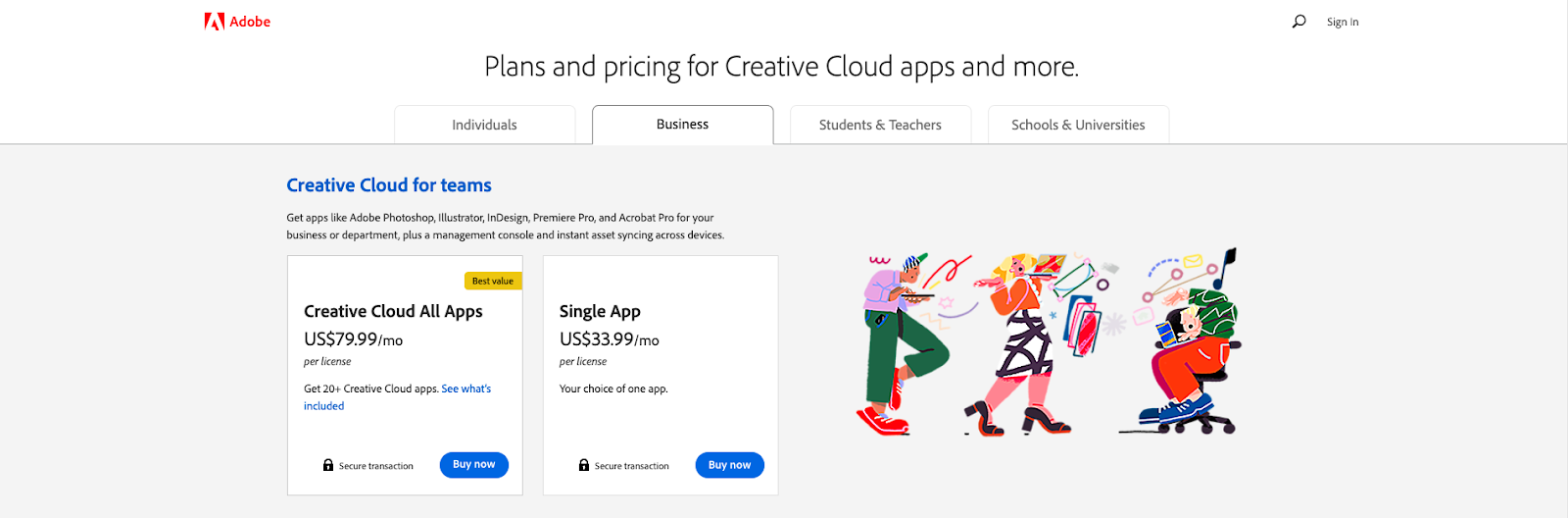
Adobe encourages users to go with the Creative Cloud All Apps plan, which includes all apps, pointing out that this particular subscription option offers the best value for money.
Use Anchor Prices
From a consumer psychology point of view, one excellent pricing page tactic to boost conversions on your SaaS website is anchoring.
Essentially, price anchoring is a strategy that allows you to set a suggested price point (which automatically ties your product to a monetary value) but offer subscriptions that are below that suggested price.
The strategy works not just because it gives your audience the impression that they’re making considerable savings. More than that, it allows you to direct web visitors towards your target product by assigning high prices to your most advanced subscription tiers.
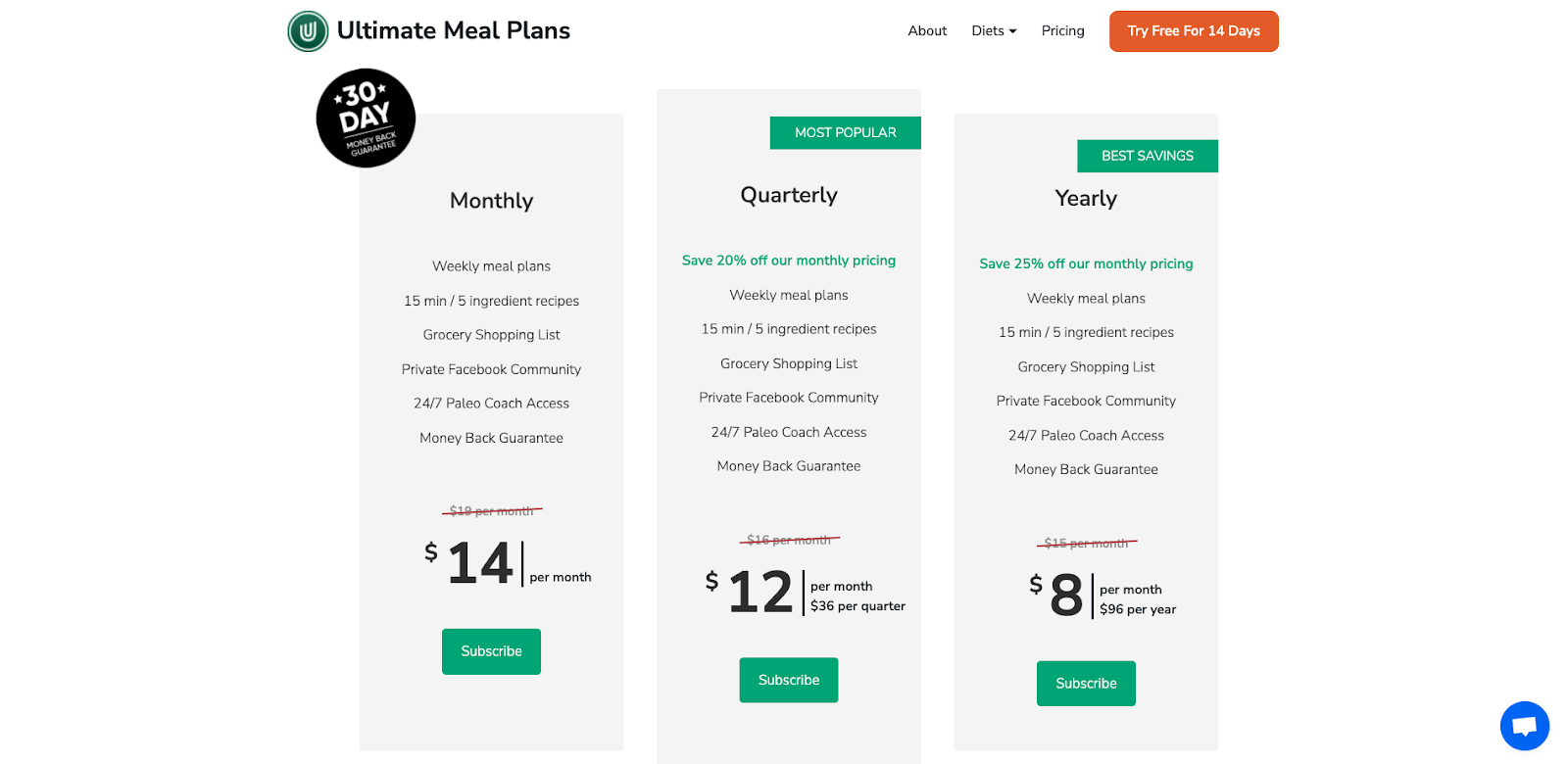
For an example of this strategy in action, check out the Ultimate Meal Plans pricing page. As you can see, each subscription option features an anchor price, which is then crossed out and replaced with a “discounted fee.” This gives web visitors the impression that they’re making considerable savings.
Or, if you’re looking for more advanced applications of price anchoring, take a look at the MailChimp website.
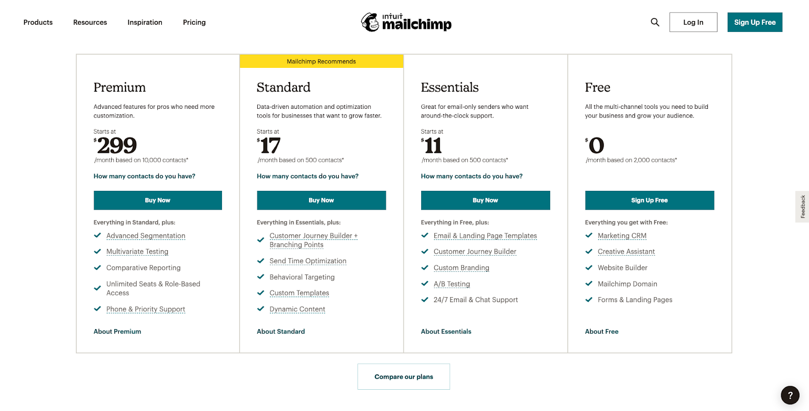
Here, the first tier shown costs a whopping $299 per month. But, the very next price point only sets users back by $17 per month, making it the preferred option for the majority of MailChimp’s target audience of small and medium-sized business owners.
Of course, this SaaS brand also offers a free subscription. But by implementing the price anchoring strategy and visually highlighting the Standard plan, the brand ensures that potential users attribute that particular tier with the best value for money.
Remember the Social Proof
Finally, to boost conversions on your SaaS pricing pages, don’t forget that this is where your leads make their final decision on whether they want to buy from your brand or not. So adding a dose of social proof to these assets might just be the way to guide your audience through the bottom section of the sales funnel.
The great thing about social proof is that it can be as versatile as you need it to be.
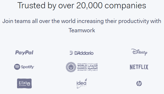
If your users include well-known brands, showcasing their logos allows your SaaS business to position itself as trustworthy and an authority in your niche. Look how Teamwork did it, for example.
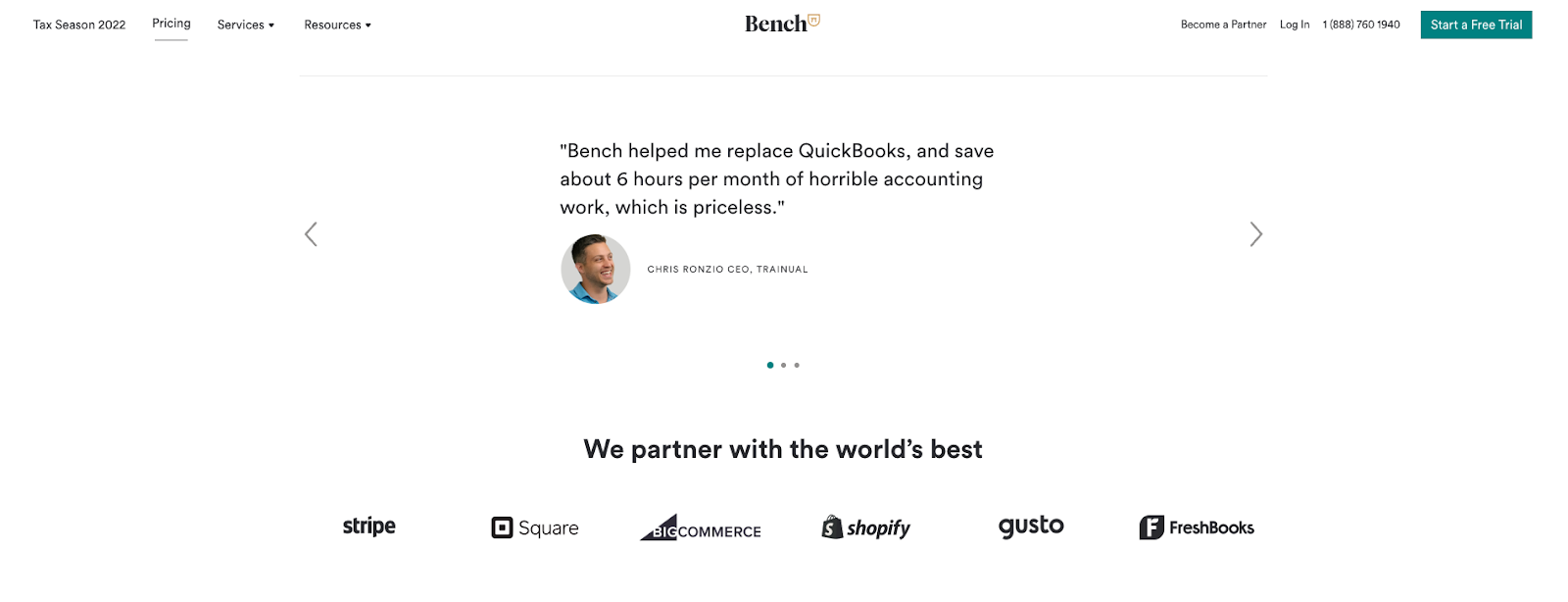
Alternatively, you can display a credible testimonial that highlights a specific benefit of your products.
For example, Bench shows a quote from a customer who claims to have managed to save six hours per month of accounting work. It’s an excellent illustration of the value the brand’s product provides.
In Closing
When choosing pricing strategies to implement on your SaaS website, your ultimate goal is always to boost conversions. So, whether you decide to use one, two, or all eight of the tactics we’ve talked about here, make sure you’re keeping an eye on website analytics. They’ll help you stay on track and ensure you’re getting the results you’re after.
If you’re making changes to already existing pages, do it gradually. That way, you’ll be able to measure your results and revert to the old state of things if you find that the new approach doesn’t benefit your brand.
Last but not least, never forget to consider your specific target audience and your brand identity. These hold the key to what will or won’t work to boost conversions.


