
We assume most of you are glad to see 2020 come to an end, not that it looks like things have improved with the new year just yet. For email marketing software providers (ESPs), 2020 was a mixed bag. On one hand, many businesses relied more than ever on email to get the word out about their products. On the other hand, many businesses couldn’t weather the lockdowns, with restaurants being especially hard hit.1 Now that the longest year in history is finally over, and it’s time to look back on the emails from the past year and see what people have been doing.
One thing we noticed was that there were a lot fewer really terrible mistakes in email. Some of this is, no doubt, because most ESPs now offer templates and drop-and-drag options that can help avoid serious HTML mistakes. Another possible reason is that many companies have streamlined their email design to use a branded template each time. That doesn’t mean the year was without its missteps. Here are a few.
Don’t Bother to Phone
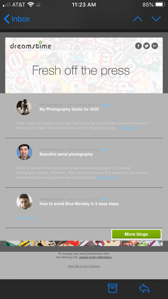
Dreamstime got the year off to a bang-up start with this unreadable mess. It looks fine on the desktop and on iPads. The content is black, and the backgrounds are white. That all flies out the window on the iPhone. This is one case where simply reducing your window size in the browser is not going to help you see what’s going to happen on a phone. This might have been spotted if someone had bothered to look at the email on a phone, or, at least, ran it through an email preview service, such as Litmus, Email on Acid, or proofjump, although Apple plays by its own rules sometimes, so even the services that offer testing across multiple devices and browsers don’t always catch these iPhone issues.
A Common “Type” of Problem
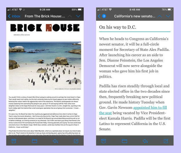
While we’re on the subject, even if you’re not using media queries to make your mailings more responsive and readable on phones, you should still make sure they are readable on any mobile phone from an iPhone 3 on up. It’s a problem that is all too common across the board. Getting the font size right can be tricky. A larger font may look good on a phone but looks goofy on a monitor. A smaller font may look great on a monitor but is rendered unreadable on a phone. In the examples shown above, the one on the right looks fine, but the one on the left is virtually unreadable on any but the largest mobile phones. You can turn the phone sideways, which helps, or you can pinch and spread the image to make the type larger, but this means scrolling back and forth as well as up and down just to read the thing.
Ironically, the example on the left has twice as much formatting information in the style tags as the one on the right, including 24 media queries. Unfortunately, none of them address the issue of font size, so you end up with an email that is unreadable on most iPhones. This is an easy one to solve, and you don’t need any media queries to do it. A font size of 14 pts works for both the desktop and smartphones.
See: Data
Here’s a disaster that never should have happened. There were so many things wrong with this mailing. It started with the CDATA expressions and media queries in the head that are hidden in CSS comment tags. Problems are compounded when the width of the email and the width of tables within the email don’t match. The end result was to cause the tables to stack and push the content to the side forcing the comment widths into their smallest setting. The whole thing looks even worse on a phone.
Fun with Templates
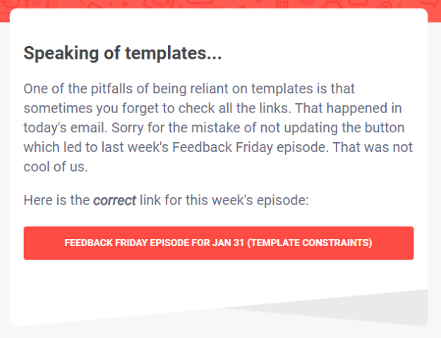
I don’t have to even say anything about this one. This apology email from Really Good Email actually says it all. It’s also worth noting that this is as true of a template you’ve been using for a while as it is for a new one. For instance, look at the footer on this mailing from Dangerous Minds:
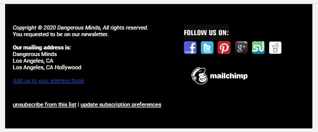
This is, most likely, a Mailchimp template. I’m sure when it was created, an icon for Google+ was worth having, but that platform has been gone for over a year. If you are using the same template for more than a year, you’ll want to look at that footer and make sure you’re not doing the same thing. It’s also worth mentioning that CAN-SPAM requires an actual physical address. “Los Angeles, CA” doesn’t really qualify.
First, Tell Me Who You Are
While we’re on the subject of CAN-SPAM violations, this one from Babble, a language learning service, certainly qualifies. First, here’s their footer.

It looks legitimate enough. They’ve included their physical address, and there does appear to be an unsubscribe link. But when you click on the unsubscribe link, you are presented with this screen:
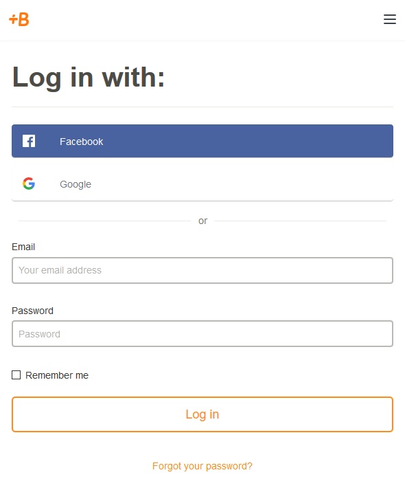
Hello? You want me to log in to unsubscribe? This is a clear violation of CAN-SPAM.
GUESS who?
An even more aggravating violation of CAN-SPAM comes from GUESS, a fashion company best known for their jeans. I received this email the other day:
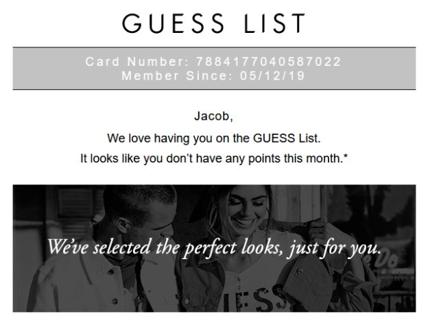
As my name is not Jacob, it’s apparent that someone signed up with the wrong email address. That’s fine. Things happen, especially with this particular AOL account (which I stopped using a long time ago, but still check it regularly). But when I clicked the unsubscribe link I was taken to the main page of the site with no instructions on unsubscribing. Sometimes when this happens, it is because the emails are being sent out transactionally and you have to change the settings on your account to stop the mailings. This is the reason you see so many people complaining about the email from sites such as LinkedIn and Quora. When I went to the sign in, it asked for my password, so I clicked “Forgot password.” At this point, I was told that no such account existed. This means the “Jacob” must have corrected his email address at some point, but the email department at GUESS Jeans didn’t get the memo. There’s only one recourse at this point, and that is to report them and start marking any future emails as spam. Nice work GUESS.
We All Make Misteaks
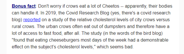
I wonder how many people were confused by the reference to covid. What the author meant was, of course, “corvid”—the family of birds known as crows. This one came from Dan Lewis, whose Now I Know newsletters are always filled with fun facts. One thing any of us who often work alone have learned is that you can’t proofread your own work. You need another set of eyes somewhere along the way. Dan quickly followed it up with a correction, but at the bottom of the page we see this:
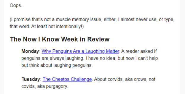
Purgagory? Don’t you hate making a mistake in an email apologizing for making a mistake? We can relate to this one.
Here’s Lorem!
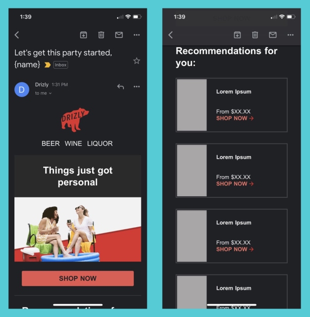
Using Lorem Ipsum text and other placeholders while designing a mailing can help get through the initial stages of email design, but when you forget it’s there, the results can be embarrassing. A case in point is what happened to Drzly back in May. Few businesses have fared better under the Covid restrictions than the liquor delivery services, and Drzly’s no exception. Perhaps that’s why they sent this email without testing it first, trying to capitalize on the moment. The mistakes are bad enough, but the banner line “Things just got personal” doesn’t help. This is as bad a mistake as we’ve ever seen, but Drzly’s response shows exactly what to do when this happens:
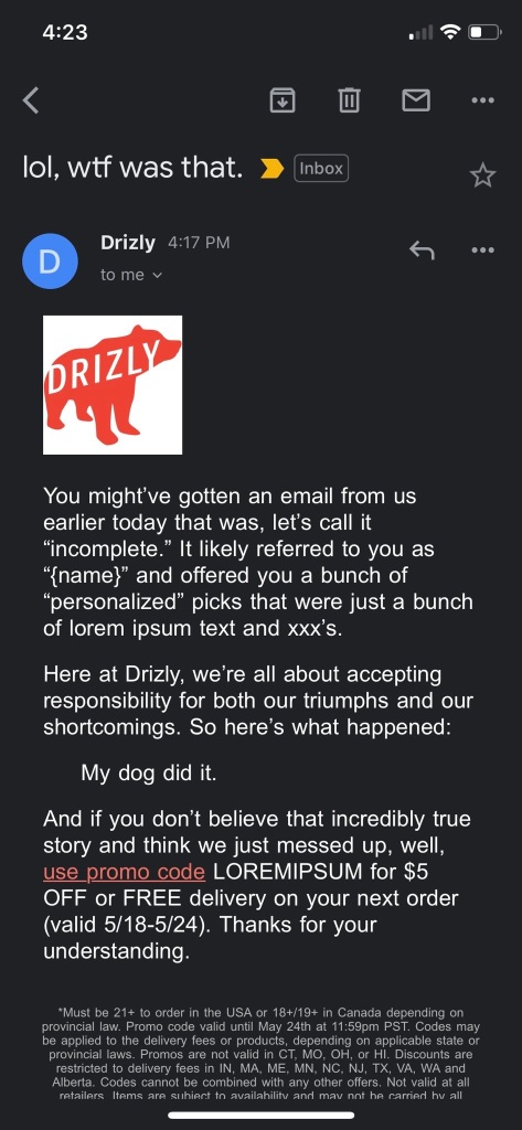
They acknowledged the mistake, then added an offer to induce people to engage with them. A perfect follow-up.
Give Me Some Room!
There’s no reason for this one. A few pixels of right and left padding or margins would have solved the problem. None of Walgreens’ other mailings suffer from this problem, so we suspect that the content was copied and posted from another source. Be that as it may, the problem was an easy one to resolve and would have been noticed had they checked their mailing on a smartphone.
A Shot in the Dark
A trend that received a lot of attention in email marketing last year was the growing popularity of the “dark mode” on smartphones. While we tend to believe that much of the discussion on this subject is hype, it’s a good idea to make sure that your content is easily read no matter how or where the recipient chooses to read it. The biggest offenders in dark made are black logo png images with transparent backgrounds. Here are a few examples:

This can be easily fixed by adding a transparent glow to your logo, or by placing the logo in a contrasting background. You can test the results either by sending it to your smartphone or by using the online dark mode simulator that proofjump provides for free.
The Bottom Line
In the end, the best advice is always the same: Test your mailings across different platforms and devices before you send them. Most of the mistakes listed here could have been avoided with less than fifteen minutes of additional attention at the beginning of each campaign.

1. In December, SFGATE reported that 85% of the restaurants in San Francisco’s Financial District had closed permanently.
© Goolara, LLC, 2021. Unauthorized use and/or duplication of this material without express and written permission from this site’s author and/or owner is strictly prohibited. Excerpts and links may be used, provided that full and clear credit is given to Goolara, LLC and the Goolara Blog with appropriate and specific directions (i.e., links) to the original content.
