 Picture this.
You're the owner of AtoZJeans.com.
Your customer Patty checks her email inbox and finds an email from AtoZJeans.com that tells her about a sale on patterned skinny jeans that she’s had her eye on for the longest time. She quickly clicks on the email and goes to your website.
She browses for a while, but after spending about 15 minutes checking out various options, she closes the tab and leaves your site.
What made Patty leave? She wanted to buy patterned jeans, didn’t she? What went wrong?
This is a story that all marketers -- ecommerce marketers, in particular -- go through every day. In fact, a checkout usability study by Baymard Institute shows that 67.91% of all shopping carts are abandoned. That’s a ridiculously large chunk of real prospects that you’re losing day in and day out. So, going back to the original question: What's going wrong? Let’s see.
1) Poor Showcasing of Merchandise
Leading brick and mortar retailers like Macy’s and Harrods are known to spend small fortunes on window dressing their stores. After all, first impressions are crucial to draw in a potential customer. Similarly, your website is your window to the world. You might have the best products out there, but if you don’t showcase them well, even the most willing customer will get put off.
The Fix:
Aesthetics are important. Keep the site easy on the eye and don’t overwhelm the customer with disorganized merchandising.
Have a lot of variety in SKUs of each product? Showcase them, but in a sane, easy-to-navigate manner. Customers like to see what they’re buying. Use high quality images and allow customers to zoom in to see details.
2) No Trust Building Measures
A user who visits your site for the first time has no clue whether they can trust you, particularly when it comes to payment systems. With major gaffes like Target's security breach, shoppers are extremely wary of where they swipe their credit cards and what information they share with businesses.
The Fix:
A professional-looking website that keeps up with the latest web design trends does wonders for customer confidence. It's an indication to the customer of the level of commitment business owners have toward the ecommerce venture.
Your website probably uses various security services like Verisign, Norton, etc. Online shoppers are subconsciously tuned to recognize these logos on ecommerce sites as a measure of security. Give them what they need, and display logos of your security partners across your site.
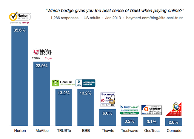
Image source: Baymard.com
Additionally, if you have a customer protection program, by all means highlight it. eBay reinforces its buyer protection messaging on the homepage (in some countries), on the product listing pages, during checkout, and on emails sent out to customers to reinforce their confidence in the brand.
Product reviews by existing customers are also a great way of telling a prospective buyer how good a particular product is. Don’t skip including customer reviews in your product page to ensure conversion.
3) Painful Navigation
Imagine walking into a basement filled with old junk. You’d probably spend hours combing through the mess if you had to try and find something. This is exactly what you put your customer through when you don’t have a clear site navigation structure.
The Fix:
Keep it simple. Avoid overwhelming the user with unnecessary pop ups and flashing banners. Spend time and resources on perfecting product groupings and creating logical and easily comprehensible categories, sub categories, variants, color choices, and SKUs.
(You can also put in a prominent search bar on your homepage so that even if your navigation is not the best in the world, a user can still search and find what they're looking for.)
4) Inventory Issues
Let's say you have a customer buying an elusive first edition copy of Batman: Shadow of the Bat on your site. Just as they’re about to complete the transaction, they get a message saying, “Sorry, item not in stock.” They get frustrated and leave your site. Probably for good.
This is an inventory nightmare for any retailer. It could happen because the item got sold on a different platform (maybe a traditional brick and mortar store?) owned by the retailer, it could be because inventory positions are not linked to the checkout process, or could even be a straightforward error on the part of the retailer.
The Fix:
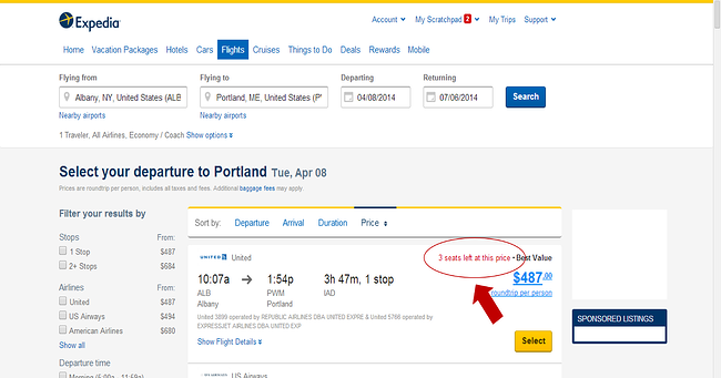
Use technology to your advantage. If you have an offline and an online presence, don’t depend on luck. Manage the inventory between the two using smart tools -- such as Shopify’s online POS system. You can also use inventory as a tool to create urgency. By showing the number of items left for a particular product, you can encourage a customer to buy right away instead of postponing the purchase.
Expedia does a great job of communicating the exact inventory available and motivating the user to buy right away:
When you’re running short on a particular item, cross-sell a similar item that has decent stocks. Cross-sells are a powerful tool that can generate tons of revenue if applied correctly. In fact, according to Amazon, 35% of their sales in 2006, came from cross-selling items.
5) No Guest Checkout
How many different websites have you shopped on to date? Five? Ten? More? And how many login IDs and passwords do you remember for these? A very small handful is my guess.
Jared Spool from User Interface Engineering talks about a client who lost over $300 million dollars a year in sales due to the absence of a guest checkout option.
The Fix:
It’s really simple. Allow guest checkouts.
In the case of first-time customers, guest checkouts avoid diverting them into a new process. For returning customers who may not remember their passwords, they prevent frustration and drop-offs.
In the case study referred to above, Spool and his team found that 40% of returning customers requested password resets. Of these, only 25% actually reset their passwords and of these only 20% completed the purchase.
6) Long Checkout Process
Most of us dread going to a supermarket or a big box retail store, thanks to the serpentine queues at their checkout counters. So what do we do instead?
Go online, right?
The trouble is, ecommerce businesses sometimes don’t realize how their frustratingly long checkout processes are actually counterproductive and replicate the same problems that traditional retail suffers from.
The Fix:
There are verifiable merits in shortening your checkout process. A study of the top 100 ecommerce sites conducted by Baymard Institute, showed that their checkout process was an average of 5.08 steps long. As the checkout process grows longer, user satisfaction with the purchase process starts to drop.
Ask only for information that is absolutely essential to complete a purchase. Most organizations never use the tons of information they collect from their customers, and customers find it highly annoying to part with irrelevant personal details.
Additionally, autofill entries wherever possible to reduce the overall time taken by the customer to check out. For example, when a customer provides their ZIP code, prefill country and state based on the given information.
Do not ask for the same information twice. If you've already collected the user’s shipping information, ask if you can replicate the same address for billing, instead of creating a new form for billing address and forcing the customer to refill it all over again.
If you do not have a one page checkout process, include a checkout progress indicator prominently in your checkout section to inform the customer exactly how many steps away they are from the purchase.
Finally, add a "Save for Later" option. There is only so much pruning that you can do to a checkout process. For customers in a real hurry, this option will allow them to save the items they want to buy and come back to them later. A good way to use this feature and ensure the customer returns would be to send a follow-up email within 48 hours of the customer creating the saved cart.
7) Hidden Costs
How do you think a customer reacts when the price of their purchase jumps up by 10-15% by the time they reach the end of the checkout page? Not very kindly at all.
Research shows that hidden or unexpected costs are the #1 cause of abandoned shopping carts.
Unless mentioned alongside the price of the product, “hidden costs” in a customer’s book include
- Convenience fees
- Shipping & handling costs
- Taxes
In fact, according to a ComScore study, at least 61% of users are likely to cancel their entire purchase if they eventually find that free shipping is not offered.
The Fix:
Being as upfront as possible about all costs related to a purchase is the safest way to go. Include all additional costs on the product page to avoid any ambiguity. The online travel industry was plagued with bad customer experiences in the past when just base fare used to be displayed at the start, and on entering the checkout process, numerous other fees like fuel surcharge, airline fees, and airport terminal user fees were added on to the original price. This is now changing with bundled fares being displayed at the search stage itself to ensure complete clarity.
Shipping is an unavoidable cost in ecommerce, so if free shipping isn't possible at all times, build in shipping cost calculators so the customer can check the actual cost of shipping before heading to checkout. eBay is a good example, which has been offering a shipping calculator for years on every product page.
8) Limited Payment Options
Imagine a shopper who’s found exactly what she wants, at the right price, at the right time, but not being able to complete the purchase just because her preferred payment mode was not offered by your site.
After doing everything right in terms of attracting the right customer, guiding them through the entire search and checkout process, only to fail at the final step is truly a criminal waste of the marketing resources spent on getting the customer to your site in the first place.
The Fix:
Research by WorldPay shows that alternate payments will account for over half of all payments by 2017. They already account for over 22% of all ecommerce transactions worldwide.
Given these numbers, the only real alternative that any ecommerce business has is to incorporate as many different payment options into their system as possible.
Clear messaging about the various payment types accepted is also equally important to ensure that the customer does not miss the options and move on.
9) No Live Help
Who do you turn to when you’re shopping for a shirt in a department store and can’t find the right size? The sales assistant.
While ecommerce sites are obviously handicapped in terms of providing in-the-flesh guidance to a confused customer, most do provide a call center number or email contact details. Unfortunately, both of those communication modes are time consuming -- it usually takes at least 24 hours to respond to customer queries via email, while call center numbers are notorious for their long wait times, ruining the customer experience.
The Fix:
Offer Live Chat as an option to customers. According to a study by Forrester Research, 44% of online shoppers considered live chat one of the most important features of ecommerce sites. An eMarketer study shows that most buyers who use live chat -- a whopping 63% -- were likely to return to the site for a repeat purchase.
So these were some of the big ways product marketers and online retailers have been shooing customers off of their sites. Did you recognize anything on this list that you’re guilty of, or any big ones I missed?
![How to Write an Ecommerce Business Plan [Examples & Template]](https://blog.hubspot.com/hubfs/ecommerce%20business%20plan.png)


![How to Send Effective Order Confirmation Emails [Examples + Template]](https://blog.hubspot.com/hubfs/order-confirmation-email-1.jpg)

![How to Start an Ecommerce Business in 2022 [Steps + Must-Follow Tips]](https://blog.hubspot.com/hubfs/how%20to%20start%20an%20ecommerce%20business.jpg)