Become A Keyboard Accessibility Champion With These 5 UX Design Tips
Not everyone can use a mouse. Learn how you can influence they way your team builds a product to be more accessible.

Scott Pitkin
Keyboard accessibility is essential to building products at scale. With Marketing Cloud, for example, thousands of customers create, send, publish, and automate marketing campaigns that reach and engage millions of people daily. But, about 16% of the world’s population has at least one disability. This means there are product functions, like drag-and-drop, that may not be accessible to some users. At Salesforce, we lead with our values to ensure equality. That means we design with every user in mind. When we prioritize keyboard accessibility, it enables more people to effectively use our products
What is keyboard accessibility?
So, what does keyboard accessibility mean? It means that all functionality that can be completed with a mouse can also be completed with a keyboard. It’s the foundation for how everyone will interact with the product. A person who’s blind may use a screen reader or voice commands. A person with mobility or dexterity-related accessibility needs may use a head wand or a switch control or some other assistive device to operate their computer. What connects them together? All these modes of interaction rely on keyboard access.
Let’s learn more about an alternative interaction pattern to drag-and-drop and five opportunities to elevate keyboard accessibility.


Can I do it with a keyboard?
For marketers, the Email Builder in Marketing Cloud is an essential tool for building creative assets and content, but it presents an accessibility problem. It relies on drag-and-drop interactions that aren’t keyboard accessible.
By asking, “can I do it with a keyboard?” a group of Salesforce designers and accessibility experts imagined a pattern called click to create. This provides a keyboard-accessible alternative to drag-and-drop and affords anyone, not just mouse users, the ability to add content to a page. It complements other keyboard accessible functionality such as reordering, editing and deleting existing content.
As a user tabs through the email, they find a node for click to create (a small circle with a plus sign icon) below each section. When the node is activated, they can search or navigate a list of elements, then add one to this precise location on the page by selecting the return key. It’s a simple, flexible, and efficient pattern found in the context of content and is ready to use.
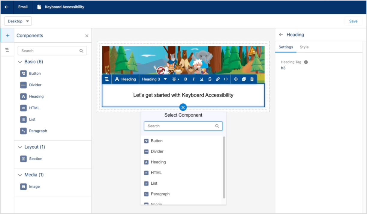
Click to create has been built into a new keyboard accessible version of the Email Builder. (The new builder is available in Salesforce Starter and as part of the CMS.) Since older builders are complex, with code that’s hard to retrofit for accessibility, it made more sense to develop a new builder. The keyboard accessibility standards in place today can benefit all marketing content creators. The tool is well positioned for the future to evolve with the latest Web Content Accessibility Guidelines (WCAG) for keyboard accessibility success criteria.
Elevate keyboard accessibility
The product design process, though it may vary for every individual or team, provides a consistent platform to elevate keyboard accessibility at five key moments that matter. Moments are flexible and can adapt to a given design process. Designers can lead conversations and engage the team whether you’re having early conversations and framing, defining and aligning on a solution, or building and testing a product or feature.
Here are the five key moments that matter:
1. Identify barriers
Identifying barriers is the first moment and happens early in the process. Project teams can create intentional space to review research findings, customer feedback, and accessibility testing results. Listening to lived experiences of people with disabilities is especially valuable to learn what prevents people from effectively using a product. This helps the team understand the unmet needs of users as well as compliance gaps or missing standards. Internal or external testing results may contain valuable information and guidance to enable the team on how to remediate a specific issue.
The work to identify barriers may be ongoing in your organization. Revisiting it with the team at the start of every project is the best way to establish empathy. It helps to build a shared understanding of accessibility barriers, including areas where people can’t use the keyboard to accomplish key tasks or flows. If there isn’t a research program in place or audits available, designers may opt to lead an informal audit with the team or engage with research or accessibility specialists to get started.
2. Create a design brief
Another moment early in the process is creating a design brief to align on goals for keyboard accessibility. Design briefs can take many forms, such as slides, a document, or a Figma file. Add a section that contains questions or a checklist that promotes the conversation. Capture accessibility goals and build a shared definition of success for the project. Then make sure the team is enabled to make the goals a reality.
Build with accessibility in mind
Web accessibility ensures that people with disabilities can perceive, understand, navigate, interact with, and contribute to the applications you create. Follow the Accessibility Guidelines in the Lightning Design System when designing your product.


3. Ideate and iterate
Next, elevate keyboard accessibility during ideation and iteration in every design cycle. Continue to ask “can I do it with a keyboard?” and raise it regularly in design reviews. Prioritize keyboard accessible interactions as the default, and any alternate interactions, such as drag and drop, as progressive enhancements. During detailed design, designers and teams can learn from design system documentation and WCAG.
The Salesforce Lightning Design System has component blueprints that each contain a section of specifications for keyboard accessibility. The trees component to visualize a structure hierarchy is an example. Finally, engage the team to innovate for the user when you identify barriers that are not easily addressed with existing patterns.
4. Prepare lean specifications
As you create solutions, prepare lean specifications to support the development of keyboard accessibility requirements. Start by adding resource links, such as component blueprints or WCAG success criteria, into user stories. In Figma, create annotations for tab order and the expected keystrokes for interaction patterns, especially for complex or multi-panel experiences. Knowing exactly how much to document may be a challenge for some team members. So consider a checklist and annotation kit in Figma. Also, encourage designers to think about what should be tested later with the keyboard as a guide.
5. Support keyboard demos and testing
Finally, the last moment is to support keyboard demos and testing in the development cycle. As a build progresses toward completion, stay present. Support the team by maintaining design files and annotations if changes occur. Attend demos to monitor progress and encourage a keyboard demo when the team is ready. Obtain access to a test environment for your own keyboard testing. Then engage with the team on test plans for keyboard functionality.
Whether you’re building something new or improving an existing application, don’t wait until conditions are ideal. You need to start wherever you are. Elevate the focus on keyboard accessibility in all phases of the product development cycle. Use “can I do it with a keyboard?” as a constant reminder to designers, product and program managers, engineers, and anyone who contributes to the process. We can all be accessibility champions.
Derek Featherstone co-authored this blog