Facebook’s level of popularity may have lowered, but the social network is still a marketing channel worth investing in.
Facebook ads can bring great results and convert as soon as they go live.
But for that to happen, your ad designs must be powerful enough to compete with content your audience is genuinely interested in, such as photos of their friends or news.
So how do you make sure users don’t turn a blind eye to your ads?
From our experience, there are a few design aspects that can impact your ads’ performance, which is why we prepared some tips and tricks that will help you create Facebook banners that defy banner blindness.
If you prefer getting your information from dynamic content, we also uploaded a video version of this material on our YouTube channel.
Without further ado, let’s get into it.
1. Make Your Product the Focus of the Ad
Your ads’ purpose is to make users interested in buying what you’re selling, whether it’s products or services. So naturally, the product must take center stage.
Ideally, you want to place your product at the center of your design, so it’s the first thing users notice as soon as they see the ad.
For this purpose, you need to use a high-quality image or illustration of your product that covers at least 70% of your design.
Take a look at the Hershey’s Facebook banner below. It’s pretty difficult to ignore their product when it takes up almost the entire ad space, right?

With tools like the ones in Creatopy, it’s extremely easy to highlight the product in every Facebook ad you make. Our background removal feature can help you automatically create transparent background photos with a single click.

If you feel a cutout of your product on a plain background is too simple, you can add additional elements that complement your product. However, we do advise you to keep it simple.
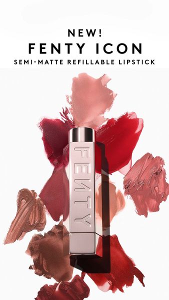
Fenty found the perfect balance with this Facebook ad for their newest semi-matte refillable lipstick. Because having their product packaging on a white backdrop would have been too underwhelming, they decided to spice the background up with swatches of the lipstick’s shades, giving potential customers a look at the colors they could pick from.
You can also emphasize details of your product when designing in Creatopy. Just browse our extensive library and add creative elements that enhance your banner design.
Pro tip: Work with images of people holding or using your product instead of plain product photos as an alternative. Having this human element in your Facebook ads will encourage users to connect with your brand and even imagine themselves owning the product.
2. Leverage Color Psychology
Colors have more power than you think. They dictate visual hierarchy and can even influence human behavior through the feelings and thoughts they convey.
Here’s a simple guide to the most popular colors and the corresponding emotions they can evoke in people.
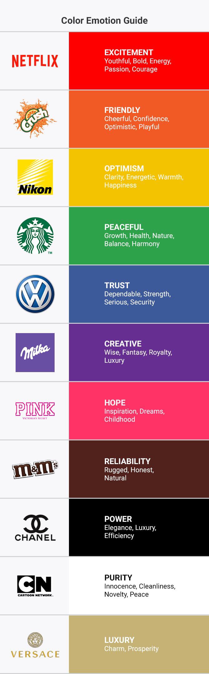
Shades that are combinations of two colors can conjure feelings specific to both composing colors. For instance, plum, a reddish-purple, may evoke emotions related to luxury and royalty specific to purple, as well as youth, energy, and courage specific to red.
This Facebook ad for the European brand Fjällräven uses plum as its primary color. Since it is one of the most renowned outdoor gear brands and it is also known to be quite expensive, the meanings behind the predominant color fit like a glove.
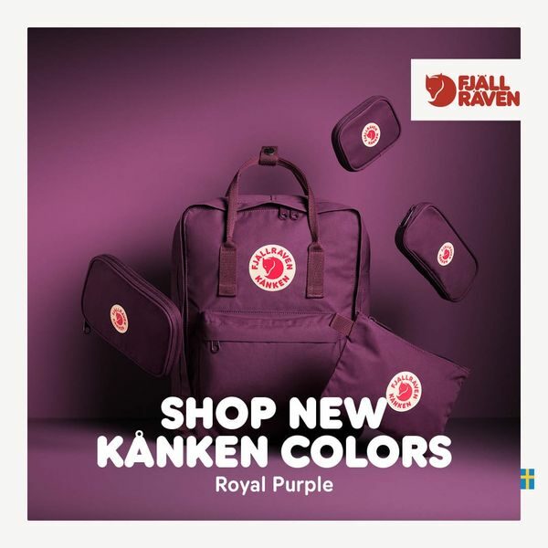
Still, however aesthetically pleasing it may look, an almost monochrome banner like the one above might not prove as effective as you’d wish.
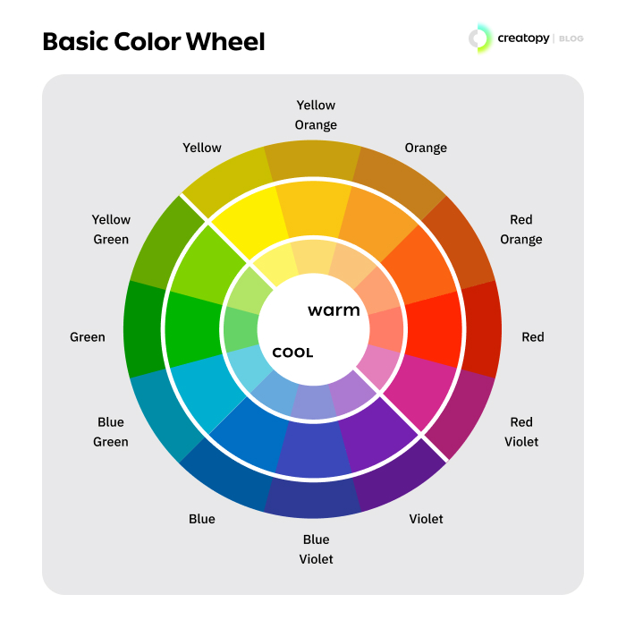
To draw your audience’s attention and get your ad noticed you should have contrasting colors in your design.
But how do you pick the best color scheme?
The easiest way to do it is by matching colors from opposite points of the color wheel, such as yellow and purple, to obtain a striking effect.
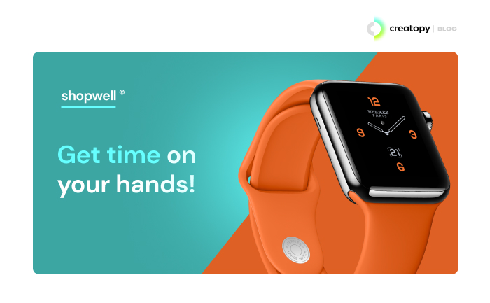
For instance, the red-orange shade in this Facebook ad contrasts really well with the blue-green one from the opposite spectrum. Such a combination of colors is bound to stand out.
If you want to know more about how to mix colors and create scroll-stopping color schemes, you can read our comprehensive guide on color theory.
Alternatively, you can get inspired for future Facebook banners by going through our list of eye-catching color combinations examples for social media ads.
While contrast is desirable, you should avoid using black and white images for your Facebook ads. A black and white color scheme may appear elegant and mysterious, but it will always fail to grab attention in an over-saturated feed.
Keep in mind the best approach is to keep your color combinations on brand. This way you will have consistency across all designs and become recognizable to your audience. You can extend this to images/illustrations and messaging as well, and ensure they set you apart from the competition.
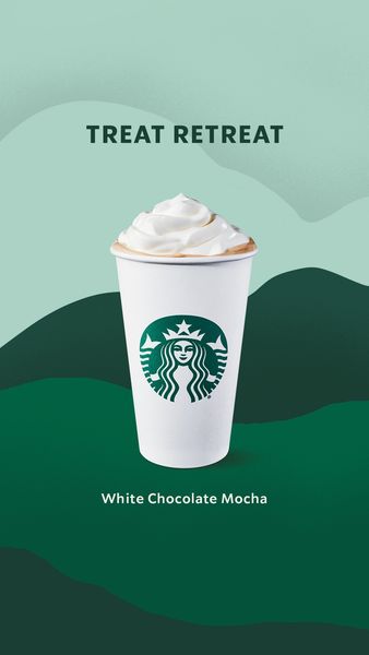
Take a cue from Starbucks. Most of their ads use a color combination of the green from their logo, plus a blue-green shade, also known as teal. This color scheme is already part of their visual identity and it’s instantly recognizable.
This is quite easy to achieve when designing in Creatopy because you can use the Brand Kit feature to maintain brand consistency. All you need to do is upload your brand assets, including logos, color palettes, and typography, and then access the brand kit from your workspace whenever you’re designing ads.
You can create a maximum of ten color palettes with up to 30 colors each, having a total of 300 brand-approved shades at your fingertips at all times.
Pro tip: Steer clear of blue and white color schemes similar to that used by Facebook. Otherwise, your banner can get lost on the feed.
3. Use Text to Its Full Potential
Less is more when it comes to ad text so keep it to a minimum. Use a short and clear ad copy that delivers your message effectively and include a call to action to invite users to click.
After all, if users reach your website or app, they will learn more about your product or service so there’s no need to pack your Facebook banner with unnecessary information. Besides, you have plenty of room for text above and below the ad as well.
Spotify is usually a pro at making the best use of text. Just look at this Facebook banner for Spotify Premium that uses text to convey just the right amount of information.

Your ad should be easily scannable and that means using simple fonts as opposed to decorative ones and combining a maximum of two fonts per ad.
To stay true to your brand’s identity try to use the same font(s) for all Facebook ads. If you have a clearly defined brand style guide, it probably includes font guidelines as well. Follow them to build a strong brand presence through your ads.
McDonald’s sure knows what we’re talking about. The brand uses its custom-made typeface named Lovin’ Sans for all promotional materials, including Facebook ads.
Case in point: this Facebook banner for their new plant-based burger. You can see that not only is the ad easily scannable thanks to having a single font, but it is also in line with the brand’s guidelines and easily recognizable.

Pro tip: Facebook’s recently released feature “Optimize Text Per Person” allows your primary text, headline, and description to swap between fields. For instance, your headline might switch positions with your primary text, or description when the ad is shown to different users.

If you want to see if this feature can improve your ad performance, first make sure that the three texts are interchangeable.
Additional Tip: Automate Your Design Process
You can save a lot of time otherwise spent on repetitive tasks and deliver Facebook ad campaigns faster by using Creatopy’s intuitive tools.
Choose from our predefined sizes or create custom ones. To further speed up the process, put together a design set that covers all the Facebook placements you want. You can work with an industry-specific template or design ads from blank using only your creativity.
Customize your banner or ad set with a few clicks. Add or remove any design elements or change them by editing the layers. Remember that when working with sets, any change you make to a banner automatically applies to all sizes.
Access your previously built brand kit to add your logo, font, or brand-specific images to the design.
When you reach a design you’re satisfied with, export your entire ad campaign in a format that complies with Facebook’s upload requirements and publish your ads.
Wrapping Up
As ideal as it would be, there isn’t a universal formula that will guarantee your ads’ success. Still, following the tips in this article will bring you closer to creating top-performing Facebook banner ads.
Experiment with social media ad design and constantly test your ads either by using the A/B testing feature available on the Facebook Ads platform or by creating two different banner versions and seeing which one performs better.
This way, you’ll find out what your audience prefers, which is the most important.