How to choose brand elements for your company
What your organization should consider when developing visual and textual elements of your brand – examples included.
Brand positioning is the strategic process of defining how your brand is perceived in the minds of your target audience, distinguishing it from competitors.
A strong brand identity is essential in developing an effective brand positioning strategy. Brand elements are the building blocks of this identity and may be textual (e.g. your tagline) or visual (e.g. your logo). Without them, competing against other brands becomes a needlessly difficult task.
However, most B2B brands today are lost in the ‘sea of sameness’. According to B2B International, marketers report that brand differentiation remains one of their biggest challenges.
This article shares guidelines on what to consider when developing some of the most important brand elements.
Why are brand elements important?
To fully answer this question, we must first talk about brand equity.
Brand equity refers to the commercial value (or ‘worth’) of a brand in and of itself. Organizations with strong brand equity have a clear, sustainable competitive advantage. This is because brands can’t be easily copied, unlike most types of products.
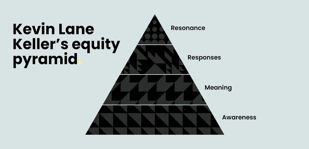
According to Kevin Lane Keller’s widely-used equity pyramid, there are four steps to achieving a strong brand:
- Raise brand awareness
- Communicate your brand’s meaning
- Encourage positive brand responses
- Strive for brand resonance
Brand elements play a vital role in this process (but especially step 1). Without them, prospects won’t be able to remember your brand and you’ll find it difficult to encourage brand loyalty among your existing customers. This inevitably will have a knock-on negative effect on other areas of your business, such as product development, sales, and market activation.
When used properly and consistently, brand elements help you achieve several strategic objectives, like shaping your positioning strategy.
What makes a good B2B brand element?
The main goal of a B2B brand is to build long-term relationships with customers. After all, B2B products and services usually exist to improve the work of business stakeholders – long after the initial purchase is made.
For this reason, trust is a crucial part of B2B branding. A strong brand element will emphasize your organization’s expertise in resolving the day-to-day challenges that your target personas face.
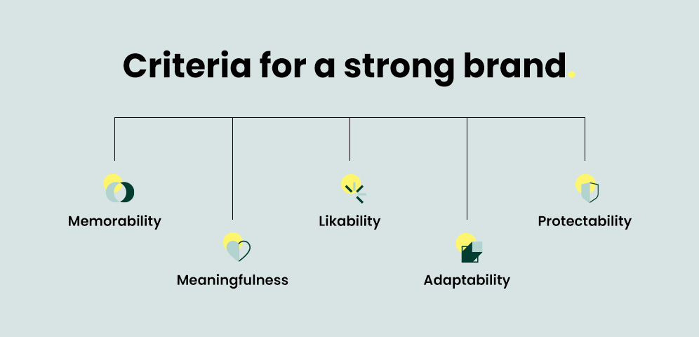
They should also meet the following criteria:
Memorability
One of the most important conditions that a single visual element should meet is that it must be memorable. This means it should grab the attention of the viewer and be simple enough to facilitate instant recall or recognition.
Meaningfulness
At the very least, a visual element should convey something about your brand. In these cases, the meaning can be descriptive (as is the case for brand names) or persuasive (i.e. taglines or slogans).
Likability
Likability refers to how well a brand element is written or designed (in the eyes of the target persona). If it’s a visual element, does it make aesthetic sense? If it’s written, does it roll off the tongue?
Adaptability
Customer needs change over time, so the market will also change. For this reason, brand elements should always be adaptable and flexible in case you must update them.
Protectability
Brand elements should be protectable. From a legal standpoint, marketers should formally register them with the relevant legal bodies whenever possible – especially when it comes to logos. From a competitive standpoint, they should choose brand elements that can’t be easily imitated.
What are the guidelines for each brand element?
Brand name
Brand names are arguably the most important element because they capture the key ‘essence’ of your brand in a concise way.
While a blog post or eGuide may be a thousand words or so (as is the case for most B2B content), your brand name should be as snappy and memorable as possible.
The name must be easy to pronounce and spell for this to happen. Simplicity reduces the time and effort needed to remember a name. It also encourages online and offline word-of-mouth; people may not be comfortable speaking about your brand if they don’t know how to pronounce it in the first place.
Another factor to consider is how familiar and meaningful your brand name is. Many names are based on existing nouns and adjectives, so prospects spend less time deciphering what they mean. But you can still create meaningful names out of made-up words – as long as it has unambiguous connotations.
One tactic to improve the pronounceability and memorability of a brand name is to use linguistic features to your advantage.
A study conducted on sound patterns in top brand names suggests that marketers should consider using brand names that contain plosives such as ‘p’, ‘b’ and ‘t’, as well as sibilants like ‘s’ and soft ‘c’s.
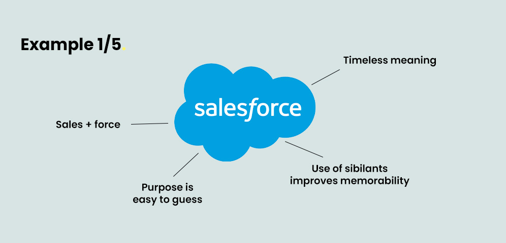
Example: Salesforce
Salesforce is a strong brand name for a few reasons. Firstly, it’s a combination of two existing words, which makes it easy to recall and pronounce. This is enhanced even further by the use of sibilants (‘s’ and ‘c’).
Secondly, the name is suggestive of its product category and benefit. B2B prospects can easily guess that Salesforce is a tool that helps your organization sell better.
Lastly, the words ‘sales’ and ‘force’ are timeless in their meaning. Brand names which are based on trends (such as slang) face an uphill battle because constantly changing them confuses customers.
Logo
Every brand needs a logo. They play an essential role in building your brand equity.
Most of the time, the first interaction that someone has with your brand happens when they see your logo. What’s more, every asset your brand owns contains your logo – your business cards, website, social media pages, and so on. For this reason, your organization should get it right the first time.
Logos come in all shapes and styles, from literal to pictorial to abstract. No style is inherently better than others, but the way your logo is designed should be in line with your brand values.
The key here is simplicity. A common mistake that organizations make is not recognising the difference between logos and illustrations. Illustrations tend to have intricate shapes and details, whereas logos are more minimal and recognisable from a distance.
Because of this, your logo must be legible and scalable at any size. To achieve scalability, your logo should be designed and saved as a vector file.
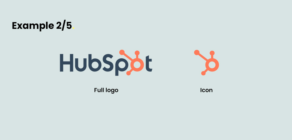
Example: Hubspot
HubSpot’s logo is effective because its symbol (which resembles a hub and spoke model) suggests centrality. This is in line with their value proposition, which is all about synchronizing different departments and systems with the use of a single platform.
Colour palette
Color is a key component of any brand’s visual identity. Some companies have even trademarked their signature colors.
Colors influence how your brand is perceived by all stakeholders (internal and external). To choose the right palette, you must take color psychology into account.
As trust is so important within a B2B context, many brands use blue to convey a sense of reliability and stability. Think IBM, Cisco, Salesforce, etc.
There is, of course, a downside to choosing the same colors as everyone else. Standing out can become more challenging.
One way to overcome this is to pick shades and tints that your direct competitors aren’t using and experiment with different saturations. Tools like Adobe Color can help you explore color combinations and test if they’re visually accessible for all.
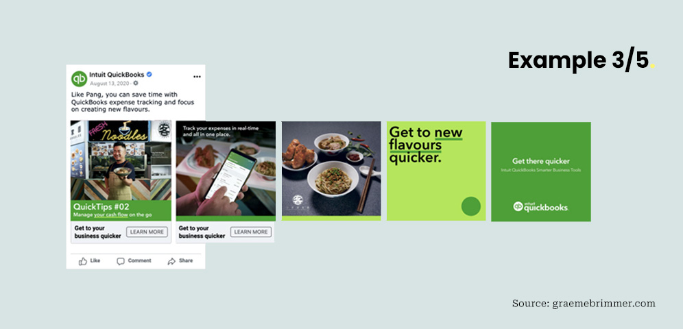
Example: QuickBooks
Accounting software company QuickBooks uses green as its primary brand color, which connotes profit and positive cash flows. Even though blue is generally the most common choice, the company’s use of green demonstrates a clear understanding of its sector.
Taglines
Like brand names, taglines are technically textual elements – but including them in any visual asset can significantly influence people’s perceptions.
Taglines are short, punchy statements that summarize what your brand is about. Unlike slogans (short-term phrases used for specific products or campaigns), they’re usually more holistic and long-term.
Not every B2B company has a tagline. But they serve an extremely useful purpose: they can communicate your offering’s unique selling point (USP). If your tagline emotionally resonates with your target personas, they’re much more likely to enter the sales funnel. This in turn lowers your customer acquisition costs (CAC).
Keep brevity in mind. One way your marketing team can get started is to write a paragraph that explains what your organization is and what it does, then trim it down later.

Example: Zapier
Workflow automation software company Zapier aptly summarizes its USP in its tagline ‘The Easiest Way to Automate Your Work’. With time (or lack thereof) being a major pain point for most B2B businesses, this tagline is effective because it allows the reader to instantly but subconsciously position Zapier at the top of their ranked list of similar products.
Typography
People make subconscious judgements and assumptions about your brand simply by looking at the fonts you use. If chosen well, fonts can influence prospects to learn more about your brand. But if chosen poorly, they can repel viewers entirely.
There are two main types of font categories you should know about: serif and sans-serif. Serif fonts are perceived to be more stable and practical than sans-serif fonts. However, the latter can be seen as more modern.
Make sure your fonts match your target personas. If you’re not sure, analyzing the websites of the organizations you want to target can give you an initial idea.
To get started, use websites such as Google Web Fonts Directory and Fontpair to explore different font combinations. When choosing a typeface, always check that multiple font weights are available (i.e. light, regular, semibold, and bold). These are extremely important when building a clear text hierarchy.
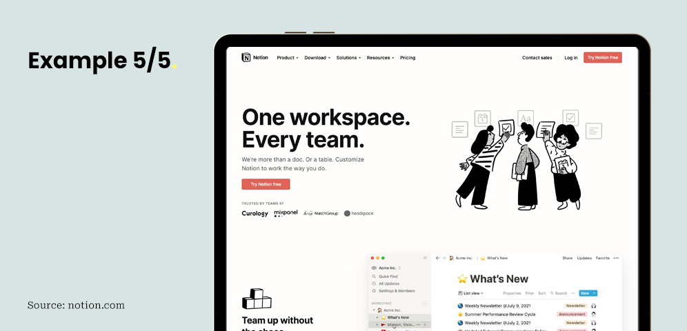
Example: Notion
Project management and note-taking software companies often make simplicity and ease of use a core part of their brand positioning. For Notion, this is effectively conveyed through their use of modern and clean typography. Sticking to only two fonts prevents their website from looking too busy.
Final thoughts
First impressions are hard to change, so getting your visual and textual elements right the first time is crucial.
However, what’s just as important is consistency – by establishing strict brand guidelines and sticking to them, you can begin to build brand equity and become more visible in the marketplace.

This post has been updated on June 10th, 2024. Originally published: June 21st, 2022
Read the latest positioning trends and insights.
Tap into our brand and product positioning, storytelling, and creative expertise to inspire your next strategic move.