How to Find the Best Selling Angles For Your Shopify Store Products (With Data & A/B Testing)

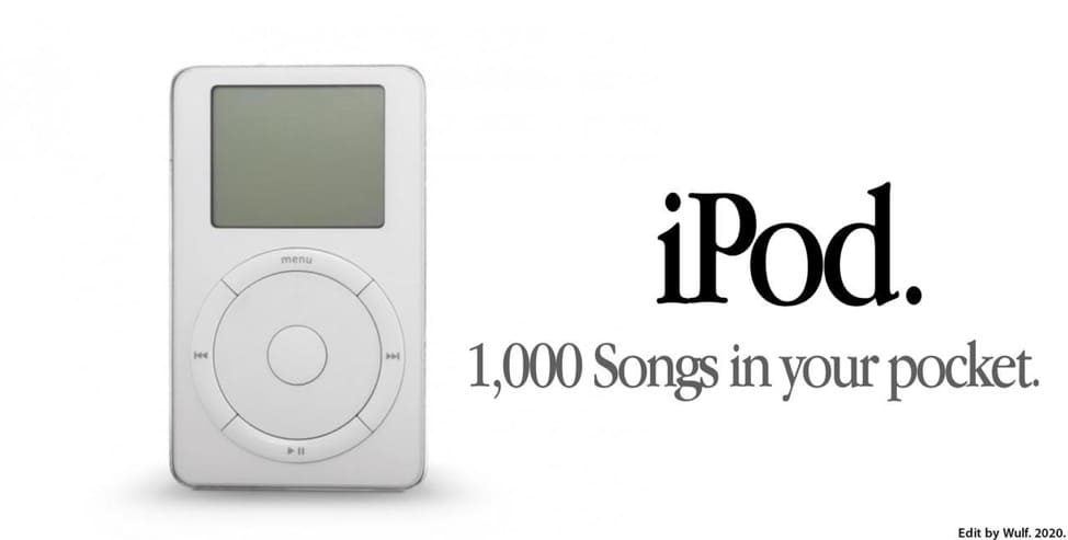
“iPod: 1000 songs in your pocket.”
Remember this iconic line?
At a time when MP3 players weren’t designed for ease of use and had little storage space, the iPod was an instant hit. But it wasn’t just the product that made people buy.
It was the benefit-driven selling angle.
Selling angles sell products. But coming up with them is considered to be largely mysterious—a regular “throw spaghetti at the wall and see what sticks” exercise.
Of course, creativity isn’t formulaic. But it’s not devoid of process either.
Great headlines aren’t great sentences—they’re great ideas expressed in words.
Dan Nelken, author of “A Self Help Guide for Copywriters
And these great ideas aren’t conjured up from thin air. Research, data, and iterative testing are the foundation of the creative process and help validate your selling angles.
When you look at your creative product positioning through the lens of something as rigorous and tangible as A/B testing, you can demystify creative product positioning and no longer wonder if your audience is “buying” what you’re selling.
Selling Angles: Hooks That Do the Heavy Lifting
Selling Angles are marketing hooks used to connect to the needs and desires of your shoppers.
Rishi Rawat, Founder & CEO of Frictionless Commerce
Rishi explains that selling angles are the foundation for your sales pitch and come from a mental checklist that shoppers use when making a purchase:
1. Shoppers are skeptical of too good to be true
2. They find expertise sexy
3. Root for people who beat the odds
4. Are fascinated by surprising details
5. Are visual animals
6. Need motivation to break habits
7. Love personalized user experiences
8. Like knowing they’ve stumbled onto something rare
9. Must overcome their negative thoughts
Also known as “marketing angles” and “advertising angles”, selling angles give buyers an insight into your product without overwhelming them with all the details.
You should speak the language of the target audience, respond to concerns, and persuade them to take action.
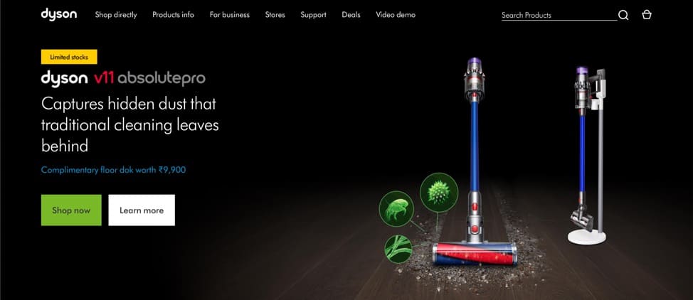
Take a look at Dyson’s selling angle for its V11: “Captures hidden dust that traditional cleaning leaves behind.”
Or these selling angles from Warby Parker for its women’s glasses:
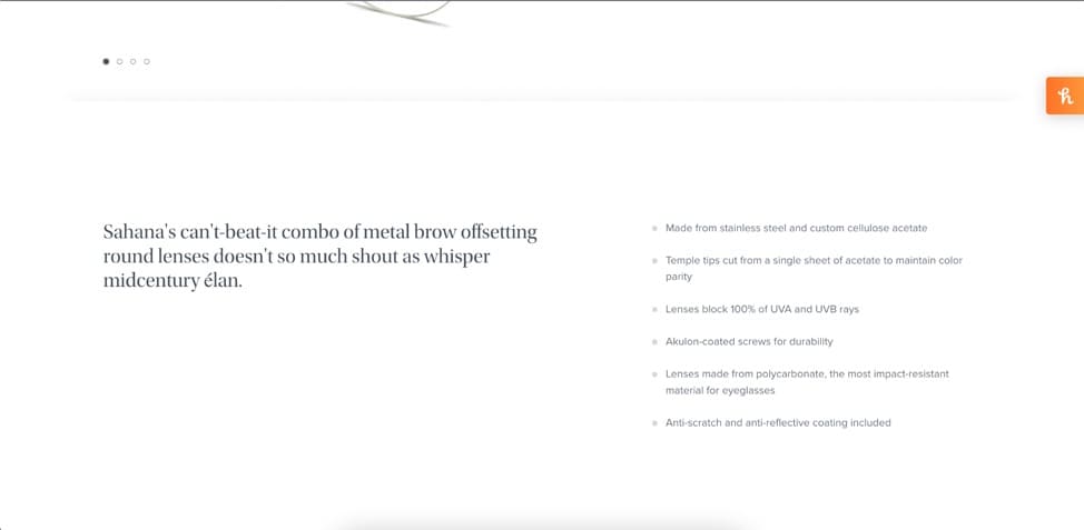
There’s mention of the design aesthetic, durability, and benefits—each carefully chosen to allay customer concerns and emphasize the “form with function” idea.
“Understanding how shoppers think,” a YouTube channel by Rishi Rawat and Lorenzo Carreri (CRO expert) dives deep into how brands use conversion optimization techniques.
Videos we recommend:
- Ep #1: Dyson.com Conversion Optimization Ideas
- Ep #9: ThirdLove.com Conversion Optimization Ideas
- Ep #17: Olipop.com Conversion Optimization Ideas
Here’s a quick look into how these conversion optimization specialists parse selling angles from qualitative data.
Using a technique known as review mining i.e. diving into product reviews to understand the benefits cited by customers and dissecting the product page copy, Rishi and Lorenzo show you how to turn it into selling angles.
Psst… We dive into detail about review mining with Lorenzo further in the post.
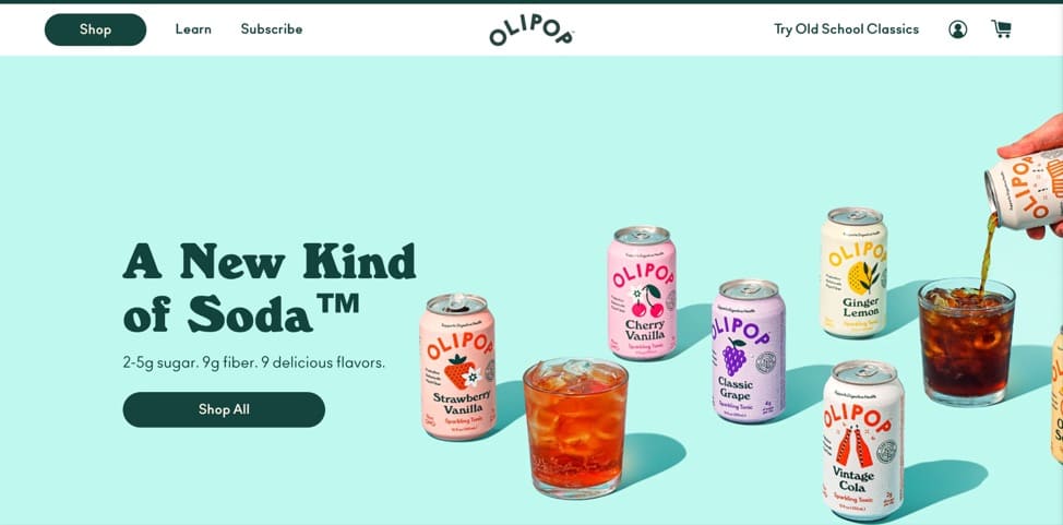
Olipop, for instance, is liked by customers because it’s a tasty, low sugar, and low-calorie healthy alternative to soda.
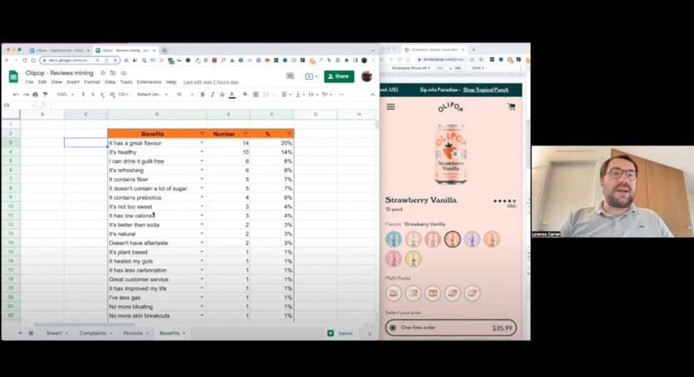
There are two opportunities for Olipop—to “sell the taste” and pull focus on how it’s a low sugar alternative.
Lorenzo Carreri recommends using anchor text to call out the flavor and linking it to YouTube videos with influencers sharing their experience and front-loading the fact that Olipop only has “3g of sugar” because people don’t scroll down the page.
How are Selling Angles Different From the Unique Selling Proposition?
Your unique selling proposition (USP) is the main selling angle and your biggest differentiator. It’s the reason why someone would choose you over the competition and what you’d tell someone when making an elevator pitch.
For example, Olipop’s main USP is that it’s a “new kind of soda.”
But, like Olipop, all products have multiple selling angles. Perhaps it’s designed a specific way or the ingredients are cruelty free and vegan or the company’s mission and purpose are worth getting behind.
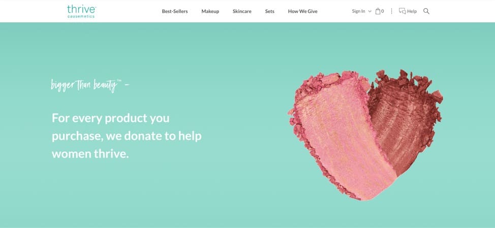
For instance, Thrive Causemetics is a “luxury cosmetics brand that gives back.” For every product purchased, the brand makes a donation to help women thrive.
While each selling angle meets the buyer’s pain points a different way, the USP is what you lead with—it’s the bleeding neck problem you’re solving and you’ve got research and data to back that up.
Examples of Selling Angles vs. USP
Let’s take a look at a few examples to further illustrate the difference between USP and selling angles.
1. Sheertex: A company that makes resilient intimates
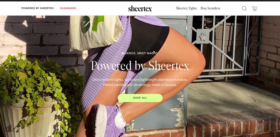
Main USP: Ultra-durable tights and pantyhose that don’t cause chafing made from award-winning fabric
Selling Angles:
- Hand-sewn
- Sustainably manufactured
- Patent-pending technology
- Machine washable
2. Athletic Brewing: A non-alcoholic craft beer company
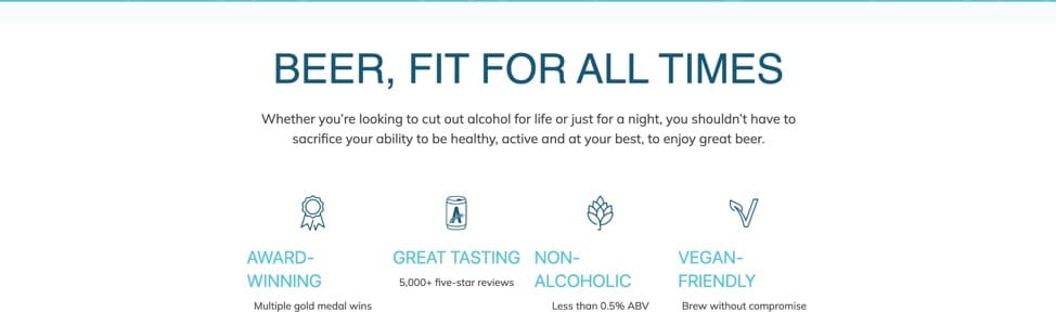
Main USP: Non-alcoholic craft beer for the health conscious
Selling Angles:
- Tastes great (better than watery, traditional non-alcoholic beer)
- Proprietary method of brewing
- Vegan friendly
- Award-winning
3. African Ancestry: DNA testing company for Black people
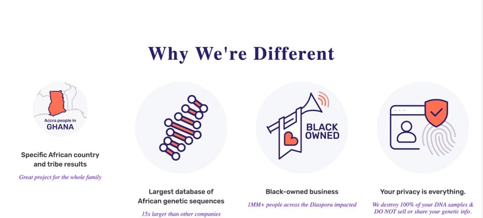
Main USP: Largest database of African genetic sequences
Selling Angles:
- For Black people by Black people
- Privacy first
- Results contain specific African country and tribes
Finding your USP: Radical Differentiation
Louis Grenier, Creator of Stand The F**k Out, an 8-week high intensity workshop, advocates for radical differentiation.
Grenier recommends becoming a “big fish in a big swimming pool” by steering away from the red ocean (saturated market) to find a big swimming pool (niche market) instead.
When you seek to share your best work—your best story, your shot at change—it helps if it’s likely to spread. It helps if it’s permanent. But even if it’s extraordinary, it’s not going to make a difference if you drop it in the ocean.
That doesn’t mean you give up hope.
It means you walk away from the ocean and look for a large swimming pool.
He shares the 5-step process to become a big fish:
- Find the smallest category
- Obsess over an underserved segment
- Give them a compelling reason to switch
- Benefit from word-of-mouth from early adopters
- Dominate the market, rinse, repeat
PS: Here’s an inventory of all the options available to differentiate your product.
Bringing Things Together: Anatomy of Money Making Product Pages
High converting online businesses lead with the main USP and sprinkle their selling angles throughout the product page and home page.
Here’s an example:
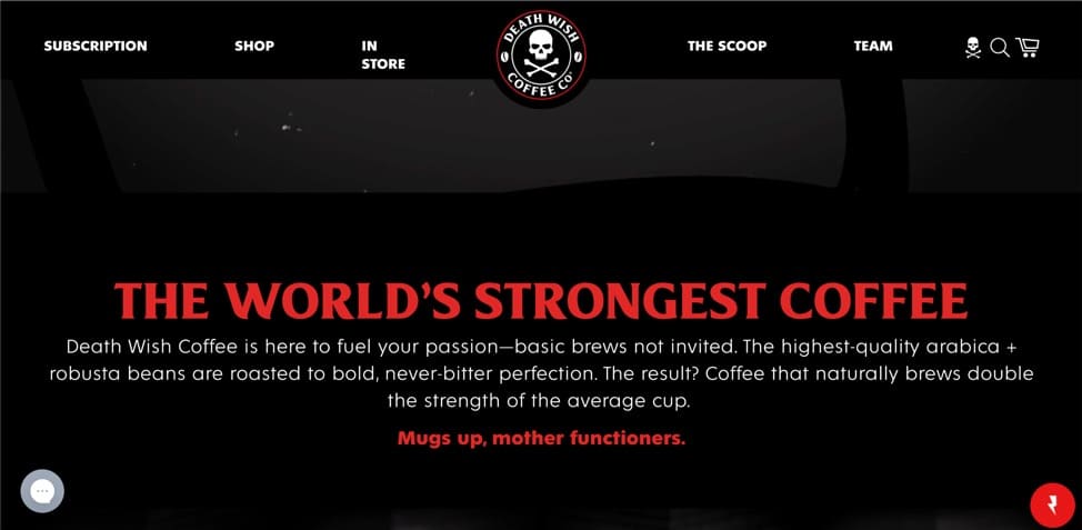
Death Wish Coffee places its USP, “the world’s strongest coffee,” front and center on its home page:
Selling angles feature in multiple places on the online store—product pages and the home page.
If you sit down to analyze some of the best brands, a pattern begins to emerge. Almost as if they’re following a script that’s been tailored for their brand and customers.
This framework called The StoryBrand Framework is useful for any brand that wants to tell a good story but is unsure of how to distill its message. A popular tool to clarify your message, it allows you to immediately connect with customers and communicate your value.
Think of it like a movie script with characters, a plot, conflict, and resolution except, instead of actors, you’re directing customers.
The StoryBrand Framework has 7 parts:
- Character
The main character aka the hero of your brand—your customer. Mull over what they want. Make it about them, not you.
- Who has a problem
- Villain (the thing or idea your customer is fighting)
- External (the surface issues they’re googling)
- Internal (how does the lack of a solution make them feel?)
- Philosophical (why is it wrong for your hero to experience this)
- Meets a guide
You are the guide who helps the customers solve the problem through empathy and authority.
- Who gives them a plan
You give them a clear process (usually, a 3-step plan) and make them a promise
- Calls them to action
You tell them exactly what to do either through a direct or a transitional CTA
- Which leads to success
What does success look like by using your product or service?
- And helps avoid failure
Remind customers what’s at stake. What happens if they fail? What happens if they don’t choose you?
The StoryBrand Framework is particularly helpful to convert first-time buyers. Potential new buyers aren’t sure you understand what they need, are skeptical of your claims, don’t understand your expertise, or aren’t sure yours is the right product. Your story forms the building block for your sales pitch which addresses all of these questions.
Let’s take a look at a couple of product pages that employ the StoryBrand framework:
1. Coco & Eve
Coco & Eve, a beauty brand, uses this framework on its landing page for its leave-in conditioner.
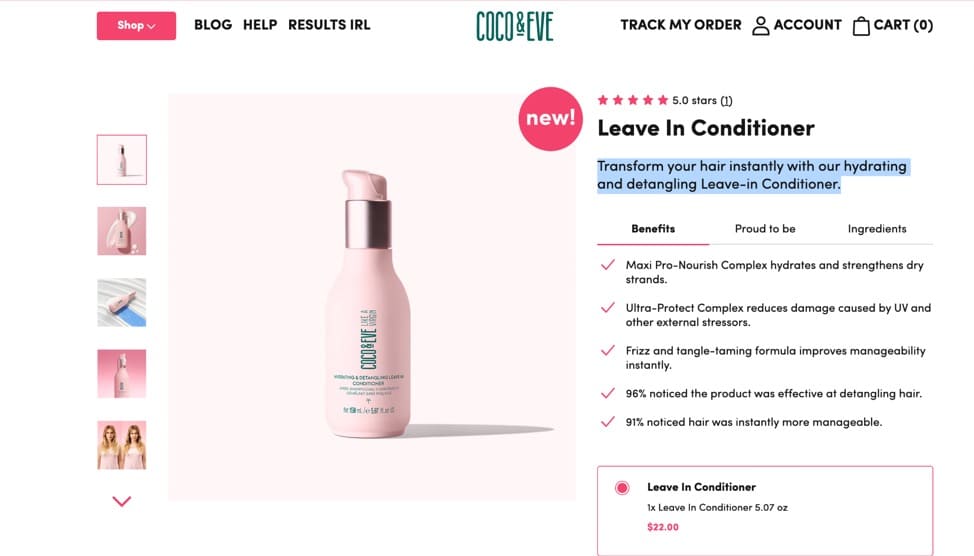
Character: Customers with all hair types
Who has a problem:
- Villain: Damaged, dull or frizzy hair with split ends
- External: How to manage frizz, nourishing leave-in conditioner, lightweight conditioner
- Internal: Frustrated, low self-esteem, insecure
- Philosophical: Why should you have to deal with damaged, dull hair?
Meets a guide:
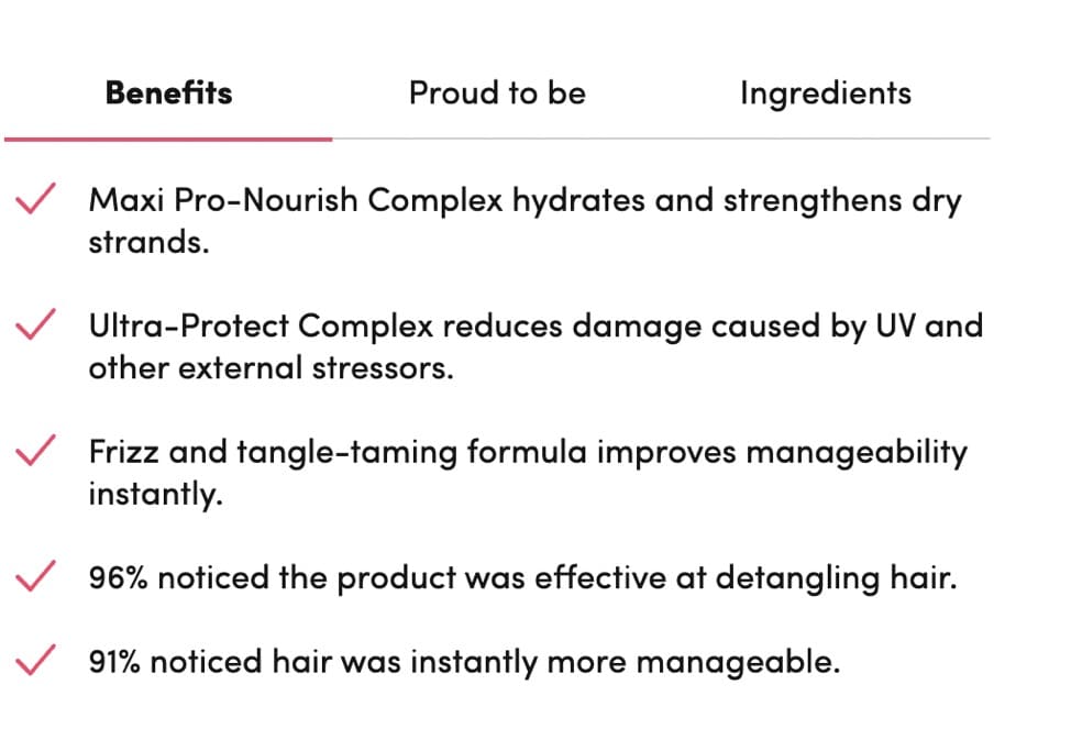
Coco & Eve uses several selling angles on the product page including data from their customers:
Who gives them a plan:
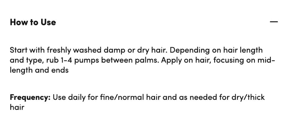
Coco & Eve outlines the easy process for potential customers under the “How to Use” section.
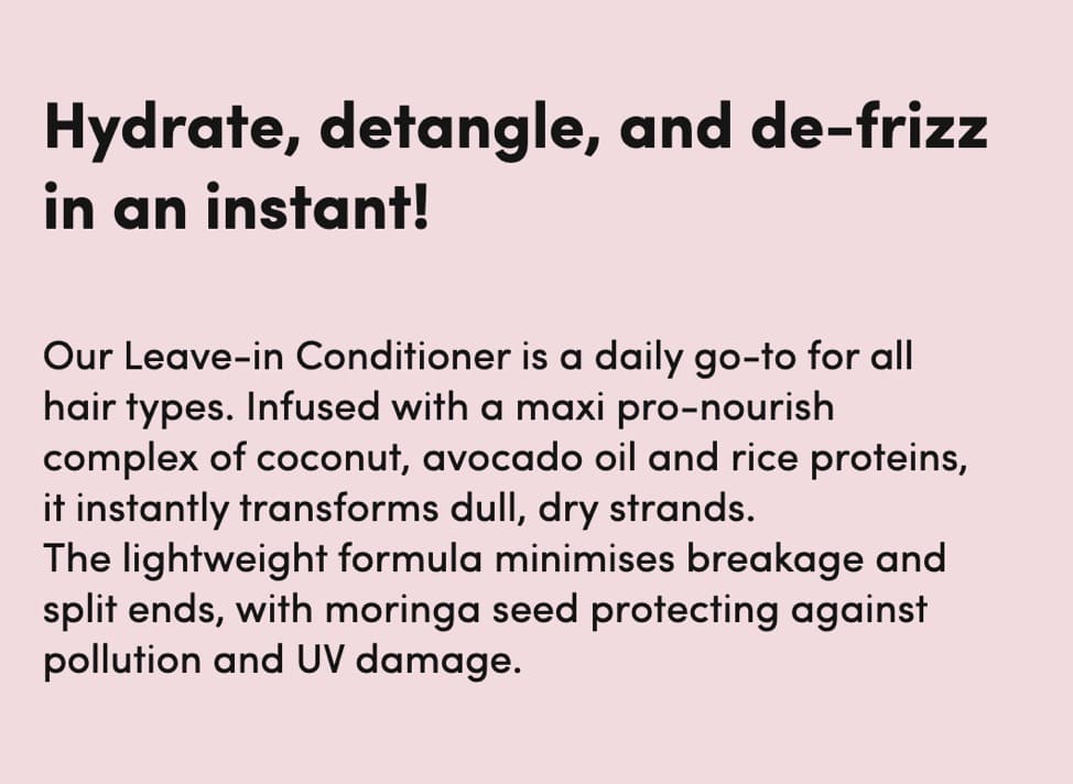
The product copy makes several promises—the transformation of dull, dry strands, minimization of breakage and split ends, and protection against pollution and UV damage.
Calls them to action:
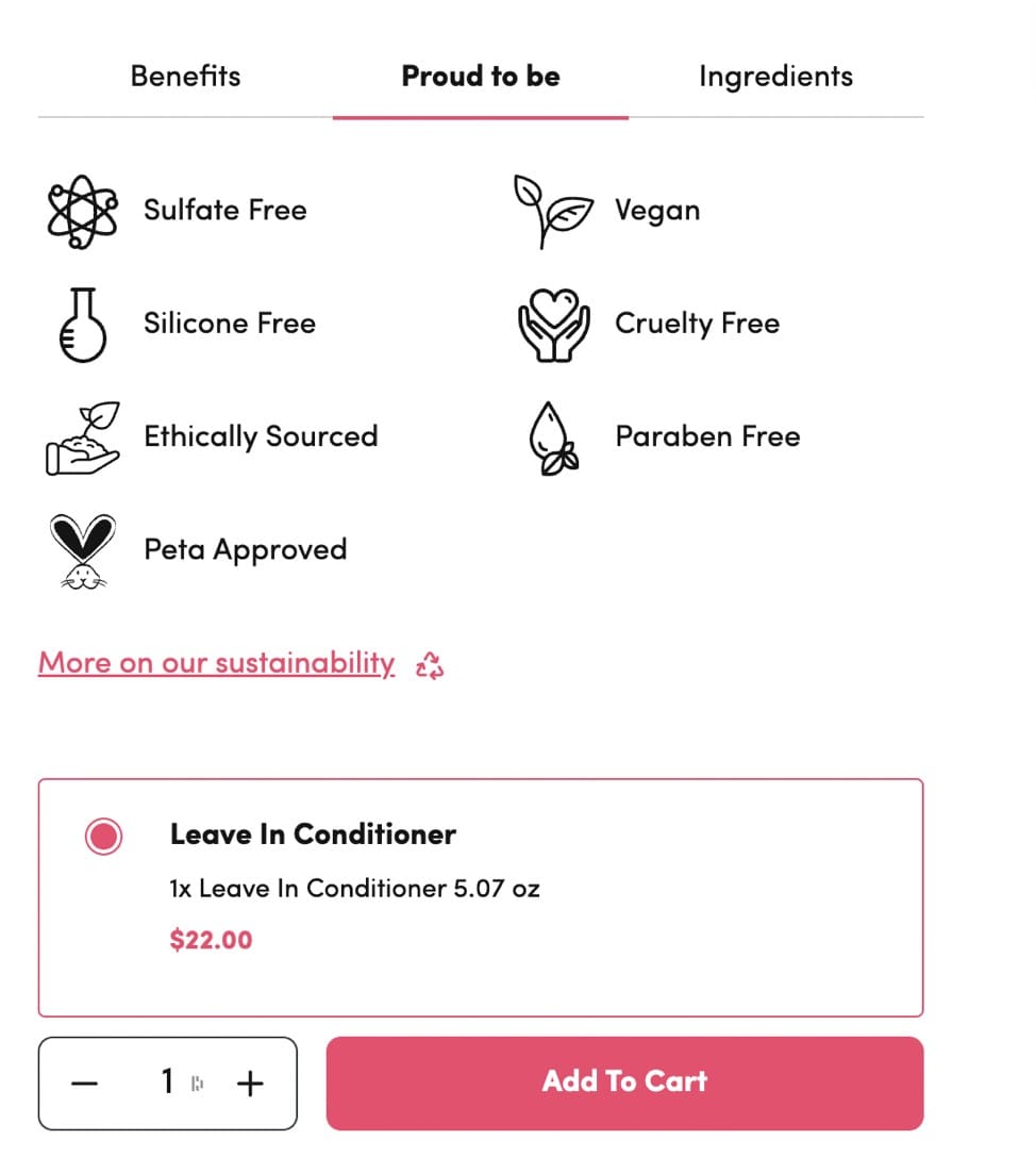
Customers who want to learn more about Coco & Eve’s sustainability practices or the ingredient list can click on those transitional CTAs while customers who are ready to buy can click on the direct “Add to Cart” CTA button.
Which leads to success:
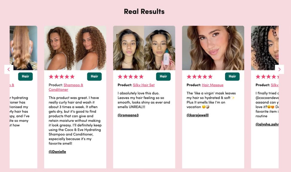
Coco & Eve paints a rosy future for customers with the “Real Results” section. The Before/After is compelling because buyers can identify with other reviewers in the before photo and visually understand the effects of the product.
And helps avoid failure:
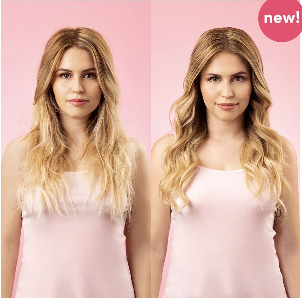
The product page reminds customers of what failure will look like via the copy “dull, dry strands” and also through high-quality product photos in the carousel.
2. Pourri
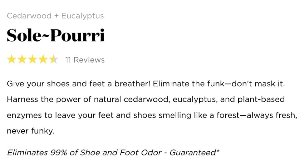
Let’s look at how Pourri, a brand that sells natural odor eliminators, uses the StoryBrand framework for its product, Sole~Pourri.
Character: Customers with shoe and foot odor.
Who has a problem:
- Villain: foot and shoe odor (the thing or idea your customer is fighting)
- External: how to eliminate odor
- Internal: embarrassed, frustrated
- Philosophical: Why should you have to deal with funky feet?
Meets a guide:

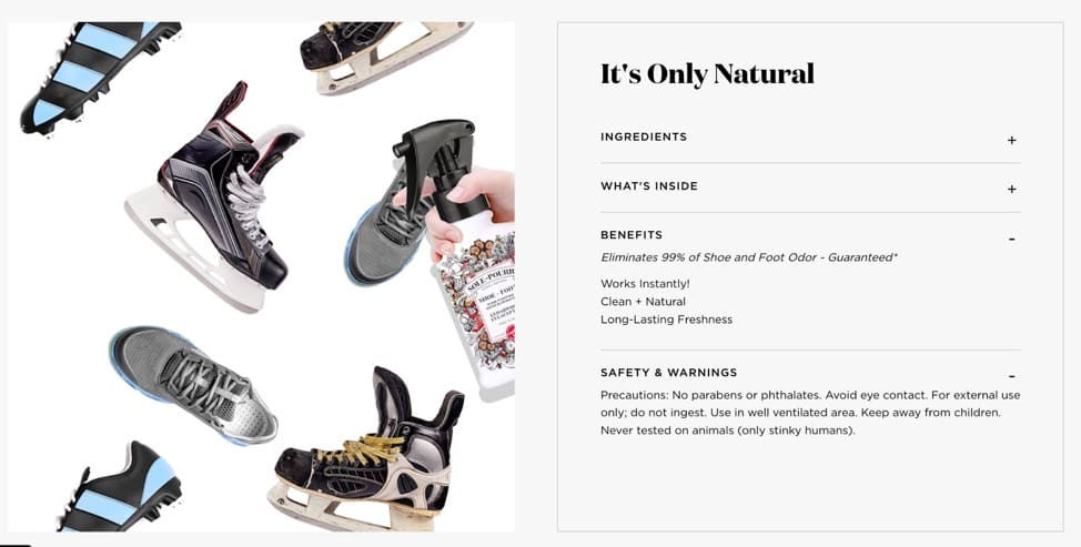
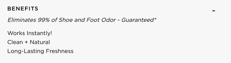
Sole~Pourri showcases their authority in the product description by claiming the product “Eliminates 99% of Shoe and Foot Odor – Guaranteed” and empathy with the line “Give your shoes and feet a breather! Eliminate the funk—don’t mask it.”
Who gives them a plan:
Sole~Pourri shows customers how to use the spray visually through a looped video on the product page.
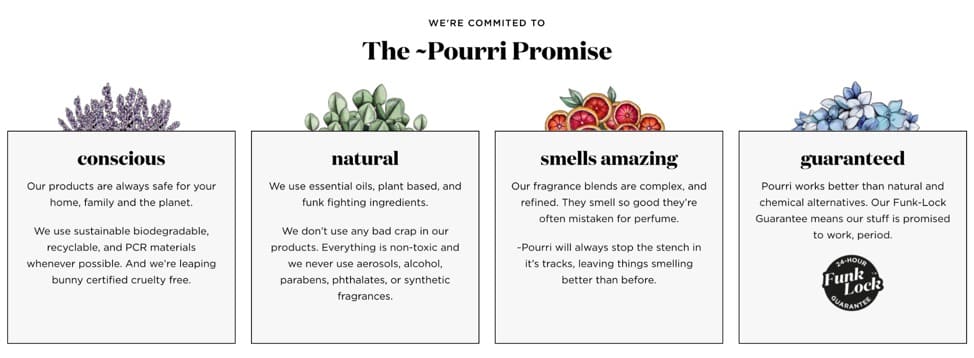
Pourri has a dedicated section on the promises they make to customers. The product is made using sustainable, natural materials, smells amazing and is guaranteed to work.
Calls them to action:
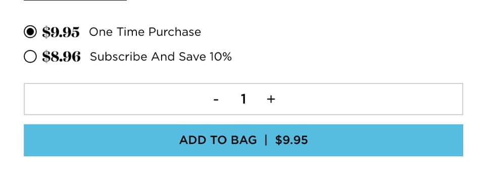
There are no transitional CTAs, only direct ones. Customers can make a one-time purchase to try the product or subscribe to save 10%.
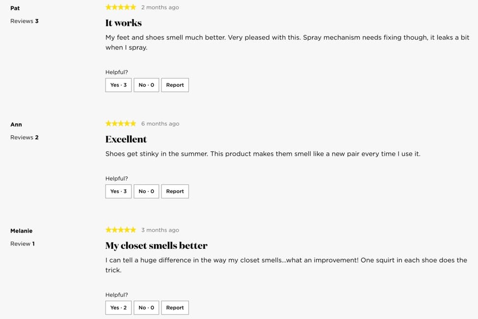
Which leads to success:
Buyers know what to expect if they choose the product. The customer reviews on the page also serve as further social proof.
And helps avoid failure:
The use of the words “funk” and “funky” reiterates what life is like without the product.
A Fail-Safe Process to Find Selling Angles Your Buyers Can’t Ignore: Research, Implement, Test
At any given moment, your buyers are being bombarded with all kinds of ads, campaigns, and selling angles. You have to cut through the noise and reach them with messaging they cannot ignore.
Here’s the 3 step process e-commerce businesses should follow:
- Collect and categorize customer opinion
- Infuse your brand message in your marketing
- Test your messaging through A/B tests
Let Customers Show the Way: Power of Voice of Customer (VoC) Data
Your customers hold the key to your best selling angles. But you have to ask the right questions to collect meaningful qualitative data.
Andra Baragan, Founder of Ontrack Digital, shares a list of survey questions they usually ask customers:
- What can you tell us about yourself?
- What is the first thing that comes to mind when you think about our brand?
- What made you buy our products/become our subscriber/sign-up?
- How would you describe the overall shopping experience with us?
- What doubts and hesitations did you have before buying/subscribing/signing up?
- If you had to describe our product in one word, what would it be?
- What would you miss the most if you could not use our products anymore?
- What should we do next to WOW you and offer an even better experience?
- What is the one big thing that we are missing?
Emma Travis, Director of Research at Speero, explains how to approach qualitative research: Ask users why, not just what.
For me, the key question is to always have in mind when running qualitative research is “why”.
While this might seem broad, the best specific question to ask depends on your research goals and objectives. Ensuring you’re always asking “why” can be something to bear in mind across every research project, regardless of goal, objective or research method.
Asking users or research participants “what is holding you back” or “what are you struggling with” will help you isolate issues. However, these questions won’t necessarily help you fully understand the issue which is extremely important if you’re ever going to successfully solve the issue. Giving users or research participants the opportunity to elaborate and explain why will get you much closer to the truth.
For example, asking “what” might highlight that the delivery options are holding users back, but asking “why” would help you understand specifically why it’s a barrier. Is it the delivery cost, the lead-time, or the number of delivery options?
Surveys and interviews can be cost and time-intensive but it doesn’t have to be that way. Rishi Rawat and Lorenzo Carreri offer two contrarian perspectives on customer research.
Rishi Rawat’s Case Against User Research
Rishi posits that user research is expensive, can take a long time, isn’t free from bias, and is a hard sell for agencies.
Here’s what he recommends instead:
- Focus on finding common buyer traits
- Trust your gut
- Talk to the CEO/Founder (if you’re an agency)
- Study competitor sites
- Mine insights from testimonials (we’ll get into detail below)
Lorenzo Carerri’s Case for Review Mining
Review mining is an approach that relies on using customer reviews to zero in on potential selling angles. We saw how this technique was used to find missed opportunities for Olipop but now we’re diving into a step-by-step process courtesy of Lorenzo Carreri.
Lorenzo’s definition of review mining:
Reviews mining done for CRO purposes is basically a customer research technique that has the goal of finding valuable customer insights directly from analyzing customer reviews. And use insights throughout the website (specifically on a product page) to increase conversions (or whatever other KPI matters to the company).
What kind of insights can review mining help you uncover?
- The anxiety, fears, hesitations and skepticism that customers had before buying your product.
- The benefits and the end results that customers are getting from your product.
- The “customer stories” that your customers share organically with you. Which helps understand them and develop empathy towards them. And we all know the practical end benefits of mastering customer empathy.
- What other products or alternative solutions they have tried during their consideration process and what convinced them to try your product vs others.
“There are tons of other types of insights that reviews mining uncover. Every time I do reviews mining for a client or for an episode of Understanding How Shoppers Think, I uncover new things I’ve never come across before in other reviews mining projects.
All these insights can be used to improve the website conversion rate and overall customer experience.
And that’s just one aspect of it.
Reviews mining also helps you with product improvements, product development, new growth channels, new marketing opportunities and so much more.
Here’s a practical example of review mining:
“In episode 5 of our YouTube show, we cover Crossnet, a DTC brand that invented a new sport. It’s like four square meets volleyball.
While doing review mining I discovered 2 things:
- There’s a segment of customers that bought Crossnet as a gift for somebody (usually for Christmas or birthday parties).
One commonality among these customers was that the gift receiver would open up the gift and everyone at the party would start playing the game. So the gift receiver would receive value from the product along their friends and family. And as a consequence they would go to the store and buy it for themselves. This is a huge insight, because the product has built in virality. So now Crossnet has an opportunity to engineer virality even further by improving that “new customer discovery and acquisition journey”. - Another segment of customers mentioned that they play Crossnet at the beach.
Random people stop by the net, start watching them play, and start asking questions about the game: how does it work? What are the rules?
This is another good “channel” that Crossnet should work on further because it can allow customers to acquire other customers at scale and for free (or very cheap).
Tips to do review mining right
The #1 tip I can give is this: Master active reading.
In sales, the top sales that make the most money are masters at the art of active listening. In reviews mining (or I should say qualitative customer research), the best people master the art of “active reading”.
Understand what the person means in the reviews mining comment. Go beyond the surface comment and think and analyze what the person really means.
Here’s an example:
I was doing some reviews mining for an email marketing software the other day and here’s what one of their customers said:
“This is probably the easiest mailing list platform out there. It takes minutes to set up your account and get started sending emails to a list. For developers, API is a dream. It’s incredibly well documented and there are dozens of integrations already built in almost every platform and language to make integration into your software even easier.”
If you go beyond the surface of this comment and start to analyze it, here’s what this person is saying:
“easiest mailing list platform” → benefit for “persona 1”: the user
“It takes minutes to set up your account and get started sending emails to a list” → outcome for “persona 1”: the user
“For developers, the API is a dream. It’s incredibly well documented and there are dozens of integrations already built in almost every platform and language” → benefit for “persona 2”: the developer
How to organize the results of reviews mining
You should organize the results in themes. Every time you read a customer review, just try to bucket it in themes and sub-themes.
Here’s an example.
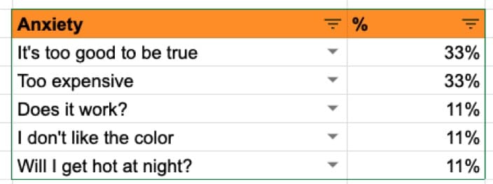
In episode 6 we analyzed Hush.ca, a Canadian DTC brand that sells weighted blankets.
One customer said this:
“I am OBSESSED. I was skeptical that I wouldn’t get very hot at night. I have had this blanket for weeks now and I never got hot at night. It’s also great to help calm my anxiety. I recommend this to everyone”
This review can be broken down into 2 themes:
Theme 1: Results the customer got from the product:
Sub-theme 1: I never got hot at night.
Sub-theme 2: It helps calm my anxiety
Theme 2: Customers’ anxiety and skepticism before buying
Sub-theme 1: Will I get hot at night?
Once you are done bucketing each response in different themes and subthemes, you simply quantify how popular each subtheme is at the theme level.
Here’s an example for the Theme “Customers anxiety and skepticism before buying” that we discovered when analyzing Hush.ca”
How to Collect and Categorize VoC Data
No matter the route you end up taking with qualitative data collection, how you categorize user responses, extract patterns, and view it from the lens of your brand mission will help you weed out stellar ideas from the mediocre, ubiquitous ones.
Collecting VoC Data
Here’s 10 ways you can conduct VoC research:
- In-depth customer interviews
- Customer surveys
- Social media listening
- Sales calls
- Customer reviews
- NPS
- Focus groups
- Feedback forms
- Insights from sales, support and CSMs
- Customer behavior mapping
Categorizing VoC Data
Momoko Price, a conversion copywriter, has a quick and dirty manual VoC tagging kit you can use:
Momoko’s VOC Analyzing Kit – MAKE A COPY TO EDIT / USE
Or, if you’d like to skip the manual effort, you can use VoC analysis tools that run sentiment analysis to tag the data as negative or positive and topic analysis to put in the right buckets.
These tools use Machine Learning so you can train them to look for or ignore certain aspects to get meaningful insights.
How VoC Helps You Find the Right Selling Angles: Practical Example
Eden Bidani, a conversion copywriter at Green Light Copy, has a fool-proof way to look for ideas and angles that aren’t hogged by your competitors.
With regards to finding the right selling angle – it boils down to two things.
- Intense voice of customer research.
So either interviewing existing customers, if you have them. Or doing deep data mining on your target audience. This means diving into forums, Reddit threads, communities to understand how existing customers talk about your product, or how prospective customers express the problems they have and the characteristics of their ideal solution.- A high level SWOT analysis.
How are your competitors pitching their products? You have to identify and understand the Strengths, Weaknesses, Opportunities and Threats – compared to the rest of the market. The idea is NOT to duplicate what they are saying. The exercise helps you come up with strategic opportunities to leverage with what your product can do best.
To illustrate this better with an example, Eden shares her experience with a popular hearing brand.
Most competitors were obsessed with crystal clear hearing as the main selling angle. But customer data revealed that customers expected to hear well—it was the bare minimum.
What prevented buyers from making a purchase was often the cost because often their insurance didn’t cover it and facing the stigma around being “hard of hearing.” Customers didn’t want a conspicuous hearing aid to announce their “weakness.”
This formed the basis of the campaigns that empathized with the fear and promised discretion through the design.
Brand Purpose & Mission Infusion: Create a Unique, Conscious Brand
Your journey to find the best selling angles doesn’t end at customer research—it begins there. Listening to customers shouldn’t mean you create a vanilla brand minus the quirks that make your brand unique.
Peep Laja, Founder of Speero, CXL and Wynter, explains,
Customer research is amazing and super powerful if you use it right. You have to understand what it can do, and what it’s not for.
It won’t tell you much about how to be different. It won’t tell you how to be unique since in interviews people much prefer options that they already know and have seen.
Teaming up with experienced copywriters can help you uncover great selling angles and USPs that consider customer feedback and competitor positioning, while remaining aligned with the brand’s vision, mission and purpose.
When your WHY coincides with the buyer’s pain points, true conversion magic occurs.
A company that is not clear on its WHY stays stuck in ephemeral tactics, in leads that will never close, and in delivering an inconsistent experience to its buyers. Such a business fails on both counts: the promise of the Experience Economy and the execution that’s measured by the Retention Economy.
Trina Moitra, Head of Marketing at Convert
This is the reason you see purpose-driven businesses thrive, even in saturated markets. Take Bombas, for example. There’s nothing particularly unique about socks and T-shirts but the company started with a simple mission: for every pair of socks purchased, one was donated to homeless shelters.
Merging profits with business is how you can create a conscious business. It’s hardly a revelation because the concept has been around for ages but it’s important because when faced with a choice, users flock to companies with a purpose over those without. This is backed by a 2019 Aflac CSR survey.
More Americans believe it’s important for a company to make the world a better place than it is to make more money for its stakeholders. 77% of Americans are motivated to purchase from a purpose-driven business.
Here’s how to infuse your marketing with your purpose:
- Clarify that your purpose is not your product. Don’t obsess over features and benefits—tell the story of how you transform lives with your product.
- Distill the Purpose into Strategy with Vision & Mission. Know your why, what and how.
- Market to humans. Don’t look at the new shiny trend in town—focus on being authentic.
We recommend reading the full post on how to become a conscious business and find your angle.
Testing & Iteration Separate the Wheat from the Chaff: What you think works vs. what actually works
The last piece of the puzzle in finding the best selling angles is to introduce the scientific method i.e. A/B testing your Shopify store.
Lianna Patch, Founder of Punchline Conversion Copywriting, has a handy template to tie the nuggets of data from VoC research and C-suite interviews together:
Aside from mining your existing customer reviews for swipe-able copy nuggets (which you should *definitely* be doing), one way to craft a solid USP is to use a construction like:
“[Product name] is the [clear, succinct product explanation] for people who [want to goal] OR [define ideal customer]”
OK, that’s a little messy. So… WHAT MIGHT THIS LOOK LIKE? (you say, shrieking into your third espresso of the day.)
Here are some examples from my actual recent work:
– For a period underwear company: “ProductName is life-changing leak proof underwear” (OK, this was actually a review-mining nugget)
– For an ecommerce SaaS product: “ProductName is the flexible subscription solution for customer-obsessed CPG brands”
– For an iPad screen protector: “ProductName is the multitasking screen protector you wish your iPad came with”
Now, are these super clever and funny? Of course not. With very few exceptions (wink wink — call meeeee), your USP is not the place to be clever.
Why? Because it’s already so hard to achieve what a USP has to achieve in less than 5 seconds! Your USP has to answer the questions:
1) What is this?
2) Who’s it for?
3) Why should I care?
Whew, I’m tired just reading that.
Tl;dr: Mine your reviews! Be clear over clever. And focus on the end goal: what your customers REALLY want from your product.
Deborah O’Malley, Founder of GuessTheTest, shows us what testing selling angles and value propositions looks like in the wild:
In analyzing hundreds of product page-specific A/B tests, I’ve boiled it down to the top-9 actionable strategies. Each strategy focuses on establishing a USP or selling angle that differentiates your site from the competition.”
- Use narrative to set your product apart from competitors
- Use narrative as your USP
- Use free shipping as a USP
- Test the optimal free shipping threshold
- Tell shoppers ways you make them happy
- Test the effect of adding USPs directly below the CTA button
- Test formatting of your USPs
- Use USPs to ease anxiety and provide reassurance
- Make comparison shopping easy
1. Use narrative to set your product apart from competitors
Step in the power of prose.
With narrative, or story-telling, you can easily create a powerful connection with shoppers, setting your product – and your product page – apart from the competition.
Even if your product page follows a standard template, you can differentiate yourself by presenting a compelling story that grabs attention, facilitates interest, and sparks desire.
Then, the impetus for shoppers to purchase will happen naturally.
Take this real-life A/B test case study as an example:
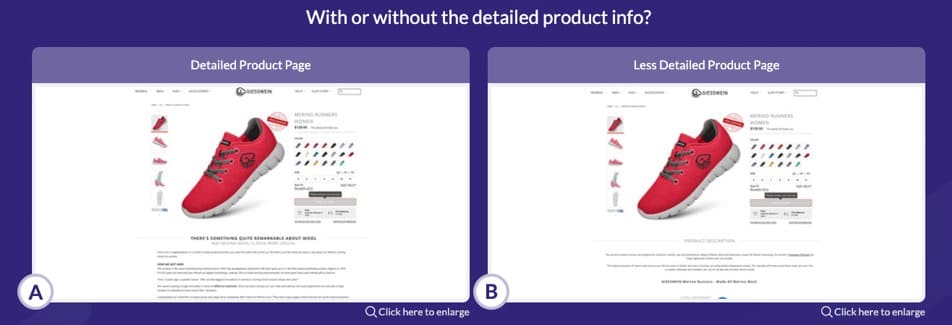
It features the product page of Austrian footwear company, Giesswein.com, a company specialized in making Merino Wool sneakers.
Merino Wool shoes are in themselves unique.
But Giesswein isn’t the only company making them; there are plenty of competitors out there.
What is unique, however, is the company’s story.
It’s one woven together of a family business with a 67-year history of revolutionizing the shoe cobbling craft to make the perfect Merino Wool shoe.
Now, that’s different!
But do shoppers really care? That’s the question the product page optimization agency, Frictionless Commerce, put to the test in this noteworthy narrative study.
The testing team hypothesized telling the story of the shoe company, its values, and its history, would create a compelling connection converting browsers to buyers.
To tease out this test idea, they took the original standard-looking product page, which looked like this:
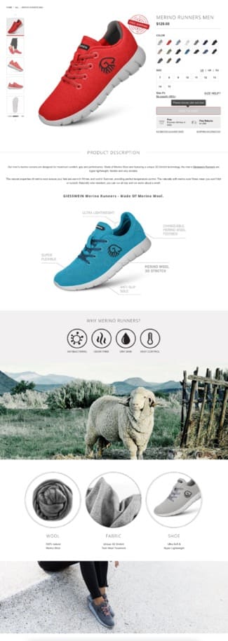
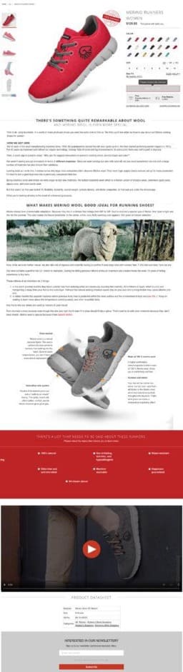
And transformed it with added narrative that read like a choose-your-own adventure novel.
It described the company’s background story and mission, showcased a product video, included a data sheet, and had an interactive features section.
The updated page looked like this:
Which version won?
If you guessed the longer, more detailed product page, you guessed the right test!
Compared to the original version, the narrative product page created a strong 29.28% increase in shoe purchases.
Results achieved statistical significance at a 99% level of confidence. (Read the full study here).
2. Use narrative as your USP
Not many product pages currently take a story-telling approach. To differentiate, you should!
As recognized by the conversion copywriting agency, Wynter, narrative is necessary to distinguish your product:
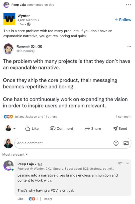
Without an expandable narrative, you’re likely to limit conversions. So use narrative as your USP.
Test the effect of creating a compelling narrative to describe your product.
Tell a story that sets your product apart from competitors while aiming to craft copy that creates a sense of connection.
Determine if adding a compelling, connective narrative to your product page converts.
3. Use free shipping as a USP
Crafting converting copy can be challenging.
But one of the easiest ways to communicate your USP is simply to tell shoppers the benefits of purchasing from you.
Many companies offer great perks, like free shipping. Far fewer clearly state these benefits on the product page.
Without needing to write hardly any copy at all, one fantastic optimization strategy is to add a prominent free shipping notification on your product page, if you don’t already have one.
And, if you already do have one, that’s fine too. It can probably be optimized.
The food delivery company, SkipTheDishes, provides a great example of how to present free shipping as an outstanding USP.
On the equivalent of their product page sits a right-side order pricing bar. Within it, users see a clear free shipping message, framed in an encouraging way.
Rather than simply stating, “free shipping,” the dynamically updated text tells users they’re $X dollars from getting free delivery, based on the amount they’ve already added to cart.
The message looks like this:
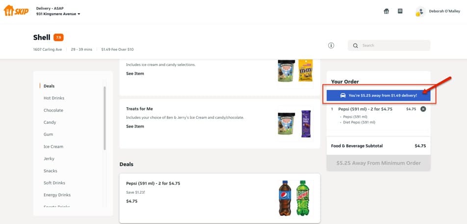
Since delivery charges can sometimes be as much as the food itself, you can bet most users add more to their order to take advantage of the free shipping.
A dual benefit.
First, it encourages users to add more to their cart. Second, it makes free shipping a highly desirable, tangible target that serves as a unique selling point.
If your site offers free shipping, but it’s not clearly stated on your product page, test the effect of clearly adding it to the page.
If you’ve already clearly shown you provide free shipping, consider stating the free shipping offer in a way that encourages spending, similar to how SkipTheDishes does it.
4. Test the optimal free shipping threshold
But don’t stop there.
In addition to offering free shipping, test the optimal free shipping threshold as an additional USP on your product page.
For example, In this eCommerce A/B test for clothing retailer, SpiritHoods, tested the effect of changing the advertised free shipping amount from $99 to $199:
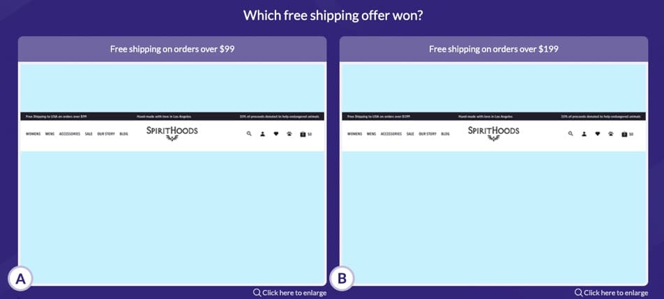
Can you guess which version outperformed?
If you think version B, with free shipping over $199, you’re right!
Making it so shoppers had to spend more to get free shipping had a hugely positive impact on sales.
The version with the higher shipping threshold led to a 24% increase in RPV, compared to the version with the $99 shipping offer.
As well, increasing the shipping threshold accelerated AOV by 5.6%, compared to the lower $99 offer.
Results achieved 90% confidence. (Read more about the results here).
Test idea:
If you offer free shipping, test free shipping thresholds as a USP and a Unique Sales Profit idea for your product page.
It may take some fancy math, but try to find the optimal point at which you profit most because shoppers buy more to get free shipping.
Just be careful not to upset customers. You don’t want to make your shipping threshold so impossible to obtain, it’s obvious you’re pricing it in your best interest, not theirs.
5. Tell shoppers ways you make them happy
If your company doesn’t offer free shipping, that’s okay.
There must be something you have that shoppers love.
For example, maybe you provide free returns? Or maybe you honor exchanges – even on products already worn?
Whatever you do to make customers happy, that’s your unique value proposition.
Flaunt it!
And don’t take for granted users already know about it.
In a meta-analysis I conducted on A/B testing platforms, one of the most revealing findings was, most sites don’t clearly communicatie how they’re different or better than their competitors.
Yet, in speaking with the site owners, they instantly rattle off all the things that make them better.
The knowledge is in their heads, but not presented on the website.
So make sure you don’t make that same mistake.
You customers likely don’t know how great you are until you tell them why and what makes you so special. So communicate it!
Unsure how to communicate your USPs?
Here’s real-life A/B test inspiration from Dutch fashion retailer, Omoda.
As you can see, originally their page didn’t have a USP section. It looked like this:
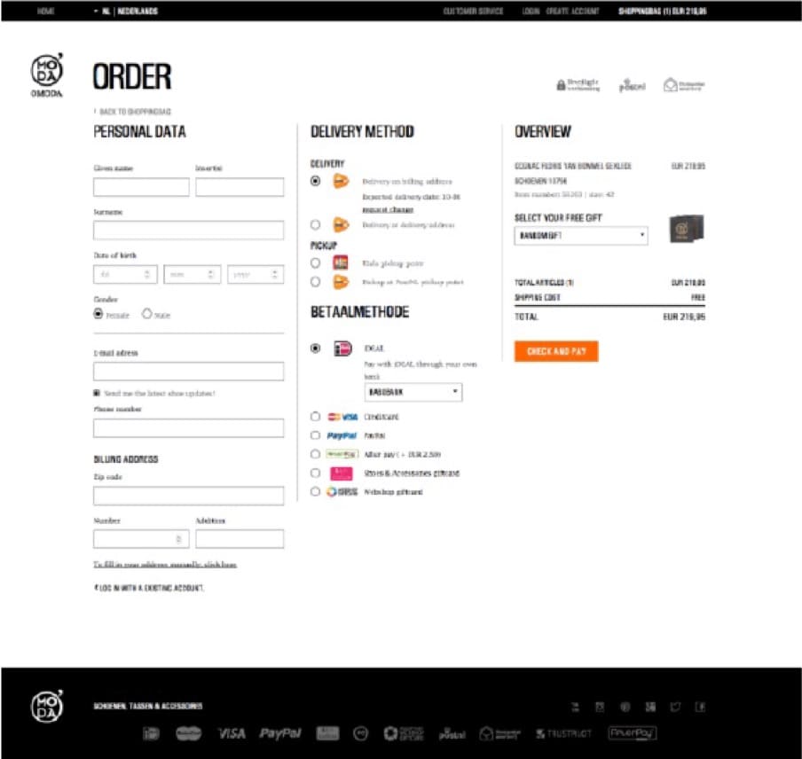
However, in analyzing the data, the testing team realized customers weren’t clear on all the company’s benefits.
So they decided to test the effect of adding a USP banner in the top header.
The banner emphasized the key purchase benefits and stated (in Dutch):
- Free shipping and returns
- Pay afterwards
- Delivery 1 to 2 working days
- 30 day return policy
- 100% secure shopping
The updated page, with the top USP banner, looked like this:
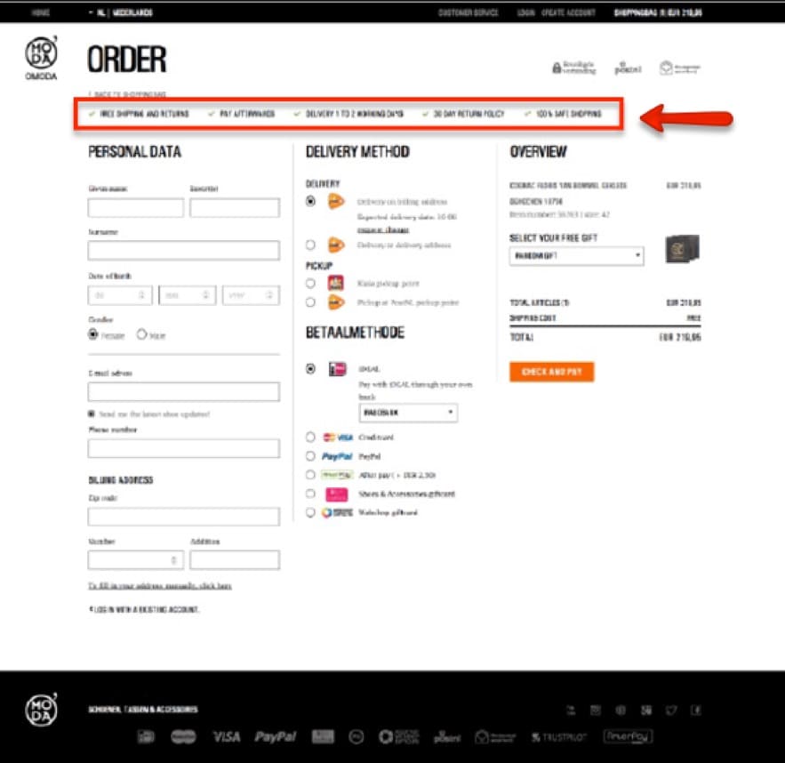
Can you guess which test won? With or without the USP banner?
If you guessed with the USP header, you guessed the right test!
Adding the USP banner led to a strong overall sales uplift. Results varied by viewing platform, but sales increased:
- 9% on mobile devices
- 5% on tablets
- No uplift on desktop computers
Results achieved statistical significance at a 99% level of confidence. (You can learn more about the study and results here).
If your product page, or site, doesn’t already have a top-placed USP banner, test the effect of adding one.
Consider making it sticky, or persistent, so it scrolls with users as they move down the page, providing a constant reminder of the value you offer – and why customers love you.
Pro tip: test the effect of adding an add to cart CTA within the sticky USP bar on the product page.
A USP banner placed in the top header can work well.
But as this product page from LuxyHair shows, USPs may convert equally when placed directly under the CTA button:
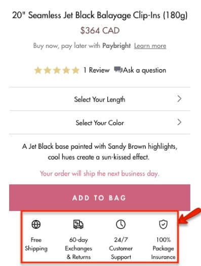
This USP placement is strategically because it’s closest to the point of conversion. So it provides a visually-associated reference between the CTA and the messaging.
That said, test, don’t guess on optimal placement!
In one client-run A/B test, the eCommerce retailer added a free shipping and returns guarantee directly under their add to cart CTA button on the product page.
The team was so confident the added USP section would work, it was nearly decided to implement the element without testing.
But testing is done because you never truly know what will work. . .
In this case, surprisingly, the added USP section far under performed on mobile – the majority of the site’s traffic. And it only moderately lifted add to cart conversions on desktop.
It’s hard to for sure know the reason why, but it provides a valuable lesson: the effectiveness of USPs don’t always translate across device types.
On larger desktop screens, USPs tend not to stand out as much.
But, on a smaller mobile or tablet screen, the USP section is harder to miss. It, therefore, likely will catch more viewers’ attention, so needs to be formatted to not detract from the CTA button.
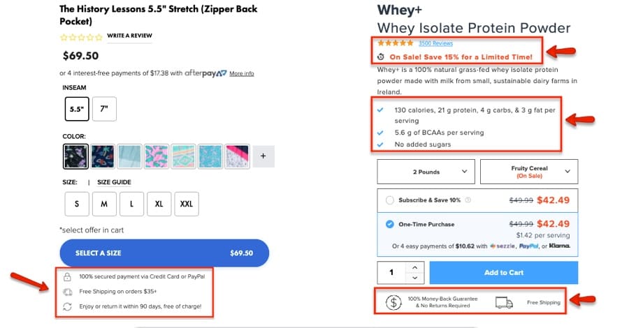
7. Test formatting of your USPs
The optimal format of your USPs will depend on your site and brand guidelines.
However, generally speaking, you want to present any value proposition in a clear, quantitative, and concrete format.
Bullet points, check marks, or with icons and short text statements are all easily scannable.
And they don’t take visual prominence away from the CTA or page content.
Elements like these may work well for your site:
Test idea:
Test optimal placement, sizing, color, and formatting. Keep iterating to optimize performance.
8. Use USPs to ease anxiety and provide reassurance
USPs, typically, work best when they anticipate pain points, or objections, and preemptively address these concerns before users even have the chance to fully consider them.
For example, when shopping online, some of the frequent anxieties customers may have include:
- How much will shipping cost me?
- What happens if the item doesn’t fit? Can I return it?
- How long do I have to return the item?
- How quickly will my order arrive?
- Is the checkout secure? Can I trust the site with my credit card details?
Taking the initiative to address these concerns, in a positive way, may ease anxiety, offer reassurance, and prompt shoppers to convert with confidence.
Most marketers apply this easing strategy on the checkout page, where trust badges and secure checkout symbols are typically placed.
But have you ever considered adding reassuring trust symbols on your product page?
In this real-life A/B test, the customized art prints retailer, Armourprints found doing so strongly lifted conversions.
As shown in the screenshots below, on the original site, there were no trust badges at all. In the updated version, trust elements were added across the site, including the product page:
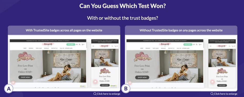
The effect?
The version with the trust banner placed across the site was the solid winner!
Overall, across desktop and mobile, it resulted in:
- 11.95% increase in add to cart conversions
- 9.28% increase in purchases
This uplift translated to over a $35,000 monthly increase in revenue. (For more info on this case study, check out the full write-up here).
This A/B test shows, trust badges don’t just belong on the checkout page. Adding them to the product page can be a conversion coup.
That said, whether it’s a trust badge, a secure credit card icon, or any other USP format used, it’s important you test placement.
You don’t want to bring up anxieties the user doesn’t already have.
For example, if you’re selling supplements, the USP on the product page is not the place to tell customers about potential side-effects.
Test Idea:
Test the effect of placing trust icons and security badges on your product pages.
However, ensure the USPs are preemptively presented in a positive way that eases rather than creates anxiety.
9. Make comparison shopping easy
One fantastic strategy for highlighting your USPs is adding a comparison chart on your product page.
The chart should outline your product against the competitors and show how yours outstrips theirs.
An important caveat, within the comparison chart, your company shouldn’t be the absolute best at everything.
The comparison chart needs to appear objective.
It needs to come across an authentic, real, and trustworthy source of trust – not exaggerated or bogus claims.
The supplement site, Legion Athletics, provides a great example of an optimized eCommerce product page which uses a comparison chart as part of its USP:
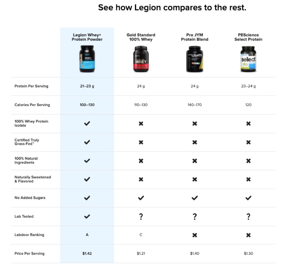
The chart succinctly tells a story and makes it simple for shoppers to get an at-a-glance view of how the product compares to the competition.
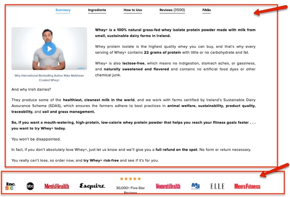
Additionally, the section right above the chart is chock-full of convincing copy, followed by social proof:
Which, altogether, creates a compelling and unique value proposition.
Save your shoppers the work of having to determine why your product is best. Summarize it for them in an easy-to-scan, side-by-side view comparison chart.
This chart inherently acts as the USP because it shows how you outperform competitors. Test the effect of placing a comparison chart on your product page and see if sales soar.
Create a learning repository to keep track of selling angles that work, and the ones that tank.
Finding selling angles is like playing Jenga: You build, test, win/lose, and build again
Looking for the right selling angles is an almost never-ending, iterative process. But it’s worth the time and effort because copy is crucial to increasing conversions, trust and loyalty.
Here’s some research to chew on:
- People pay more attention to your product if you describe the detrimental effects of the problem you’re solving [2016 study into emotional marketing].
- The first line in any sequence has the greatest emotional impact and influence on purchase decisions [2007 study by Qiu and Yeung].
- Personalized CTAs convert 202% better [HubSpot].
That said, like Jenga, there is no one right way to win. And, fortunately, with an A/B testing platform like Convert, you don’t have to be anxious about making money moves.
Bookmark worthy: The Entrepreneur’s Guide to Shopify A/B testing