26 A/B Testing Examples to Inspire Your Next Test

In your journey into A/B testing, you’ve probably come face-to-face with this popular 2004 quote by Jeff Bezos:
If you double the number of experiments you do per year, you’re going to double your inventiveness.
That’s all well and good, but what if you don’t know what to test?
You know that A/B testing unravels insights that can translate into business growth and set new records in revenue generation, but the problem is when you sit down to test something on your website, landing page, email, etc. and turn up blank.
Where lies the opportunity for optimization?
Thankfully, you can get hints from someone else. There are examples of A/B testing in marketing that turned out successful and helped businesses increase their conversion rates.
These examples can be a springboard for your own conversion rate optimization journey — something to trigger a train of thoughts that’ll lead you closer to your winning hypothesis.
I dug deep and pulled out the best of them, sorted by what’s relevant to you; by industry or by channel. You’ll get the info about them to help you spot A/B testing patterns to give you testing ideas and inspire your own success story.
- How to Extract Maximum Insights From an A/B Testing Example
- A/B Testing Examples to Learn From and Inspire Your Own Tests
- Conclusion
How to Extract Maximum Insights From an A/B Testing Example
Before we begin, let’s set the right expectations about A/B testing examples and how to use them correctly.
It’s easy to check out what your competitor or someone else is doing and think to yourself, “You know what? I’m going to do exactly that and see what happens.”
Chances are, that’s not going to work for you. You’ll end up wasting resources testing something that doesn’t work with your unique business model, audience, and brand.
Instead, you get inspiration from what they do — not only from their winning tests but also from those that lost.
But if we’re being honest, you hardly hear stories about failed tests even if they’re also packed with insights. At least the tester learned what doesn’t work.
Draw inspiration from these examples and use elements of the solution tested to develop your hypothesis (if that jives with the qualitative and quantitative research you have conducted). Then, run an A/B test to see if that moves your desired metric.
These A/B testing case studies are meant to help you think outside the box, and most importantly, see how the often disparate data points you collect through your research can be tied together with specific solutions.
On their own, they can seem like isolated incidents but put together, it makes sense why a certain solution trend works. This often gives rise to “best practices”. But like I’ve said earlier, you should only adapt this to your unique case, not copy and paste it.
So, whether the elements and solutions come from the DTC or B2B industry, or were used in a PPC campaign or email newsletter, if you track the uplifts and results, you’ll be able to see patterns. (This is the basis of the work that is done by Jakub Linowski at GoodUI).
These patterns can inspire your next big insight and take your experimentation program to a new triumph.
A/B Testing Examples to Learn From and Inspire Your Own Tests
All the A/B testing examples below are split into different categories based on the industries they served and the channels they ran on.
A/B Test Examples by Industry
Let’s start with a couple of examples from various industries and see what parallels we can draw between them.
B2B A/B Testing Examples
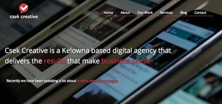
Csek Creative: Homepage Tagline Test
Csek is a digital agency whose homepage tagline reads: “Csek Creative is a Kelowna based digital agency that delivers the results that make business sense”.
If you’ve got some experience with copywriting, you can instantly sense the vagueness of that line. It doesn’t hit an immediate need in the mind of the reader. So, it could be the reason people were bouncing off the page.
And Csek wanted to decrease its bounce rate. So, the goal was to test if the tagline was the culprit.
Hypothesis: Change the tagline to something more explanatory and specific about the services offered to see if there will be an improvement in bounce rate and click-throughs to other pages on the site.
The “B” tagline was: “Csek Creative is a digital agency that helps companies with their online and offline marketing needs”
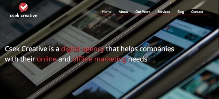
The updated text was shown to over 600 site visitors and resulted in an 8.2% increase in click-throughs to other pages on Csek’s site.
What you can learn from this: Clarity about your offering in the first seconds of visiting your site is vital. Online audiences have a low tolerance for ambiguity and wouldn’t want to burn calories trying to figure out what you do. If bounce rates are up on your homepage, check if people can immediately understand what you do.
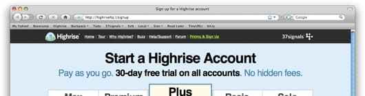
Highrise: Signup Page Headlines
Highrise wanted more signups and decided to check out how effective different headlines and subheads were going to be to the conversion rate. So, they decided to run a multivariate test for a sample of 4000 page views.
Hypothesis: If the headline and subhead are changed to emphasize different benefits, then one of those benefits will perform better than the original.
Variants:
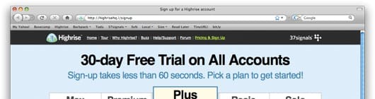
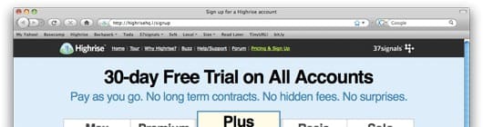
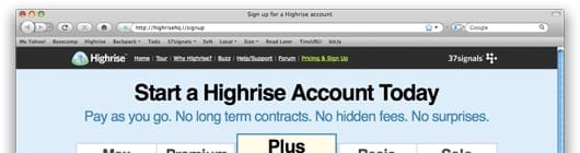
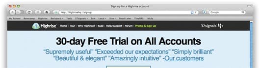
The winner (the one that performed 30% better than the original) placed emphasis on “30-day free trial) and the speed of signing up. And the CTA button was super simple: just “pick a plan to get started”.
What you can learn from this multivariate test: If there are several benefits for your product or service, knowing which one to emphasize on your landing page, homepage, or signup page isn’t something to leave to guesswork. Test them, maybe all at a time, with A/B/n tests, and see which one resonates the best with your target audience.
Techinsurance.com: Landing Page Conversion
Techinsurance.com wanted a higher conversion rate for their pay-per-click campaign. Originally, all traffic was directed to their website’s homepage.
So, they decided to create a dedicated landing page for the campaign, drive traffic to it, and see how it performed in comparison to the website homepage.
Hypothesis: Create a dedicated landing page, direct traffic to it, and it will convert better than the website’s homepage.

Variant:
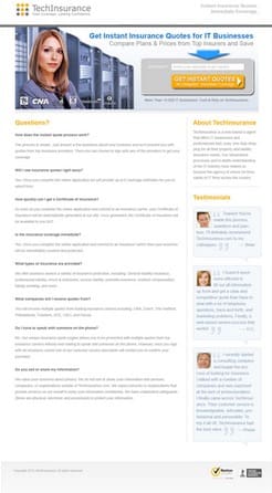
The landing page that was designed for the PPC campaign converted 73% better than the website homepage.
What you can learn from this: Potential customers wouldn’t stay on your website long enough to see if your messaging speaks to them directly. There needs to be an instant spark of “Oh yes, there’s more.” To improve the performance of your ad campaigns, test a designated landing page that speaks specifically to the audience your PPC ads are bringing in.
DTC A/B Testing Examples
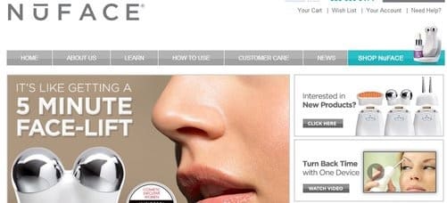
NuFace: Incentive Test
NuFace provides anti-aging skincare products directly to its customers. They found that although people were interested in their products, not many were completing their purchases. And this wasn’t in line with NuFace’s goals to grow their online process and improve sales.
Hypothesis: If we offer customers a free shipping incentive when their order totaled $75 and more, there will be more sales and order completions.
Variant: They found that the incentives encouraged people to complete their orders. Over 90% more orders were completed and boosted order value by 7.32%.
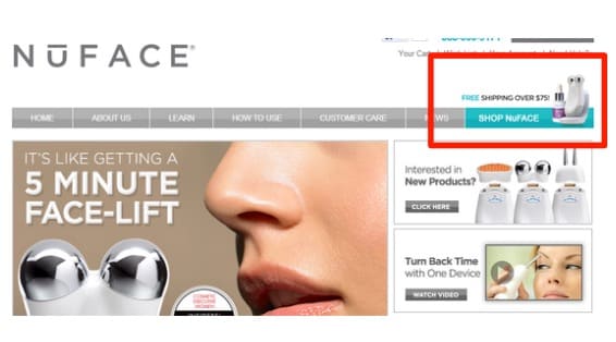
What you can learn from this: A free shipping incentive at a certain price minimum can improve the average order value. This is something worth testing.
Luxury Handmade Glass Brand: Free Shipping Profitability
If you offer free shipping to your customers, how do you know you’re still profitable with that offer? How do you know you’re more profitable with the free shipping offer than without it?
That’s what this luxury handmade glass brand wanted to find out when they hired Brave One to help out.
Hypothesis: It was more of a question: Does the free shipping offer bring in enough revenue to offset shipping costs and still make profits?
Variant:
When the 25,000 web visitors were split 50/50 between the control and challenger (that had the free shipping promo bar) and ran for 15 days, they found that the free shipping offer boosted revenue by 20%. That’s an additional $16,000 revenue.
What you can learn from this: Free shipping definitely improves conversion rates, but you’ll need to test if it is beneficial to your bottom line in the long run. With A/B testing, you never have to run your business on assumptions.
Vancouver 2010 Olympic Store: Single Page vs Multi-Step Checkout
Should you split the checkout process into several pages or have just one page for the whole process? How will this affect conversion rates? That’s the question this test answered for the Official Vancouver Olympic store.
Hypothesis: Combine the multi-step checkout process into one single page and more orders will be completed.
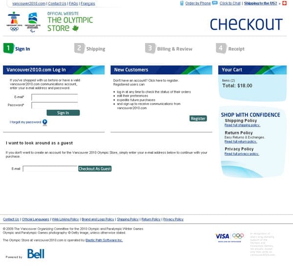
Variant: With 50% of the traffic going to both versions of the checkout process, 300 transactions were enough to see the winner. But they let it run up to 606 transactions and found that the single-page checkout outperformed the multi-step process by 21.8%.
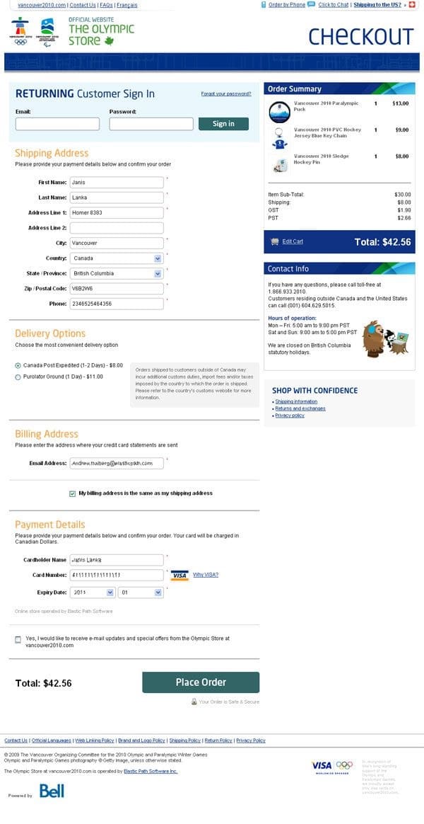
What you can learn from this: Not all checkout processes perform the same way. For this target market and product niche, the test results show the audience preferred a single-page checkout. What does your audience prefer?
Ecommerce A/B Testing Examples
Lampenlicht.nl: Specs Under Product Images
Lampenlicht.nl hired Mintminds to improve the add-to-cart rate of their product pages and revenue per visitor.
So, Mintminds delved into their qualitative and quantitative data and found that visitors wanted to see the products in the online store from different angles and weren’t really into highly technical specs. Also, USPs like “in stock” and “fast delivery” got them excited.
They designed a test that attended to these needs compared to the original product pages.
Hypothesis: It was “if one important product feature or USP is textually shown below each product image from the second product image onwards (in the carousel) then the number of transactions will increase since buyer information needs will be better served in a location that is already frequently viewed.”
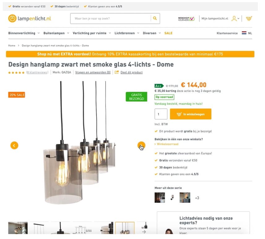
Result: The control and variant were served for 28 days and compared to the control, the variant showed:
- 13% increase in add to cart
- 4.96% increase in order conversion rate, and
- 6.58% increase in revenue per visitor
Overall, the ROI of the test was 116%.
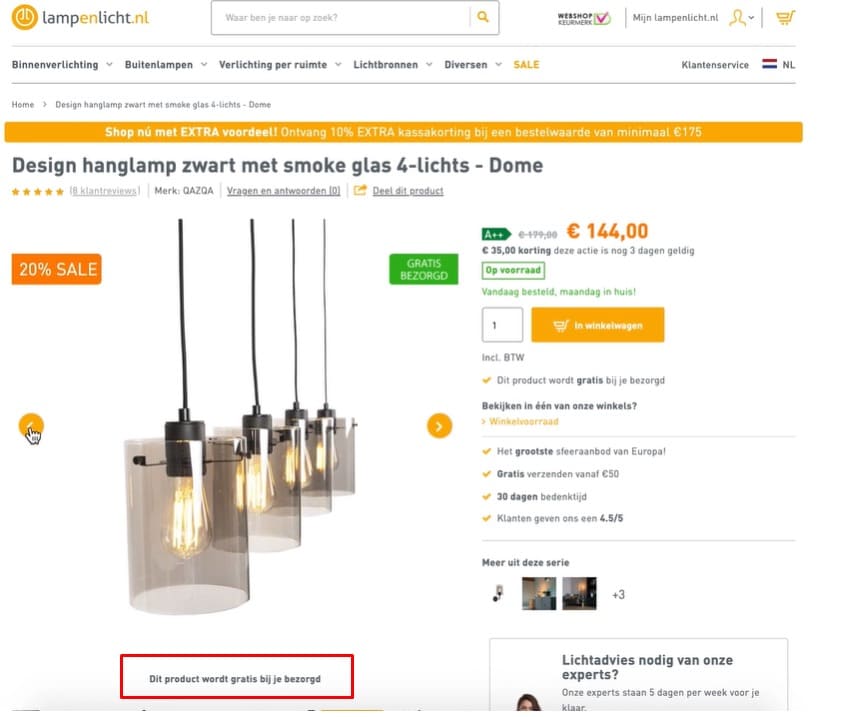
Main takeaway: Gather valuable data about how your visitors are using your site. You’ll discover leakages or clogs in your conversion funnel. This can help you test solutions to the problem and unravel a new and better way of doing what you already do.
Online Grooming Store: Offering Purchase Guidance
An online grooming store was looking for ways to optimize their bundle offering of scents for men. They asked Conversion Fanatics to help out, so they can learn how to persuade more people to buy (or subscribe to) their product.
Conversion Fanatics ran a poll to reveal the obstruction and found that people hesitated to buy because they found it hard to make a choice.
Hypothesis: Helping people to choose which scents to buy will improve sales.
Result: When the store featured a guide that explained what the scents smelled like, provided guidance on choosing a scent, and showed them equally to 2000 visitors, they found it increased revenue per visitor by 37% and led to a 53% increase in completed orders.
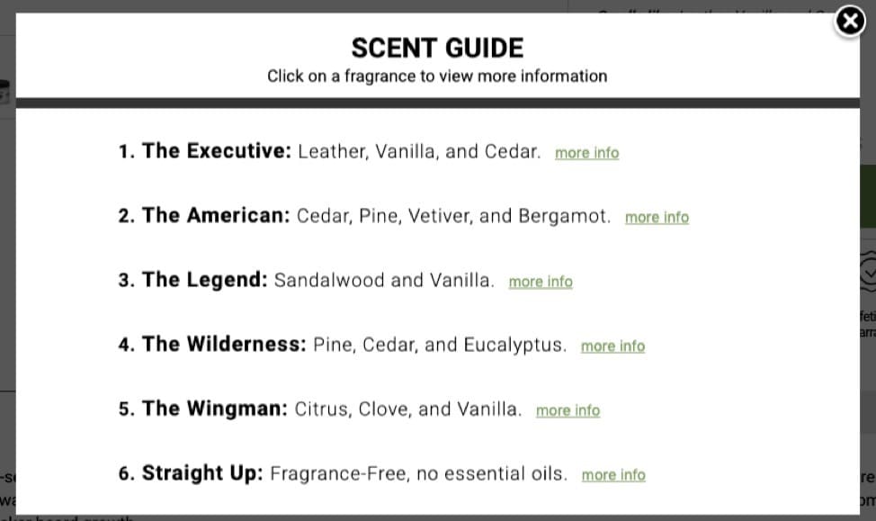
What you can learn from this: People tune off at the slightest appearance of friction. This could be UI or even a decision problem. In the case of a decision-making problem, you’ll have to talk to your customers to know where it itches and test a solution.
Button Text: Add to Bag vs Add to Cart
Many successful ecommerce brands use “add to bag” in their button copy. Other ecommerce websites still stick to “add to cart”. The fashion and accessories brands seem to lean more towards “add to bag” text but would that work for you too?
Conversion Fanatics ran a test to see how “add to cart” performed compared to “add to bag” for one of their clients.


Hypothesis: Changing the button text from “add to bag” to “add to cart” will result in an increase in button conversion.
Result:
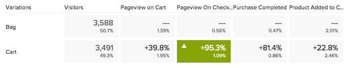
In this case, when “add to cart” was used:
- Pageviews on the checkout page grew by 95.%
- Purchases went up by 81.4%
- Add to cart improved by 22.4%
This is a major lift — but note: it was for this specific ecommerce store. But worth testing, don’t you think?
What you can learn from this: There could be a lot of lift hidden in your shopping cart button text. Just changing 1,2, 3 words can mean a major difference. It’s the same for button color.
NGO A/B Testing Examples
Kiva.org: Above the Fold of Donation Landing Page
Kiva.org is a non-profit organization that helps to alleviate poverty by connecting people to lenders via the internet. You start at $25 and help someone somewhere in the world to achieve a certain goal.
Their landing page for first-time visitors looked ripe for optimization. After brainstorming, they came up with some opportunities for improvement and decided to test them.
They set up 3 variants to challenge the original (which was already looking great):
- A plus version (with some explanations, format changes, and auto-rotate carousel)
- A large slider version (visually attractive with a progress meter)
- A video version (90-seconds explanation of how it works on auto-play)
There was also an additional variant that focused on adding trust elements to the bottom of the page.
Hypothesis: If we provide more information about how it works in a text, image, and video version to visitors, more people will donate. The idea was to inspire more trust.
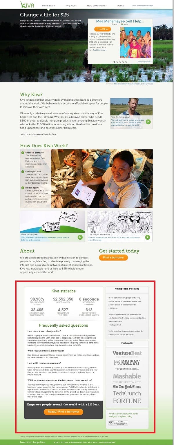
Result:
The first 3 variants only showed small lifts but the stats weren’t solid enough to confidently declare a winner. But the variant with the bottom area trust elements boosted the conversion rate by 11.5% at over 95% confidence.
What you can learn from this: People want to know more, especially when they’re donating money. They want to know where their money is going and if they can trust you enough to take it where they intend to send it. Is your donation page helping visitors trust you better?
John C. Cook: Text vs Video
The non-profit, John C. Cook, knows about the engagement benefits of videos. So, they decided to test it in their emails to see how well it performed compared to text emails in terms of engagements and donations.
Hypothesis: Redesign the marketing message in emails from text to video and it will increase engagements and donations.
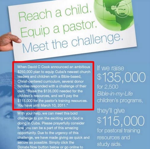
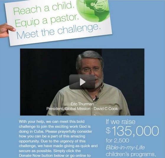
The video message led to 43% more click-throughs and donations went up by 114% as a result of this version.
What you can learn from this: Heard about a best practice that improves one of your favorite metrics? Test it to see if it works for you first. Prove its validity before it makes a major dent.
Also, consider using videos or other interactive elements to inspire more trust and add one more dimension to the personality of your organization.
SaaS A/B Testing Examples
Earth Class Mail: Landing Page Optimization
Earth Class Mail was acquired by Xenon Ventures, and Xenon invited Conversion Rate Experts to help grow the business to its full potential.
One of the things they did was optimize the landing page in this A/B testing case study. They rejected best practices and went for a lean and simple page. Here’s the control and challenger:
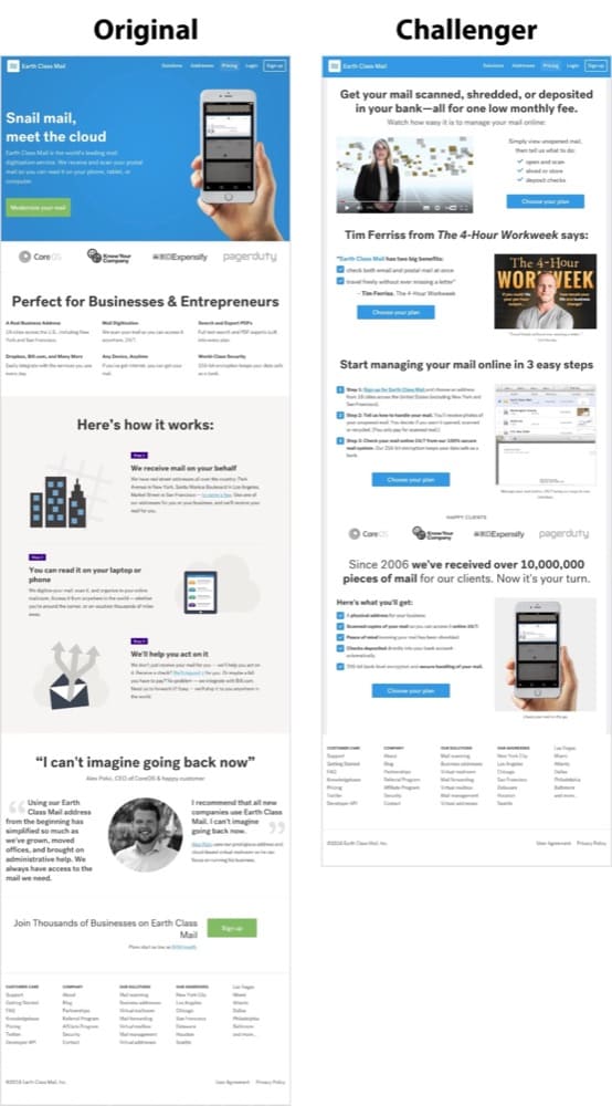
Hypothesis: After studying qualitative and quantitative data gathered from surveys and polls, customer service team data, and Google Analytics, they hypothesized that a total revamp of the landing page to a “simple and lean” version will outperform the original.
Result: They were right. There was a 61% increase in leads generated on the challenger version.
What you can learn from this: Don’t always abide by best practices. Use your own research to figure out points in your sales funnel that can use a little less friction.
HubSpot: Site Search Feature
HubSpot ran an A/B/n test to see what will get people to engage more with their site search tool.
They designed 3 variants:
- Variant A – the site search bar was more visible and the placeholder text was changed to “search by topic”
- Variant B – the site search bar was more visible and the placeholder text was changed to “search by topic” but for only the blog, not the entire site
- Variant C – the search bar was more visible, with placeholder text “search the blog”
Hypothesis: If the site search bar is more visually prominent with the right placeholder text, people will interact with the tool more and it will lead to a higher blog lead conversion rate.


Result: The 3 variants did better than the original. There was a higher conversion rate with variant C winning at 3.4% and a 6.46% increase in user engagement with the search bar.
What you can learn from this: Even seemingly negligible features on your webpage can lead to higher conversion rates. Use qualitative data like heatmaps to figure out where your users are clicking, use that to build a story of how they use your site. You can find ideas of what to test in there.
Netflix: Featured Video Artwork
Netflix is one of the big names in the world of experimentation. They’re known for running thousands of tests and being open about it on The Netflix Tech Blog.
One of the most popular ones is selecting the best artwork for videos. They do this with A/B testing, and the goal is to help members find something to watch and engage more with each title.
One example is the test for a better artwork for The Short Game.
Hypothesis: The default artwork did not tell the story of the movie effectively. A better artwork would, widen the audience and increase engagement.
Result:
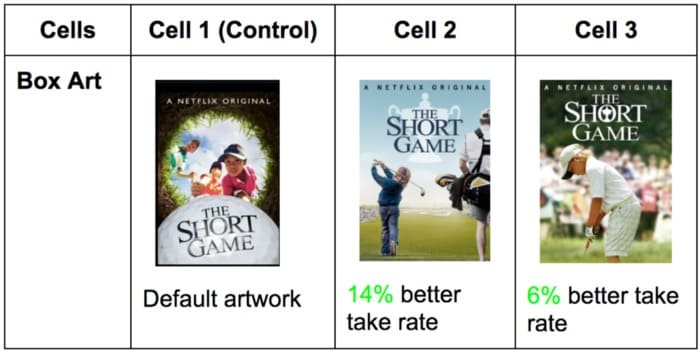
One variant resulted in a 14% better take rate.
What you can learn from this: Visual storytelling can be optimized to increase conversion. Are your graphics saying exactly what you want them to say? Or are they holding back a better customer experience that could lead to higher conversion rates?
Now that we’ve shown you quite a few examples of A/B tests for B2B, DTC, ECOMMERCE, NGO, and SaaS, let’s do the same for the different channels you can run tests on.
A/B Test Examples by Channel:
A/B Testing Landing Page
Humana: Landing Page Banner
Humana wanted to improve the performance of its landing page banner. The control had a lot of copy that didn’t perform well, along with the CTA.
Hypothesis: Improve the headline, feature shorter, more concise copy, and a stronger CTA, and this will improve the click-through rate.
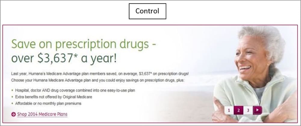
Result: They did that and found version B had a 433% increase in clickthrough to version “A”. That’s huge, but what if it can be better?
For version “C”, they tried a different (and stronger) headline and CTA featuring the word “shop”. This one went higher by 192%.

What you can learn from this: 5 times more people will view your landing page’s banner than the rest of the page. Ensure what you have there is seizing attention and speaking directly and clearly to your target audience.
Also, your best can be better.
Brookdale Living: Visual Elements
Brookdale Living provides community and assisted living for the elderly. They wanted their “Find a Community” to do better in attracting more interested people to their service.
So they explored the idea of improving the page with more trust signals, social proof and USPs. One more element was needed but they weren’t sure which will perform better: Image vs Video.
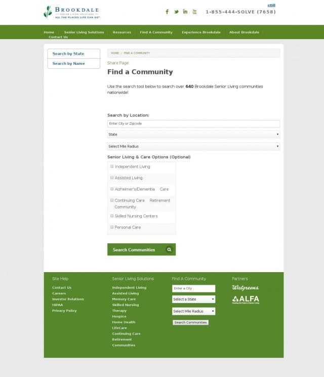
Hypothesis: With a new landing page built with trust signals, a video will make the page perform better than if it had an image.
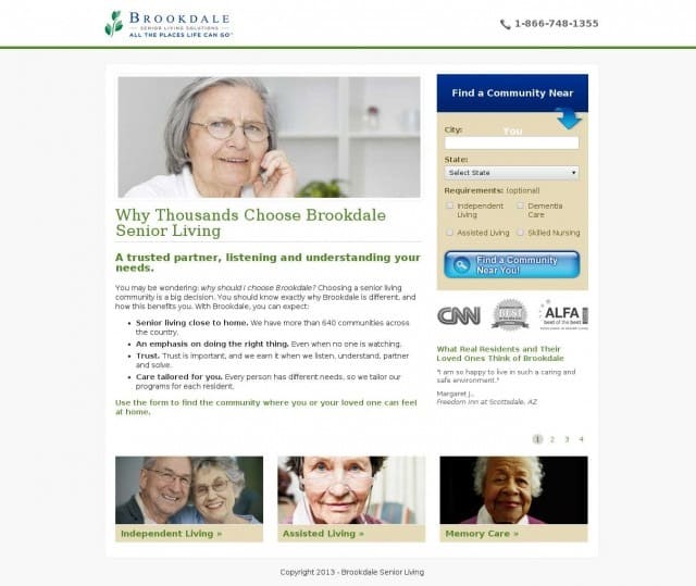
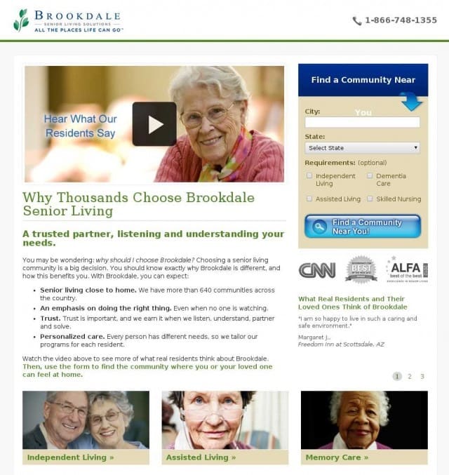
Result: The video version that featured residents talking about their amazing experiences with Brookdale lost to the version with a static image. In fact, the static image increased revenue by $106,000.
What you can learn from this: Again, best practices couldn’t defend themselves in an A/B test. I’m not saying all best practices are bad, but always be testing to find out what marketing strategy works for your unique audience and business.
Landing Page Form Position
Here’s an example that went against the grain:
Hypothesis: If we move the landing page form from the right side to the center of the landing page, there’ll be more form submissions.
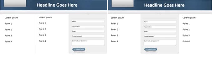
Result:
Even though the landing page was already optimized and delivered an 11% conversion rate, this simple repositioning of the form boosted the conversion rate to 16%.
What you can learn from this: Having your form in the center of your page is not a “best practice”, but somebody wanted to try a different functionality and seize an opportunity to further optimize an already optimized page.
A/B Testing Email Examples
Designhill.com: Email Headline Style
When the peer-to-peer crowdsourcing platform for graphic artists, Designhill, wanted to send an email newsletter a few days before Christmas to promote a blog post, they wondered what headline would have the highest click-through rates.
Hypothesis: Using the blog title as the email headline was sufficient to attract clicks compared to a call-to-action style of headline.
Blog headline: Top 10 Off-Page SEO Strategies for Startups in 2015
CTA-style headline: Check out My Recent Post – Top 10 Off-Page SEO Strategies for Startups in 2015
Result: The blog headline style performed better with a 5.84% higher CTR and 2.57% higher open rate than the CTA-style version.
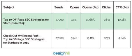
What you can learn from this: The closer the benefit of your headline is to the beginning, the slimmer the chance you lose your audience. Get the benefit closer to the beginning of your email headlines and test to see if it performs better.
“Merry Christmas” vs “Happy Holidays” Email Headline
What should the headline of your holiday email be if you’re trying to get people to come over to your site and browse your collection?
Hypothesis: If we go with “Merry Christmas”, it’ll outperform “Happy Holidays” or a combination of both of them.
Result: Absolutely right (in this case, of course). “Merry Christmas” resulted in a 2.57% higher CTR. See the details in the screenshot below:
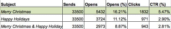
What you can learn from this: Personally, I prefer being greeted with “Merry Christmas” as opposed to the vague “Happy Holidays” or its sister “Compliments of the Season”. It’s slightly annoying to me. But the latter is more inclusive and works better for a larger, more diverse audience.
Microsoft: Email Color Scheme
Microsoft wanted more people to click on the links in their emails and tested the effect of the color scheme. This included buttons, backgrounds, and text colors.
Hypothesis: A different color scheme will have a significant effect on CTR.
Version A (white background, full product image, and purple CTA) vs Version B (orange background, cropped product image, and pink CTA).
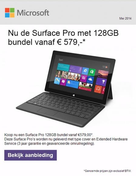
Result: Version A (with the white background) had 325% more click-throughs than version B.
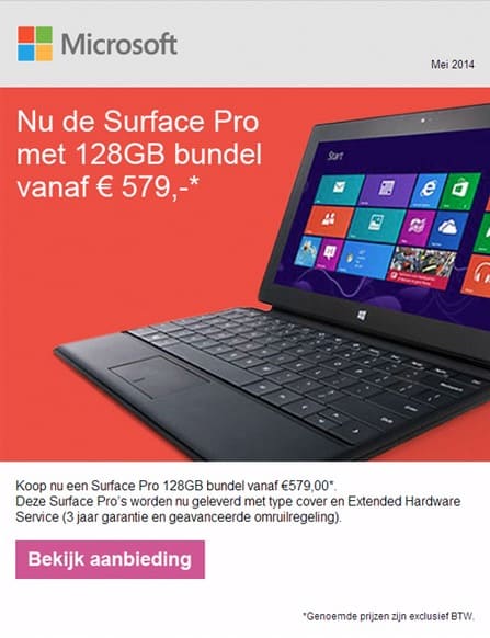
What you can learn from this: I would test other color schemes because this shade of orange may be too aggressive visually. So, consider testing a gentler and more peaceful color to beat the control. Some things like background colors might not be at the top of your email marketing test ideas, but the impact could virtually change your business.
A/B Testing PPC Examples
Adspresso: Facebook Ad Copy
Adspresso ran two Facebook Ads to see which will attract the most likes.
Hypothesis: A different ad copy that says “pro tips” will beat one that says “daily tips” + “& increase your ROI!”.
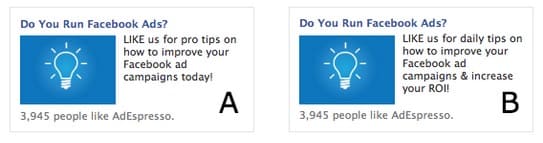
Result: It turns out adding “& increase your ROI!” couldn’t save version B from being obliterated by version A. Version A got 70 likes and version B got 0.
What you can learn from this: Most of the time, people want tips that tell them something they don’t already know. “Daily tips” sounds like that’s going to be many days of random things you know and once in a while, you’ll get something surprising. It doesn’t really get you excited like “pro tips”.
Where in your social media marketing copy can you add an exciting language?
Sony: Personalized Banner Ad
When Sony wasn’t getting the results they wanted from their banner ads, they decided to tweak the copy and test ways to make it sound more personal.
Hypothesis: Personalized ads lead to higher conversion rates than promotional ads.


Result: There are levels to personalization. There’s just saying it and then there’s creating the feeling of personalization.
Version A that said Create your own VAIO laptop performed better than the other two. It had 6% more CTR and was added to cart 21.3% more than the control.
What you can learn from this: Ad copy that speaks directly to the audience in a personal tone using words like “you” and “your” creates a stronger emotional connection that often translates into better success with that ad.
PPC Ad: CTA Copy
Brad Shorr told Wordstream about a PPC ad A/B test his team ran to find what CTA copy performed best between:
A. Get $10 off the first purchase. Book online now!
B. Get an additional $10 off. Book online now.
Hypothesis: CTA A will lead to a higher click-through rate than CTA B.
Result: The click-through rate of CTA B was, in fact, double that of version A.
What you can learn from this: It seems like “additional” did the trick when compared to taking something “off”. It has more positive reinforcement. That’s something worth testing.
A/B Testing Shopify Examples
Oflara: Mega Menu
Oflara experimented with a mega menu that showed best-selling products in the navigation bar in each product category. This also contained a CTA link to view the full collection.
This was meant to feature best sellers in the navbar, as opposed to the simple menu that didn’t have any drop-downs.
Hypothesis: “If we utilize the site’s menu to highlight our best offers, this will lead to an increase in our store revenue.”
Result: After running the test, the variation was the obvious winner by a whopping 53% increase in revenue.
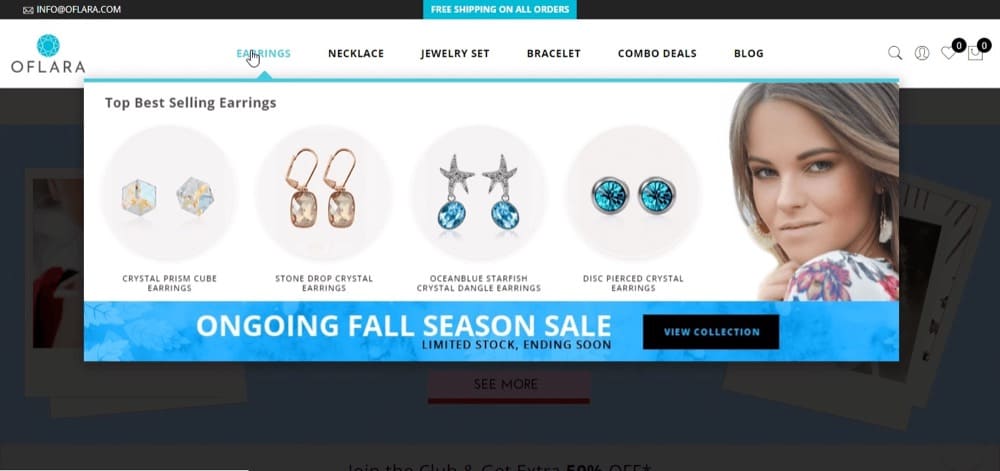
What you can learn from this: Mega menus can be valuable real estate for Shopify sites. You can test this to see if it resonates with your audience.
BattlBox: Personalized Ecommerce Content Marketing Strategy
BattlBox distributes survival/tactical subscription boxes.They were curious about how customizing their homepage experience can provide insights for optimizing their overall sales funnel.
Hypothesis: Showing different segments of returning customers a separate content experience on the site’s homepage will boost engagement and conversion rate.
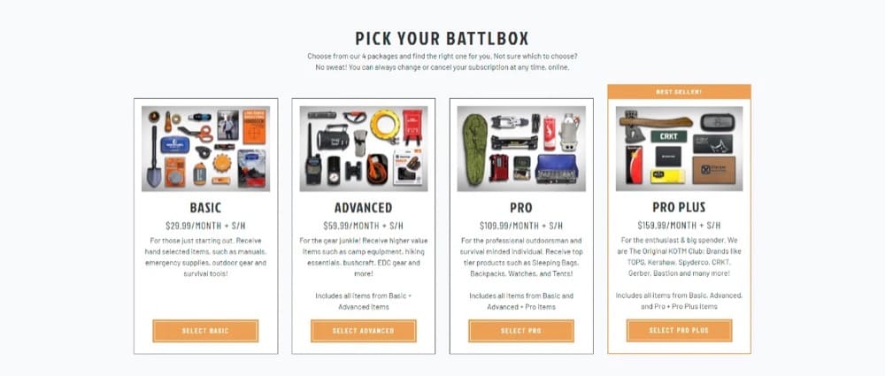
Result: After experimenting with different content experiences, they found a unique variant that boosted a prospects segment’s conversion rate by 30% compared to the regular variant that everyone else experiences.
What you can learn from this: Ecommerce brands can leverage personalized content experiences to boost site engagement for returning users. This customized user experience feels much more personal especially when you have a large and varied customer base.
Star Ratings vs No Star Ratings
Some Shopify stores don’t have product reviews and star ratings like you would find on Amazon. Is it possible that that might be keeping their revenue from reaching its full potential?
Growthrock.co tested this for one of their clients.
Hypothesis: Adding a review star rating summary can boost add to cart and average order value.
Result: When they added star ratings at the top of the product detail pages (PDP) in one variation, it increased conversion rate by 15% with 94% statistical significance and increased revenue per session by 17% with 97% statistical significance.
The average order value also went up slightly by 2.4%, but this is mostly a result of the higher conversion rates.
What you can learn from this: Folks actually want to know if other people like your products. Not having star ratings, testimonials, or reviews on your PDPs can work for luxury brands like Louis Vuitton, but not everyone.
Conclusion
I hope this list of A/B testing examples has lit a brilliant CRO bulb in your head and helped you figure out all the different types of experiments you can run on your site.
If you already know the step-by-step process for A/B testing, how to formulate hypotheses that lead to actionable insights, and how to make your A/B testing tool work in your favor, then you have the ideas to excel now.