

In 2020, people spent an average of 11.8 seconds reading a marketing email, and in 2021 it declined to 10 seconds.
Unfortunately, this number will keep decreasing in the coming years. Why?
The reason is simple; too much content and too little time for people to read it all.
It means that you’ll have to level up your email game to cut through the noise and keep your readers hooked to your email.
Hence, it’s essential to pay attention to each detail, including your email headers. It’s the very first thing your readers see and decide whether to continue reading your email or move on to the next one.
We’ll learn the basics of the email header and the do’s and don’ts to design an attractive email header through this article.
Table of Contents
What’s An Email Header?
Let’s refresh our basics first.
An email header consists of:
- The subject line
- Sender’s information
- The first section of your email visible to the reader
Here, we’ll talk about the HTML header visible to your readers inside the email. It’s the top section of your email, followed by a body and footer.

Source: Really Good Emails
An email header is a small but significant section of your email. If used wisely, it can set the right tone compelling the reader to keep scrolling and hit that CTA button.
It's also an effective marketing strategy that creates brand awareness among your audience.
To design striking email headers, keep the following simple yet effective do’s and don’ts in mind.
7 Best Practices For Designing Email Headers With Examples
1. A Header That Relates To Brand
The header reinforces who the sender is and builds trust. So, ensure to maintain consistency of the brand's visual identity among the audience.
If a website visitor subscribes to your email communication, then the email should instantly remind them of you.

Source: Grammarly’s Website

Source: Really Good Emails
Takeaways:
- Add the logo in your header to introduce and familiarize the audience with your brand.
- Use of primary brand colors and font to create a memorable impression.
2. Images That Catch the Eye
Adding a quality image in your header breaks the monotony and nudges the reader to scroll to know more.
Example: Disney

Source: Really Good Emails
Takeaways:
- Avoid stock images. Instead, use the professional shots that relate to your email content.
- Add a vibrant image to catch the reader’s attention.
- You can also use your product screenshots.
3. A Clean & Simple Header
Since the header is the first thing a reader sees in an email, it can be tempting to put in all kinds of information there. But it can be distracting and may route the reader to another email or keep them from reaching the CTA.
So, to make the most of this limited space, use a minimalist approach.
Example: Pret A Manger
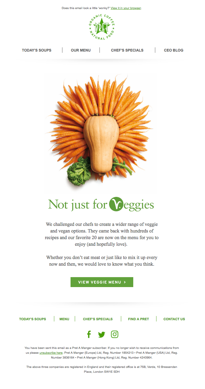
Source: Really Good Emails
Takeaways:
- The header should have just enough value to lead the reader to your main content. Too much information in the header can prevent the reader from moving to any other section.
- Provide sufficient whitespace for better readability.
- You can add menus to make the email look like a website and drive traffic to the links.
4. Put Your Mascot to Action
If you have a brand mascot, use it in your email headers to strengthen your brand identity.
It’s a fun way to personify your brand and convey its message effectively.
Example: Duolingo

Duolingo's mascot is Duo, an owl. You can often spot Duo in their header, resonating the email’s sentiment.

Source: Really Good Emails
Takeaways:
- Improve brand recognisability through mascots.
- Use them to make the emails more appealing.
- More relatability leads to better conversions.
5. Incentivize the Reader
Nothing is better than some rewards to hook the reader to your email. And headers are a great place to give the reader a glimpse of what’s in it for them.
Example: The North Face

Source: Really Good Emails


Source: Really Good Emails
Takeaways:
- Offer a valuable proposal in the header in order to maintain engagement and boost conversions.
- You can create one-time or limited-time offers. The excitement of a new deal can encourage the readers to check your email regularly.
- It also shows that you care for your audience and builds customer loyalty.
6. Animate the Header
Movement in gifs or animation captures the attention immediately and makes the email interesting.
It’s also a great way to show the value of your product or a feature of it instead of writing long sentences.
Example: Netflix & Burberry

Source: Really Good Emails

Source: Really Good Emails
Takeaways:
- Use animation in the header to make your reader feel something. Like adding a countdown timer can create interest and urgency for the reader to take action.
- You can also use it to showcase your product effectively.
- Even if you don’t have a product but services to offer, you can take a creative approach to hold the reader’s attention.

Source: Really Good Emails
- Keep in mind not to overdo the animation. Else, it’ll be too distracting and chaotic.
7. Customize your Headers
Maintaining consistency in the header doesn’t mean it has to be boring. You can keep multiple versions of the header without losing the brand identity.
Example: Allbirds
Version 1

Version 2

Version 3

Takeaways:
- Use an anchor that will remain the same in all header versions. It can be your logo or mascot. Make slight adjustments around that anchor for a new look without losing the essence or identity of the brand.
- You can change the background color, give a makeover to the mascot, or change the logo’s position.
- Adding different images related to your brand in the header also enhances the look and feel of the email.
What NOT To Do While Designing An Email Header?
1. Don’t Overuse the Navigation
Don’t overwhelm the reader with too many options in the header. Keep the menu concise so that the reader can quickly get what he wants.
A clean header looks better even when seen on a smaller device like a mobile.

Source: Really Good Emails
2. Don’t Design a Big Header
The readers use mobile, tablets, and desktops for reading emails. Design your email header so that it looks appealing on any device.
Ensure that the email header size is between 650-700 px for the same viewing experience.
3. Don’t Add Unclear Content
Don’t save your good ideas for the email body only. Good copywriting is also necessary for the email headers to engage the readers.
Statements with no apparent value can drive the reader away before they even scroll down to the main content.
Conclusion
An effective email is the one that instantly engrosses the reader and makes them take the needed action. And you can’t expect the reader to give the email body a try unless the header appeals to them.
For better conversions, start from where the first interaction in the emails begins with the readers.
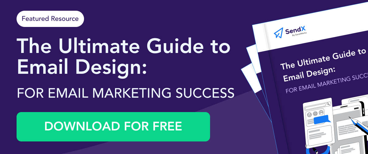
SendX provides 20+ free email templates that have been designed by professionals and have proven to be high-converting. In these templates, you get different email headers to hook people as soon as they open their emails.
Your email header is critical for a successful marketing campaign. It sets the tone for your email and hence can’t be overlooked.
Now use these best practices to design email headers that impress your readers.