
Email Accessibility for Designers: 8 Best Practices You Should Follow
Visual design is more than mere decoration. Great email designs aren’t just pretty, but make it easy for your subscribers to digest your content, find key information, and take action quickly—regardless of your subscribers’ ability. With that, email design has a significant impact on email accessibility.
If you’re looking to create more accessible email campaigns, optimizing your email design is just as important as writing accessible email copy and optimizing your code. How? Here are 8 best practices you should follow to ensure your campaigns are designed for everyone, regardless of ability.
Is your email accessible?Litmus’ Accessibility Checks make it easy to test your email against accessibility best practices. See how you can improve and make better emails for everyone. |
1. Use real text
A lot of companies use all-image emails, designing them in programs like Photoshop, and dump them into a basic HTML template. Although this allows for a high level of visual customization, favoring real text in HTML has a number of benefits when it comes to accessibility.
Many email clients disable images for security reasons. When this happens, even those without disabilities can’t read your email. Perhaps more importantly, even when images are enabled, assistive technologies can’t take full advantage of your content. Screen readers can only access the underlying code of an email, not the text in an image, and screen enlargers and zoom settings often result in blurry, unreadable emails.
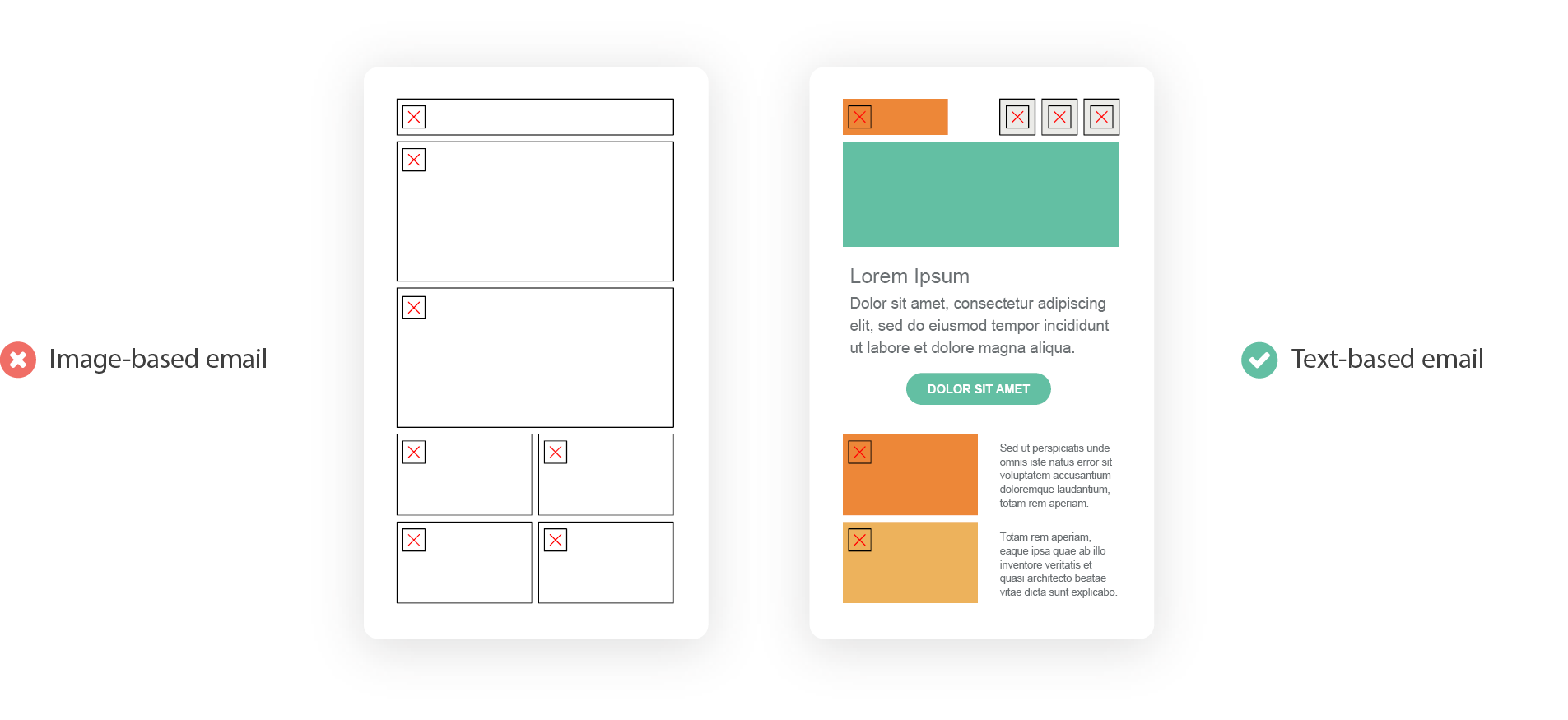
The majority of your copy should be included in your email as live text inside of HTML elements.
2. Create a strong hierarchy
Both cognitive and situational disabilities (like being in a hurry or being distracted) make it hard for people to read and understand long, uniform blocks of text. Hierarchy—or creating visual differences that reinforce importance—helps those users quickly consume content in email.
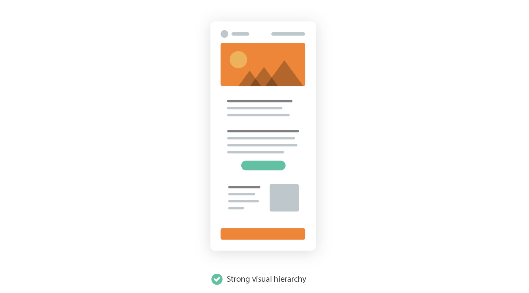
By using text size, color, and placement, you can create emails that are easily scanned and read. Try creating bold, high-contrast headlines above smaller portions of copy, and allow for enough whitespace between sections to avoid content bleeding together.
3. Left-justify your email copy
Using both real text and hierarchy can aid readability, but there are subtler ways to improve the readability of your emails, too. One way is by using left-justified text for longer sections of copy.
Reading relies on visual cues to make sense of where we are on a page or screen. One of the most important cues is the start of a new line, which acts as an anchor for our eyes when jumping around an email. It’s helpful to keep that anchor in the same place for every new line in longer bits of copy, but many designers prefer the visual symmetry provided by centered text. Using left-justified text is one of the best ways to keep copy readable.
The #1 email accessibility trick: If you have any copy that’s longer than two lines, left-align that copy.
Justified text, which adjusts the spacing between words to keep uniform lines of text, creates those anchors but comes with other problems. When using fully justified text, rivers of white are often introduced which create hurdles for people with cognitive disabilities.
4. Use a minimum font size of 14px
You should ensure that your text is large enough for people to easily read, regardless of what size screen they are using. Some mobile devices, like iPhones, will automatically enlarge text that is less than 14px in size. Keeping copy at least that big—preferably even larger—can help create better reading experiences.
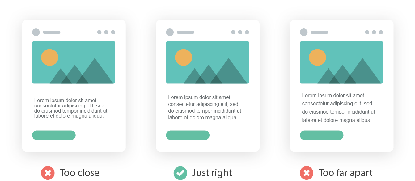
5. Optimize your line spacing
Ensuring that there is enough space between lines of text, but not too much space, is a great way to improve readability. When lines of copy are too close together, it’s hard to tell them apart. Conversely, when they are too far apart, it’s hard to know where to look for the next line as they all look like short, individual paragraphs. The World Wide Web Consortium even has clear guidelines around proper line spacing, suggesting 1.5 to 2 is preferred to single spacing.
6. Keep contrast high
Contrast is the difference between two elements in an email. Most often, it’s the difference between the color of copy and the background on which it sits. Too low of contrast and people with low-vision can have an extraordinarily hard time reading an email.
Fortunately, there are well-established guidelines for proper contrast. The Web Content Accessibility Guidelines clearly define how they determine appropriate contrast. The main rule is to make elements distinguishable. In their words:
Make it easier for users to see and hear content including separating foreground from background.
There are a variety of ways to do this, including using color, font weight, and font size. Regardless of which method you use, make sure your elements contrast enough with other elements to ensure your emails are accessible. Accessibility group WebAIM even has a free contrast checker online that can help identify any contrast issues before your subscribers do.
7. Increase usability
When it comes to actually interacting with emails, you should ensure that all links and buttons—anything considered a touch target—are usable.
When it comes to text links, this means making those links distinguishable from the surrounding text. There is a reason the default for a link is underlined blue text. When overriding that styling, you should do so sparingly. Underlines, especially, are helpful for denoting links in an email. There are approximately 300 million colorblind people in the world, so relying solely on color for link styling puts them in a difficult position.
For calls-to-action and buttons, keep them large enough to be tapped by even the biggest, shakiest thumbs or pointing devices. And make sure there is ample whitespace around those targets so there aren’t accidental link taps and avoidable frustration for users.
For both text links and buttons, including a hover state is another great way to create a better, more accessible user experience. Targeting links in your CSS and using the :hover pseudo selector allows you to apply different properties when a user hovers over those links. This can provide a clear indicator that a piece of content can be clicked and is an often overlooked enhancement in email design. Anthony from UX Movement sums it up nicely in his article, Why Your Links Need a Hover Effect:
Whether your users are colorblind or not, everyone should be able to spot and target links with ease. Adding a hover effect to your links is a simple and effective way to meet their needs. Links and text shouldn’t just look different. For the best user experience, they should also behave differently.
8. Keep your email layout simple
The layout of your email itself can affect accessibility.
Complex, multi-column layouts can lead to sensory overload for users. The more complex a layout, the easier it is to get lost in an email, so simpler layouts are often preferred. Single column layouts are especially effective at creating accessible campaigns—they streamline content and help reinforce hierarchy, aiding scannability in the process.
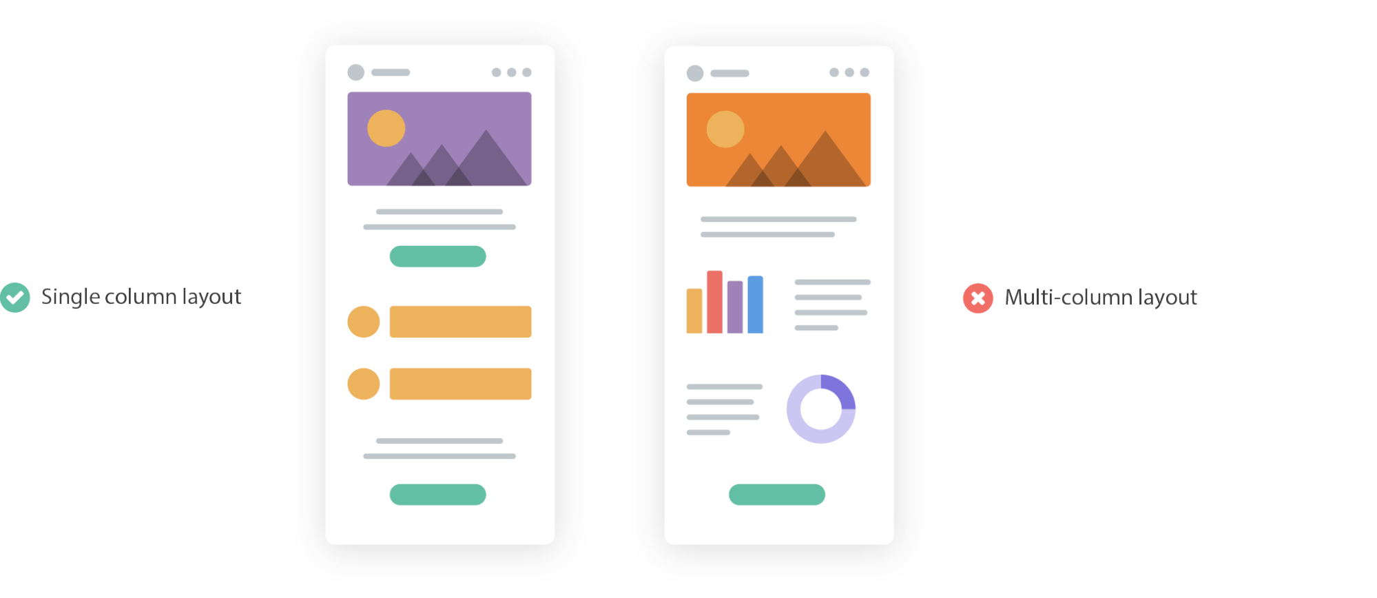
Single column layouts are also generally easier to adjust across different screen sizes. As more of the world comes online, more people are using smaller mobile devices to access the internet and email. Regardless of which technique you’re using, keeping your emails responsive across different devices is a great way to improve the subscriber experience.
 | Ultimate Guide to Email AccessibilityThis guide has the insights and step-by-step advice you need to write, design, and code emails that can be enjoyed by anyone—regardless of their ability. |
Bettina Specht
Bettina Specht was the Senior Content & Lifecycle Campaigns Manager at Litmus