
New in Litmus: Extended Dark Mode Testing
Dark Mode is hot right now. It’s ripe to be the defining trend of 2020—outside of the pandemic and too many social issues to count—and the subject of more blog posts and webinars than you can shake a stick at. At Litmus, we’ve spent the last few years educating people about dark mode in email with things like our Ultimate Guide to Dark Mode for Email Marketers, Alice Li’s Litmus Live Day talk on the subject, and some of Lily Worth’s trend hunting.
While we have supported Dark Mode testing on some clients for a while, our latest release extends Dark Mode testing to both the Gmail App on Android 10 and iOS, as well as in Outlook.com on Chrome and Firefox. Here’s what you can expect from these popular clients.
Dark Mode Support
In the past, we’ve identified three different levels of Dark Mode support across email clients:
- No color changes, so there’s effectively no support.
- Partial color invert that changes some colors while leaving others untouched.
- Full color invert that swaps both light and dark backgrounds and text.
Additionally, some email clients support the CSS `prefers-color-scheme` property which allows you to override default Dark Mode color inversions and specify your own Dark Mode theme for your emails.
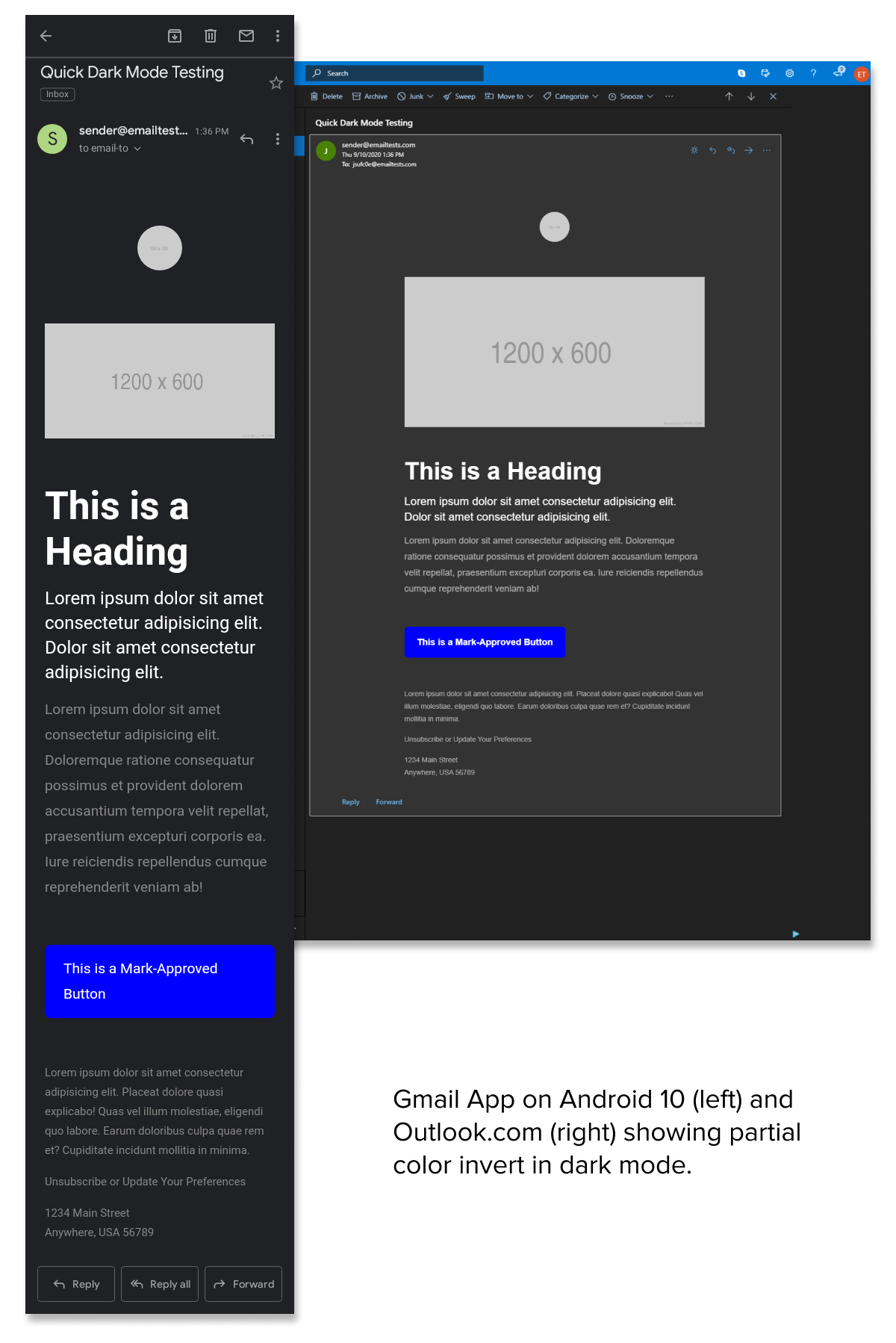
The Gmail App on Android 10, as well as Outlook.com on both Chrome and Firefox, do a partial color invert. Light background colors are swapped to dark, with dark text switching to light. However, darker backgrounds—like CTAs—preserve their original colors.
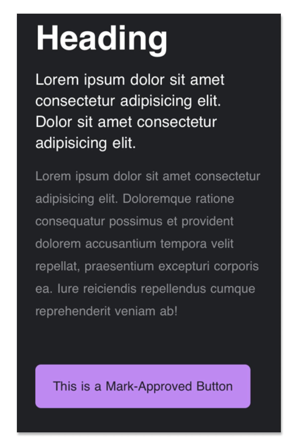
On iOS, the Gmail App appears to do a full color invert in Dark Mode, swapping out not only the background and text colors but darker colors on elements like CTAs.
Unfortunately, unlike recent versions of Apple Mail and a few other email clients on MacOS, neither client supports `prefers-color-scheme`, so email designers are left with limited support for achieving ideal Dark Mode designs. This seems to be par for the course right now with email clients but, hopefully, we’ll see increased support for CSS-controlled Dark Mode styling in the future.
On the brighter side (pun intended), our latest email client additions don’t introduce any significant changes to rendering. You can keep using your tried-and-true design techniques to create beautiful, functional, and accessible campaigns without any additional effort.
Design for Dark Mode
As the latest additions to our Email Previews testing suite show, it’s important for email designers to consider how their emails will display in both Light and Dark Mode scenarios. While it’s tempting to just design for the Light Mode and move onto the next task, you should consider a few things which we previously noted in our Ultimate Guide to Dark Mode for Email Marketers.
- Images and logos should be optimized for both Dark and Light Modes. Use transparent PNGs for non-rectangular images so that there aren’t unsightly white backgrounds and add a slight white shadow to images with dark text to keep them readable in Dark Mode.
- Use high contrast text and background colors so that, even when partial and full color inverts happen, your message is still readable.
- Test! Test your campaigns across as many email clients and settings as possible to ensure that your message gets across to subscribers, regardless of their personal device settings.
Start Testing Today
We have Dark Mode support for over 10 clients, as well as dozens of other popular clients. . You can start testing in all of the 90+ email clients today inside of Litmus.
Not a Litmus customer? Sign up for a free 7-day trial and start sending better emails today.
Jason Rodriguez
Jason Rodriguez was the Community & Product Evangelist at Litmus