
Why You Should Be Using Responsive Email Templates
In our on-demand and on-the-go world, an increasing number of email subscribers are checking their messages on their mobile devices. It’s up to email marketers to deliver the same experience no matter where their message is read. Using responsive email templates allows you to display your content with consistency across any device and at scale to deliver mobile-friendly emails with every send.
We have provided steps to help you take more control over your email campaign consistency by implementing responsive email templates into your email design.
What is a responsive email and why is it important?
A responsive email is an email that looks the same across any device such as desktop, tablet, or mobile phone. This is important not only for brand consistency, but also for the fact that 60% of emails are viewed on mobile devices, although it remains to be seen how Apple’s Mail Privacy Protection (MPP) will ultimately impact this behavior. If you aren’t optimizing for viewing outside of desktop, you could be losing a huge portion of your audience.
In fact, up to 79% of consumers admit they would delete an email that isn’t mobile optimized. Without a responsive email design, your emails are more likely to create unnecessary frustration and more people are headed to unsubscribe.
What’s the best way to make an email template responsive?
Responsive emails use CSS media queries, also known as @media to change fixed-width tables and images on desktops into fluid ones for smaller screens to ensure maximum compatibility.
Media queries detect the screen size of a device and then “turn on” different sets of rules based on that screen size. These can be very simple to implement or quite complex, depending on adjustments needed. They do require more planning and testing than standard emails and don’t work with all email clients.
To simplify and scale the process, responsive email templates can be created. Templates can help take the tediousness out of HTML design.
Responsive email design best practices
Creating mobile-optimized responsive email templates isn’t just simply making your email “mobile-friendly.” You should take careful consideration to adjust the layout and user experience.
Here are a few tips for designing successful responsive email templates:
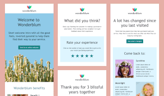
- Use a single-column layout. Emails with two or more columns require more testing and potentially more room for error. Stick with a single-column layout near 600 pixels for best results across mobile devices.
- Design calls-to-action (CTAs) that make sense. Per Apple’s guidelines, your CTA buttons should have a minimum target area of 44 x 44 pixels to provide ample room to tap. This also creates less friction in the user experience.
- Choose web fonts that work. Not all web fonts work in every email client. Because of this, it’s important to declare your font choice (and size) followed by fallback fonts, or font stacking. Including multiple font names ensures that if one font doesn’t work, there is a fallback or backup font of your choosing. You can also use web-safe fonts so you can be confident your text will display properly.
- Prioritize content to display. When adjusting to a smaller screen, you may want to consider what content to prioritize for the best viewing experience. When necessary, you may choose to hide content for your mobile layout.
- Don’t forget Dark Mode. Most operating systems include Dark Mode settings, which commands about 27% of email opens. If not considered, readers could get an unfavorable view of your message due to the inversion of background and text colors. Incorporating both Dark Mode and Light Mode color schemes into your templates will ensure the best possible experience.
- Make unsubscribing easy. Unsubscribes can be good for business. This can eliminate those who are unengaged or uninterested. No amount of emails will likely change their mind so it’s best to cut your losses and make it easy for them to unsubscribe or adjust their preferences so they get the content they are seeking.
Measuring success
It’s important to have historical data on hand in order to see what’s working—and where you can improve with your responsive email templates. Start by comparing your standard email marketing metrics (click-through rates, engagement, subscribe or unsubscribe rates, etc.) before and after the templates are implemented over a set period of time. It’s also important to keep a close eye on your conversions and ultimately, your return on investment (ROI). Emails that aren’t reaching your audiences can be a strain on your budget and long-term strategy.
If your templates are working, you should see numbers improve across the board. Responsive email templates are meant to improve the subscriber experience, and the proof is in the data. Readers who find your emails difficult to read on mobile devices—where they spend a third of their waking hours—will have limited engagement, quickly unsubscribe, or may even report your email as spam.
Responsive emails are not “nice to have” but are imperative to a successful email program. With factors such as email deliverability and retaining brand trust, responsive email templates can help you scale your efforts to create a seamless and consistent email experience, every time!
 | Responsive Email Templates That Your Subscribers Will Love Launching a mobile-responsive email design can increase unique mobile clicks by as much as 15%. Check out our free email templates to help you boost your email engagement and overall brand loyalty. |
Maria Coleman
Maria Coleman was a Senior Content Marketing Manager at Litmus
 Blog
Blog 