6 Mobile SEO Tools
Given that mobile first indexing is the way Google indexes the majority of web pages, ensuring your site is optimized for mobile is a prudent approach. But you’ll need to go beyond employing responsive design, although that’s a good start.
To perform well in mobile search, mobile SEO is a necessity. That means making sure that page speed and website functionality for mobile devices needs to be on par with the desktop experience. Even a little lag can drive many potential leads away from your business. A Deloitte study has shown that improving page speed by just 0.1 seconds can boost conversion rates by 8%. Mobile SEO will also make your site more accessible to search engine crawlers, so smartphone and tablet users can find your site more easily.
Read on to learn about the top mobile SEO tools on the market. We’ve outlined the major features of each platform so you can discover which are the best for you.
Google Test My Site

First in this list of free SEO tools is Google Test My Site; it shows you how long it takes for your site to load on mobile. Start by typing in the URL of the web page you want to test.
After that, you’ll get a screenshot of the way the web page will look on a mobile device. You’ll also see the following stats:
- How long it takes for a mobile user to connect to the webpage. You can toggle the connection from 4G to 3G, depending on what connection you think people may be using to access your website.
- Google’s rating of your site. You’ll see Good if it takes 0 to 2.5 seconds for your site to load on a mobile device, Needs Improvement if it takes 2.5 to 4 seconds, and Poor if it takes 4 or more seconds.
Depending on your rating, Google will recommend ways you can speed up your website, similar to Google PageSpeed Insights. Suggestions typically include:
- Deleting unused CSS. If your site has style sheets with unused CSS, this can increase your page’s loading time unnecessarily.
- Ensuring text remains visible during webfont loading. Make use of your site’s font-display CSS function to ensure users can see the text while webfonts are loading.
To get even more personalized suggestions, scroll to the bottom of the page to request a full report detailing mobile optimization tasks for your site. Because mobile is often most sensitive to core web vitals, you’ll be able to address those at the same time.
Mobile Friendly Test

Mobile Friendly Test tests whether your site is navigable for mobile visitors.
Simply enter the URL of the web page you want to test. The application reveals whether your site is mobile-friendly.
You can get any of the following results to help with mobile optimization:
- Your page is mobile-friendly.
- Your page isn’t mobile-friendly. This suggests your page doesn’t work well on mobile devices due to possible errors, such as.
- Viewport not set, which means your page doesn’t define a viewport properly. Viewports tell browsers how to scale and adjust the web page’s dimensions for different screen sizes.
- Viewport not set to “device-width,” which means that your web page has already defined a fixed-width viewport. As such, it doesn’t fit different screen sizes.
- Clickable elements too close together, indicate a poor user experience because it’s difficult for mobile users to press the buttons and links they want.
- Content wider than screen, which means that mobile visitors need to scroll horizontally to see all the images and words on your page. Consider redesigning the mobile version of your site so users can see everything without needing to scroll.
- Text too small to read, which means mobile users have to zoom in to read your text.
- Uses incompatible plugins. For example, Flash is a plugin no longer supported by most mobile browsers. Google recommends redesigning your web page using more popular technologies, such as HTML5.
- No data available. For some reason, Google wasn’t able to retrieve your page. Wait for a little while and then try again.
Merkle’s Mobile-First Index Tool (Mobile vs. Desktop Test)

Merkle’s Mobile-First Index Tool you compare your mobile and desktop pages. Besides checking your page with Google Test My Site and Google’s Mobile Friendly Test, it also reports on discrepancies between content (links, alt=”text”, page title, etc.), SEO signals (meta robots, canonical, hreflang tags, etc.), and structured data markups.
Enter the URL of the page you want to test. After selecting a suitable user agent, press the “test” button to get your results.
You’ll get the following:
- Crawling/Indexing. This section compares the crawlability of your mobile and desktop pages. It will also show you if your site has any hreflang tags, link rel=”canonical,” and link rel=”alternate” media.
- Content. This part of the report shows the page titles, meta descriptions, words, and image counts of your mobile and desktop pages, helping you spot discrepancies you may need to fix.
- Google Tests. This part gives you your results for Google Test My Site and Mobile Friendly Test.
- Images. This will give you all the image URLs on the web page.
- Links. This will give you all the links on the web page.
- Structured Data. This will give you information on structured data on your website. It’s okay to use different structured data types, but there are certain types of structured data that are only available in JSON-LD. If that’s the case, make sure there’s equivalent microdata for the other version.
Mobile First Index Checker

Mobile First Index Checker you find out if your pages are ready for mobile-first indexing. It lists the differences between your mobile site and your desktop site as a checklist, with questions such as:
- Do you have the same number of images for both desktop and mobile versions?
- Do you have the same number of internal links for both versions?
- Is your metadata the same for both devices?
- Are all structured data types identical on both desktop and mobile versions?
- Does the AMP page have a proper canonical to the valid page?
If you see an “X” next to any of the questions on the checklist, click the arrow on the right-hand side to see if there are any problems that you need to fix. You’ll then see the content that’s different for the two versions. For example, if you have an X next to “Do these two devices have similar content in HTML,” you can click on the arrow to see the extracted content from both versions of your site. There, you can spot differences to weed out.
Mobile First Index Checker works a lot like Merkle’s Mobile-First Index Tool. The main difference is that Mobile First Index Checker gives you updates in a conversational manner, while Merkle’s Mobile-First Index Tool shows information in a table. If you’re torn between these two tools, think about which format helps you digest information more easily. After all, you need the tool that will help you out the most.
Google Search Console
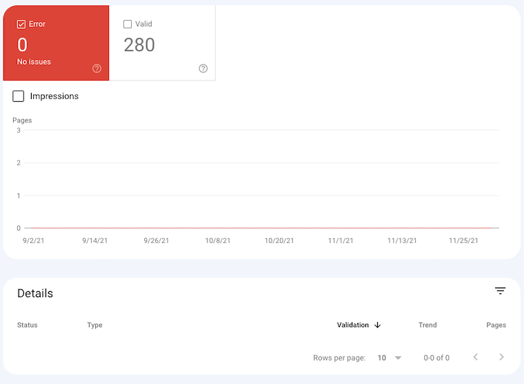
Google Search Console (formerly known as Google Webmaster Tools) offers a Mobile Usability report to help optimize your site for mobile devices.
In the top-level view, this SEO tool shows all the pages that have mobile usability issues beyond a threshold amount. To fix these problems, click on each issue to see:
- More details about these problems, including a list of links affected by the issue
- Recommendations for fixing each issue, including the process for contacting Google about your fixes.
Google Search Console also comes with a Performance report (Search) functionality, which shows you how your site performs on Google. You’ll see the following metrics:
- How often your site comes up
- Click-through rate
- Average position in search results
- Any special features associated with your results, such as rich results
- Which queries are made on mobile versus desktop. This can help you improve your mobile targeting and find out more about who is using mobile and what products or services they’re interested in.
Google Analytics

Finally, you can use Google Analytics to compare mobile versus desktop traffic.
Click on the Reporting tab and then select Audience, followed by Mobile and Overview. You’ll then see how many people came to your webpage through desktop versus mobile and tablet. To understand your numbers better, you can generate pie charts and comparison reports to make conclusions such as, “for every 1,000 mobile users, we get only 10 sales, but for every 1,000 laptop or desktop users, we get nearly 30 sales!”
Takeaway
User-friendly and powerful, all of these tools can help you boost your website’s mobile usability.
To determine which is best for you, think about your goals. Do you just want to know how many people come to your website through desktop versus tablet? If that’s the case, Google Analytics may be for you. However, if you want a full picture of your mobile website’s limitations, consider getting Merkle’s Mobile-First Index Tool and Mobile First Index Checker.