How 4 Growing SaaS Companies Are Optimized for Conversions

We all know that conversion rate optimization (CRO) is important. But the truth is — businesses rarely invest enough time and money into it.
In fact, over 68% of small businesses don’t have a documented CRO strategy.
So I’ve been thinking a lot about the why. Why do people always forget about that? Is it because of budget restrictions? Probably not. The most effective CRO strategies are based on psychology, copy and design. No need to spend $$$ on an infinite number of tools.
So what’s stopping optimizers?
They still don’t know how.
There are hundreds of guides covering different CRO strategies you can implement right away, but people are still not doing it right.
So I’ve built this actionable and in-depth breakdown of how 4 growing SaaS companies are optimized for conversions.
The companies in this analysis are:
- Poptin,
- Tidio,
- Venngage,
- Userpilot.
All the above are SMB SaaS companies that are growing to the skies.
We’re going to see:
- What are the secret CRO strategies they’re implementing,
- How they are using psychology on their websites to increase sales,
- How Tidio reduced the friction of their sign-up page,
- How Userpilot is telling the story on its landing pages,
- How Poptin is showcasing features and uses cases on the landing page,
- How Venngage is using its users’ work to acquire more customers,
…and many more.
The best part?
You can implement all of these strategies right away.
Let’s get started.
How is Poptin Optimized for Conversions?
Poptin is one of the Privy alternatives you can use to boost your conversions with popups, forms and automatic messages.
But how exactly is Poptin optimized for conversions?
I’ve divided their entire CRO strategy into four parts:
- Showcasing how the features work,
- Showcasing the value proposition through examples of what people can do with the tool,
- Engaging with website visitors through a mascot,
- Using exit-intent popup technology.
Let’s go through each part.
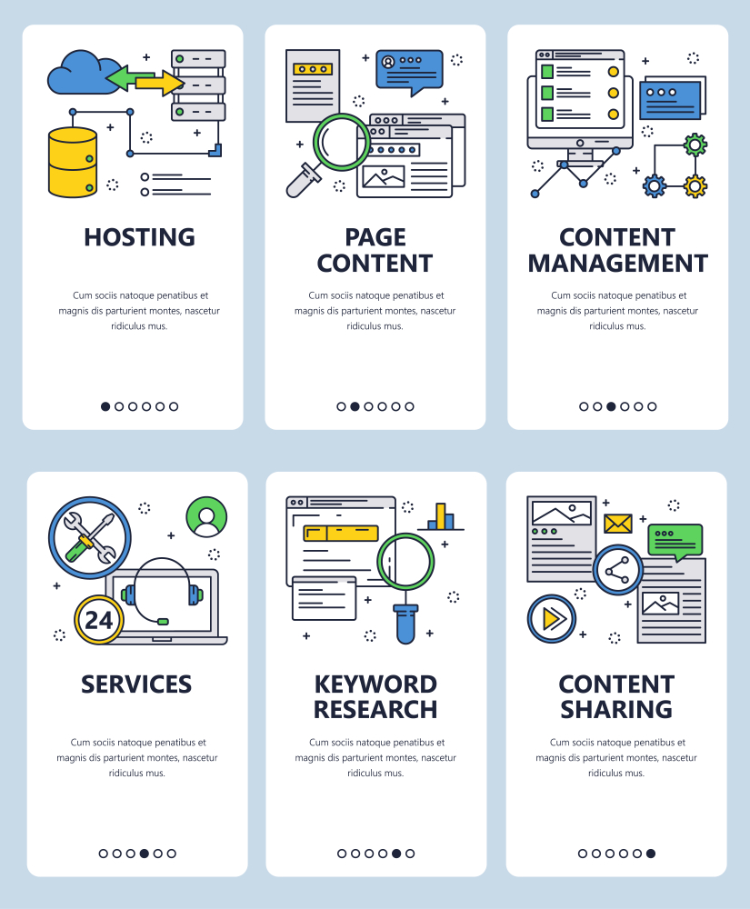
Forget about the illustrations — gifs are better for CRO
I don’t know about other people, but I don’t particularly like illustrations on SaaS landing pages.
Why?
Because honestly, they speak nothing.
They show nothing and they’re not memorable.
How many times have you seen something like this? ⤵
What does it say?
Not much, right?
Every website has illustrations like this.
But there’s something that showcases your features way better.
Gifs.
On Poptin’s homepage, they use an interactive section showcasing the different features with gifs:
For comparison, here’s another generic feature section the likes of which I’m sure you’ve seen on many websites:
As you can see, both websites are illustrating the same thing.
But which one resonates with you better?
Gifs that actually show you how things are done or illustrations that miss the point?
Showcase the value of your product
Here’s something else I particularly liked about Poptin’s website.
Besides using gifs to present how features work, Poptin is also using gifs to showcase what can be done inside the product.
This is a great way to leverage unique value propositions and also great to engage with potential customers.
Here’s how Poptin is doing this on the homepage:
I can just imagine their potential customers checking this and thinking: Wow! It would be dope to have this on my website.
Improve brand awareness and build engagement using a mascot
I really like mascots! They’re really powerful tools for engaging with website visitors and building a powerful brand.
If you think about it, the vast majority of big brands are using mascots:
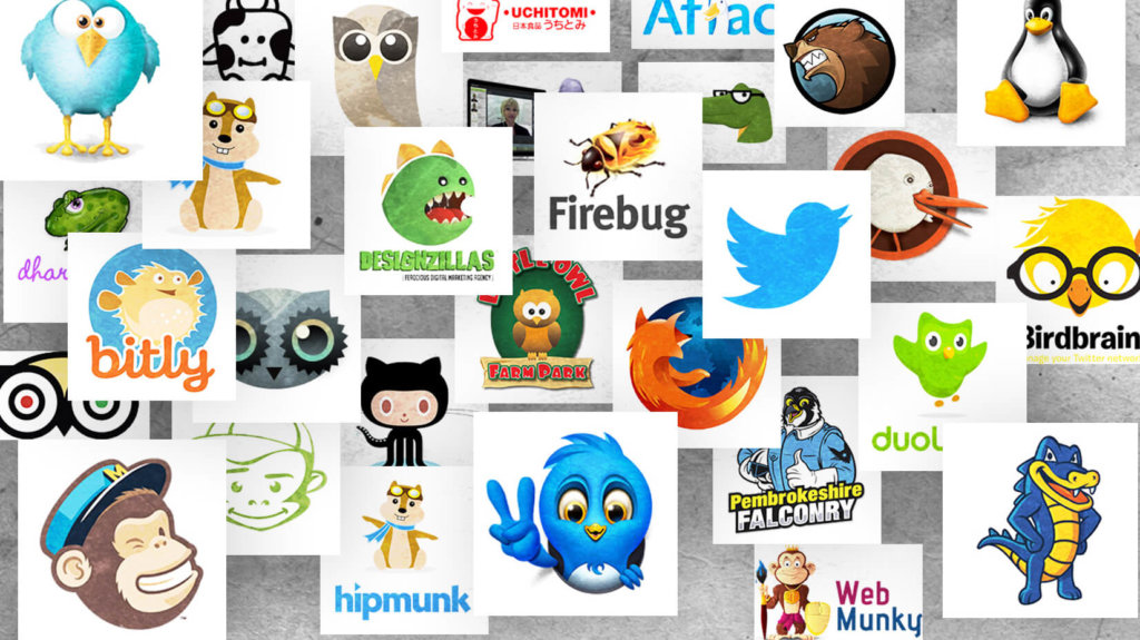
And Poptin has its own — a little Macaw parrot, of course, called Poptin.
And they’re using it on the most vital parts of the website, such as the CTA buttons:
This is a great way to build engagement. Even if someone visits your website many times, at some point, they might come back and create an account just because they remembered you.
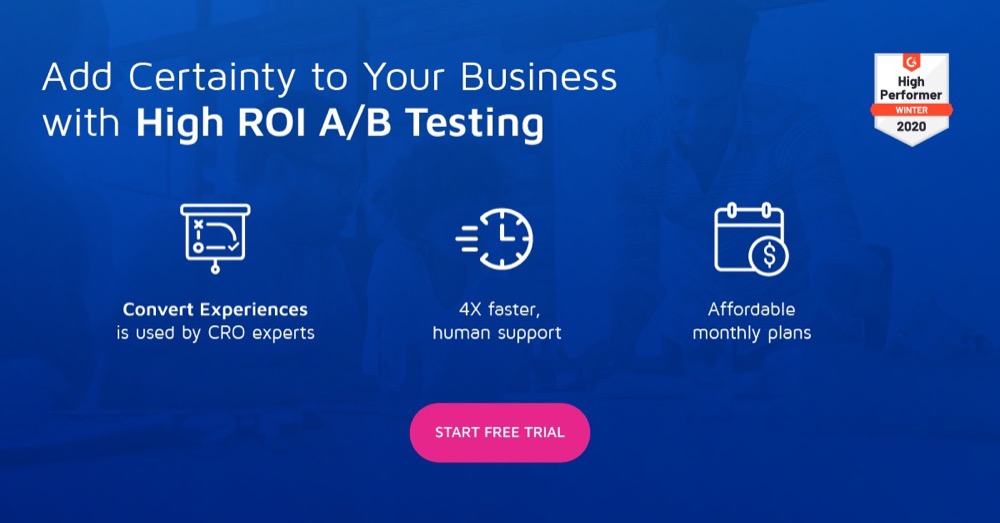
Use exit-intent technology to boost conversions
Exit-intent popups can be a great way of converting people who’ve already decided to leave your website.
A lot of people think exit-intent popups are frustrating and poorly constructed.
But let me ask you one question: if someone’s already leaving your website, what do you have to lose?
Nothing.
Poptin is using this popup:
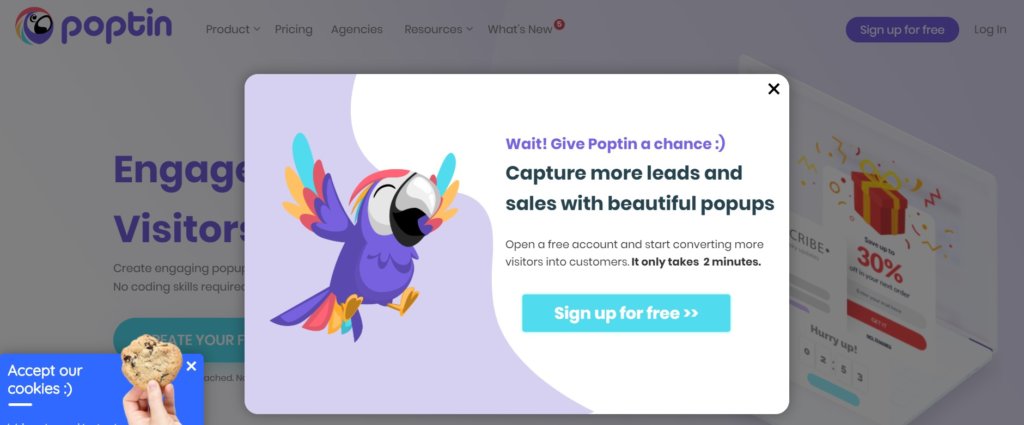
So, why do I like this exit-intent popup?
To understand this better — there are 4 essential pillars of every successful popup:
- Design – In Poptin’s case, the design is pretty flawless. It shows a mascot (pretty memorable and eye-catching) and has easy-to-read text.
- Copy – In this case, it’s very engaging. It gives the visitor value, goal and means. In other words, everything they need to make a decision.
- Context – This popup is shown whenever someone tries to exit the page. Hence, it offers them another opportunity to get more leads.
- Offer – More leads? More sales? For free!? Why not!
Exit-intent popups might have different use cases. You don’t need to use them only for converting website visitors into customers. You can also use them to get newsletter subscribers or more leads for your email marketing pipeline.
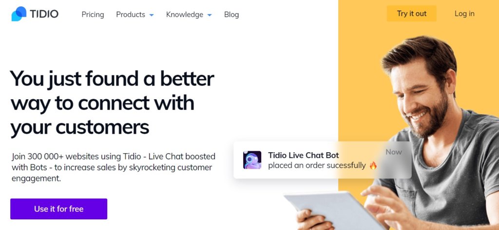
How is Tidio Optimized for Conversions?
Tidio is a live chat and chatbot platform for e-commerce websites.
There are two CRO strategies they employ I particularly like:
- Using the human element across the entire website,
- Reducing friction in the sign-up process.
Let’s check them.
How does Tidio leverage the power of the human element to boost engagement?
If there’s one thing I particularly liked about Tidio’s CRO strategy, it’s the way they use the human element to improve conversions and engage with their website visitors.
What is the human element?
In a nutshell, the human element is the process of showcasing people and human emotions. The ultimate goal of the human element is to improve engagement and prompt users to convert.
This is what the hero section of Tidio’s homepage looks like:
Strong copy on the left and an image of a happy human being on the right. It catches your attention and prompts you to further explore the website.
There are testimonials at the bottom of the page:
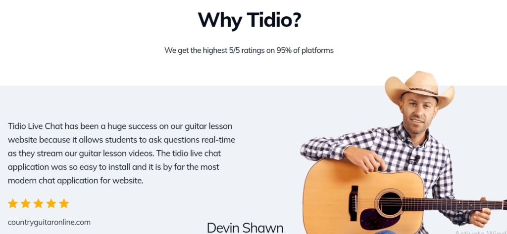
Unlike traditional testimonials where you have a tiny picture of each person, Tidio is using big and engaging pictures.
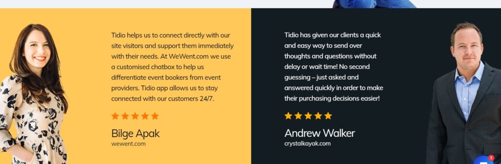
Also, when you see their product pages, you can see sections like these:
In the era of automation, AI and bots, we often forget that behind companies there are human beings.
Web design like this reminds us that not everything needs to be automated.
Use the human element whenever you can.
Reduce friction on the signup page
Signup pages are one of the main dropout pages. One of the main reasons for this is because signup pages are friction-rich. It means that visitors need to fill a lot of forms in order to start using your product.
But Tidio reduced the friction of its signup button in a nice way:
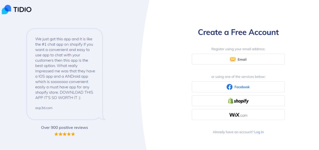
You have a testimonial on the left (another CRO strategy) and social signup options to create a Tidio account on the right.
But notice, there are no forms to fill.
You can choose to create your Tidio account with one of the options listed. Whatever you click, your new Tidio account will become connected to your Wix, Shopify, Facebook or Email account and you will automatically create an account on Tidio as well.
This helps Tidio reduce the “churn” on signup pages and convert more people.
How is Venngage Optimized for Conversions?
Venngage is the third brand we’re going to analyze.
In a nutshell, Venngage is a graphic and poster maker tool that allows people to easily create different forms of infographics, posters, flyers, social media posts, and so on.
In this chapter, we’re going to see how Venngage is:
- Using multiple landing pages to improve conversions,
- Showcasing their users’ work,
- Using templates as an acquisition and conversion channel.
Use multiple landing pages to improve conversions
According to Hubspot, businesses with more than 40 landing pages can generate 12 times more leads than those with 1-5. It seems that Venngage seriously considered these statistics. To be exact, Venngage has a landing page for each feature and use case.
That’s a lot of landing pages.
Why is this great?
No matter how well you narrow down your target audience, there will always be people who have different goals and needs.
When this happens, multiple landing pages come to the game.
Showcase users’ progress for more conversions
This is a pretty nice CRO strategy.
Here’s how Venngage is using it:
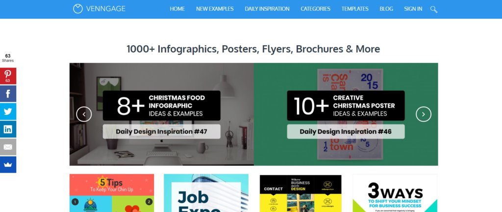
They have a dedicated page (like a blog) called Gallery inside their navbar.
When you open it, you see examples of the work conducted by their customers.
Why do I like it?
If you’re in doubt whether Venngage is the right tool for you or not, you can visit their Gallery and exclaim: Wooow! I can do this with Venngage. Look, I can do this as well!
Explaining your features and use cases on the landing pages is one thing. Showing the end work of your customers is another.
In a nutshell, Gallery is another layer of engagement Venngage applies with their potential customers.
How does Venngage use templates as an acquisition channel?
From all of this, we can see that there are three layers of engagement on Venngage’s website:
- One landing page per feature/use case.
- A Gallery where you can find work from their customers,
- And finally, the ultimate database of templates you can use.
This is the third step of their “conversion funnel”.
The first and second steps were meant to engage with the potential customer and explain to them how Venngage works and what they can do with it.
The third step has another goal: to unleash the “aha” moment and convert leads into customers.
When you visit the Templates page, you find thousands of different templates to choose from.
The best thing? Once you choose a template, you will automatically be redirected to creating a free account on Venngage and immediately start working on that template. No need to search for it again.
And this 3-step framework is how Venngage is optimized for conversions.
How is Userpilot Optimized for Conversions?
The last but not the least important SaaS brand we’re going to analyze today is Userpilot.
Userpilot is an user onboarding software that helps SaaS companies create engaging user onboarding and improve their trial-to-paid conversions and feature adoption.
There are two things I especially like on Userpilot’s website that help them improve their conversion rates:
- They’re showcasing the benefits of using Userpilot in an engaging way,
- They tell short stories on the landing pages.
Clearly showcasing the benefits of the tool
Why should someone use your tool? What are your unique selling points (USPs)? What are its benefits?
No matter how obvious this sounds, a lot of people forget about this very important aspect.
And Userpilot does this in a pretty compelling way.
On the homepage, Userpilot is showing its users the Old and New way of user onboarding:
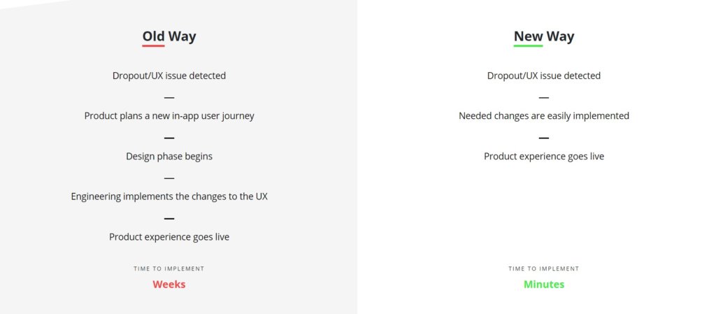
For companies that still haven’t embraced the new way of user onboarding, this is a pretty compelling website element.
It clearly shows the benefits of using Userpilot over traditional ways of building user onboarding and UX through manual code.
Telling the brand’s story on landing pages
The vast majority of copy on landing pages is out of context.
The Userpilot team realized that the “user journey” should follow a certain path through the landing pages.
When you take a look at their website, you might find sections like this:
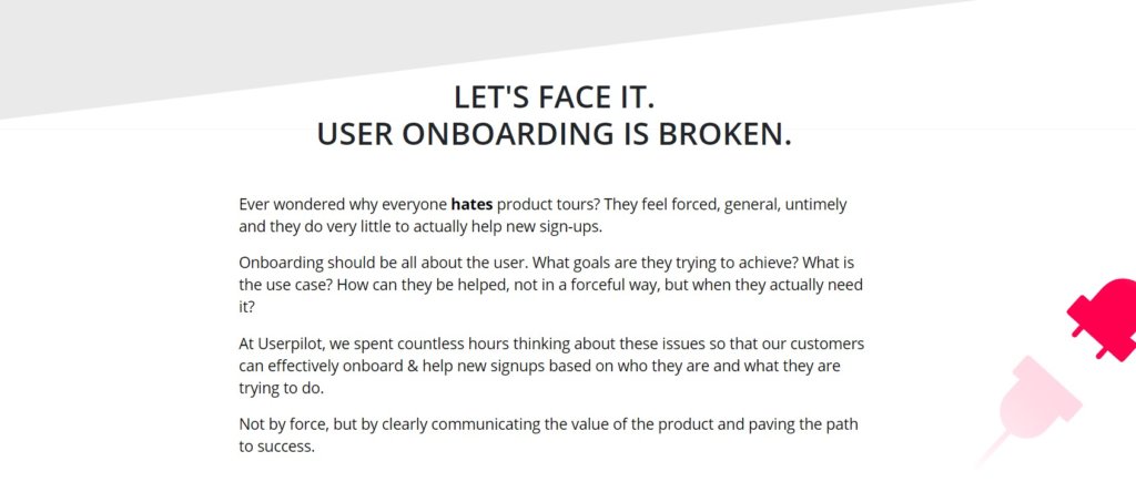
Although a lot of CRO specialists would tell you that this approach and using long text in the copy is dull and ineffective, I don’t agree with them.
If you know how to tell a convincing story, it can be a great marketing, sales and conversion asset you can use to get more leads and high-quality prospects.
For Userpilot’s target audience, this story is pretty convincing. At least that’s what Aazar, Head of Growth at Userpilot, told while I was interviewing him.
Bonus tip: use fear in your website copy
Fear is definitely one of the most used marketing techniques in history.
If you think about it, a lot of marketers and salespeople are trying to sell us something by using fear as a communication technique.
Insurance agents are selling insurance packages by using fear as their main leverage and strategy.
There are different types of fear you can use, such as the Fear of missing out (FOMO), for example.
When I was writing this article, I came across one platform for federated search, called Traversals. Their copy on the hero image is stunning, at least in my eyes.
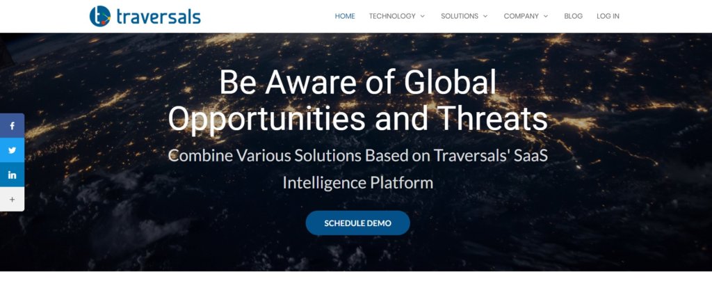
Be aware of global opportunities and threats. It sounds so convincing to me.
Think, how can you incorporate fear in your own website copy?
The Bottom Line
Looking at how these 4 growing SaaS companies are optimized for conversions was a hell of a journey.
Let’s quickly recap the most important CRO strategies they’re using and what you should consider implementing in your company:
- Use gifs to explain what your product does. They’re far more effective than illustrations.
- Showcase the value of your product early on.
- Use mascots, they’re great for brand awareness.
- Exit-intent popups and other forms of website popups can seriously boost your conversion rates.
- Don’t forget to leverage the power of the human element to build better relationships with your website visitors.
- Reducing friction on your signup page might bring more conversions.
- Not every potential customer is the same. Make sure to have multiple landing pages for each use case.
- If possible, unleash the “aha” moment by showing your users’ work, progress and results.
- Use templates or other lead magnets relevant to your brand to acquire more users.
- Clearly showcase the benefits of your product. You can use the old way vs new way approach, like Userpilot does.
- Don’t forget to tell a story on your landing pages. Stories are what brings us together.
- Implementing fear in your website copy can be a great conversion hack.