By Rob Petersen, {grow} Community Member
If you can’t measure it, you can’t manage it. – Peter Drucker
This succinct truth says you can’t know whether you are reaching your goal unless success is defined and tracked.
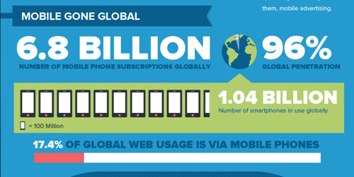
Data visualization is technology that lets corporate executives and other end users see data to better understand information in context.
Hundreds of tools are now available to chart, create dashboards, and better measure and manage data. They range in sophistication from “drag and drop,” plug-ins and widgets to JavaScript that is likely to involve a web developer; prices range from open source to thousands of dollars per year.
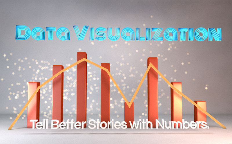
Data visualization adds a narrative element to your data, and can be a great way for a business to tell their story.
Which tools are best to tell your story?
Here are 14 of the best data visualization tools. They are grouped by categories to help determine how you tell better stories with data.
PIE, LINE AND BAR CHARTS:
- DYGRAPHS is a fast, flexible open source JavaScript charting library. Dygraphs creates chart that are interactive: you can mouse over to highlight individual values. You can click and drag to zoom. Double-clicking will zoom you back out. Shift-drag will pan. You can change the number and hit enter to adjust the averaging period.
- jqPlot is a plotting and charting plugin for the jQuery Javascript framework. jqPlot produces beautiful line, bar and pie charts. qPlot is an open source project by Chris Leonello.
- Zing Chart is a JavaScript charting library and feature-rich API set that lets you build interactive Flash or HTML5 charts. It offer over 100 chart types to fit your data.
MAPPING
- Color Brewer was originally designed with federal funding and developed at Penn State?—?is really for choosing map colors, and is worth spending some time with if plan to make many more. You can choose your base color and get the codes for the entire palette.
- Exhibit was developed by MIT. Fully open-source, Exhibit makes it easy to create interactive maps, and other data-based visualizations that are orientated towards teaching or static/historical based data sets, such as flags pinned to countries, or birth-places of famous people.
- Instant Atlas enables information analysts and researchers to create highly-interactive dynamic and profile reports that combine statistics and map data to improve data visualization, enhance communication, and engage people in more informed decision making
TIMELINES
- Timeline is a fantastic widget which renders a beautiful interactive timeline that responds to the user’s mouse, making it easy to create advanced timelines that convey a lot of information in a compressed space. Each element can be clicked to reveal more in-depth information, making this a great way to give a big-picture view while still providing full detail.
- Here is Today is a great example of an interactive timeline which continues to zoom out to give relative times all based on today. It seems simple, but is an example of several good aspects of data visualization design. It compares today with a month, then a year, then century, etc. It isn’t overwhelming the reader with all the data at once, or forcing the person to choose only one interpretation.
- TimeFlow allows you to create time-based diagrams easily and quickly. Designed for journalists, it allows for a variety of different ways to visualize the data and help you understand any underlying trends.
INFOGRAPHICS
- Visual.ly is a combined gallery and infographic generation tool. It offers a simple toolset for building stunning data representations, as well as a platform to share your creations. This goes beyond pure data visualisation, but if you want to create something that stands on its own, it’s a fantastic resource and an info-junkie’s dream come true.
- Piktochart is a web-based tool that has good free themes and a whole bunch more for the paid version) for creating simple visualizations. You can drag and drop different shapes and images, and there is quite a bit of customization available. You can also add simple line, bar, and pie charts using data from CSV (or manual entry). The infographic in our previous blog post “6 more studies prove Digital Marketing ROI” was created with Piktochart.
MULTIPURPOSE
- Google Charts is the seminal charting solution for much of the web. It’s highly flexible and has an excellent set of developer tools behind it. It’s an especially useful tool for specialist visualizations such as geocharts and gauges, and it also includes built-in animation and user interaction controls.
- NVD3 is a library meant for reuse. The project takes all the power of D3 and distills them down into common chart types. I really like this idea because it gives you constrains and prevents you from running wild with different designs, while at the same time making the code much easier and more approachable if you are just getting started in data visualization.
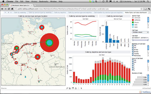
- Tableau places great emphasis on the ability to create visualizations without the need for any technical skills (scripting). and has a relatively easy to use interface. As with other products of this nature its utility is firmly anchored in visual exploration of data using every format imaginable. It is not a data mining tool or a text analytics tool, but sits in the traditional business intelligence camp, albeit with a rich visual interface.
Which of these 14 tools are of interest to you? Do they convince you of the power of data visualization? Would you use them better tell the story of your business?
 Rob Petersen is an experienced advertising and marketing executive and the founder of the BarnRaisers agency. Follow Rob on Twitter: @RobPetersen
Illustration (c) businessesgrow.com