
It’s no secret that landing pages are essential to the success of your ecommerce site. Whether you’re creating these pages for your pay-per-click campaigns or for email blasts, a few things always remain the same. It doesn’t matter if you’re brand new to the ecommerce landing page design or just looking for a quick refresher. These six landing page musts will never change.
Logo
When pulling together a landing page for your latest offer, you have a lot of components to think about. One big component you simply cannot forget is your company logo. This is for the sake of your buyers’ comfort, even more than the chance to increase brand awareness. Sure, your buyers probably landed on that page by clicking something else that has your logo on it, but that doesn’t mean you can slack. Make buyers feel safe; include that logo.
Matching Products
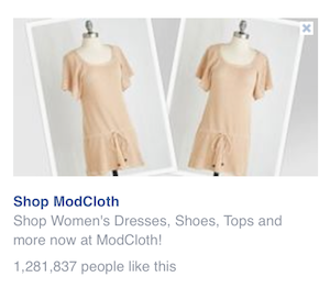
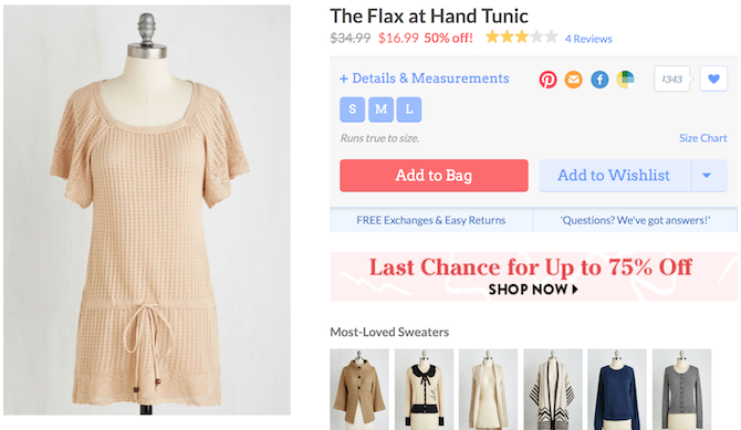
Whatever products you use in your paid advertising campaigns, use those again on the landing page. There should be no discrepancy between products, prices, or discounts. No one should ever wonder if they’ve landed in the right spot after clicking through to your landing page.

Bold (and Similar) Images
While some PPC campaigns may not allow for images, other paid advertising channels do. You may be tempted to use fun and quirky designs to catch a buyer’s attention. If so, that’s fine. Just be sure your imagery matches across the board. If a buyer clicks through an ad that features images of models in T-shirts, shorts, and flip-flops, only to learn the item for sale is a bracelet that could barely be seen in the marketing image, they might not trust your company when they run across later marketing campaigns.
Call-to-Action
What do you want buyers to do once they land on your website? That’s exactly what your call-to-action should say. There are several different design elements to consider when creating a CTA, but the most important thing is simply that you have one. Without it, what’s the point of your landing page?
Short Form
If you’re giving something away—even if it’s just a small discount on some of your most popular items—you should get something in return. The best way to get what’s coming to you is a short form on the landing page. By requiring customers to part with their email address, you gain a way to keep in contact. This will allow you to share news about upcoming sales and keep an eye on where they are in the buying cycle at all times. If your offer is good enough, they’ll be happy to hand over their info.
Security Information
Before anyone buys anything from your site, they’re probably going to look for your security seals. That’s not all that makes a buyer feel safe, though. Other security information might include some of your company’s partnerships, reviews or testimonies from past customers, and maybe even some mentions in the news. Anything you do to show buyers they’re making the right choice can only increase the chances that they’ll open their wallets.
We really do talk a lot about landing pages, but that’s because they work. Not only do you avoid confusing your buyers, but you also add yet another page to your website. More pages mean more quality content for Google to enjoy. In the end, it’s a big win for everyone involved.


![11 Website Page Load Time Statistics [+ How to Increase Conversion Rate]](https://blog.hubspot.com/hubfs/page-load-stats.webp)


![Lead Conversion: Everything You Need to Know [+ Expert Tips]](https://blog.hubspot.com/hubfs/Lead%20Conversion.png)