
Conversion funnel by definition can mean a few different things depending on the source, but here at Lake One, when we talk about conversion funnel as it relates to an inbound marketing program, we’re talking about the call-to-action, landing page, thank you page, and follow-up email that supports our inbound efforts.
Read on to learn more about the key components of a conversion funnel along with some insider tips for implementation.
Call-to-Actions
With content consumption at an all-time high among consumers, Call-to-Actions (CTAs) are uber important.
In Marketing, a call-to-action (CTA) is an instruction to your target buyer designed to provoke an immediate response. Figuratively speaking, CTAs are a hand wave or an arrow saying, “Hey! Look over here. We have something you might like!”
CTAs use action words to direct the user. For example, ‘download this white paper now’, ‘click here’ and ‘watch the video’. There are so many examples of CTAs, but a few elements stay consistent across the board.
- Headline: Write a header that makes it clear and easy to see what it is you’re offering.
- Sub Header: Explain the value to the user of what you’re offering, but keep it concise. Space is limited.
- Image: Include an image that relates to what you’re offering to catch the user’s eye and add additional context.
- Action Words: Here’s where you actually say what action you want the user to take (download here) typically called out by a button or highlighted differently in some way.
Below is an example of a Lake One’s CTAs. Go ahead. Click on it

Landing Page
Although the majority of B2B businesses are using landing pages, not all landing pages are created equal.
Landing pages are different than your other website pages for a few reasons and should contain at a minimum, the following elements.
No Page Navigation
Landing pages should be designed to be lean mean converting machines and the full navigation menu can distract users. We want them to submit the form and get down to business.
Above the Fold
Keep the main gist of your offer (body copy, image, form, CTA, etc.) above the fold. If the CTA is below the fold and requires a scroll, conversion rates could suffer. You want to make it as easy as possible for the user to convert.
Landing Page Copy
The copy should have a header, a subheader, a few sentences that explain your offering in more detail, and then roughly 3 – 5 supporting bullets that talk about the user benefits of your offer and what the user can expect by submitting the form.
Image
Include an image on your landing page that depicts the offer. The image should be sized appropriately and placed in close proximity to the copy and the CTA making sure to add value and not distract the user from converting.
Here’s an example of the type of image we like to use. Click to see the full funnel in use.
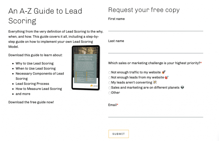
Form
Forms are an absolute must. They are the method you’ll use to capture the lead’s information in exchange for whatever your offering. Make sure that your ask matches the value of the offer. For example, if you have a form 10 questions deep for an infographic, you’ll likely scare away your user.
Insider Tip: My favorite form field is ‘Role’. Role is imperative because it essentially identifies the lead by persona. Role identification allows us to better tailor our workflows, and, not to mention, it gives us better insight into who is actually submitting our forms and engaging with our content. Oh and the bonus is, we’ve found that ‘Role’ is a light ask for the user as it doesn’t hold the same trepidation that company name or phone number can.
CTA
All landing pages must have a CTA that’s clearly visible and intuitive to the user as to what they’re getting and what step to do next.
Truthfully, the above just scratches the surface on the information available on landing pages and best practices. Here is an awesome infographic by Unbouncedescribing additional elements of a landing page if you want to learn more.
Thank You Page
Some conversion funnel implementations don’t use a ‘Thank You Page’ (TYP), but we are big fans. In short, a TYP is just that- a page thanking the now lead for submitting their information via the form to obtain whatever it was you were offering. The TYP also hosts an actual link to the file, guide, case study, etc.
If you’re peeking ahead and seeing that we deploy a follow-up email that also contains the asset link and thinking TYPs are pointless, they aren’t! TYPs have an important job and here are a few highlights on what they bring to your conversion funnel:
- Trust: For some leads, submitting information via the form in hopes of obtaining an asset can feel a little uncomfortable. They are likely wondering if they’ll actually get the asset, will they start getting spammed and harassed, etc. TYPs are a chance to build trust with your lead by showing them you’ll give them what you promised and you’ll do it fast.
- Conversion: TYPs have prime real estate for additional CTAs. Make sure the CTAs are relevant and helpful in aiding in the next step of the buyer’s journey. Also, insider tip: Make sure the CTAs are not interfering with the user clicking on the asset to download it. It can go from helpful to intrusive quickly.
- Brand & Site Exploration: Unlike landing pages, TYPs have a full navigation menu and can incorporate links to the company’s social media pages as well. It’s a chance for the lead to explore more on their own.
- Tracking: Without getting too technical for the sake of this post, the TYP is a perfect place to fire your conversion pixel for tracking. Why? Because in order for the TYP to render, the form submission must be completed. You get the lead’s info, they get the asset. Bam. Conversion.
Follow-Up Email
Follow-up emails consist of a direct link to the piece of content (or whatever the CTA promised) and then an additional CTA to interact with your brand an additional way like a newsletter sign up or to check out your blog.
The emails are pretty simple, but we send them for a few reasons.
- User Experience: For example, if your offer is a download of a white paper, how convenient for the lead is it to have the white paper sent to their inbox vs needing to download it and save it right away?
- Conversion: It opens the door of communication with the lead via email and provides them with more ways to convert and interact with your brand right from their inbox.
- Lead Nurturing: Simple follow up emails can be a great segway into lead nurturing as the lead will have already received their first email from you. It seems more natural after sending the high-value first email to continue a cadence.
Key Takeaways
In summary, now that you know about the elements of a conversion funnel, here are a few reminders to take with you if you put the elements above into practice.
SEO. SEO. SEO.
All conversion funnel elements must be optimized for SEO. Think images, landing pages, meta descriptions, URLs, etc. All of it.
Optimize. Rinse. Repeat.
Nothing in marketing is set it and forget it, including conversion funnels. Let the numbers be your optimization compass. They’ll point you to where you need to focus your attention first.
Marketing is for Humans.
When in doubt, always remember you’re content was created for humans and so were your conversion funnels. Where is your eye naturally drawn? Can you understand what you’re offering quickly and easily? A little humanity gut check can go a long way.