
Trending in Email Design: Photography
Each year, we see new design trends shaping digital marketing—from the use of color and imagery to typography trends, interactivity, and more. In our “Trending in Email Design” series, we look at the hottest digital design trends and dive into how they translate into email marketing.
In 2019, custom illustration was the hottest trend across many areas of design, including email. Brands were able to bring their unique identity to life and show complex concepts, but as this trend has been leveraged to create more and more visual content for email, creative use of photography is gaining momentum to form a counter trend.
As photography can be expensive and time consuming to produce, designers are often encouraged to leverage stock imagery. The risk here is that using imagery available to everyone, at a small price, can lead to generic and unengaging designs that are unlikely to capture your audience’s imagination and drive results.
“A reliance on stock imagery can run the risk of a competing company using the same images as you, which could negatively impact trust in your product or service—and harm the unique quality of your brand.”
There are so many creative ways to use photography as visual content. Even a popular stock image can be transformed into an exciting visual that supports your content and reflects your brand’s identity.
Take a look at how these brands breathe life into photography with exciting compositions and Photoshop trickery.
Tasteful treatments and filters
One of the most simple ways to stylize an image is to add a layer filter. This can be achieved in Photoshop by creating two layers: The top layer should contain your image with a color layer below it. On the photo layer, select a filter from the dropdown in the layers panel.
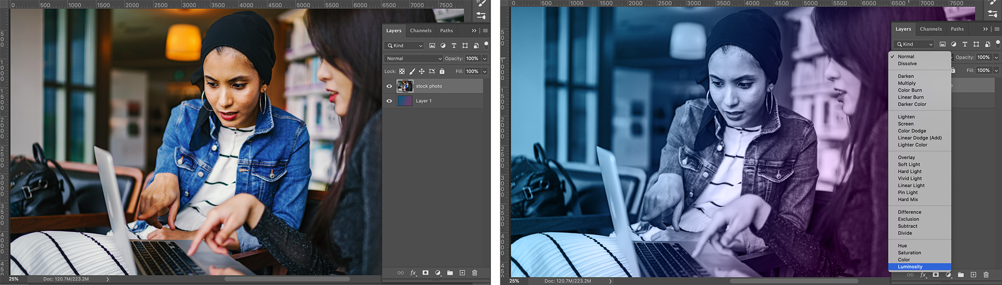
This is a great way to apply your brand colors to stock imagery and give it a little flair. Whatever you add to the bottom layer—whether it’s a flat color, gradient, or pattern—will be merged with your photo.
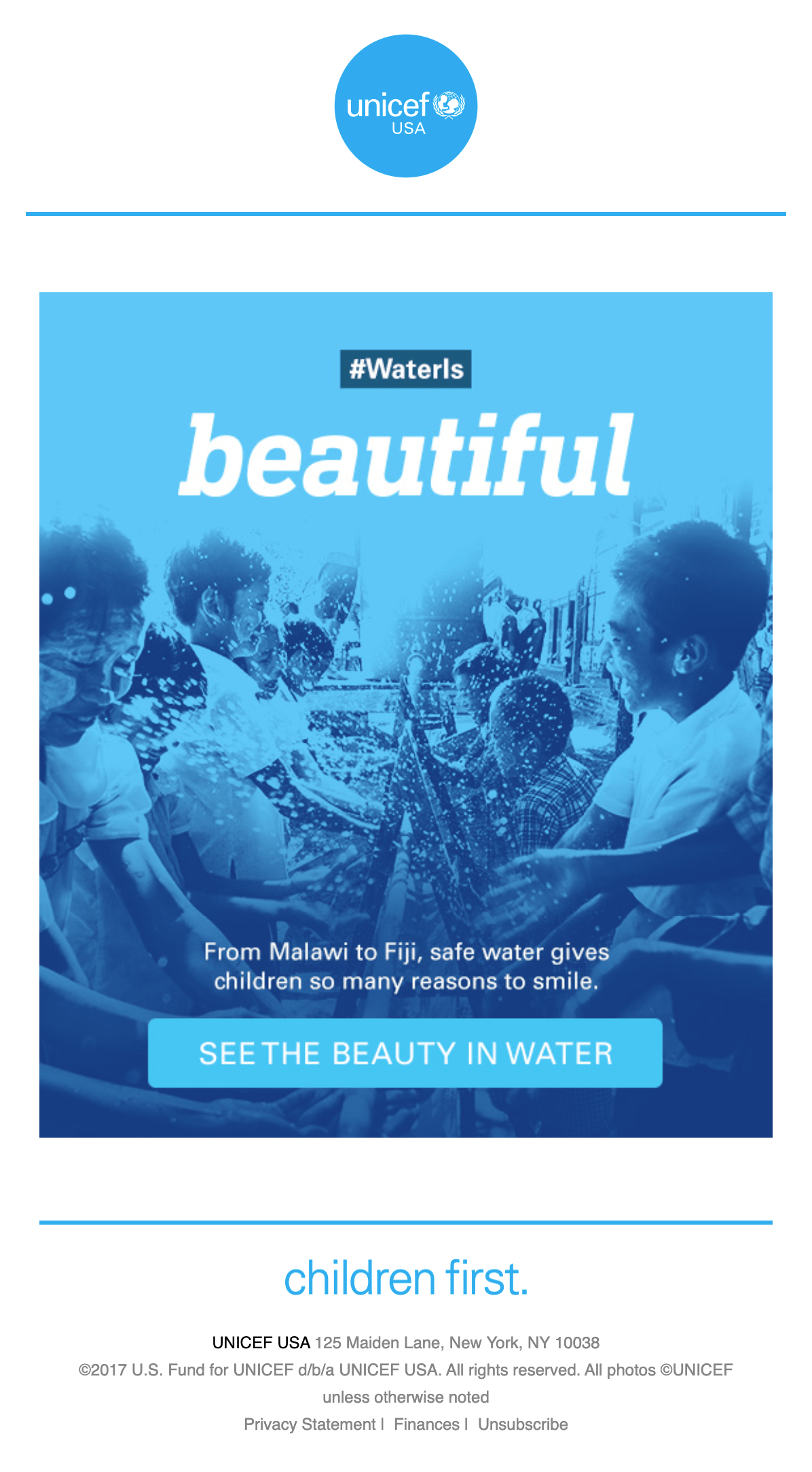
Unicef shows just how impactful this quick treatment can be when used in an email campaign.
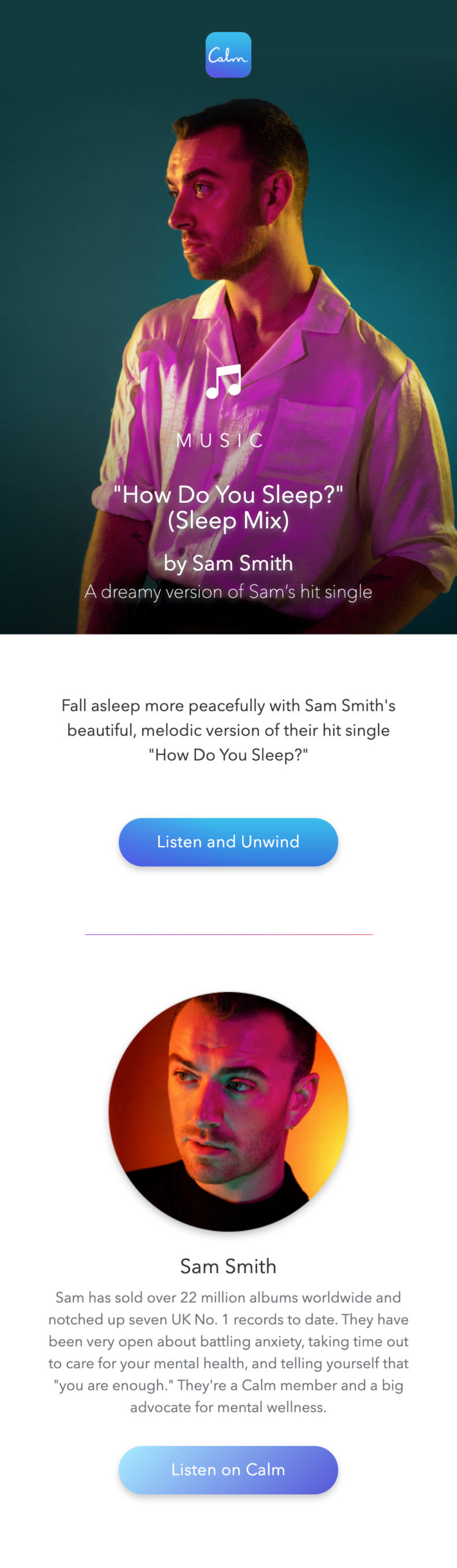
You can easily make images pop by adjusting the saturation levels, like Calm does in this beautiful email:
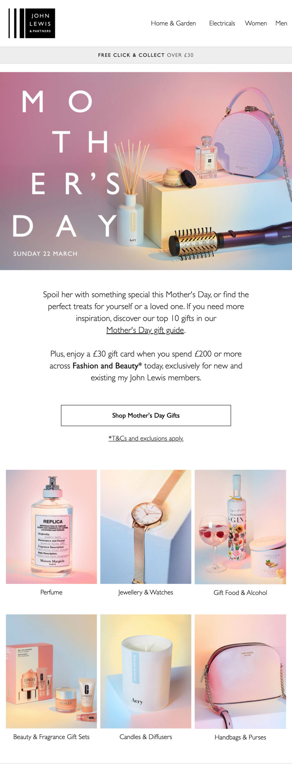
This Mother’s Day campaign from UK retailer John Lewis uses layers and overlays. They opted for a pastel palette to bring unity to their product photography.
Remove the clutter with a cut and a slice
It isn’t all about layering on top of existing stock imagery—it’s about chopping it up for your needs, too! Cutting out elements and creating new compositions breathes life into photography. It’s possible to purchase stock imagery that sits on a white background, but these images often feel overly staged. Imagery with cluttered backgrounds or other details that don’t fit with your brand voice if you used them as-is often offer the most natural and believable pieces when cut out and suited to your purpose.
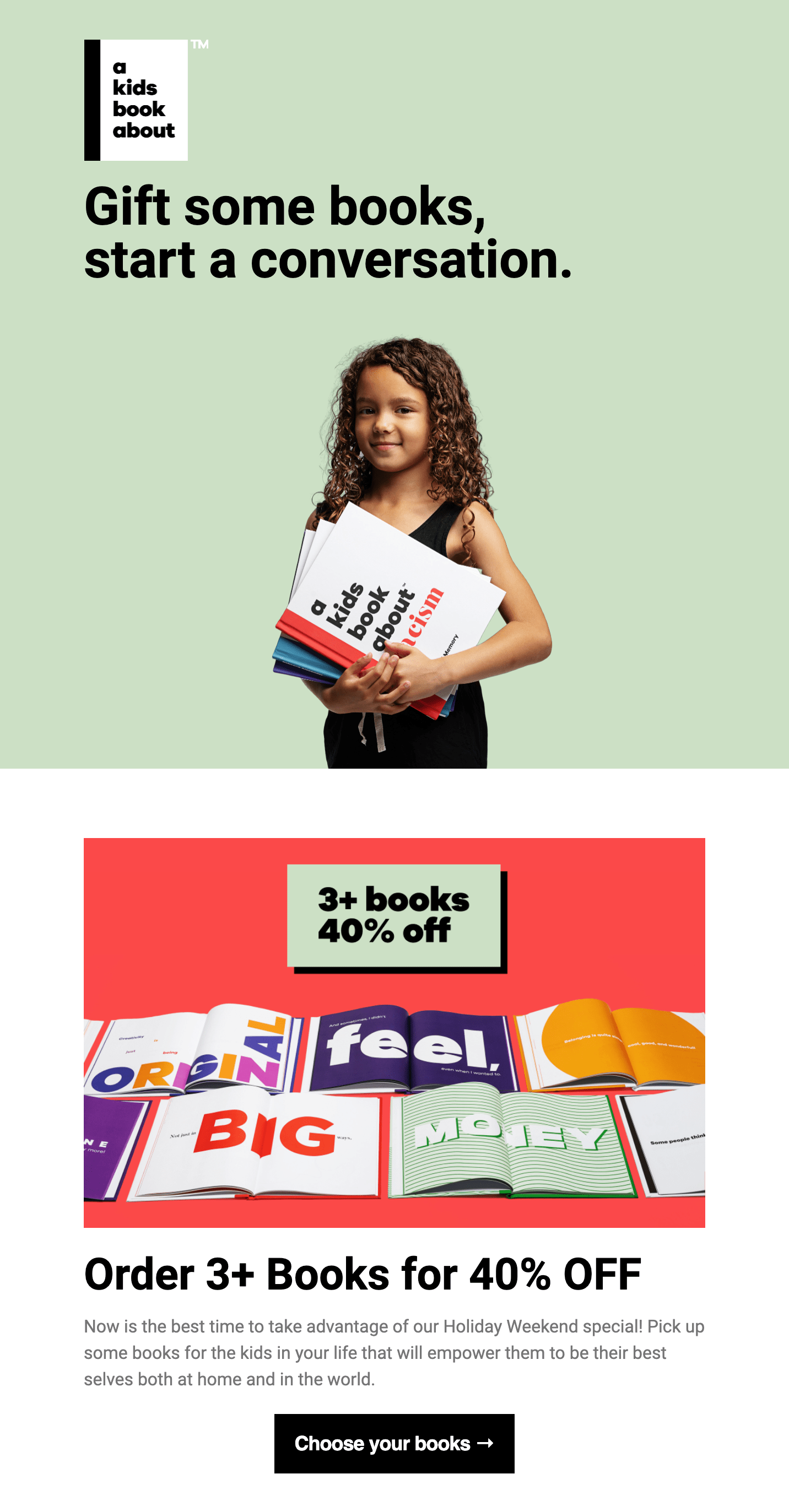
A Kids Book About uses ample amounts of negative space with their image placed on a flat color background, drawing your eye to the girl and the book she’s holding, the natural focal point of the hero image.
Smile Direct Club adopts a similar approach—but instead of a flat color behind their subject, they opted for a gradient and pattern to add depth to this hero area.

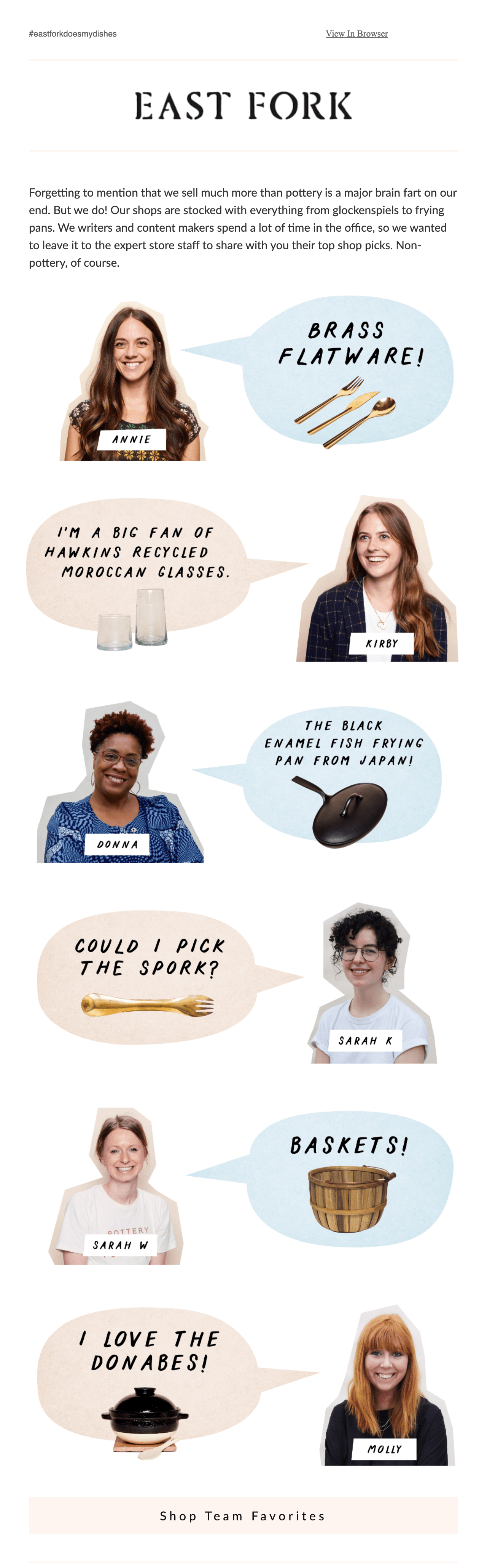
Getting creative with your cut outs isn’t all about the perfect extraction—you can be “crude” in your approach and create a cut-and-stick style that evokes scrapbooking, just like handmade dinnerware retailer East Fork does in this example:
Market research and insight company Mintel shows just how creative you can be when you bring photographic elements together, like they did in this photo montage background.

Switch perspectives and get 3D with new, unexpected angles
During the image selection process, it’s worth considering perspective. Choosing interesting angles can make your photographic content appear three-dimensional, and help your subscribers really dive in and get something new out of the imagery.
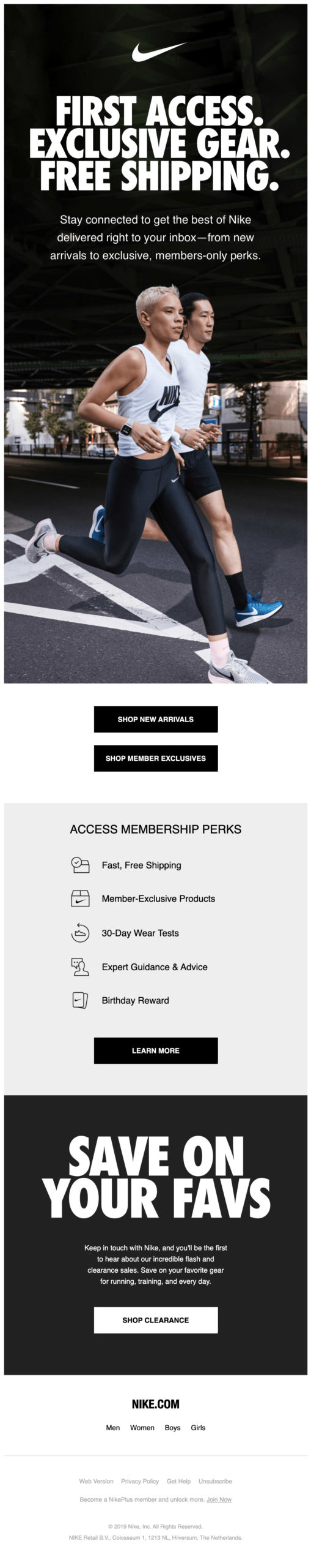
Nike creates a dynamic experience with this hard-to-ignore hero image. The use of perspective makes the subject matter jump off the screen—and with visual content complemented by bold typography and clear calls-to-action this email is a slam dunk.
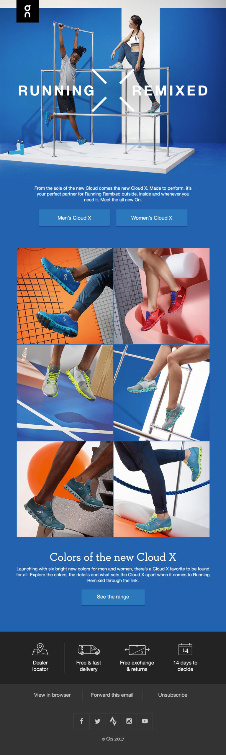
On has carefully thought out the perspective and composition of their photography in this email, drawing attention to multiple variations—presented in different angles—of a single product.
Creative compositions: Going off-grid or using shapes
Considering the placement of imagery within your composition is another way to help captivate your audience. Using off-grid techniques or including organic or geometric shapes are both proving to be popular ways to make photography all the more engaging.
Photography and film equipment retailer Moment uses off-grid techniques to place photography and written content within this well-considered reader journey. The unpredictability of abstract layouts can be considerably impactful and help guide readers through long form email campaigns.
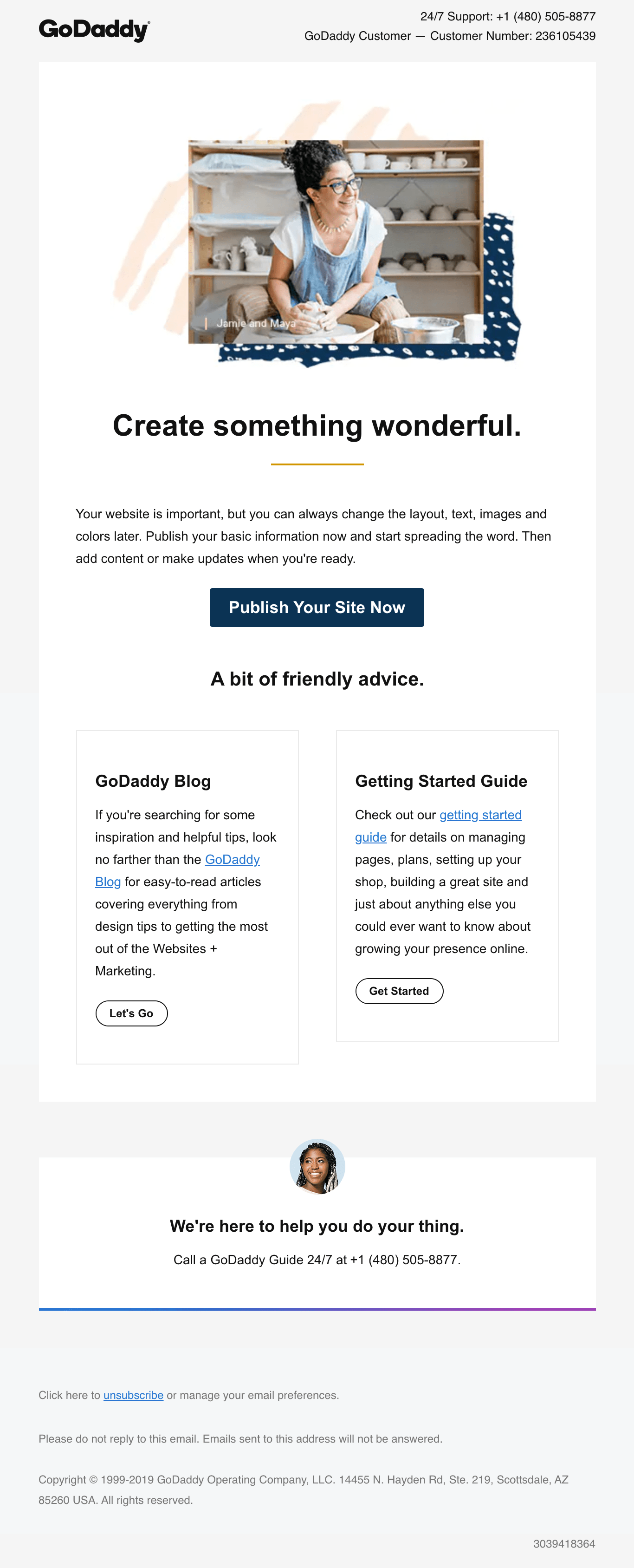
The off-center hero image in this GoDaddy email incorporates organic shapes and patterns. This draws the eye, bringing a pop and an area of interest to this clean, clutter-free design.
Lily Worth
Lily Worth was a Senior Email Designer at Litmus