
What Facebook’s New Pages Layout Means for Your Business
Facebook is at it again. Just a month after the social media giant changed its algorithm, it’s now tweaking the layout and design, adding a new feature and making page metrics more accessible.
The visual experts at Shutterstock, a site that specializes in stock photography, call the new look “visually appealing” with an “attention-grabbing layout that’s designed to delight viewers.”
Intrigued? We thought you might be. Here’s a breakdown of the new changes that are planned to roll out on June 13.
New page design
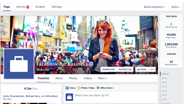
Instead of your posts showing up on both the right and left side of your feed, all of your posts will appear in a straight line down the right side like the picture below.
Derek Overbey, our senior Social Media Manager at VerticalResponse says, “The old layout is a bit a confusing. The linear feed will help viewers consume your content easier.”
On the left side, you’ll see your likes, an About tab, any apps that apply to your page, photos, videos, reviews, and posts to your page. If you’re a brick-and-mortar store, the left column will also show a map of your location, your phone number and hours of business. You can reorder these tabs to fit your needs.
“Having a spot to prominently display reviews could pay dividends for businesses,” Overbey says. “People love word-of-mouth reviews, and if they see a friend of theirs raving about your place on Facebook, they may be more likely to give it a try.”
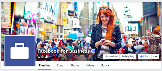
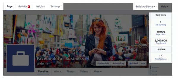
Information on top of your cover picture
Your business name and category will sit on top of your cover photo now. The like, follow and share icons will also sit on top of your picture, so you’ll want to make sure the image looks right with this new addition. The dimensions of the cover photo aren’t changing.
Easier access to page stats
To see how your posts are doing with the current layout you have to click the Insights tab. That tab will still be there, but with the new design the most important Facebook stats will be listed on the top right side of your screen. It will look like the white highlighted block in the picture below.
At a glance, you can see if you have an ad running, the number of page likes, post reach, unread posts and the number of notifications that you have.
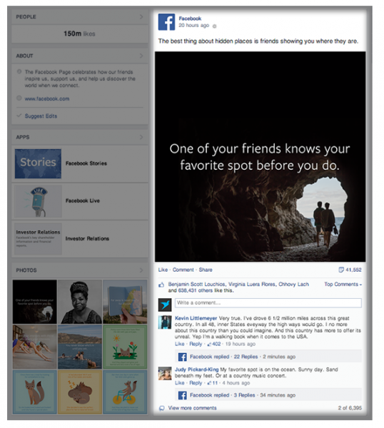
New “Pages to Watch” feature
Ever wonder how your competitor’s Facebook page is doing? Now you can find out. You can add pages to your “Pages to Watch” section and compare their results with yours. If you add a competitor’s page to this list they are notified that they were added to a watch list, but they aren’t told who added them. Here’s what it will look like.
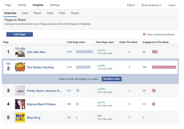
You’ll be able to see how many likes your competitor got that week, how many posts they published, and see how much engagement they got.
The new features are mostly for the desktop version of Facebook, although you’ll notice a lite version on the mobile Facebook. You won’t see these changes on the Facebook app.
What do you think of the new changes? Share in the comments.
Want more marketing tips and advice? Get the VR Buzz delivered daily!
© 2014 – 2018, Contributing Author. All rights reserved.


 Features
 Pricing
 Partner
 Blog
Blog Support
 More
More Terms of Services
 Privacy Policy
Hey Anita!
Thanks for the feedback, we’ve fixed it!
Can you let me know what your Facebook Page is Barb? I’d love to take a look and give you some advice.
Derek
Unfortunately, this new layout forces “posts made by others” to stay in their little box, with no way of highlighting them or adding them to the regular timeline. For organizations who thrive on interaction between their fans, this, for lack of a better term, stinks.
Great Article Lisa!
I noticed some business pages have a review function. Is this a paid feature? How can I turn it on?
I find it’s harder now to get a cover pic that looks good on both desktop and mobile. The company name and icons that obscure the bottom of the image on desktop aren’t there on mobile. Your example above of the Facebook Page for Business works well.
Love your blog but absolutely HATE HATE HATE that bar on the side with Facebook, Twitter, etc. tabs. It cuts into the test and it’s really annoying to have to scroll up and down just to get the text out of the way of the tab. Please get rid of it or put it somewhere else! Thanks.
Hi Erica,
Thanks for reading! So the good news is, the dimensions of the cover photos aren’t changing, but your company name and several buttons will now appear on top of the cover photo, so that may affect your design.
Cheers,
Colleen
VerticalResponse
I like the look but am wondering does anyone know the new cover photo dimensions. Thank you for the sneak peek :)peace
On my business page, my photos post on the right site and look beautiful, but then go into newsfeed on left. How do I keep my photos in the right 2 columns?