Just the other day, I was Googling something in a rush and came across a blog post that I thought would give me all the information I needed.
But, when I clicked on the page and tried to start reading the post, the entire screen went dark and a giant "Subscribe to our email" CTA popped up -- completely interrupting my experience.
I looked around for a "No thanks" button or an "X", but I almost couldn't find one. Just before I went to click the back arrow, I noticed a very faint, tiny "X" that was nearly the same color as the CTA background. It was obvious that this site's designers wanted to trick visitors into signing up for an email list before reading their content.
Not only did this CTA almost backfire by causing me to bounce off the site, but it also made me judge the brand's morals.
Although some business people might not think a code of ethics matters in design, it does.
In this post, I'll explain what design ethics is, what guidelines ethical designers might use, and a few tips for avoiding questionable design ethics.

What is Design Ethics?
Using design ethics, often referred to as ethical design, involves producing graphics, web pages websites, and visual aspects of technological products that are not misleading, valuable, and helpful to customers. It also involves considering aspects like user experience, inclusion, audience pain points, and accessibility when producing, reviewing, or adjusting designs.
Why are ethics in design important?
One of the best places to highlight your brand's mission, as well as its ethical values, is in your marketing and designs. After all, these are the areas of your company that prospects and customers might see most.
While ethics, inclusivity, and accessibility are not necessarily always top of mind for some busy marketers or designers,, it's incredibly important to review any public-facing projects from an ethical perspective.
Today, more than ever, consumers are paying attention to the moral standards of brands. Research shows 62% of consumers are attracted to brands that have strong, authentic ethical values.
When companies are considered ethical, consumers trust them, feel like the brand cares about their experience, and identify with the company. On the other hand, when brands use tactics that feel unethical, consumers lose trust in the brand which could lead to less brand loyalty or purchases.
Ultimately, every aspect of your brand's design contributes to the message you're putting out. If you want to create content and that demonstrates your company's values, you should regularly review your brand's design ethics.
Ethics in Graphic Design
When creating marketing content like landing pages, web experiences, or other visuals, ethical graphic designers consider a handful of guidelines. Here are just a few:
1. Designs should not be misleading.
You should aim for your designs to engage people and nurture them towards converting. Your designs shouldn't mislead, pressure, or coerce audiences into doing or thinking something.
In the intro, I noted a website I visited that tried to pressure me into signing up for email before I was even able to read their content. This just one of many sneaky dark pattern design techniques.
While it's not uncommon or unethical to create colorful or embellished designs that draw attention away from an "X" or opt-out button, dark pattern designs happen when designers make an obvious and conscious effort to trick visitors into doing something, such as giving out personal information.
For example, making the "X" nearly invisible and darkening content behind a pop-up ad so visitors think they need to convert or subscribe to email list to see content is a dark pattern technique. You might also see similar techniques in spammy emails where the unsubscribe link is hidden or made illegibly small so you can't easily find it.
While it's understandable that you want to get as many people as possible on a promotional email list, tricking visitors into subscribing for something is not the answer.
Why? If the contact didn't want to get signed up for the email, they might complain about the sneaky design, mark the email as spam, and unsubscribe immediately. If they aren't annoyed to the point of unsubscribing, they might not engage with the email because they weren't expecting it or were never interested in promotional content in the first place. This, in turn, could negatively impact email performance and future deliverability.
Ultimately, sneaking consent from visitors isn't likely to create major engagement or brand loyalty. So, if you must use a similar tactic or an automatically checked box in your design, make sure the text is large enough so visitors can see it and easily uncheck the box if they aren't interested in your offering.
2. Designs shouldn't hurt the user experience.
We've all been on a website where an ad or full-page CTA blocked the content we wanted to see. Sometimes, this gets so annoying, it causes us to leave websites entirely.
When we bounce off a website with too many pop-ups or design glitches, the site not only loses visitors and credibility, but it also loses SEO strength.
Designers should make sure they're creating experiences that nurture an audience member into doing something rather than force-feeding them an offer or advertisement. To do this, they should be asking themselves, "How can I design valuable online experiences that help visitors rather than shamelessly selling products to them?"
At HubSpot, we encourage companies to nurture leads rather than using unethical or desperate marketing tactics to trick them into signing up for something. Our natural lead nurturing approach can be seen right on our blog.
Each HubSpot blog post includes unintrusive CTAs at the bottom of the page, as well as a slide-in CTA that appears when the reader has scrolled passed a certain point in the post. Here's what the bottom of a post looks like:
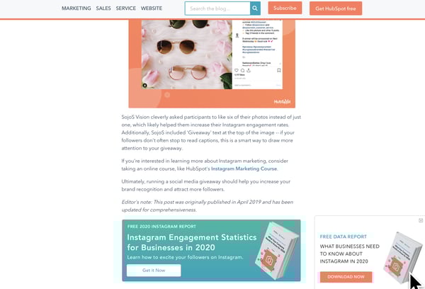
Not only do these CTAs fit smoothly within our blog design (and don't cover up the content), but they also relate to the content we're posting. This way, the reader gets a taste of our expertise in our blog content. Then, they can choose to dive deeper into our offers.
With unintrusive CTAs like this, we primarily send offerings to contacts that want them most, are likely to download more free resources, and might turn into qualified leads later on.
3. Messaging, disclaimers, and policies are clear and legible.
In the design below, another example of dark pattern design, the disclaimer, "Your subscription will renew automatically. You can cancel at any time," is so small you might not notice it.
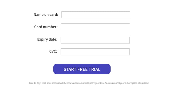
Because of this, visitors might give credit card information not realizing that they'll be charged without being asked at the end of their free trial. Ultimately, when someone's card is surprisingly charged for a service they didn't want because they didn't see this message, they might get annoyed with the brand, unsubscribe, and potentially complain about the small text.
On the other hand, if your text is legible and understandable, you might only receive the customers that understand free-trial policies, are serious about your service, and won't rush to complain if they forget to cancel their subscription before the credit card charge.
4. Use proper representation and embrace inclusion, whenever possible.
Ethical designers always ask, "Does this design accurately represent groups of people discussed?"
Between 2011 and 2015, Access Icon embraced inclusive design ethics when they revamped the International Symbol of Access -- often seen on accessible parking spots or wheelchair-accessible bathrooms -- to better represent people with disabilities.
While the original symbol showed a simple stick figure sitting in a static wheelchair, the new symbol shows a person's arms moving with their body tilted forward as if they're actively moving or speeding in their wheelchair.
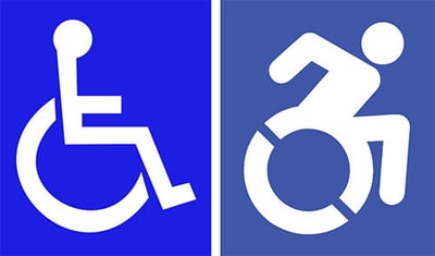
The new design came after a 2011 Boston-based street campaign, where Access Icon members placed a moving body over the static body on accessibility signs.
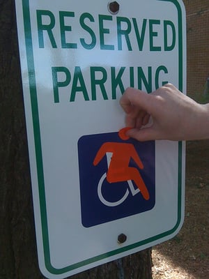
Although Access Icon did not intend to replace or criticize the original symbol, created in the 1950s, the organization wanted the new version to create an "occasion for asking questions about disability and the built environment, in the largest sense. Who has access—physically, yes, but moreover, to education, to meaningful citizenship, to political rights?"
Between 2012 and 2015, state governments, cities, major companies, and local businesses around the world adopted the symbol.
By refining this design, the group aimed to accurately represent people with disabilities as mobile, energetic, and empowered, rather than as static, less mobile figures. Ultimately, they realized the original design wrongly depicted those with disabilities and created a new design that solved for it.
Ethics in the Design of Technology
Design ethics doesn't just stop with imagery or website UX. Tech products, software, and other tools also need ethical designers to create smooth, pleasant, and trustworthy experiences for customers. While technical or product designers think about the ethical guidelines noted above, there are a few additional standards they might follow:
1. Designs should be accessible.
In recent years, accessibility has been a major topic in the world of tech and product design. Although you might not realize it, people with varying accessibility needs might be using your product. And, when your product is accessible to more people, more people can use it and buy it.
One recent example of an accessible technology design was Microsoft's Xbox Adaptive Controller.
After learning that children with physical disabilities, such as missing limbs, were having trouble playing Xbox video games with the console's controllers, Microsoft developed an adaptive touchpad controller, which enabled people with multiple types of disabilities to play games with their friends.
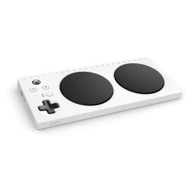
Aside from two circular touchpads, which replace small controller buttons, the Xbox Adaptive Controller features large programmable buttons and can connect to external switches, buttons, mounts, or joysticks that make gaming more accessible for users.
The process of designing the controller was highlighted in a Super Bowl ad called, "We All Win," which you can watch below:
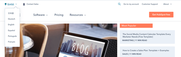
On a smaller scale, accessible technological design could also involve including accessibility tools and symbols within your software interface or web page.
For example, some brands might offer an accessibility icon at the bottom of their website where you can click to adjust settings for a smoother experience if you have a disability. Or, to make their site or UX accessible to people in other countries, websites, like HubSpot's offer an icon and menu that allow you to toggle between languages:
2. Designs should promote safety and security.
In 2020, many people are thinking about data security as many are buying smart devices and software for workspaces and their homes. With many devices listening to our voices, logging our lifestyle habits, and even recording health data, some worry that this information could be sold, stolen, or used unethically later on.
Because of data concerns, many tech firms are emphasizing security in their overall product design.
For example, when smart home devices with virtual assistants initially hit store shelves, consumers panicked when they learned that some devices, such as Amazon's Echo, would surreptitiously record them.
To make consumers feel more secure with Echo devices in their homes, Amazon designed each device with a very visible mute button on them. When the button is pressed, the Echo's light ring and the button turn orange to visibly show people that the device has deactivated recording.
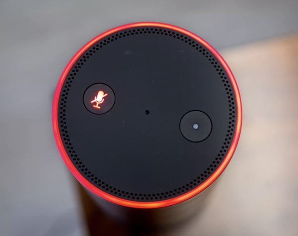
While this button might make Echo owners feel secure at home, it might also ease the nerves of prospects who see it in product shots or Echo ads before purchasing it.
3. Consider or respond to unexpected ethical dilemmas.
If you're helping to design a new piece of technology, you should consider all of the potential ethical dilemmas it could create and create a design that could either solve for them or ease your audience's concerns.
In 2018, Netflix was forced to address a design strategy on its platform when a recommendation algorithm was panned across the web.
The algorithm in question, which Netflix called, "Artwork Personalization," aimed to show users show thumbnails based on the design traits of thumbnails they'd previously clicked. While it sounded like an interesting personalization experiment, consumers quickly argued that this personalization was racially targeting users.
Specifically, some users noted seeing primarily content recommendations with white people in thumbnails while some BIPOC users saw mostly thumbnails that showed people of color. While Netflix denied that the algorithm targeted users by race, the news went viral.
In this scenario, had Netflix designers and developers researched their design tweaks or audited it from an ethical perspective, they might have been able to tweak the algorithm before launch.
How to Promote Design Ethics
If this post has inspired you to develop a new ethical standard for your designs, here are a few next steps you can take.
Audit Your Past Designs
Even if your designs have been successful in the past, it's still good to re-audit them to ensure that they continue to promote design ethics. For example, you can look at your website or product's design to ensure that they're accessible, easy to comprehend, and inclusive to all potential web visitors.
Review Your Current Projects.
Whether you're working on a product, website, graphic, or software-related design, reviewing it from a design ethics perspective might lead to a successful launch with fewer risks of complaints or concerns from the public.
Pivot if Needed
Sometimes a design tactic you once embraced is now considered out of date. For example, a design symbol that used to be culturally acceptable or valuable might now be seen as a misrepresentation or offensive. When you notice things like this changing, it's smart to adjust or modernize your design tactics.
Want to learn more about design and ethics? Check out this post for additional information on dark-pattern design or this post on ethics in modern marketing.