

You've heard it several times, or you're just hearing it for the first time, email marketing remains one of the best options for boosting your ecommerce business
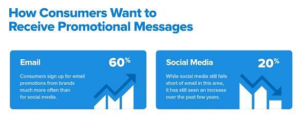
Most online consumers, at least 60%, prefer to hear about your products and offers through email, as opposed to 20% who like to be engaged by social media.
Savvy ecommerce brands therefore use email signup forms to retain some of their leads or complete their sales.
Despite the popularity of this practice, the attempt to success ratio leaves much room for development. The average success rate for email sign-ups falls between 1.95% and 4.77%. And only the very best marketers get the maximum average.

This is nothing to be discouraged about, anything around 5% can be a rich number depending on the level of traffic you're bringing to your ecommerce store.
In this article, my duty is to inspire you on how to make the best of your ecommerce traffic and convert as many of your website’s visitors as you can into your email list. For this, you need to start shaping the best eCommerce experience by choosing one of the leading eCommerce tools to host your website. Those with headless commerce capabilities provide increased flexibility.
We will be looking at high-converting email form examples from brands that have mastered this art. We'll also treat the strategies they used to make their email sign-up forms so effective.
The idea is for you to be inspired, but more importantly, for you to be able to apply what you've learned to your list-building strategy.
Table of Contents
Necessary Steps for Creating High-Converting Email Forms
Before we jump straight into these examples, let's have a quick look at the best strategies you must implement to create high-converting email signup forms.
With this information, you'll find it easier to understand why the examples given below are so effective. You would also have a very realistic chance of boosting the conversion rates of your email forms.
1. Be Simple and Concise
As much as consumers love seeing exciting and beautiful content, they get lightning-speed frustrated when they can’t understand your message at first glance.
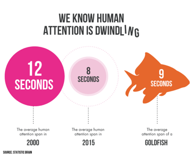
The average human attention span only keeps dropping. It was as low as 8 seconds back in 2015.
In reaction to this, you want to make sure the few seconds an online user would spend looking at your signup prompt or form would be well utilized and enough to convey the message.
Do this by using short, concise content that still delivers the message and emotion you want them to feel.
2. Use a Brilliant Design
The design of your form should be three things: effective, appealing, and memorable.
Naturally, these are the three most pursued keywords for brands when it comes to anything design, whether it’s to design a logo, or to build a website, or create visual content like infographics and animations.
Eye-catching and memorable designs will always have a positive influence on your conversions as they speak volumes about your brand and create longer lasting impressions.
3. Use Practical Form Fields
It is generally believed that the higher the number of fields, the lower the possibility of conversions. However, that is not always true. A research by Omnisend in 2018 discovered that the number of fields that generated the highest signup rate is 3 at 10%.
You must still be wary of using longer form fields, as they tend to create unwanted friction for consumers.
It’s advisable that the more information you have to collect for your personalization strategy, you should consider using more engaging methods like quizzes, or drop-down menu forms, or even lead generation chatbots.
Providing a stronger incentive for people to sign up or running a new campaign to your new subscribers to collect more information would be effective in this regard too.
If you want to use a minimal form but are curious about the best combination of details to request for, the research by Omnisend proves that asking for an email address and name has the highest signup rate at 7.41%.
4. Use Clear Incentives
Consumers are always looking out for incentives and value, so it makes perfect sense for you to offer them something in return for their emails.
Your incentives don’t necessarily have to be in the form of discounts, although discounts are more likely to be effective. Promising your subscribers exclusive deals or high-quality and valuable content also count as incentives.
5. Avoid Irritating the Users
You must be deliberate and careful with your opt-in strategy so that your attempt to recruit a subscriber doesn’t inconvenience them and develop into a bounce or abandonment statistic.
There are some timing parameters you can follow to make your signup form appear at the right time that work great for ecommerce stores.
- Making the form appear immediately helps the user visits the site. This is especially popular for first-time visitors, where you can offer them a certain discount for their first purchase.
- Making it appear as part of the checkout process.
- Making it appear after they’ve clicked on an element, like a CTA or a floating icon.
- Making it appear when it seems they’re about to leave the site. This is otherwise known as an exit-intent popup.
- Making it appear when they’re about to abandon a cart. This will boost your cart abandonment strategy.
- Making it appear when they’ve spent an amount of time on your site without taking a definitive action.
- Making it appear when they’ve visited your site a number of times without signing up to subscribe or making a purchase. This could also apply if you use a guest checkout process and don’t require customers to create an account and therefore submit their email before checking out.
6. Use an Effective CTA
An effective CTA is especially vital to increasing your email form signup rate. Effective CTA buttons stand out invitingly against the background design of your form. They also have clear and relatable commands.
7. Follow Privacy Regulations
Adding a privacy policy to your email forms is not exactly a strong conversion booster but it's a necessity. Consumers are more bothered about their security and privacy these days so it's vital that you take those into consideration or you will risk losing conversions.
There are regulatory bodies that keep an eye on how online businesses handle consumers' data and how they interact with them. Organizations like the GDPR, CAN-SPAM, and the CASL protect American and European citizens from privacy violations.
You must familiarize yourself with the rules of the bodies that apply to your jurisdiction and online audience.
8. Include Social Proof
Social reviews, testimonials, and star ratings are the most popular and effective forms of social proof and they're utilized generally in ecommerce advertising.
You can save a space for them in your signup form or prompt. When used smartly, they can provide that extra motivation and FOMO for users to drop their email addresses.
Statistics and user-generated content are also effective versions of social proof. They are great options for convincing your target audience of the quality of your product or brand.
12 Examples of High-Converting Email Forms for Ecommerce Stores
Now for the inspiring stuff. Pay close attention to how these email signup forms utilize the strategies we just discussed.
1. Death Wish Coffee
This brand uses a modal pop-up form to entice and recruit newcomers to their email list.
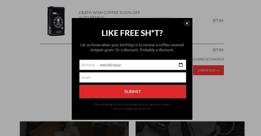
What we can learn from DW Coffee's signup:
Engaging Copy
The copy on the form is short and immediately understandable. But it's also exciting.
The informal and humorous tone is more interesting than plain sentences and would resonate more with their target audience.
Use of Incentive
This particular incentive feels special because it promises to give the subscriber something ‘‘free’’ on their birthday. Since most people appreciate the idea of birthday gifts, that just serves as another strong motivation to sign up.
Well Designed CTA Button
The CTA button is the most prominent element in the form. It stands out against the background, pushing itself into the minds of viewers. An effective CTA button should be that noticeable.
2. Nike
Visitors who are about to exit Nike's online store without making a purchase or taking any major action receive this exit-intent popup form to submit their email addresses.
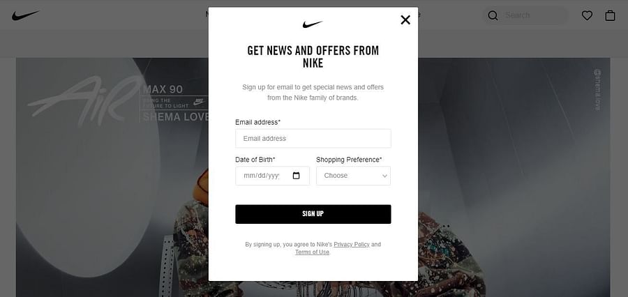
What we can learn from Nike's signup form:
Personalization
The form is clearly optimized for personalized marketing and it doesn't shy away from getting the most important details, in this case, the email address, date of birth, and shopping preferences.
The form avoids the tediousness of long forms, using only three form fields, while still aimed at capturing high-quality leads. A good way to optimize both the quality and quantity of your leads.
3. Wool and The Gang
This knitting-focused store uses a floating bar that pops into a signup form when clicked.
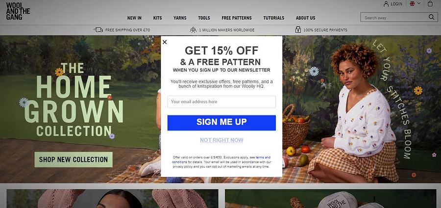
What we can learn from Wool and The Gang's signup:
Non-intrusive
Unlike modal and full-screen popups that automatically appear on the screen, the click-to-trigger option adds a layer of convenience and the element of choice to consumers' browsing, which we know can be decisive for conversion.
The button strongly calls out owing largely to that strong incentive of 15% and by how it contrasts with the page's design.
This strategy is effective because it eliminates the risk of repelling new users while also making sure your opt-in offer can't be easily ignored.
4. Zara
Zara's newsletter opt-in is an inline form. An inline bar unlike pop-ups or floating bars doesn't float or stick to a conspicuous part of the screen mostly. They're usually embedded as part of a web page, either at the top or bottom of it. Zara's inline form is embedded within the page at the left bottom corner.
What we can learn from Zara's email form:
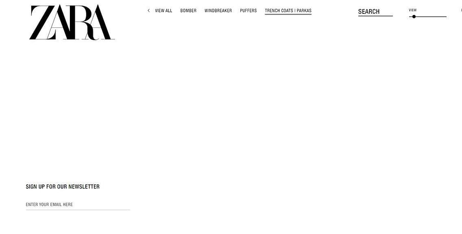
More high-quality leads
While admittedly, the inline form is not exactly an attention grabber, it does have the strength of capturing mostly high-quality leads.
No loud incentives, no popping on the screen to grab attention, no elaborate copy or design to engage users. Bearing on this fact, it's mostly individuals that have a genuine interest in hearing from this brand that will take the time to fill the inline signup form.
So while that strategy may not be great for the number of signups, it captures subscribers that are more likely to become regular customers.
5. Kate Spade
The fashion store utilizes an email opt-in as part of its cart abandonment strategy and pops up a signup form when a user is about to abandon their cart.
Cart abandonment is a serious issue for ecommerce stores. According to Statista, 88.05% of online shopping carts were abandoned in 2020. That's a huge number of potential sales going out the door, sore to the eye of any ecommerce business owner or marketer.
By adding an email form pop-up to your cart abandonment strategy, you can reduce the number of abandoned sales and prime many of such leads for future offers.
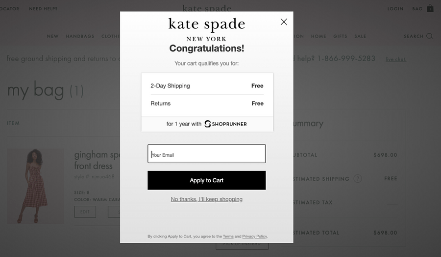
What we can learn from Kate Spade's cart abandonment popup:
Smart Incentive and Good Copy
The incentive of free shipping was already included as part of the checkout details but by sticking it out in that list format along with the free returns, it rebrands the idea, reminding shoppers of what they're going to miss if they abandon their carts.
The bold imprint of the words "free" along with the 1-year guarantee boost the perceived value of the incentive.
6. MVMT
The watch and accessories brand throws in an email form popup to sneak first-timers into their mailing list and also encourage them to make their first purchases.
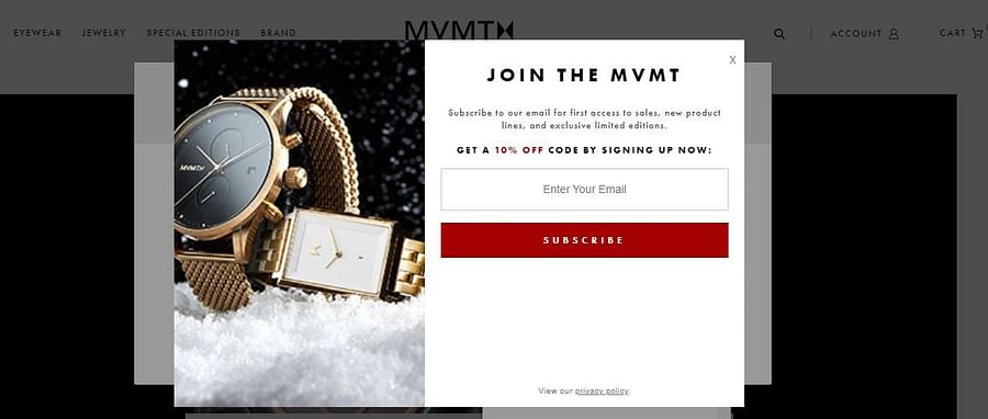
What we can learn from MVMT's email signup form:
Use of Visuals
The image adds to the integrity of the form's simple and effective design. Apart from making the form more inviting, it serves as a subtle reinforcement of what the brand is all about; luxury and quality watches.
7. Amazon
Amazon's signup form is not a traditional example of an email opt-in, but it's a good example of a signup form users should encounter as part of the checkout and account creation process.
It is important to be deliberate about your account creation forms because they play a vital role in determining if consumers complete their checkout process and subscribe to your list.
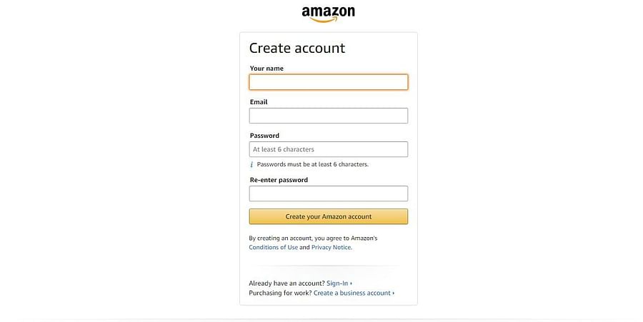
What we can learn from Amazon's form:
Simplicity
Amazon's form is a brilliant example of using simplicity to aim for the convenience of the consumer. With just four form fields requesting only for the most vital details, signing up becomes less of a hassle to shoppers.
People that sell on Amazon benefit from this positive consumer experience. Amazon has one of the highest conversion rates for ecommerce stores owing partly to the fact that they try to avoid long, stressful forms.
8. Osmotics
First-time visitors to the cosmetics brand's online store will receive an email signup form in the form of this popup.
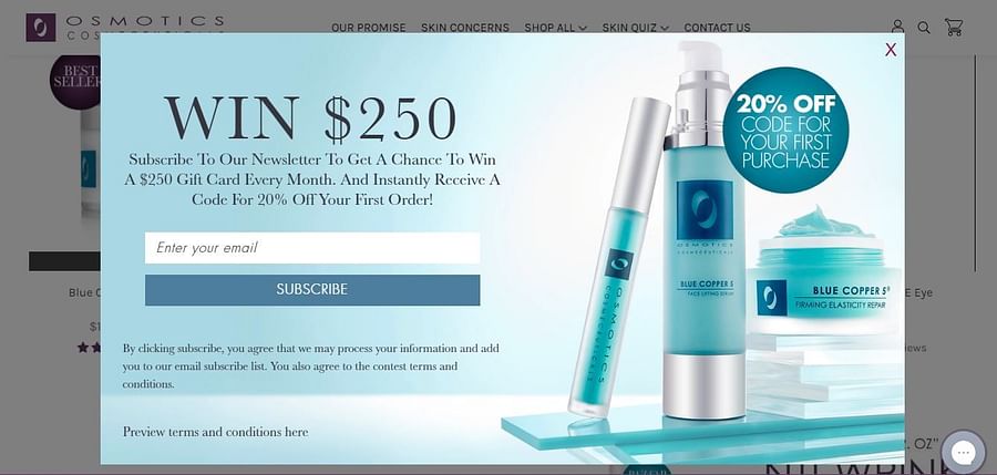
What we can learn from Osmotic's email form:
Eye-catching Design
This form especially makes use of good design with an attractive color scheme.
The graphic elements are designed to make the incentives pop out to the shopper, making them harder to resist. The visuals used agree well with the background and color scheme. They also boost the brand's image.
9. Schuh
Schuh provides a more elaborate example of an inline email signup. The inline email form sits at the bottom of their page, next to their social proof.
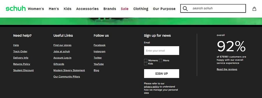
What we can learn from Schuh's form:
Social Proof
The social proof beside the form on the left is a smart input. The huge numbers and positive statistics would serve as a good motivation to shoppers to complete the signup.
10. Sweaty Betty
In Sweaty Betty we have a great example of a floating icon email signup. Even better, this one is embedded in the live chat button on the right side of the screen. Shoppers who desire to speak with customer service will have to submit their name and email.
It is an effective way to recruit emails, since online shoppers these days prefer to channel customer support through live chats. It also works for capturing the details of stubborn shoppers that ignored the site's first email opt-in prompt, which automatically pops up with a customary discount once you first visit the site.
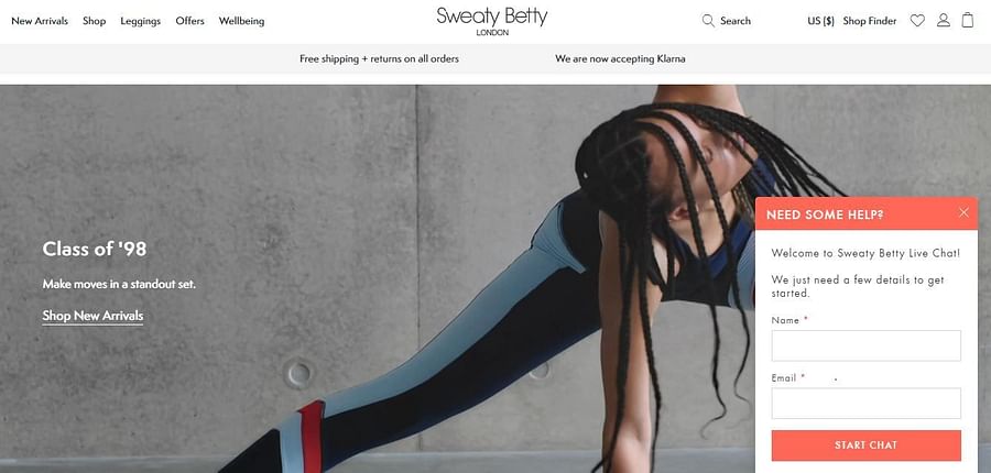
What we can learn from Sweaty Betty's email signup form:
Non-intrusive
The form is discreet since it's triggered by a noticeable but almost unassuming icon. Shoppers have to click it before they see it.
11. Gymshark
Gymshark offers a good example of a whole page signup form. A newsletter signup page and a CTA that links to it is another option you can consider for your opt-in strategy.
The strength of this approach is not in the quantity of conversions it generates but in the quality.
It's no wonder that according to Omnisend's research, landing pages have the highest signup conversion rate at 23%.
Consumers have a higher commitment towards completing the process in click-to-page scenarios.
Also, like Gymshark, you can reinforce your CTAs across the site to increase your chances of conversions.
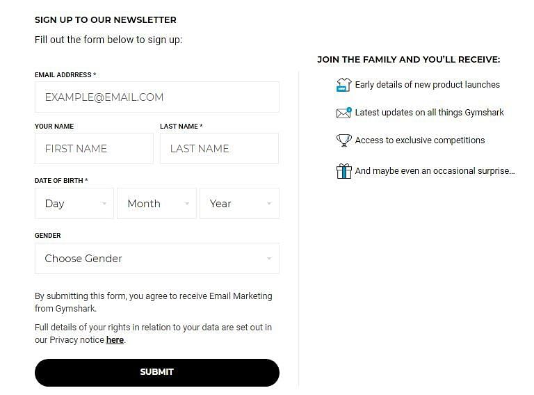
What we can learn from Gymshark's email form:
Personalization
The form is clearly primed to collect relevant data from high-quality leads for an effective personalization strategy. The DOB, Gender, and even last name are requested for. That’s a lot of information that only genuinely interested consumers would fill.
Safe to say a pleasant percentage of those leads would be making hot conversions at the end of the sales funnel.
12. Shinesty
Shinesty is a clothing store that has a fun and bold, humorous outlook and they use this to their advantage for their full-screen email form popup.
More importantly, they make the form appear immediately when you visit the website, which is probably the best time to make it appear. Sending an unprompted full-screen form at any other time might mean creating a distraction and annoyance when a shopper is on the verge of making a purchase decision.
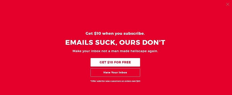
What we can learn from Shinesty's email signup form:
Empathic content :
The brand uses a more personal approach by sympathizing with a popular headache consumers have: flooded inboxes. They solve that pain point by promising to be different.
The very upfront and humorous language serves to warm shoppers and make them open to taking positive actions, like submitting their email.
The negative CTA button avoids a generic command and leverages the power of communication. "Hate Your Inbox" is something a lot of consumers can resonate with. It'll also make them reconsider clicking the button.
Use Your Information Wisely
Now that you've been inspired, it's only imperative that you go ahead and implement those ideas in your email opt-in strategy, right? Not so fast..
While these are examples of high-converting email forms, there's no ultimate guarantee that they'll increase your email signup rate. For one, those brands might have different target audiences, different product lines, different brand identities, etc, so their approaches might not work for you.
You must consider that fact. Your best option is to experiment with those ideas using an A/B testing strategy. For the best results, your ecommerce platform should be integrated with a quality email marketing service that offers inbuilt testing and great opt-in features.
With this knowledge and your access to the right tools, you'll be closer than ever to having a mailing list that's not only bulky but guarantees hot sales.
