
How to Use Email Typography That Speaks Volumes
When we think about creativity in email, we often consider imagery as the go-to solution for eye-catching designs. There’s another way to get creative—typography.
Learn how you can make an impact, too, as this guide explores:
- What email typography is
- What’s a typeface?
- Which typefaces you can use in email
- The benefits of email typography
- How to add font styles to your email
- Email typography best practices
- Real-life examples of great email typography
What is typography in email?
Typography is the styling of the written content and includes typeface, weight, size, color, and letter spacing. Typography in email is all about your copy’s overall look and arrangement to make a visual impact.
Many brands today are grabbing subscriber attention and getting their message across with well-styled copy and few or no images.
What’s a typeface?
A typeface, or a font family, is the design of a set of characters, including letters, numbers, punctuation marks, and symbols. So, the typeface you choose is one aspect of your typography in email.
There are a plethora of typefaces out there that you can use to style email copy. The number of options can make deciding a little daunting, especially if you’re not bound by brand guidelines. But you can follow some general guidelines to help with your selection.
What are typeface classifications?
A typeface classification is a category of typeface. There are five basic classifications of typefaces: serif, sans serif, script, monospaced, and display.
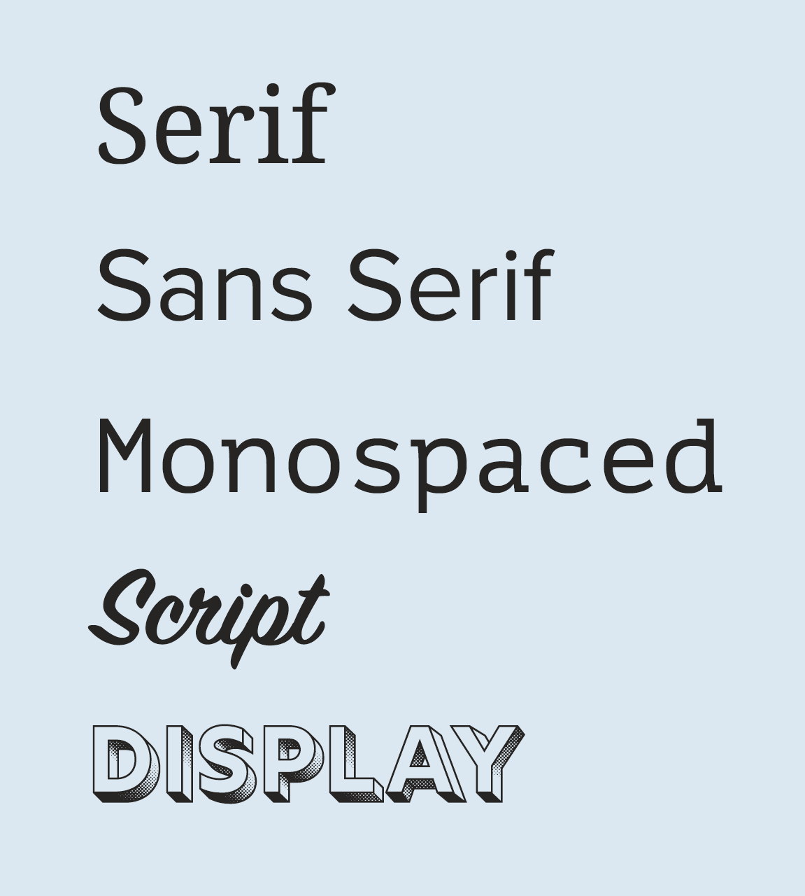
- Serif fonts are recognizable by the decorative stroke at the end of letters, also often described as feet.
- Sans serif, meaning ‘without serif’ in French, has clean, precise ends to each letter.
- Monospaced typefaces have characters that each occupy the same amount of horizontal space. Fonts without monospacing are variable-width, with letters and spacings of different widths.
- Script, or cursive fonts, are often fluid, joined letters, similar to handwriting.
- Display, or fantasy fonts, are decorative, creative typefaces you can use in large format or logo design.
The typefaces you can use in email
To use a typeface within an email, it needs to be a web font.
A typeface needs to be a web font to use within an email, which is a digital typeface that you call in with your code. There are many free web fonts available, plus options you can purchase. Let’s look at the two types of digital fonts you can call into your email: web safe fonts and web fonts.
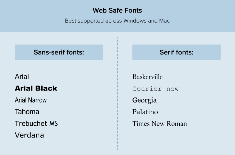
Web safe fonts
Web safe fonts are typefaces installed on most operating systems, meaning that calling these fonts into your email code will result in consistent rendering across email clients, devices and operating systems.
Here are the web safe fonts best supported across Windows and Mac devices:
Pro tip: you can grab web safe CSS font stacks from CSS Fonts!
Font stacks are a list of fonts starting with the primary typeface you want to render, followed by fallback fonts that will appear if a subscriber doesn’t have your chosen font installed. For example:
font-family:’Helvetica Neue’,Helvetica,Arial,sans-serif;
Web fonts
Web fonts are typefaces that are not available on all operating systems.
Therefore, you need to add some extra code to your emails to put them to use. You also need to use fallback web safe fonts in your font stack, as not all email clients will render email typography the same way.
You can find web fonts in many different places, such as Google Fonts, a free resource, and Adobe Fonts, which requires a subscription. If you have custom fonts created in-house, you’ll also treat them like a web font that needs a web safe backup.
For a comprehensive guide to web fonts, check out our Ultimate Guide to Web Fonts.
Ideally, you shouldn’t use more than two font styles at a time, or the design can become noisy and confusing. Too many web fonts can also increase the load time of your email.
Why typography matters in your email design and development
Sure, unique typography looks cool, but is it worth the extra effort to customize? Here’s what you stand to gain by standing out with email typography.
Help subscribers identify your brand
Using brand-specific fonts helps subscribers identify your brand when they open your email. Some fonts are very distinctive, even out of context—think of Walt Disney and Coca-Cola. Cohesive and consistent branding could increase recognition, reputation, and trust.
Differentiate communication types
You can style different types of communication, like transactional messages and email newsletters, using separate font styles. Unique visual identities help your audience quickly identify the type of communication. The typeface you use can also elicit different emotions. For example, you need password reset messages to feel secure and professional—so Comic Sans is definitely off the table.
Elevate brand personality
Creative typography can also elevate brand personality, like if you use display fonts in the hero area.

Keep eyes on your email, even when you’re away
Litmus Email Guardian monitors your emails continuously so you know if a previously-perfect message suddenly breaks because of email client updates.
Create hierarchy
Your subscribers are inundated with emails daily, so you have limited time to get your message across and capture their attention. Our research found that the amount of time readers spend with your email keeps getting shorter.
Opened emails are often scanned as the reader searches for anchor points within your email to understand the value, which is where typography comes in handy.
Your email typography’s size, style, location, spacing, and color determine where subscribers look first, second, and so on.
Using typography intentionally shows which parts of your email are most important. Although I am not a believer in ‘the fold’, I do think it’s important to give subscribers the opportunity to understand the aim of the email, and take action without having to commit to reading lots of copy.
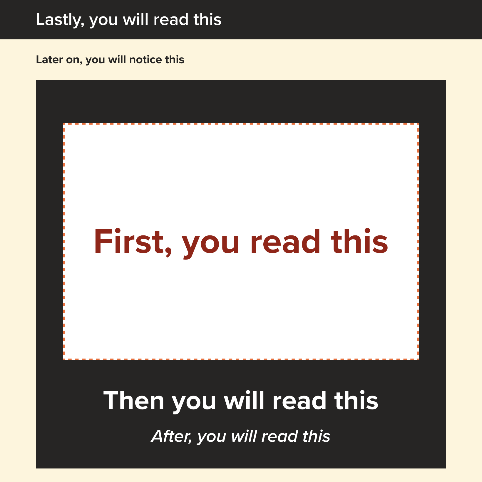
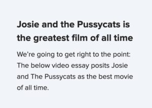
Let’s look at an example.
You looked at the large, bold text at the very top of the message first, didn’t you? Typography in the hero section is the perfect place to sum up the value or purpose of the email because it’s bound to get attention.
Next, did your eye go to the solid button? If clicks and conversions are the objectives of your email campaign, following up with a call to action can help the reader take action without consuming the whole email.
Finally, the less dominant headlines break up body copy to make the message easily scannable so you don’t have to commit to reading every word.
How to add font styles in an email
Want to add some visual interest to your emails with typography? There are two ways to add font styles in email: in the <head> section and inline. In the past, all styles needed to be added inline, but more email clients are supporting styles in the head section. We recommend including the styles in the head and then using inline styles only when necessary. This creates clearer, cleaner code that also has a smaller file size.
Bold
While bolding text can help sighted subscribers identify key information, only through semantic coding will screen readers pick up on the difference.
How to add bold text to your email
There are several ways to bold your text. The best way if you are just looking to make some text bold is to use CSS property font-weight. If you are looking to emphasize a word or phrase you can use the <strong> tag. The <b> bold tag isn’t semantic and will not emphasize your chosen word(s) to the screen reader user. Be aware that using the <strong> tag is a signal to your screen reader to emphasize your word or phrase, so be intentional when using this tag.
Font weight accepts keyword values such as normal, bold, and light. It also accepts numerical values with 700 being equivalent to the traditional bold and 400 being equivalent to the traditional normal. The numerical values are more commonly seen with web fonts.
In the head (Better)
To make a bold class that you can apply anywhere you want bolded text:.bold { font-weight: bold; }
–or–.bold { font-weight: 700; }
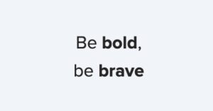
What it looks like:
Inline styles (OK)
<p>Be <strong>bold</strong>,<br />be <strong>brave</strong></p>
What it looks like:
Italic
Italicizing your text is a stylistic way to make your text stand out. As such, you could italicize your copy with with the font-style CSS property.
How to add italic text in email
You can use font-style property to create italicized text inline or in the style block.
If you are specifically trying to emphasize a word or phrase, you can use the <em> tag instead as this automatically adds the italic styles to your copy, however as this is a semantic tag make sure you are intentional in your use and make sure to test on a screen reader so that you are sure your copy is being read correctly.
If you are italicizing for idomatic reasons – the tone of voice, to convey thoughts, or technical terms to name a few examples – you may use the <i> tag. This tag is a generic tag (like a div or a span) and will not carry any semantic weight. However, this tag isn’t automatically italicized everywhere, so be sure to include the font-style to properly italicize your copy. If you are using this to call attention to a specific language, make sure to include a lang attribute as well.
| Calling out a specific language (good) | Emphasizing a word (better) | Adding italics stylistically in the head (Best) |
|---|---|---|
In the style block:i { font-style: italic; }In the body: <p>The Latin phrase <i lang="la">Veni,vidi, vici</i> is often mentioned inWhat it looks like:
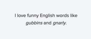
| <p>I love funny English words likeWhat it looks like:
| To make a paragraph italic:
What it looks like:
|


Strikethrough
Strikethrough text has a horizontal line bisecting it, and applying this styling can draw attention to a price reduction or information update.
The <strike> HTML tag is obsolete and should not be used any more.
It’s also worth noting that there is an accessibility issue with this style, as screen readers won’t emphasize a word with a strikethrough, which could negatively impact the experience of those reliant on assistive technology. Adding context before each amount, such as ‘was’ and ‘now,’ will make this a valuable experience for everyone.
How to add strikethrough text in email
In the style block this utilizes the text-decoration property with the line-through attribute. Inline the <s> tag can be used to strike out a word or phrase.
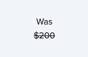
Inline to a word or phrase (OK)
<p>Was<br /><span style="color:#32716A; font-size:30px; line-height: 40px;"><s>$200</s></span></p>
What it looks like:
In the head (Better)
In the style block:
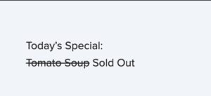
.sold-out { text-decoration: line-through; }
In the code:
<p>Today’s special:<br><span class=”sold-out”>Tomato Soup</span> SOLD OUT</p>
What it looks like:
Uppercase
I recommend styling uppercase text using CSS styling, as writing in capitals could negatively impact screen readers. In some cases, a screen reader may read words out letter by letter as it is identifying them as acronyms.
Screen readers don’t identify CSS styling, so they treat uppercase text styled using CSS like regular text.
How to add uppercase text in email
Since this is a CSS property, it’s best to set a class that you can use over and over again in the head section instead of writing it out inline every time.
In the head
In the style block:
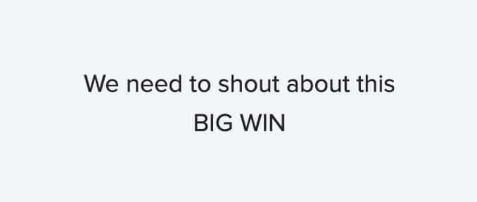
.capitalize { text-transform: uppercase; }
In the code:
<p>We need to shout about this <br /><span class="capitalize">big win</span></p>
Inline
<p>We need to shout about this <br /><span style="text-transform:uppercase;">big win</span></p>
Both versions above will produce this…
Letter spacing
Adding letter spacing can bring a little extra character and identity to your fonts, and it can also make some font styles more readable.
Support is good across email clients, with just Outlook offering partial support.
How to change letter spacing in email
Again, this is a CSS property, so it is best to set a class that you can use over and over again in the head section instead of writing it out inline every time.
In the head
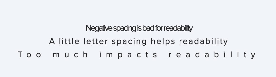
In the style block:
.negative { letter-spacing: -2px; }
.good { letter-spacing: 2px; }
.too-much { letter-spacing: 10px; }
In the code:
<p class="negative">Negative spacing is bad for readability</p>
<p class="good">A little letter spacing helps readability</p>
<p class="too-much">Too much impacts readability</p>
Inline
<p style="letter-spacing: -2px;">Negative spacing is bad for readability</p>
<p style="letter-spacing: 2px;">A little letter spacing helps readability</p>
<p style="letter-spacing: 10px;">Too much impacts readability</p>
Both versions above will produce this…
Line height
The amount of items on the shelves of a big box store is very different from that of a high-end boutique, which affects the feeling of the space. Similarly, line height in email can be an intentional styling choice to affect the mood and readability of the copy.
How to adjust line height in email
Setting this CSS property on the element type selector so that the style is applied to all of the same HTML tags is much more efficient than adding it inline to every HTML tag.
In the head
In the style block:
p { line-height: 1.5em; }
In the code:
<p>"Science is not a boy's game; it's not a girl's game. It's everyone's game. It's about where we are and where we're going. Space travel benefits us here on Earth. And we ain't stopped yet. There's more exploration to come." <br>- Nichelle Nichols</p>
Inline
<p style="line-height: 1.5em;">"Science is not a boy's game; it's not a girl's game. It's everyone's game. It's about where we are and where we're going. Space travel benefits us here on Earth. And we ain't stopped yet. There's more exploration to come." <br>- Nichelle Nichols</p>
Both versions above will produce this when using different values for the line-height:

Text alignment
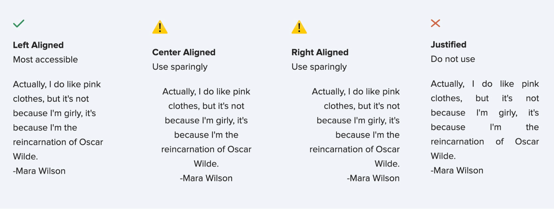
To code text alignment you can use the HTML align attribute. However, this will also align any other elements you have within the cell. Using CSS on semantic tags, such as headers or paragraphs, is the most effective way to align your copy.
How to change text alignment in email
In the head
In the style block:
p { text-align: left; }
In the code: <p> Actually, I do like pink clothes, but it's not because I'm girly, it's because I'm the reincarnation of Oscar Wilde. <br>-Mara Wilson </p>
Inline
<p style="text-align: left;"> Actually, I do like pink clothes, but it's not because I'm girly, it's because I'm the reincarnation of Oscar Wilde. <br>-Mara Wilson </p>
Both versions above will produce this when using different values for the text-align:
Color
Brand-specific colors create consistency in your typography but don’t sacrifice readability for style. Limiting your typography to a few colors is also a good idea.
How to change text color in email
In the head
In the style block:
.blue { color: #10618B; }
.teal { color: #3B857B; }
In the code: <p>”Fairy tales are more than true: not because they tell us that dragons <span class="blue">exist</span>, but because they tell us that dragons can be <span class="teal">beaten</span>.” <br />― Neil Gaiman, Coraline</p>
Inline
<p>”Fairy tales are more than true: not because they tell us that dragons <span style="color: #10618B;">exist</span>, but because they tell us that dragons can be <span style="color: #3B857B;">beaten</span>.” <br />― Neil Gaiman, Coraline</p>
Both versions above will produce this when using different values for the text-align:
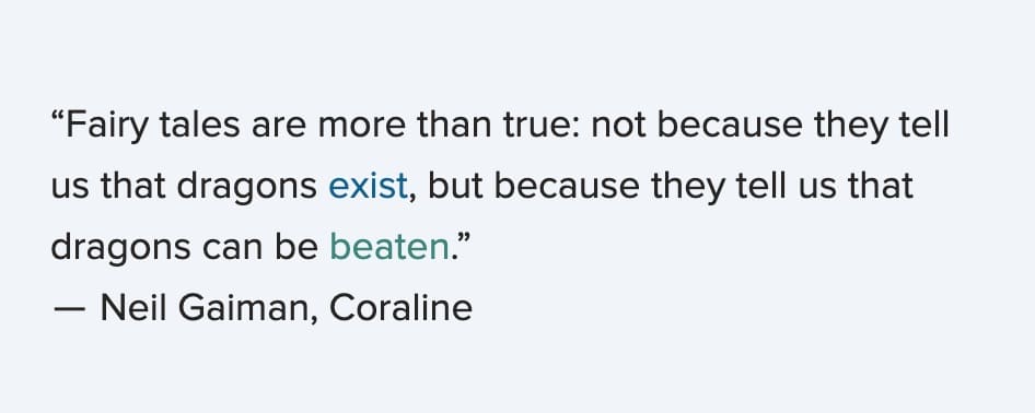
It’s important to keep the contrast ratio in mind when altering colors of text to ensure your copy is still legible.
Size
Email text size plays an important role in your content hierarchy, but be sure to test your design across devices to ensure readability.
How to change text size in email
In the head
In the style block:
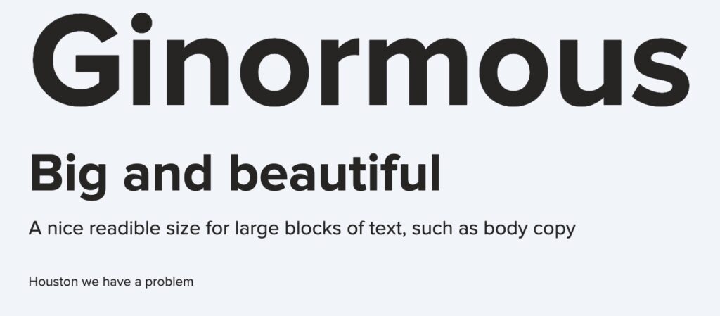
h1 { font-size: 120px; }
H2 { font-size: 48px; }
p { font-size: 18px; }
.small{ font-size: 12px;
In the code:
<h1>Ginormous</h1>
<h2>Big and beautiful</h2>
<p>A nice readible size for large blocks of text, such as body copy</p>
<p class=”small”>Houston we have a problem</p>
Inline
<h1 style=”font-size: 120px”>Ginormous</h1>
<h2 style=”font-size: 48px”>Big and beautiful</h2>
<p style=”font-size: 18px”>A nice readible size for large blocks of text, such as body copy</p>
<p style=”font-size: 12px”>Houston we have a problem</p>
Both versions will create:
Best practices for using email typography
You can get creative with email typography, but there are a few guidelines to keep in mind to balance style and substance.
Head or inline
Throughout we’ve offered both ways to include styles for your text. The true power of putting your styles in the head becomes apparent when you have to use multiple styles.
In the head
In the style block:
h1 { font-size: 48px line-height: 1.5em; color: #3B857B; }
p { font-size: 18px; line-height: 1.5em; color: #262524; margin: 20px 0; }
a { color: #10618B; text-decoration: underline; }
In the code:
<h1>An important headline</h1>
<p>A bit of supporting information about your headline. And then <a rel="noopener" target="_blank" href=””>your link goes here</a>.</p>
<img src="[your image url]" width="600" height="300">
<p>But don’t forget about <a rel="noopener" target="_blank" href=””>this other link</a>. Which could also be important to your headline.</p>
Inline
<h1 style="font-size: 48px line-height: 1.5em; color: #3B857B;">An important headline</h1>
<p style="font-size: 18px; line-height: 1.5em; color: #262524; margin: 20px 0;">A bit of supporting information about your headline. And then <a rel="noopener" target="_blank" style="color: #10618B; text-decoration: underline;">your link goes here</a>.</p>
<img src="[your image url]" width="600" height="300">
<p style="font-size: 18px; line-height: 1.5em; color: #262524; margin: 20px 0;">But don’t forget about <a rel="noopener" target="_blank" style="color: #10618B; text-decoration: underline;">this other link</a>. Which could also be important to your headline.</p>
Both of the html samples above will show:
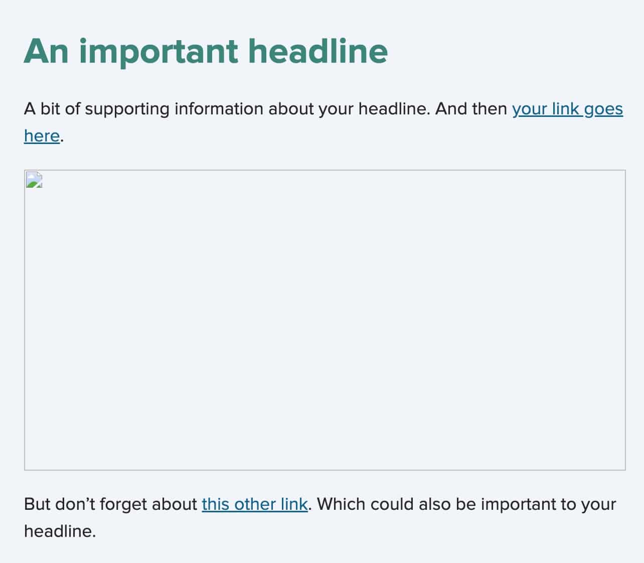
But the one with the styles in the head is much cleaner and easier to read and also has a smaller file size. If you use the styles in your head section and find some of them not translating in a certain email client, you can duplicate them inline in the specific place where you are seeing the issue. This is a good way to troubleshoot and identify an email clients that do not support a specific style in the head section.
Choose readable fonts
The best font for the job depends on where it lives in your email:
- Use serif and sans-serif for body copy. These typefaces are the most commonly used, especially for body copy, because they are the most readable and, therefore, accessible. They also render well when scaled down and at lower weights.
- Reserve script and display for headlines. These typefaces are often too complex for body copy because they can be hard to read and even harder to scan.
- Differentiate technical content with monospaced typefaces. Monospaced typefaces are also less commonly used as body copy. Instead, they are favored in technical resources for programming languages to distinguish code from natural language.
Prioritize readability and accessibility
We briefly mentioned readability and accessibility in regards to typefaces, but there are more factors to consider when designing email typography that’s easiest for sighted subscribers to read and comprehend. Coding your email typography—not locking it away within an image—also ensures screen readers and subscribers with images turned off can fully enjoy your design.
- Add a little letter spacing to uppercase and small typography. Uppercase and small text benefit from some breathing room between letters, but too much letter spacing harms readability. For more information on the dos and don’ts here, check out this helpful post on letter spacing.
- Use a line height that’s 1.5x or 2x your font size. Spacing between lines of text prevents copy from looking like a solid wall of words, but too much room between each line can feel like it’s independent from the next, making reading and scanning a challenge. We aim for line heights between 1.5 and 2 times the size of the text. For example, a font size of 20px should have a line height of 30-40px.
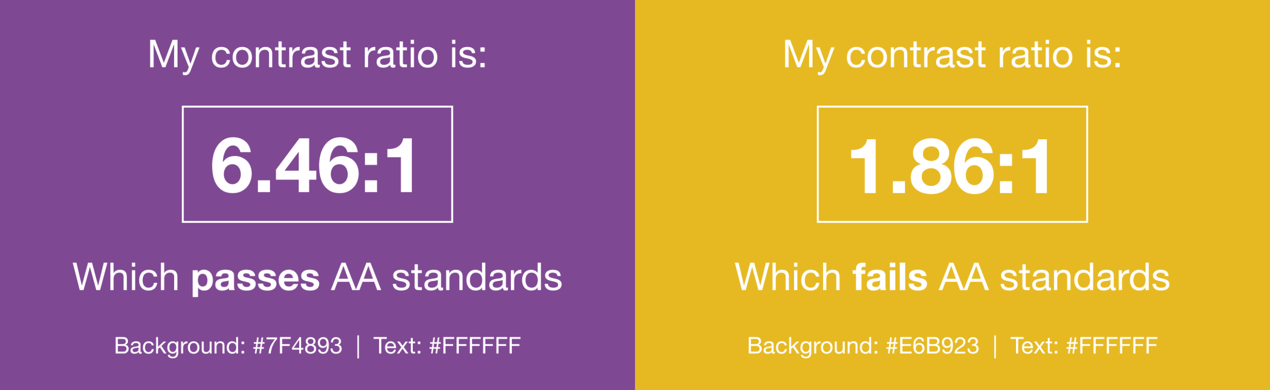
- Maintain a high font contrast. When you select text colors, make sure they’ll stand out against your background colors or images. This will help make your content readable for subscribers with vision impairments. The best way to find out whether you have a good contrast ratio is to test your colors in the WebAim contrast checker.
- Use bold, italic, and uppercase styling sparingly. Bold fonts, italic words, and uppercase headers all help copy stand out. But, there can be too much of a good thing. Use these typography styles mindfully to maintain readability.
- Align text based on language and copy length. Right-aligned body text should only be used for languages that read right to left. Center-aligned text should be reserved for headlines or short paragraphs of no more than 3 lines. Use left-aligned for left-to-right languages to create a visual anchor point to return to each time a line is read.
- Use at least a 14px font size. There isn’t really an upper limit to how big you style your text, but there is a limit to how small text should be. Anything below 14px becomes hard for many people to read, and iOS Apple Mail’s automatic text adjustment feature will kick in and enlarge your text. At Litmus, we rarely stray below 18px. If we do, we limit it to tertiary information such as caveats, footnotes, and footer content.
Pro tip: for a deeper dive into creating, designing, and coding accessible content for email, check out the Salesforce Trailhead sessions we recorded with Mark Robbins, Software Engineer at Salesforce.

Customize typography for your audience
There are general best practices for email typography, but you can also use email engagement metrics to learn what your audience likes. For example, you can try placing information in different spots within the content hierarchy to see which increases clicks. Or, you can play around with styling and take note of which typography increases read time.
Of course, it’s always a good idea to check how your email renders across different devices to know what subscribers will see, and you can prioritize testing for the devices and email providers your subscribers use most.
Brands getting creative with email typography
Now for some examples of brands with great use of typography in their email designs. What makes them stand out and draw readers in?
DAMP
DAMP, a newsletter highlighting winemakers and retailers that focus on making and selling natural wines, leans heavily into typography, working with serif and sans-serif fonts to lay out the hierarchy of content.
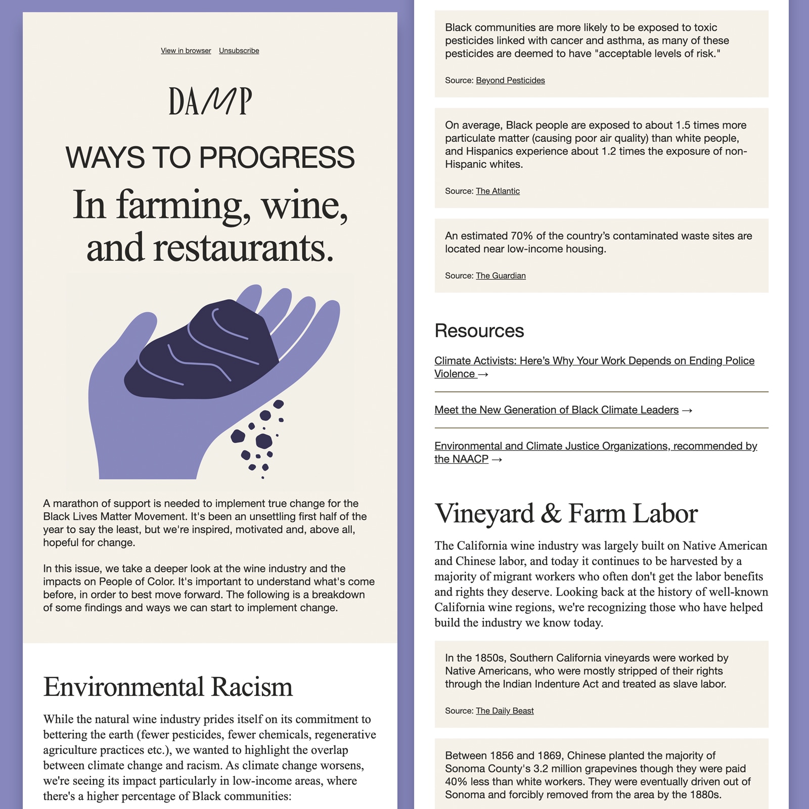
Source: Really Good Emails
Fonts used: Helvetica neue with Arial fallback, and serif system font Times New Roman.
The hero area displays the only image in this long form newsletter, with bold typography setting the tone for the email on open. This email design trend of bold typography makes a statement. It’s no wonder so many brands have adopted this style.
What is really interesting about this email, is that they achieve this modern and clean style using system fonts rather than web fonts—meaning that the fonts will render similarly across all email clients.
Ready Mag
Ready Mag, an in-browser graphics editor, also leans into system fonts, leading with Mac system fonts, followed by an array of Helveticas. This is probably beyond what is required of a font stack in email.
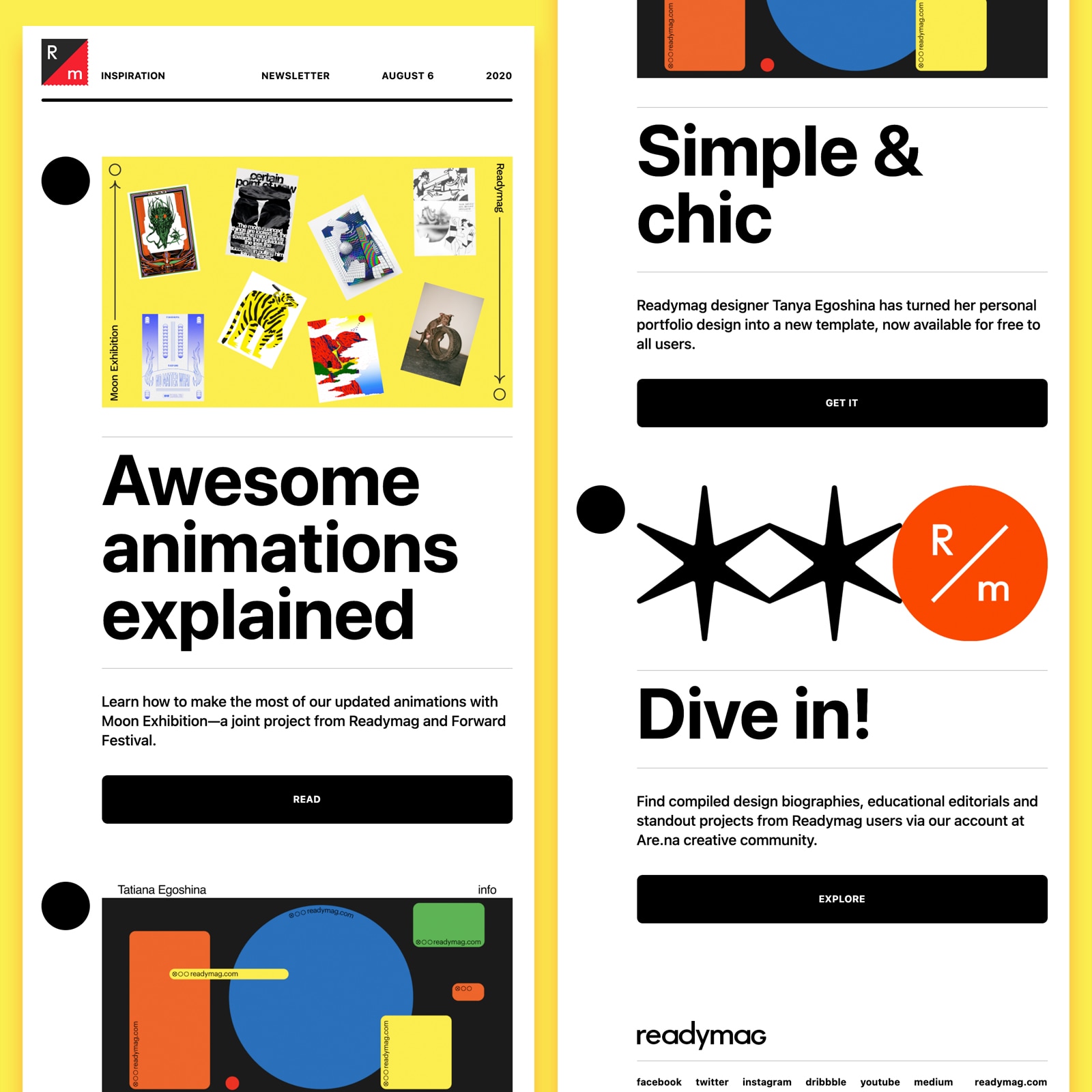
Source: Really Good Emails
Fonts used: Apple system fonts, falling back to Helvetica and Arial.
What I love about this email is how bold typography separates content. It makes the email easy to scan. And with minimal body copy, readers in a hurry can get the value of each section and take action quickly.
Blurb
Self-publishing platform Blurb uses web fonts to bring its brand identity to emails, using light and bold weights as well as uppercase letters to outline hierarchy and action areas.
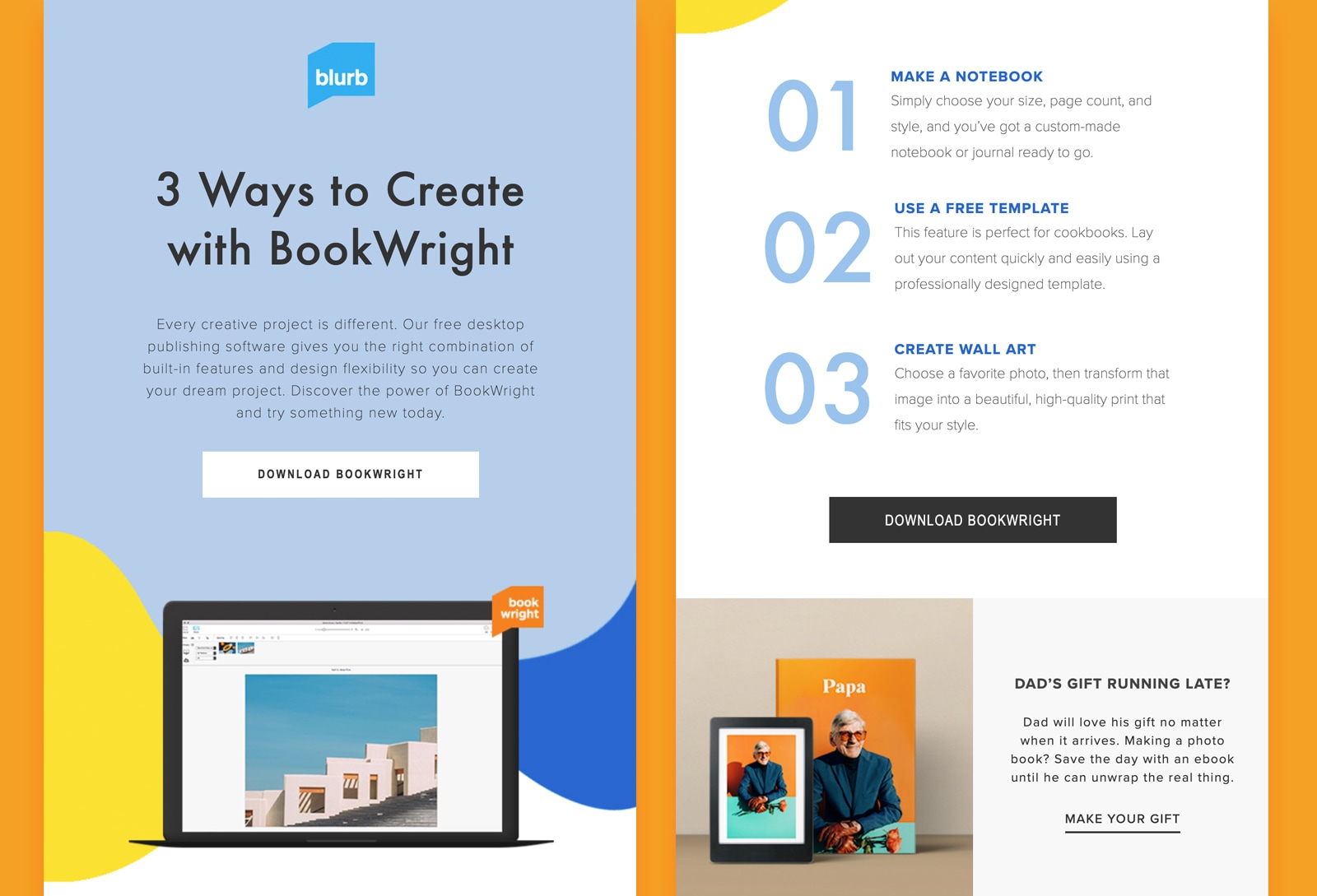
Source: Really Good Emails
Fonts used: Futura and Proxima Nova (web fonts), falling back to Helvetica and Arial.
It’s great to see the numbers–the ones that make up the steps–styled using live text rather than imagery. This creates a much smoother experience for subscribers reliant upon screen readers and also means that these will render when images are not loaded.
Tripadvisor
Like many brands, travel platform Tripadvisor sent out their COVID-19 messaging using a letter-style template. This is a more personal and direct way of communicating with customers, offering important information without the distraction of imagery, or the likelihood of being mistaken as a marketing email.
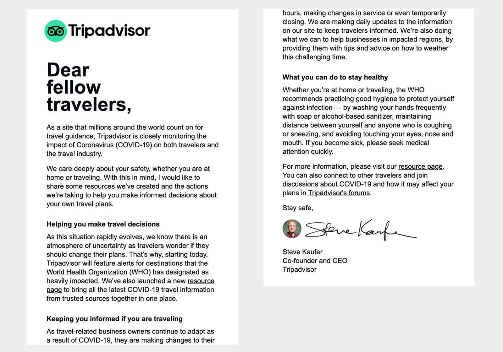
Source: Really Good Emails
Fonts used: Arial.
Big, bold typography highlights the overarching message of the email. At the same time, the headline stands out against blocks of body copy, breaking up content and providing anchor points for the reader to understand the value of a section.
This highly scannable email also has ample padding left and right of the main container, which is a great technique for preventing large blocks of copy from overwhelming the reader.
Tattly
Temporary tattoo retailer Tattly has a very creative approach to email design, with promotional emails often leveraging exciting design techniques and trends. They use bold typography in the hero of this email to draw attention to the new products featured within the email.
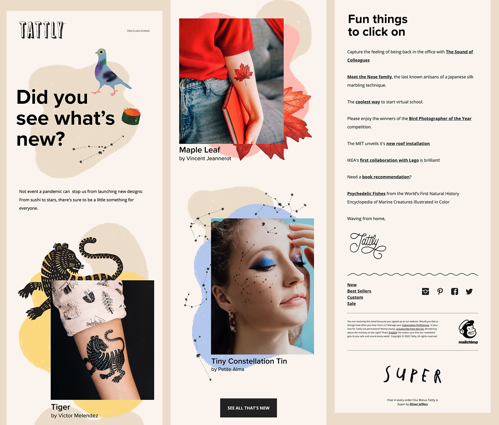
Source: Really Good Emails
Fonts used: Open Sans (web font), falling back to Helvetica and Arial.
It is common with highly designed emails, such as this one, for typography to be image based, rather than live text.
There are a number of accessibility considerations that need to be made when using imagery for text, such as applying ALT text that echoes the copy, and taking into account what the text will look like for people who need to enlarge the email due to a visual impairment. Will the text pixelate and become unreadable? Also, how readable is image-based text when the email scales down on mobile devices?
Although live text is the best way to keep your emails accessible and readable, there is a way to make image based hero areas valuable to a wider audience, by wrapping your hero image in an H1 tag and adding the image text to your ALT tag, like this:
<h1 style=”Helvetica Neue,Helvetica,sans-serif; font-size:50px; line-height:75px; color:#262524;”><img src=”hero.png” alt=”Image based hero messaging - there is a way!”></h1>
This approach makes the email scannable for subscribers reliant upon screen readers, as they are able to use shortcut functionality to navigate through headlines.
“Wrapping an image within a H1 tag is valid semantic code and will be included in screen reader headings shortcut menus. However, it is important to note that ALT text may not be read out by all text reading tools.” — Mark Robbins, Software Engineer, Salesforce
Email typography packs a punch
With the rapidly growing number of messages competing for your subscribers’ attention, the burden to stand out and still provide a reliable experience—fast—keeps getting heavier. Typography is a great way to make your emails beautiful, effective, and accessible without slowing you down.
Keep this guide in mind, and share how you use typography in your emails. We’d love to see them!

Boost efficiency and scale email development
Craft consistent, on-brand emails with Litmus. Create and store reusable templates, code modules, and more.
Steph Knapp
Steph Knapp is a Freelance Content Writer for SaaS and B2B companies